Project 7: Curves

wpf-curves.js
//Patrick Fisher, Section B, wpf@andrew.cmu.edu Assignment -07-project
var functionState = 1;
function setup() {
    createCanvas(480, 480);
    frameRate(10);
}

function draw() {
    var nPoints = 80;
    var radius = 150;
    var separation = 120;

    if(functionState == 1){ //glitchy circle
        background(0);
        fill(255, 255, 255, 64);
        var mouseXincrease = map(mouseX,0,width,-40,40);
        var mouseYincrease = map(mouseY,0,height,-40,40);
        var colorXY = map(mouseX + mouseY,0,960,0,255);
    
        push();
    
        translate(2*separation, height / 2);
        fill(255,0,colorXY);
        beginShape();
        for (var i = 0; i < nPoints; i++) {
            var theta = map(i, 0, nPoints, 0, TWO_PI);
            var px = radius * cos(theta);
            var py = radius * sin(theta);
            vertex(px + random(-40, mouseXincrease), py + random(-40, mouseYincrease));
        }
        endShape(CLOSE);
        pop();
    } 

    else if(functionState == 2) {
        var mouseXpoints = map(mouseX,0,width/2,1,30);
        var oppoY = map(mouseY,0,width,255,0);

        background(240);
        push();
        fill(oppoY)
        translate(2*separation, height / 2);
        beginShape();
        for (var i = 0; i < mouseXpoints; i++) {
            var theta = map(i, 0, mouseXpoints, 0, TWO_PI);
            var px = radius * cos(theta);
            var py = radius * sin(theta);
            vertex(px,py); 
            ellipse(px, py, 3,3);
        }
        endShape(CLOSE);
        pop();
    }    
}

function mousePressed(){
    if(functionState ==1){
        functionState = 2;
    } else if(functionState ==2){
        functionState = 1;
    }
}

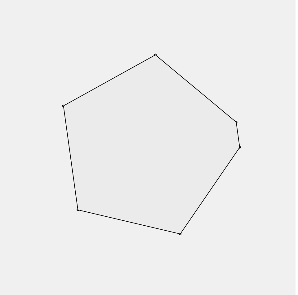
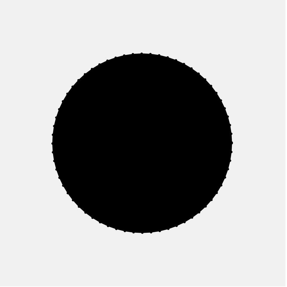
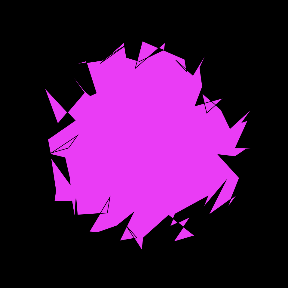
I am very conflicted on the result of this project. I had a major lack of inspiration when it came to ideas, so I ended up taking some of the shapes shown in the sample and playing around a bit with them. I had difficulty with some of my map functions as they were not working as I had intended for some reason. However, I do like in the end what I came up with. The circle getting more and more glitchy is really fun and I really love how the vertices of the second circle spring out of the original one like a clown car.

Looking Outwards 7

This week I am looking at a YouTube video called “SEIZURE WARNING Pushing Sorts to their Limits”. Hyperbolic name aside, it is an hour long video where YouTuber Musicombo visualizes 79 different sorting algorithms. All the arrays sorted just contain integer values, up to either 2^14th (roughly 8 thousand) or 2^15th (roughly 16 thousand), in a completely random order. All the algorithms are doing is comparing two number values and seeing which one is larger than the other, until eventually the array is sorted correctly from 1 to their max number. However, how each algorithm goes about where in the array it chooses to compare a pair of numbers is where the variety and artistry comes in. Some are very simple, such as starting in the middle and going down, then starting in the middle of the rest of the unsorted section, so on and so forth, while some are much more intricate. The intricate ones are not always the fastest, but they create the more interesting patterns and visuals for sorting. Additionally the creator adds fun, arcade, Pac-Man esk sounds that make the entire process very pleasant as the cluttered noise becomes closer to a solid sequence, culminating when the final check runs successfully. The idea is relatively simple but the execution is so remarkable that it is just so satisfying to watch, so much so that the video has over 1.6 million views.

Musicombo

Project-7: Composition with Curves

My Project

//cbtruong;
//Section B;

//sets up the variables for stroke color;
//col is the stroke color for smooth conical spiral;
//col2 is the stroke color for the rough conical spiral;
var col = 0;
var col2 = 0;
//sets up the variable for angl to allow for rotation;
var angl = 0;
//sets up the variable for the shifting fill color value;
//for the rough conical spiral;
var shiftingVal = 100;
//sets up the variable that allows for reversing the change;
//of shiftingVal;
var shiftingValChange = 1;


function setup() {
    createCanvas(480, 480);
    background(220);
    text("p5.js vers 0.9.0 test.", 10, 15);
}

function draw() {
    background(220);
    stroke(0);
    //diagonal lines that hit the center of the spirals;
    line(0, 0, 120, 120);
    line(0, 480, 120, 360);
    line(480, 0, 360, 120);
    line(480, 480, 360, 360);
    //lines that outline the perimeter of the canvas;
    line(0, 0, 480, 0);
    line(0, 0, 0, 480);
    line(480, 0, 480, 480);
    line(0, 480, 480, 480);
    //lines of the innerbox whose vertices are the spiral centers;
    line(120, 120, 120, 360);
    line(120, 360, 360, 360);
    line(360, 360, 360, 120);
    line(360, 120, 120, 120);

    //draws the middle, rough concial spiral;
    strokeWeight(2);
    fill(shiftingVal);
    stroke(col2);
    push();
    translate(240, 240);
    conicalSpiralTopViewRough();
    pop();
    
    //draws the 4 smooth rotating conical spirals;
    noFill();
    stroke(col);
    for (var i = 120; i <= 360; i += 240){
        for (var j = 120; j <= 360; j += 240){
            push();
            translate(j, i);
            rotate(radians(angl));
            scale(0.5);
            conicalSpiralTopViewSmooth();
            pop();
        }
    }

    //checks if the shiftingVal is too high or low;
    //if too high, the fill becomes darker;
    //if too low, the fill becomes ligher;
    if (shiftingVal >= 255){
        shiftingValChange = shiftingValChange * -1;
    }
    else if (shiftingVal < 100){
        shiftingValChange = shiftingValChange * -1;
    }
    //changes the shiftingVal;
    shiftingVal += 1*shiftingValChange;
    //changes the angle and allows for rotation;
    //of the smooth conical spirals;
    angl += 0.1;
    

}

//function that creates the smooth conical spirals;
function conicalSpiralTopViewSmooth() {
    //variables for h, height; a, angle; r, radius;
    var h = 1;
    var a;
    var r = 30;
    
    //adds interactivity;
    //as one goes right, the size of the spiral increases;
    //as one goes down, the complexity of the spiral increases;
    var indepChangeX = map(mouseX, 0, 480, 500, 1000);
    var indepChangeY = map(mouseY, 0, 480, 800, 1000);
    a = indepChangeY;

    //actually creates the spiral;
    beginShape();
    for (var i = 0; i < indepChangeX; i++){
        var z = map(i, 0, 400, 0, PI);
        x = ((h - z) / h)*r*cos(radians(a*z));
        y = ((h - z) / h)*r*sin(radians(a*z));
        vertex(x, y);
    }
    endShape(CLOSE);

}

//function that creates the rough middle conical spiral;
function conicalSpiralTopViewRough() {
    //variables are the same as the smoothSpiral function;
    var h = 0.5;
    var a = 1000;
    var r;
    
    //adds interactivity;
    //the radius is now dependant on mouseY, going up increases size;
    //going left increases complexity;
    r = map(mouseY, 0, 480, 20, 10);
    var edgeNum = map(mouseX, 0, 480, 60, 30);
    
    //creates the spiral;
    beginShape();
    for (var i = 0; i < edgeNum; i++){
        var z = map(i, 0, 50, 0, TWO_PI);
        x = ((h - z) / h)*r*cos(radians(a*z));
        y = ((h - z) / h)*r*sin(radians(a*z));
        vertex(x, y);
    }
    endShape();
}

//mousePressed function that changes the variables col and col2;
//with random values of r, g, and b;
function mousePressed() {
    var randR = random(150);
    var randG = random(150);
    var randB = random(150);
    col = color(randR, randG, randB);
    col2 = color(randR + random(-50, 50), randG + random(-50, 50), randB + random(-50, 50));
}

I initially had no idea what to make in terms of curves. That was until I happened upon the Conical Spiral. It was supposed to be 3-D, but it ended up as a top down view of a spiral which I liked. Overall, I liked what I did with this Project.

As for how it works, clicking the mouse will change the colors of the middle “rough” Conical Spiral and the 4 “smooth” Conical Spirals. The colors of both types are similar but not the same, as seen with the use of random() in the code.

Along with that, moving the mouse right will increase the size of the “smooth” Spirals and reduce the size and complexity of the “rough” Spiral. Moving left does the opposite. Moving down increases the complexity of the “smooth” Spirals while also reducing the size of them and the “rough” Spiral.

Project 07: Composition with Curves

sketchDownload
// This program displays a grid of Epitrochoid curves with increasing nPoints and cusps.
// The canvas sets up with a 5x5 grid; 
// When the mouse is pressed, more curves are drawn.
// Pressing the spacebar deletes one row and column. 

var c;				// color 
var density = 5;	// number of curves in each row and column
var nPoints;		// number of points used to draw each curve
var cusp;			// number of cusps on each curve
var mode = 0		// default mode uses Epitrochoid formula, other mode uses an edited Epitrochoid-like formula

function setup() {
    createCanvas(480, 480);
}

function draw() {
	background(200, 200, 255);
	// draw a grid of curves based on density value:
	for (var k=0; k<density; k++) {
		cusp = k+1;							// number of cusps increases from left to right
		for (var j=0; j<density; j++) {
			push();
			translate(k*width/density+240/density, 	// keeps grid centered regardless of density changes
					  j*height/density+240/density);	
			nPoints = (j+1)*density			// number of nPoints increases from top to bottom
		
        	//color based on grid and mouse location:
			let r = map(j, 0, density, 0, 255);
			let g = map(k, 0, density, 0, 255);
			let b = map(mouseX, 0, width, 0, 255);
			c = color(r, g, b);
			
			// check which mode we are in and draw curves:
			if (mode == 0) {drawEpitrochoidCurve(nPoints, cusp, c)}
			else {drawEpitrochoidyCurve(nPoints, cusp, c)}
			pop();
		}
	}
	// labeling for easier understanding of the grid pattern:
	textFont('monospace');
	text('click mouse for more curves,	press spacebar for fewer curves', 20, height-12);
	text('press "w" for weird curves,	press "r" for default curves', 20, height-3);
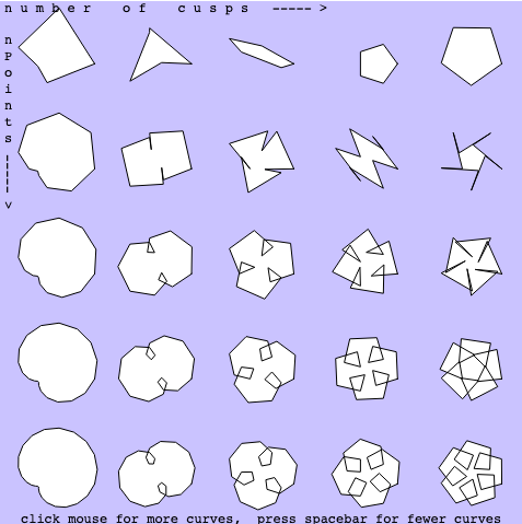
	text('n u m b e r		o f		c u s p s   ----- >', 5, 10);
	text('n P o i n t s', 5, 30, 1, 150);
	push(); 
	rotate(radians(90));
	text('----- >', 140, -5);
	pop();
	

}

// code adapted from sample in project description:
function drawEpitrochoidCurve(nPoints, cusp, color) {
    // Epitrochoid:
	//https://mathworld.wolfram.com/Epitrochoid.html
	
    var x;
    var y;

	var a = 15;
    var b = a / cusp;
    var h = map(mouseY/8, 0, height, 0, a*5);
    var ph = -mouseX / 40;
    
    fill(color);

	// shape of curve:
    beginShape();
    for (var i = 0; i < nPoints; i++) {
        var t = map(i, 0, nPoints, 0, TWO_PI);
        
        x = (a + b) * cos(t) - h * cos(ph + t * (a + b) / b);
        y = (a + b) * sin(t) - h * sin(ph + t * (a + b) / b);
        vertex(x, y);
    }
    endShape(CLOSE);
}

// code adapted from sample in project description and edited further:
// these curves do not interact with mouseY:
function drawEpitrochoidyCurve(nPoints, cusp, color) {
    // Epitrochoidy: not quite an Epitrochoid, but follows a very similar formula
	
    var x;
    var y;

	var a = 15;
    var b = a / cusp;
    var ph = -mouseX / 40;
    
    fill(color);

	// shape of curve:
    beginShape();
    for (var i = 0; i < nPoints; i++) {
        var t = map(i, 0, nPoints, 0, TWO_PI);
        
        x = (a + b) * cos(t) * cos(ph + t * (a + b) / b);
        y = (a + b) * sin(t) * sin(ph + t * (a + b) / b);
        vertex(x, y);
    }
    endShape(CLOSE);
}

// add one more row and column each time the mouse is pressed:
function mousePressed() {
	density +=1;
}

//delete a row and column when the SPACEBAR is pressed:
function keyPressed() {
	if (keyCode == 32) { 
		if (density == 0) {density = density }		// dont let density variable go below 0
		else {density -= 1 }
	}
	if (keyCode == 87) { 
		if (mode == 0) {mode = 1}		// pressing 'w' switches to 'weird' mode
	}
	if (keyCode == 82) { 
		if (mode == 1) {mode = 0}		// pressing 'r' switches back to default 'regular' mode
	}
}

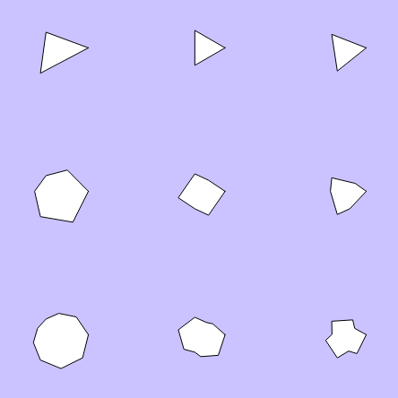
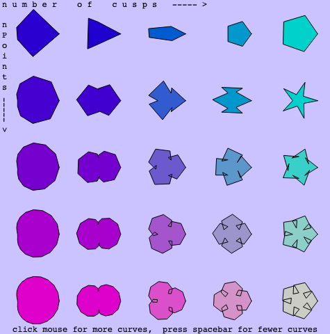
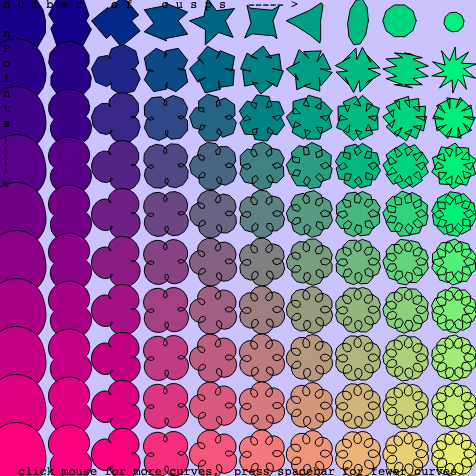
After deciding to use the Epitrochoid curve formula, I realized that the sample in our project description is a very similar curve. Using the sample formula, I adapted the code until I liked what was being drawn on the canvas. Then I made a grid of curves and built them using various nPoint values and cusp values. As you can see in the drawing, as the curves are drawn from left to right, there are more cusps; and as they are drawn from top to bottom, there are more nPoints. Similarly to the sample code, my project uses mouseX and mouseY to interact with the angle and width of the curves. Additionally, the mouseX and mouseX variables are used to determine the fill color of each curve. When the mouse is clicked, the grid gets denser; when the spacebar is pressed, the density decreases. After playing around with the formula, I decided that I also wanted to include a mode for Epitrochoid-like curves that are not technically following the Epitrochoid formula. If you press ‘w’, the ‘weird’ mode turns on and the curves look strange and interesting. Pressing the ‘r’ key puts the program back into the default ‘regular’ mode. Below are a few screen shots that document some of my proccess:

LO 7: Information Visualization

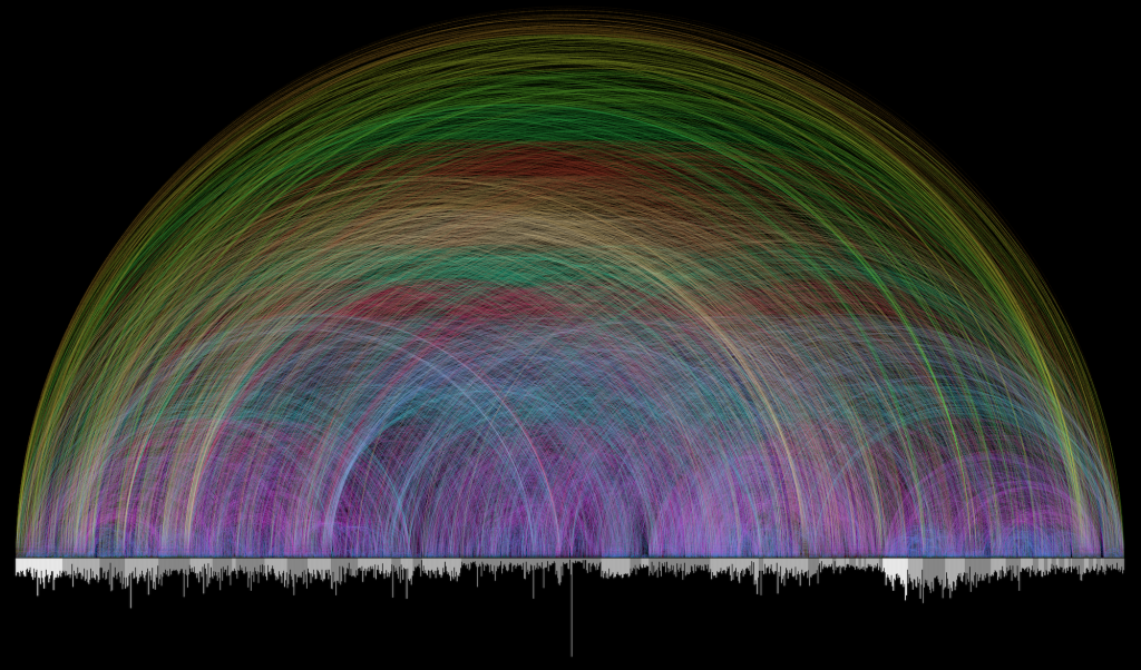
Visualization of Bible Cross References by Chris Harrison

For this week’s LO, I will be talking about a Visualization of the Cross References found in the Bible by Chris Harrison.


Chris Harrison is an Associate Professor of Human-Computer Interaction.
And as the writeup for this week’s LO states, he is here at CMU as well. Some of his work deals with Data Visualization.

This one specifically caught my eye because I am a Christian and with some Bible study under my belt, I am astounded by the references within the Bible. I have also seen this work before, but to now realize that a CMU Professor made this has made me amazed as well. So beyond my own personal beliefs, I just find it beautiful and simplistic in a good way.


As for its creation, a Pastor (Christoph Romhild) and Dr. Harrison began work in 2007. They used the arcs as the connections between chapters (individual bars on the x-axis) that are grouped in alternating light and dark gray sections (they represent books of the Bible). The colors show the length of the connection – with the shortest being dark blue and the longest being what seems to be dark orange. They used the already available 63,000 Cross References and probably separated it by chapter. And using an algorithm(s) of some kind involving the Chapters, created this work.


Overall, I think it is very neat.


Here are links to this specific work, his bio, and other works.

Looking Outwards 07: Information Visualization

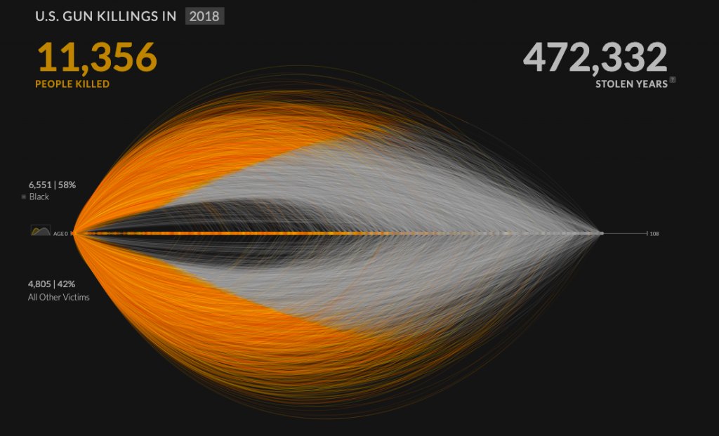
The project I have chosen for this blog post is Kim Rees’s data visualization, “Revealing the overwhelming magnitude of loss from U.S. gun deaths.” This project used data from the FBI’s Uniform Crime Report to map every individual gun murder victim from a given year at once. I find this type of data visualization to be extremely important because it gives a more realistic perspective to viewers who would not otherwise be able to grasp the magnitude of impact by simply looking at the raw numbers. In this project, Rees includes a visualization of what she labels as “Stolen Years”, or the number of years that each murder victim is estimated to have likely lived had they not been shot. The website allows viewers to use filters with can show the proportion of gun murder victims who fall into a specific category or demographic. For example, using the race and age group filters, I am able to see that 433 black children were killed at the hands of gun violence in 2018. As put by Rees, this project reveals “a massive collection of human emotion hidden within rows and rows of numbers.”

Revealing the overwhelming magnitude of loss from U.S. gun deaths, Kim Rees

Filters like race, sex, gun type, relationship to killer, and age can be used to visualize sets within the data.

Project 07: Composition with Curves

curves
var points = 100;

function setup() {
    createCanvas(400, 400);
}

function draw() {    
    background(map(mouseX, 0, width, 50, 0)); // background color goes from grey -> black as mouse moves to the right
    translate(width/2, height/2); // move origin to center
    hypotrochoid(); // draw the curve   
}

function hypotrochoid() {
    // https://mathworld.wolfram.com/Hypotrochoid.html
    var x; 
    var y;
    var a = map(mouseX, 0, width, 50, 80); // radius of fixed circle
    var b = map(mouseY, 0, height, 0.1, 1); // radius of circle rolling around fixed circle
    var h = mouseX/2; // distance from center of interior circle
    strokeWeight(map(mouseX, 0, width, 0.1, 3)); // stroke weight increases as mouse moves to the right
    stroke(mouseX, 100, mouseY);
    noFill();
    beginShape();
    for (var i = 0; i <= points; i ++) {
        var t = map(i, 0, points, 0, TWO_PI);
        x = (a - b) * cos(t) + (h * cos(((a - b)/b) * t));
        y = (a - b) * sin(t) - (h * sin(((a - b)/b) * t));
        vertex(x, y);
    }
    endShape();
}


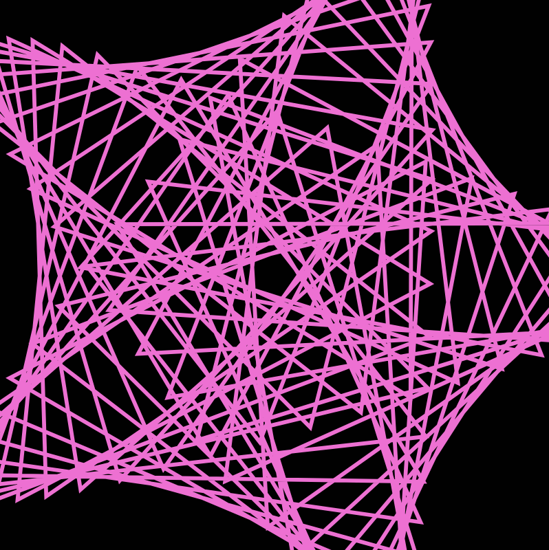
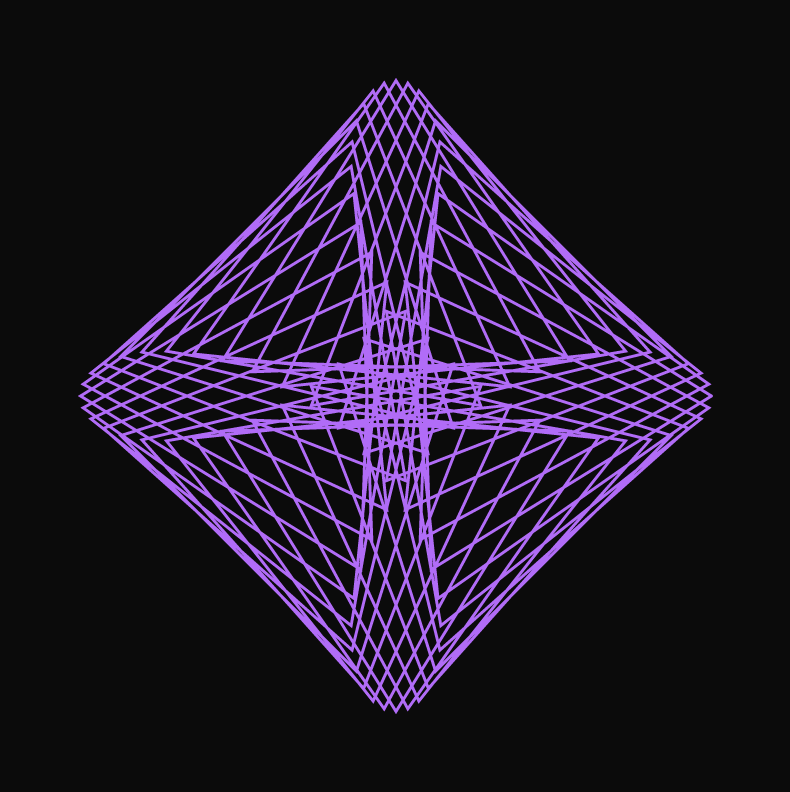
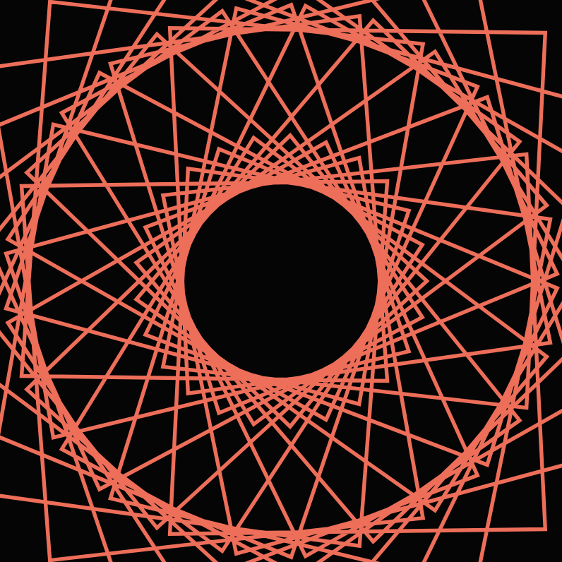
I started the project by just browsing all the different curves in mathworld and coding them to see how they look on the canvas. I ended up settling on the Hypotrochoid curve. The sample curve on the website actually didn’t seem very interesting, but once I allowed the parameters to change based on the mouse’s position, the curve had a lot more details and got much more complicated. It was quite incredible to see how the curve changes as the mouse cross the canvas. Here are some screenshots of the different looks:

The changes are quite drastic, so it’s interesting that they were all produced by the same equation.

Information Visualization

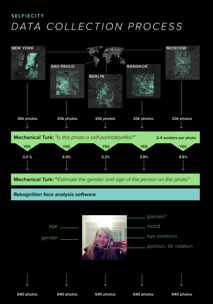
The project that I chose for this week’s Looking Outwards is called “Selfiecity” and it was coordinated by Dr. Lev Manovich. Selfiecity is an interactive project that analyzes the way people take selfies: in 5 different cities – Bangkok, New York, Moscow, Berlin, and Sao Paulo – the data of people’s selfies was collected to find many different patterns such as who smiles the most, who has more reserved looks, do angry people tilt their heads more strongly or what is a characteristic mood for people in Moscow. 

I admire this project because it focuses on different cities all around the world instead of focusing on just specific ethnicity, culture or gender which shows more inclusion and diversity.  

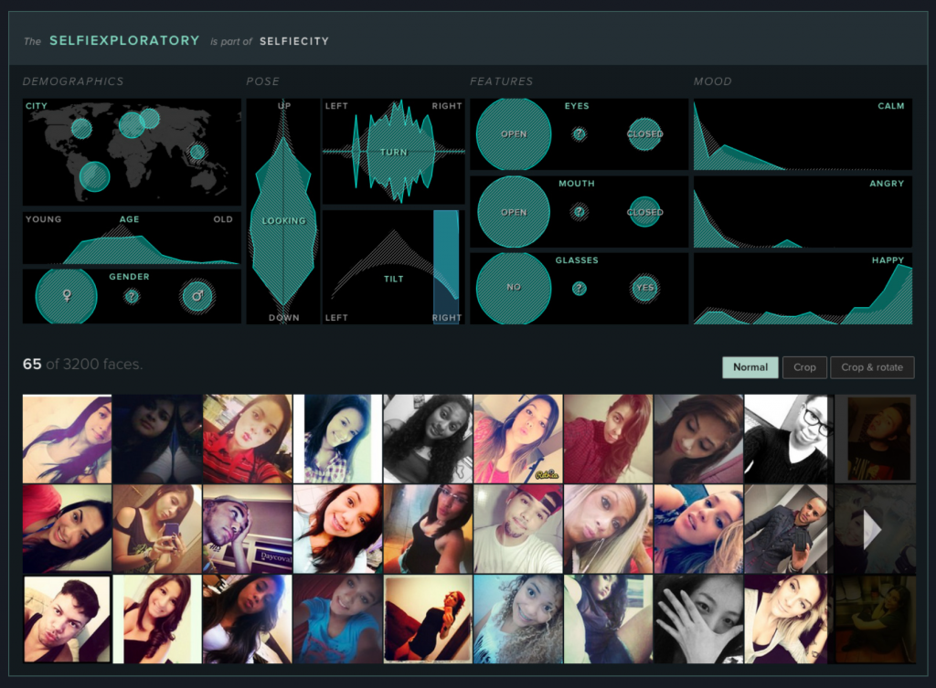
Selfiecity used different theoretic, artistic, quantitative, computational and data visualization methods to collect all the data. For example, Manovich’s team created an algorithm called Imageplots that assembled thousands of selfies to reveal interesting patterns and the team also created an interactive application called Selfiexploratory which allowed them to navigate the whole set of 3200 photos for the project. Selfiexploratory took into consideration matters such as location (1 of the 5 cities), age, gender, pose of looking up or down, tilt or turn of a head left or right, eyes and mouth open or closed, glasses or no glasses, calm, angry or happy. It’s fascinating how the team was able to create an application to take into consideration all of those things from just a simple selfie! 

“This project is based on a unique dataset we compiled by analysing tens of thousands of images from each city, both through automatic image analysis and human judgement.” Manovich’s team randomly selected 120,000 photos, approximately 20,000-30,000 photos per city, from a total of 656’000 Instagram posts. After the selection, the team made 2-4 Amazon’s Mechanical Turk workers tag each photo by answering the simple question of “Does this photo show a single selfie?” The next step was to choose the top 1000 photos for each city and submit them to Mechanical Turk again to more skilled workers to guess the age and gender of the person in the selfies. With the top image selection, the team ran Selfiexploratory app to analyze the details. Finally, one or two members of Manovich’s team examined all these photos manually to find any mistakes and rounded the photos down to only 640 selfies per city. 

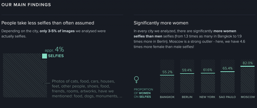
The creator’s artistic sensibilities manifest in the final form by finding out many interesting facts about selfies. For example, Manovich’s team found out that only 3-5% of images they analysed were actually selfies. The other 95-97% were pictures of cats, food, houses, artwork, other people like friends, etc. We always assume that people, especially Gen Z, take a lot of selfies lately, however only 3-5% of the photos analyzed were actually selfies. Moreover, the team found that in Moscow 82% of selfies were taken by women rather than men and Moscow has the least smiling selfies. 

I think this project is very interesting because it focuses on the idea of a selfie and analyzes things such as tilt of a head or having glasses on. Many people wouldn’t even think that any data can be collected from a selfie, however data collected from a selfie in different cities can be used to find many cultural differences and lifestyles.

http://selfiecity.net

Dr. Lev Manovich, Selficity, 2014
Process of Selfiecity
Main findings from the project of Selfiecity

Looking Outwards 7: Information Visualization

“The Rhythm of Food” showing the seasonality of Apricot

The project that I find incredibly intriguing is “The Rhythm of Food” created by teams at the Good News Lab and Truth & Beauty. The goal of the project is to investigate the seasonal patterns in food searches. Using data from 12 years of weekly Google Trends, the creators developed a radial “year clock” chart with various segments indicating the search interests of hundred of dishes and ingredients. The results are featured on a website that highlights the ongoing trends in the current month. The website also allows people to dig into the data themselves and explore the seasonality of various food. The project was built using ES2015, webpack, react, Material UI, and d3 v4. I really enjoy this project because it uses something that we need every day, food, to reveal all sorts of cultural and social phenomena. For instance, the clock shows that searches for “gefilte fish” peak around mid-March because it’s a traditional appetizer for Passover. It’s even more interesting because it explores how the seasonality of food varies across the world. Another aspect that I admire about “The Rhythm of Food” is the visual design. Moritz Stefaner mentioned that he wanted to find “unique, intriguing, expressive and elegant visual devices to bring out the most interesting aspects of the data.” This was accomplished very successfully through the intricate designs of the clock and the cohesive color scheme.

Animation showing how the clock works

LO-6

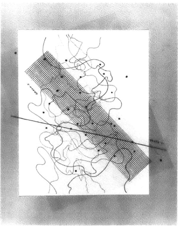
Hello! For this weeks looking outward I wrote on John Cage’s Fontana Mix. Fontana Mix is a musical composition Cage composed based on dictation from randomly generated drawings. The sheet music is a combination of traditional sheet music and transparencies with randomly generated points, grids, and lines. Stacking these transparencies allows the player to create an image that can be algorithmically turned into a piece of playable music. This is done by noting the intersections between the lines and the grid, and connecting points in and out of the grid. These intersections are associated with instructions telling the player how to play the piece. The outcome is note only an uneasy and fascinating piece of music, but a beautiful image associated with the music. The viewer will have a hard time relating the image to what they hear, but both share the property of being seemingly random while simultaneously beautiful and reasonable.