Looking outwards – 09

Artist: Stephen Malinowski

Title: Fantasy-Impromptu by Fredrick Chopin

From Simin Li’s Looking outwards 04.

Malinovsky’s work is beautiful and exciting. It is an example of how using computational capabilities can enrich our experience of music. It also hints at how these capabilities can be art in themselves.

Simin’s assessment of the work is a revelation to me too. Malinovsky’s work reminds Simin of dance and she likens it to choreography. Beautiful music seeks expression and dance is the natural response. When the music can be ‘seen’, the impulse to dance is perhaps even stronger. I can also appreciate how this work makes it easier to teach music.

What struck me, was how the work enables visual experience of sound – in this case, beautiful sound. The work opens up a myriad of vistas – what if we could not only ‘see’ but also touch sound? Would being able to perceive beautiful sounds through our other senses – the eyes and hands (or even smell and taste) enrich our experience of music? On the other hand, could we reciprocate the process by creating music from art? What about making a single piece of art that produces a simultaneous experience of visual, audio and tactile beauty – art that one experience by looking at, listening to and touching?

It would be interesting to integrate a richer colour and image palette into the Malinovsky’s work. Perhaps this could evoke deeper feelings in the visual field alone. There is an unresolved tension between the motion of music and stillness of images, the 2D and the 3D.

Grace Cha-Looking Outwards-09

Turbulence: Watercolor + Magic

Peer’s Looking Outward Post


Going back to Looking Outwards Week 2’s Generative Art, I was drawn to Dr. Woohoo’s Turbulence which combines the use of watercolor (a spontaneous medium) and a robotic arm structure (a more mechanical precise medium) to create a piece that is both spontaneous and mechanical.  I applaud Dr. Woohoo’s approach to exploring the relationship between a robot and artist to display the strengths of each. This approach pushes the boundaries of both areas as it opens new doors to creative process that combine emerging technology and traditional forms of art.  I agree with vtavarez@andrew.cmu.edu that this “increases the amount of possibilities for which these mediums could be used.”  There seems to have been a lot of thinking behind the location of color, hexagonal size, angle of lines, and the overall communication between code and the robot.  With many factors, it’s impressive that he was able to choose and carry out his plan.

Dr. Woohoo on vimeo


Sarita Chen – Looking Outwards – 09

This week, I decided to look at this post for my Looking Outward’s entry. There’s nothing I particularly disagree about in her post, as it relates to the Google Tilt Brush. Personally I think the Tilt Brush is impressive, and I like that there are multiplayer options so that you can use it with friends. I’ve noticed an increase in the amount of virtual reality software, and I guess it comes as no surprise that Google would hop on board with the trend. I myself am not too interested in virtual reality, but the idea itself is pretty creative and I admire the artistic capabilities. It was created in 2014, and is available on Steam and HTC Vive.

Here is a video with visuals of how the Tilt Brush works.

Here is a link to the website.

Mreyes-LookingOutward-09-Reflection

William Latham (rnayyar looking outwards 2)

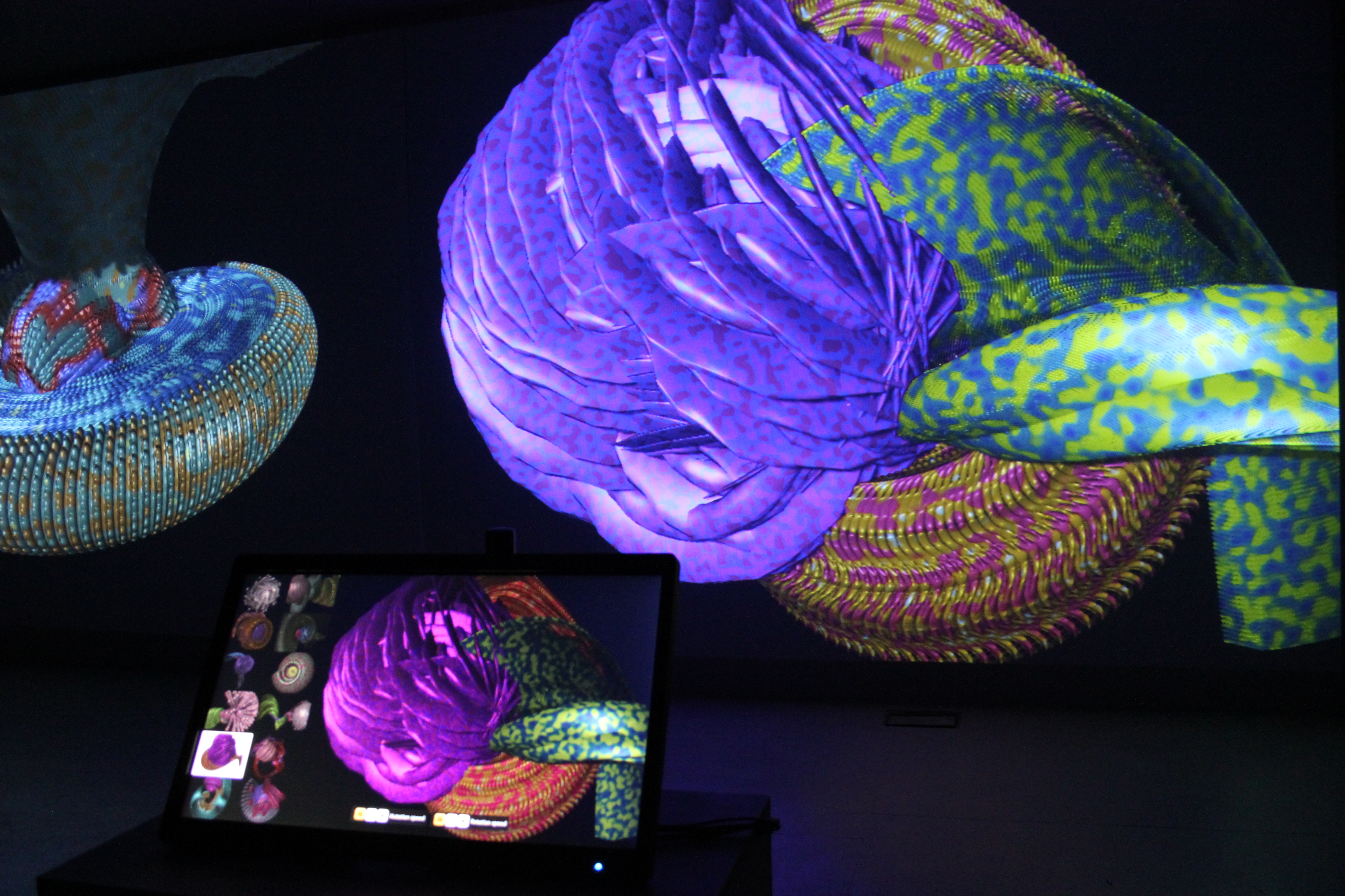
What drew me to Rhea’s looking outward was the nature of the visuals themselves. Latham’s Designs reference the medium and method they are made with a crudeness in texture and form. The forms are clearly complex though in the layering, patterning, and composition to make up forms that look almost organic. While other artists have made realistic organic works before with computer graphics, I find Latham’s fabricated realism more interesting. Additionally, as Rhea stated, these organisms bread and grow, making them really there own life form.

William Latham Mutator2 Triptych 2013

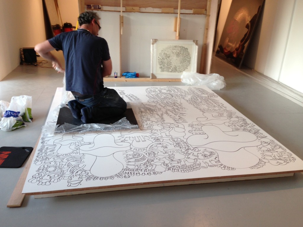
When visiting Latham’s website I was surprised to find he is a very talented draftsman. In the same year as Mutator2 Triptych, he created a 8ft x 8ft drawing consisting of highly stylized, almost cartoon like, organisms.

Latham working on the drawing, 2013

From what I can find he has done a few more large scale drawings that are also quite beautiful. Looking at his drawings and viewing him as a marksman is a portal for viewing his computer generated work in another way. Because, all the computer generated forms are marks in themselves.


zhuoyinl-looking outward09

image

I found Simmon’s Looking Outwards of the 21 Balancoires really inspiring. It is an urban scale collective instrument which located in a kind of abandoned piece of land. The instrument produced music by the movements of swings. It requires participants’ cooperation to produce the melodies; therefore, it brings people to this area and transforms the abandoned streets into an active urban public space.

I think this idea of renew urban area is really helpful for the US cities today. Most of the urban areas in this country are almost developed and some cities have experience several polulation migration. This, rehabilitating cities would be the most sustainable way for urban planning in this century. By integrating the computational technique and human interactive devices, the decaying urban area could gain a second life with very low financial investments. Simmon also saw the underlying meaning of this instrument within the urban planning context. I think we would both agree that this could be a solution to the current urban planning problems in some recessing cities in developed countries.

http://awards.ixda.org/entry/2013/21-balancoires/

Looking-Outwards-09

For this week’s Looking Outwards I read Kyle Lee’s and it looked really interesting as it was about artificial fish that are put on display at a festival in Tokyo, Japan. They were invented by TeamLab and were brilliantly put on display in shallow water to allude to real fish.

I agree with what Kyle Lee said about experiences; they are irreplaceable. However, I am not sure about whether we are heading down the right path in that so many seem to be technological. Rather than see real fish, large amounts of money and effort were put into this display which, although beautiful, cannot replace the real thing.

The link to the display can be found here, while the link to Kyle Lee’s Looking Outward can be found here.

Below is a video of the display. In it, you can see people standing ankle-deep in water, which the fish are projected upon.

LookingOutwards-09

In week five Mercedes Reyes, wrote about Eyal Gever‘s Sublime Moments (2014). In the blogpost, Mercedes writes the artist’s use of hyperrealism to be ugly, yet very interesting due to his ability to “capture the ominous potential along with a beauty and serenity of natural forms in a poetic juxtaposition”. I believe that the pieces Gever presents are beautiful due to their ability to capture actions in still moments. I would disagree with Mercedes and say that the beauty in Gever’s works is in ability to capture kinetic sculptures in still live images. I would like to add that his use of 3D printing technology and photographs is powerful, as we get to see things occurring in a macro level. I think his ability to do so, give him the ability to become much more creative with each piece. For example in his Water Dancer 3D liquid Simulation as shown below represents his use of merging hyperrealism with other creative approaches.

Water Dancer 3D liquid simulation from Eyal Gever on Vimeo.

Kyle Lee Looking Outward 09

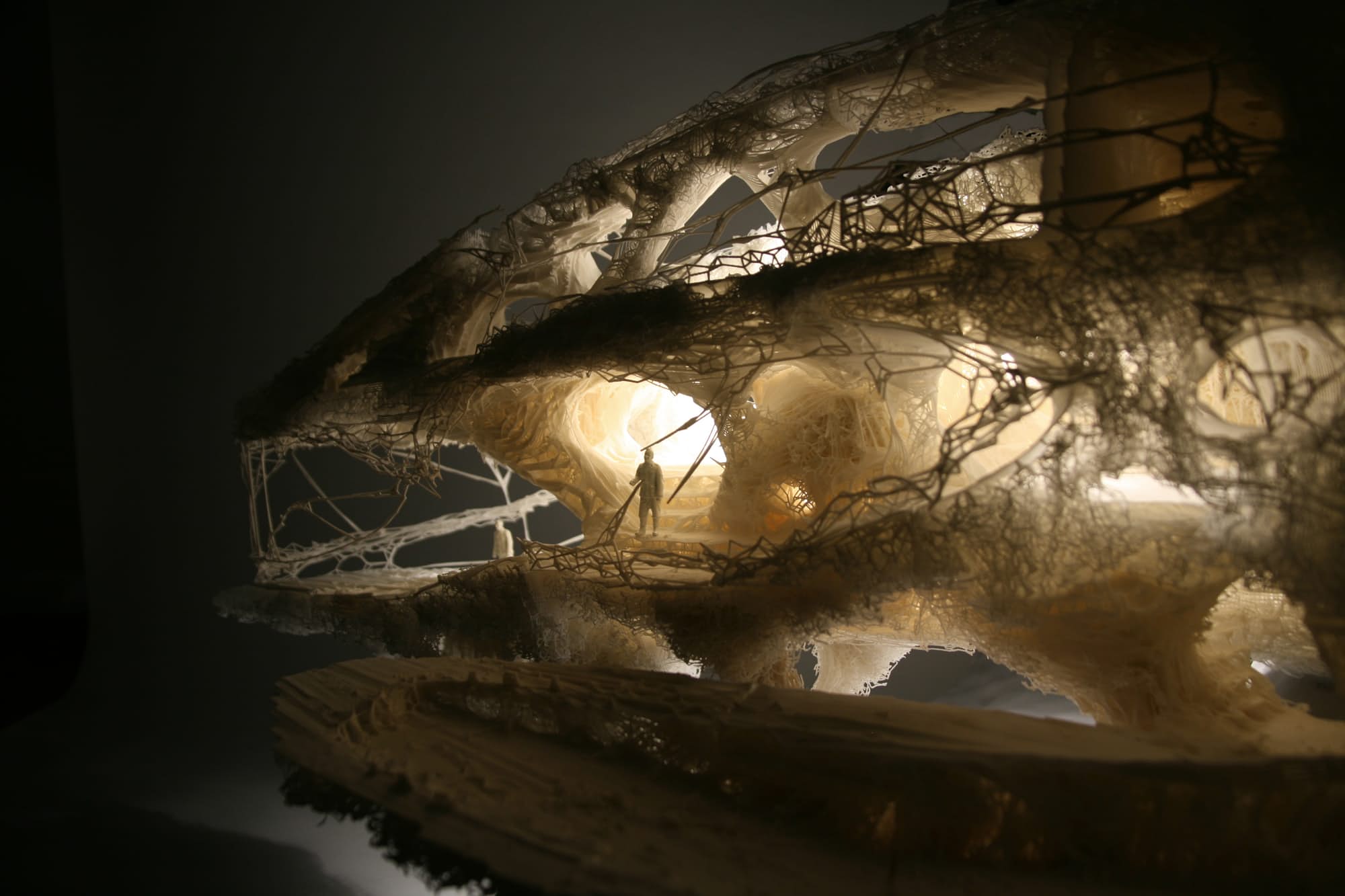
Softkill’s Protohouse

For this week, I looked at Yugyeoung Lee’s post from week 2. The project that Lee discussed is an experimental architectural prototype from the designer firm Softkill. Using bone structures as a basis for infrastructure, computer algorithms build a sound structure, that is then printed in material and cost effective plastics. A advanced algorithm coupled with a sophisticated laser technology makes this project possible.

I agree with Lee in saying that this kind of conceptual experimentation reveals much about how architecture can move towards a more cost and material efficient future. The additional features of no adhesives and lightweight fibers further shows promising signs for this technique and technology. I think this project certainly serves itself well as a concept project, but I do think there are several considerations that were not addressed in the article. While it was uplifting to see that these fibers were bioplastics, it certainly does not mean this architecture is completely sustainable. Although some of the bases for the fibers would be from renewable materials, the amount of energy needed to transform that material into structurally sound plastic might outweigh its own benefit. This is my guess as to why more projects using this bioplastic material technology have not come about in the three years since Softkill’s project; the process to use this seemingly green material consumes too much money and energy to be sustainable.

mdambruc-LookingOutwards-09

https://courses.ideate.cmu.edu/15-104/f2016/2016/09/22/diana-connolly-looking-outwards-4/

http://www.patatap.com/

Patatap, by Jono Brandel and Lullatone, 2014

An example of what you can create with patatap!

At first I wasn’t that intrigued into the project, until I actually tried using the website. This website makes you sound like a professional tech musician simply by slamming your hand on the keyboard. I agree that this website stays interesting, because every time you press the spacebar you are given 26 new sounds and visuals to play with. I think the coolest thing about this website is that I believe that our class would be able to create something very similar to it with our skill set now. I think that websites like these really captivate the attention of younger audiences and would be great to be used to introduce programming in schools. If kids see that they can be cool DJs if they learn how to program, then I’m sure many would try to learn.

Diana Connolly – Looking Outwards 09

Response to Mairead Dambruch’s Looking Outwards 07:
https://courses.ideate.cmu.edu/15-104/f2016/2016/10/13/looking-outwards-07-mdambruc-informationvisualization/

wired_311_1

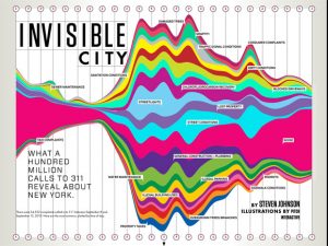
Pitch Interactive’s “Invisible City” 2010

http://pitchinteractive.com/work/Wired311.html

I think this graphic is really interesting. Mairead wrote this Looking Outwards for the information visualization Looking Outwards, and I really enjoy how this information was represented. The artist compiled information about types of phone call complaints, as well as what time the phone calls were made. As Mairead said, the loud colors and extreme waves of the graphic captures the irritable nature of the people calling to complain. I enjoy the clock icons to depict time of day, but the icons are so small that it was sometimes hard to locate what time of day was where.

I also found it funny to see exactly what kind of complaints are most common — New Yorkers apparently have a noise problem! It’s interesting to see how the noise wave progresses over time, and how large the wave becomes later in the day. The biggest amount of complaints are made during the middle of the day, but considerable complaints are still made late into the night. I think this graphic is effective in representing the volume of these complaint calls, and is a creative way of visualizing categories of complaints.