–space holder–
Author: ljkim@andrew.cmu.edu
ljkim looking outward 10
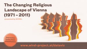
Wirel by Tina Frank.
“Tina Frank is a graphic designer and media artist aswell as professor for graphic design at the University of Art and Design in Linz, Austria. Her roots are in webdesign and cover designs for experimental electronic music during the mid 1990’s when she also started to work with digital realtime-visualisation, video & multimedia. The focus of her work lies in Print, Corporate Design, Signage Systems and within the experimental field of music visualisations.”
For this looking outward, I wanted to focus on Tina Frank. WIREL (short for WIEN / vienna and RELIGION) is a research project visualizing the increasing religious diversity in Vienna.
I appreciate her work because she was able to take something sterile and, dare I saw boring, into beautiful infographics. Being able to supply information but in an aesthetic manner is truly what I think is good design. Where as her work is less creative, I appreciate how she is able to delicately talk about religion.
I appreciate this post being dedicated to women, but I wish it didn’t have to still be an issue to shed a light on women not being appreciated in tech/cs.
ljkim project 09
cart.html
images
index.html
main.js
Product_Browsing.html
Product_Detail.html
reset.css
style.css
ljkim looking outward 09
I am reviewing the work of: ssharada from looking outward 05. Their cited project was on an Absolut Amber ad.
Absolut Amber from ZEITGUISED on Vimeo.
I appreciated their point in stating that although this looks like natural materials, it is in fact algorithms and computer generated art. “but in reality are created using technology and synthetic non-physical matter – usually from coded algorithms.”
Although this is computer generated, I consider this more on the design side. Its more likely that this was in works with an advertising ad. There was a creator who directed the vision and visuals, but had an engineer code what they wanted. I appreciate that music was the inspiration for this work because I can clearly see the correlation.
ljkim-looking outward 08
Eyeo2012 – Jennifer Pahlka from Eyeo Festival // INSTINT on Vimeo.
Eyeo2012 – Jennifer Pahlka
“Jennifer Pahlka is the founder and executive director of Code for America. She recently served as the U.S. Deputy Chief Technology Officer in the White House Office of Science and Technology Policy, where she architected and helped found the United States Digital Service. She is known for her TED talk, Coding a Better Government, and is the recipient of several awards, including MIT’s Kevin Lynch Award, the Oxford Internet Institute’s Internet and Society Award, and the National Democratic Institute’s Democracy Award. She spent eight years at CMP Media, where she ran the Game Developers Conference, Game Developer magazine, Gamasutra.com, and the Independent Games Festival. Previously, she ran the Web 2.0 and Gov 2.0 events for TechWeb, in conjunction with O’Reilly Media. She is a graduate of Yale University.” This is the website for code of america:
I appreciate one that she is a woman in tech. She also works to bridge the gap with the government and technology advancements. By using crowd sourcing, she bridges the gap between policy making and data driven information.Jennifer talks about how Code for America re-thinks, and re-makes our interactions with government, and why. I admire her approach to making design applicable to all aspects. Theres several areas where design can be used to make experiences more efficient. This is clearly one of them.
Its important for our government to be well informed. Tech can take away the lengthy process for the government to access information.
ljkim looking outward 07
http://https://www.vam.ac.uk/bigglassmic/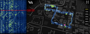
Image of Big Glass Microphone
Big Glass Microphone looks at infrastructure in ways that our eyes can’t see. By visualizing the vibrations in a five kilometer long fiber optic cable buried underneath the campus of Stanford University. Fiber optic cables are used to send signals from one another. I’m assuming an algorithm is used to read the vibrations then to interpret it to visuals. In the image above, you can see a building of Stanford. I appreciate this use of computational information visualization because it’s use of fiber optic in unconventional ways. The beauty of re-using resources in different ways is now more than crucial in a resource-depleting time period.
ljkim project 07
function setup() {
    createCanvas(480, 480);
    frameRate(10);
}

function draw() {
    background("#9CE2F7");
    fill(255, 255, 255, 64);
    translate(width/2, height/2); //moves lines to center of the canvas


    // draw the circle as a starburst
    push();
    for (var i = 0; i < 20 ; i++) {
        var theta = map(i, 0, 20, 0, TWO_PI);
        var px = 50 * cos(theta);
        var py = 50 * sin(theta);
        line(0, 0, px, py);
    }
    pop();
}ljkim looking outward 06
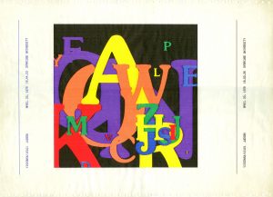
“Letter Field” by Judson Rosebush
This piece is called “Letter Field” by Judson Rosebush. I really appreciate this piece because it uses a software to generate the art. Meanwhile, I feel like it follows communication design guidelines. I’m assuming that this piece had to be generated several times in order for one to look like an actual piece of designed work. It works by through a database of the Souvenir font; random number generation, a statistical basis to determine letter size, color, and position; and a hidden line algorithm all combine to calculate this scan line raster image. I believe that the letters are randomly generated and also with the size and color.
ljkim Looking Outward 05

Snapshot from Nike’s Air Max campaign using 3D computer graphics.
After reading the prompt, I was immediately drawn to my internship this summer with Nike. I worked internally for them, and became close to the 3D team. This commercial/ad uses 3d graphics to communicate Nike Airs. The use of color and material communicates the light, flow, and durability of that particular line of shoes. I appreciate how easily Nike was able to convey that feeling through the use of 3D computer graphics. Its impressive how this level of fidelity is now available.
This is defiantly more design than coding – and frankly I much enjoy that. If there were algorithms used for this project, I see it being used in the geometric patterned scenes.Repeating the same shape, in different sizes, then randomizing the location of each. For example, 00:13.
Nike ~ Air Max 2017 from ManvsMachine on Vimeo.
“>
ljkim looking outward 04
I went to the California academy of sciences this summer in San Francisco. Its a fairly new museum with highly interactive exhibits.
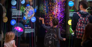
One exhibit in particular was called the Color of Life. It allowed users to pluck a string of color, and a sound would emit. Through this interaction, guests could “hear” color and play a medley based on their mood. I admired this project because it allowed an intangible feeling of sound for color. I thought the interaction was especially memorable because it engages users to think beyond what a color normally is deemed as.
I suppose the algorithms used for it were simple, if a string is plucked, emit this sound.
![[OLD FALL 2017] 15-104 • Introduction to Computing for Creative Practice](../../wp-content/uploads/2020/08/stop-banner.png)