LookingOutward-12

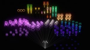
For this weeks post, I chose to compare The Creatures of Prometheus and Atlas, two generative videos that pair audio and visual experiences. The Creatures of Prometheus, creates by Simon Russell, is a visualization of Beethoven’s ballet. The animation combines both the audio and visual, directly setting up the graphics to react to the music: pitch and amplitude derive the height and speed of graphics, volume effects color, etc.

The Creatures of Prometheus

Similarly, Atlas is also a generative video that combines audio and visuals. Created by Agoston Nagy, Atlas is an “anti game environment” that produces music in a conversational cognitive space. The video uses a combination of text, sounds and graphics (“tasks”) that are automatically generated and composed and carried out (“solved”) through machine intelligence without the aid of human input. Agoston questions concepts like ad infinitum, presence, human cognition, imagination, etc.

Atlas

Although both projects have similar products (both are generative videos combining audio and visuals), the concepts driving the projects and ideas behind them are very different. The Creatures of Prometheus takes a very direct approach, programming an animation where the graphics react directly to the sound.

Atlas uses a more cognitive approach, focusing on the generation of an environment and space through audio and visuals.

Atlas

The Creatures of Prometheus

aerubin-Project-12-Proposal

For my final project, I would like to create an interactive viola that allows the user to play the viola digitally. The instrument will be controlled by either the mouse or the keypad, depending on which would make the instrument easier to play and more intuitive for the user.

A Sketch of the Viola User Interface

As a viola performance major, I have pondered how great it would be if I did not have to lug my instrument around or go walk the way to CFA to practice. The solution would be to create a computer program that would allow me to practice in the comfort of my own home without carrying my instrument around. The interface would include a digital depiction of a viola that would show the four strings to the user. Then, when a note is played, the location of that note will change color or “light up” to have a visual representation of where the note would be played on an actual viola.

ablackbu-Project-10-Proposal

For my final project I want to make a particle grid that is randomly connected by lines that the user can break. In my imagination it looks something like a web between the particle dots and when the user scrolls over the connectors, they break.

Here is some of my inspiration:


I aso want to incorporate sound into my project. Right now I’m thinking maybe if you were to press a key that a sound would go off and the dots would either grow or shrink.

There are a few things I need to iron out while making this. I think it will be a good chance to really dive into for loops and randomness. I am very unsure how i will be able to create lines going from some particles to other particles in a for loop.

Finally color will be used so that the feeling the user gets when “playing” with this program is calmness.

ashleyc1-Section C-LookingOutwards-12

Mind & Matter 3
Mind & Matter 2
Mind & Matter 1
Slanted Magazine #15 Experimental

The first project that really inspired my final project is Mind and Matter by LIA, a software and net artist who creates abstract, generative images using code. Her designs have been used for apps, performance, sculpture, projections and graphic print. She is mostly interested in the relationship of machine as artist and artist as machine: viewing the interaction as both a dependence but also conversation. All of her work is beautiful and incredible.

Her project Mind and Matter is a typographical image of the phrase Mind & Matter that is spelled out by ellipses and lines but deteriorate and evolve into a more chaotic pattern. This was finalized as a 2D image for the daily Austrian newspaper diePresse: “Freiraum” and in Slanted Magazine #15 Experimental.

Source:

Mind and Matter


New York Times 1
New York Times 2
New York Times 3

The second artist who inspired my project is Kate Hollenbach – an artist and programmer who explores interactive systems and new technologies to redefine the relationships between body, gesture and physical space. I was mostly attracted to her New York Times piece where she deconstructed the text on the New York Times using a photocopier.

Although this piece was more a formal exercise and not much compared to her more newer, more sophisticated pieces, I was still mesmerized by the layering of text to build into larger letters and altering text so that it was manipulated around larger images. I also like the idea of hacking a photocopier to play with typography and layout.

Source:

http://www.katehollenbach.com/new-york-times/

ashleyc1-Section C-Final-Project-Proposal

Very basic sketch

For my final project I want to explore the relationship between typography and animation. I want to create an interactive, animated text so that the movement reflects the word. I noticed that p5 has reference functions to allow local servers to be hosted on one’s phone: allowing the phone to essentially be a controller. This project will probably include animated illustrations but I want to push myself to animate just text so that they move in a way that’s still communicative without outside images. I’m not sure how many different text animations I should have but ideally, they would be cycling through an array the more the participant interacted with it.

sijings-lookingoutwards-12Project Priors and Precursors

The two project I chose for this week is both down by Fernanda Viégas, namely the “Wind Map” and “The Shape of Song (2001)”. I was interested to do things related to data visualization. However, I want to create the visual part with more interesting and attractive elements and Viégas’ projects is a much more complicated version of what I intended to accomplish. Although both projects are about data visualization, one source came from the environmental concern of how wind travels, and the other one is about visualizing a song. The first one is about visualizing an invisible, ancient source of energy surrounds us—energy that powered the first explorations of the world, and that may be a key to the future.


Images from Hurricane Isaac (September 2012)
Images (whole shot) from Hurricane Isaac (September 2012)
Wind Map | MOMA

For the second project, the wind map shows the delicate tracery of wind flowing over the US. The Shape of Song began as a quest to “see” musical form. He created a visualization method called an arc diagram that highlighted repeated sections of music–or of any sequence–with translucent arcs. The overall distribution of pattern gives me inspiration for making my possible work looks like. Similar to “Wind Map”, I also want to get inspirations from natural data which describes some changes.

View of Madonna’s Like a Virgin | 2001
A Collection of Many More Sounds | 2001

Overall, I liked both projects. The only suggestion I have for the second project is to have the sound placed eithere side by side to the project or played as a background music. It is really cool to see the visual element, but I will even appreciate more if I am able to hear some corresponding music.

Here are the links to the projects:

Bettina-FinalProjectProposal-SectionC

proof of concept

Classmate Hae Wan Park and I will be collaborating on making generative greeting cards with a focus on using the techniques learned in this class to create typefaces. We will split up the work by having each of us create two approaches (so the work would be split vertically instead of horizontally). Some approaches I am considering include:

  1. Using turtles to trace images in a pattern, similar to my project last week
  2. Having the user draw curves with a mouse and use those stored curve objects to generate random patterns (see below and attached proof of concept video)
  3. Create a grid system that would place typefaces in certain colors and sizes across the canvas

We will need assistance creating a simple interface/home page so the user can navigate to each of the 4 approaches; upon quick research, the p5 libary p5.gui might be helpful.

Final-Project-Proposal

For the final project, I will be collaborating with Ethan Ye (ziningy1).  As design students, we are inspired by the motion graphic videos created by the Time, Motion and Communication design class taught by Dan Boyarski. The class focuses on designing and presenting time-based graphics on screen. Although the class uses tools like After Effects or Illustrator, after watching some examples of student work, we found that the graphics could potentially be created through coding as well. We’re interested in exploring the interaction of words, images, sounds, and motion. An example video of student work from the class:

To create the 30 -40 sec video, we intend on using coding techniques from 15-104 like turtle graphics, creating a server and implementing sound and images, objects, etc. We might also create some graphics in Illustrator or Photoshop to storyboard/visualize our project. Our video will use simple geometric shapes and changing scale, color, position to create interesting visuals.

Bettina-LookingOutwards-SectionC

For the final project, Hae Wan and I plan on collaborating on making generative graphic design. We have access to a domain name, so we plan on making this generative design program a web experience people can use. Specifically, we are interested in the generative designs to be used as greeting cards, which the user can print out or send the digital interactive version. The latter may give us opportunity to use sound. Design studio Muir Mcneil and School of Design alumnae Rachel Cheng have both worked with generative graphic design pieces.

Rachel’s following project builds a set grid system that varies based on pre-determined parameters. I think her logic behind the program system is quite robust, and we have an opportunity to improve upon it by adding randomness with various random and noise functions.

Above: examples of generative posters from her system

Above: her parameter system for generating posters

Muir Mcneil emphasizes geometry and patterns in their work, with the use of repeated lines and circles similar to past projects Hae Wan and I have done with turtles and pixels recognition. At a glance, their work has a certain tone to it that may not fit “greeting cards”, so we have room to explore how varying color, lines, or even mimicking real life shapes would have a clearer theme.

Above: screenshot of sample work from their portfolio website

Looking-Outwards 11 Thomas Wrabetz

I’m doing sound art now because I did Ronald Jenkees during the sound art week

“Journey into Hyperland” is a sound art experience that brings a crucial element of the musician’s world- the crazy acid trip- directly to your domestic screen. It’s parametrically generated which means it draws upon variables such as the user’s location and time of day. If you let it use your mic it can generate more stuff, which is kind of interesting although I didn’t see any tangible reaction to my sounds. In any case, the title does not lie as this work is hype to the max. There was also an elephant, so clearly the author’s animal selection abilities are as powerful as his programming skills. It’s like browsing around google earth when you’re bored except instead of the earth it’s a psychedelic EDM swamp with elephants and flying submarines.