var w = 60; //adjusts the spacing between seeds
var h = 60; //adjusts vertical distance between seeds
var spaceY = 30; //y-circle offset
var spaceX = 30; //x-circle offset
var rad; //radius of circle component of "seed"
var wid; //width of rectangle component of "seed"
var x = 1;
var y = 1;
var columns;
var spacing = 10; //for the white lined grid-feature

function setup() {
    createCanvas(480, 480);
    background(255,174,185);

    for (var x = 0; x < height; x++) {
      strokeWeight(1.5)
      stroke(255);
      noFill();
      rect(x*spacing,x*spacing,width-50,height-150);
    } //this creates the white lines on the pink watermelon flesh
  //wanted to maintain the "square grid" feature in the corners of the
  //watermelon flesh so I subtracted from the canvas dimensions

    noStroke(); //colors of the rind
    fill(141,213,149);
    rect(0,height-100,width,height);
    fill(56,167,69);
    rect(0,height-60,width,height);
    fill(49,141,60);
    rect(0,height-40, width, height);


    var rowChange = 7;
    for (var row = 0; row < 6; row++) {
      if(row%2==0) {
        rad = 10;
        w = 420/7;
        spaceX = 60;
        wid = 5;
        columns = 7;
      } else{
        rad = 24;
        w = 60;
        spaceX = 30;
        columns = 8;
        wid = 12;
      }

//loop draw the "seeds" and depending on the row #, will alternate
      for (var col = 0; col < columns; col++){
        var py = spaceY + row * h;
        var px = spaceX + col * w;
        fill(52,54,52);
        rect(px,py,wid,wid);
        console.log(px, py);
        ellipse(px, py,rad);
      } //the combination of a square on top of an ellipse creates
        //the shape of a "seed"

    }

    noLoop();
}

function draw() {
}
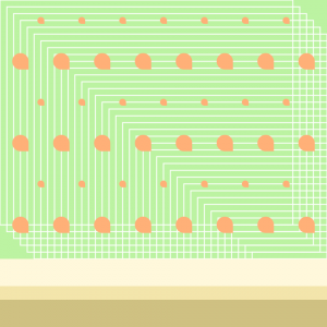
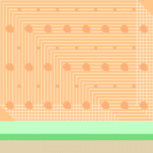
I decided to go for a design that would be more like an entire motif rather than small objects. I had other ideas to do things such as leaves or flowers but after having Founder’s Day for CMU constantly surrounding me, I chose to go for something more quirky: a watermelon. I had some struggle creating the perfect seed “shape” but got a little more creative by overlaying the square on top of the ellipse (using math). I didn’t want to add too much detail since I was going for a more minimalist approach: seeds, rind, and for added “texture”, a loop of rectangles that also crossed to create an eye-catching “grid” design in the corners of the flesh (if you look closely at watermelon, you will see these little white veins).


![[OLD FALL 2017] 15-104 • Introduction to Computing for Creative Practice](wp-content/uploads/2020/08/stop-banner.png)