For this Looking Outwards, I couldn’t help but do research on more than one artist – and I felt like in discussing one of the projects I saw and loved, it was essential to discuss the histories of each artist instead of just focusing on one thing.
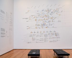
Georgia Lupi is an information designer, artist, and author from Italy who utilizes data as her medium through which to tell stories and spread information. She originally started out as an architecture student, but transferred into design. She is also the co-founder of Accurat, a New York City based data-driven design firm. Her body of work reflects her job as a data-designer, and much of her work literally pertains to figuring out intuitive ways to visualize data to viewers that are disconnected from the meaning of such information. One such piece is permanently installed in the MoMA at the moment which acts as an interpretive landscape for a fashion exhibition that occurred earlier this year

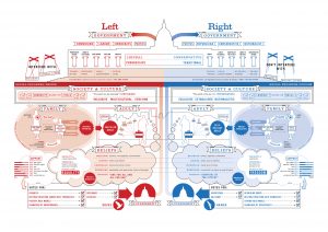
Stephanie Posavac is also a designer based out of the UK (but U.S. born) who tends to favor data as a medium for her work (specifically language, literature, and science) and earned her MFA in communication design, while her background lies in book design and text visualization. She focuses majorly on the visual representation of language or numbers and both have had their work exhibited in the Museum of Modern Art. Her body of work also greatly reflects the way that she uses data and design (but focuses more on the design aspect in her work). An example of one of her pieces would be this collaborative project she did with David McCandless, where he provided content and text and she decided how to visually present the idea. Her main focus was getting people to want to look at something they normally would care to look at, and I think that drawing attention to things people don’t notice or avoid is very important to her practice as a designer and data analyst.

Now “Dear Data”, a project that is still going on, and which they collaborated to create is a project in which you can clearly see both of their interests lying in. “Dear Data” is a collaboration not only amongst themselves, but among the people who want to be involved as well – anyone who chooses to contribute becomes a part of this project. In short, the dear data project is a serious of postcards detailing how their week was regarding one topic (i.e. love life, pet life, work, etc.) sent between these two artists, on the front is the data which could be seen as just nice illustrations by anyone who does not understand, and then on the back lies the key, or in other words – how to read the drawing on the front. The idea was to create a collection of data that not only had some coherency but that could support hundreds of different kinds of stories form anyone who decides to participate. For them, it became a way of looking at their lives, and trying to put different aspects into a new context both visually, and in terms of meaning. The discussion topics themselves became performances, and art projects. This project is something that I genuinely admire because of the intricacy and care it holds for the artists, and even for those looking in from the outside. All of the information is personal, and it was started in an attempt to really connect with another person – what it’s led to is even more beautiful in that it not only fulfills everything the artists wanted from it, but goes beyond and inspires new ideas/realizations regarding the visualization of data and in a way brings back some magic for each of these artists in their respective fields.
They started off the presentation by talking about themselves/who they are how they met, which is a great segway into their collaborative piece considering it is not only their first collaboration but it is how they are getting to know one-another. They were also extremely confident and used some humor in discussing themselves and their work, which is something that’s important when you present if you want to be sure to grab an audience’s attention and respect. They go on to talk about the way they relate to design and their methods of working before actually discussing the project itself, allowing for a lot of build-up and a good foundation in terms of why this project was even of interest to them. They set the audience up to listen and think about data-design and how the work they discuss addresses it in a clever way through giving insight into the way that they work.
Speaker Websites
Giorgia Lupi:
http://giorgialupi.com
Stephanie Posavec:
http://www.stefanieposavec.com
Lecture video:
![[OLD FALL 2017] 15-104 • Introduction to Computing for Creative Practice](wp-content/uploads/2020/08/stop-banner.png)