//Jihee Kim
//15-104 MWF 9:30
//jiheek1@andrew.cmu.edu
//Project 9 Portrait
//section D

var baseImage;
var fillR = 97; // Red value of rectangles
var fillG; // Green value of rectangles (subject to change later)
var fillB = 226; // Blue value of rectangles


//load image
function preload() {
    var portraitUrl = "https://i.imgur.com/HgOmFTq.jpg";
    baseImage = loadImage(portraitUrl);
}

function setup() {
    createCanvas(320, 480);
    background(0);
    baseImage.loadPixels(); // turn the base image into a collection of pixels
    frameRate(2000);
    // grid on canvas
    // draw verticle lines that fall down from top to bottom
    // in between the gaps of rectangles
    for (var y = 0; y < height; y ++) {
        for (var x = 9; x < width; x += 10) {
            stroke(175 - y/2, 100, 145); // apply a color gradient to the lines
                                         // color changes from red to blue
                                         // from top to bottom of canvas
            strokeWeight(1);
            line(x, y, x, height); // draw line
        }
    }
}

function draw() {
    // x and y position of pixels that are to be picked
    var pixelX = floor(random(0, width)) * 10; // get rid of horizontal overlaps
                                               // by spacing the pixels by the
                                               // maximum width of rectangles
                                               // that are to be drawn
    var pixelY = floor(random(0, height));

    // extract the color of each randomly chosen pixel
    var iX = constrain(pixelX, 0, width - 1); // make x coordinates
                                                     // integers (no decimals)
    var iY = constrain(pixelY, 0, height - 1); // make Y coordinates
                                                     // integers (no decimals)
    var cp = baseImage.get(iX, iY); // get the color at the pixel

    // the width, length, outline and fill of the rectangles are to be mapped
    // to the brightness of the color of each pixel
    var rectWidth = map(brightness(cp), 0, 100, 1, 10); // brighter the color
                                                        // wider the width
    var rectLength = map(brightness(cp), 0, 100, 6, 50); // brighter the color
                                                         // longer the length
    var strokeC = map(brightness(cp), 0, 100, 0, 100); // brighter the color
                                                       // lighter the outline
                                                       // in greyscale
    var fillG = map(brightness(cp), 0, 100, 50, 255); // manipulate the G value
                                                      // of the fill in respect
                                                      // to the brightness

    stroke(strokeC);
    strokeWeight(1);
    fill(fillR, fillG, fillB);
    rect(iX, iY, rectWidth, rectLength); // draw rectangle representing
                                         // each chosen pixel
}
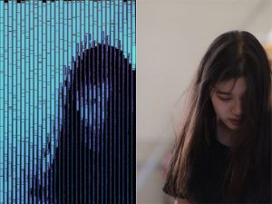
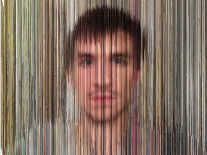
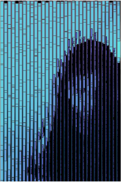
For this project, I created a computational self-portrait. While researching about data analysts in the past looking outwards assignment, I came across an image by dylan mason. Although this image was generated by compiling a lot of selfies throughout a long time, I wanted to mimic some of the qualities shown in this picture: horizontal bars and the balance between blurriness and clarity of the object.
Another inspiration for this project was the eye tracker assignment in which we used the brightness function. I implemented a hierarchical system, using that brightness function to make the width, length, outline and fill of the rectangles relative to the brightness of the color of each randomly chosen pixel on the canvas.
The brighter the color, the wider the width, the longer the length, the lighter the outline of the rectangles. The fill of rectangles are also related to the brightness. The brighter parts of the image are covered with light blue rectangles, while the darker parts of the image are covered with deep blue, almost purple rectangles. The rectangles on the darker parts of the canvas are smaller because I wanted a more detailed feel on the face area. On the other hand, the rectangles on the lighter parts of the canvas are bigger because I wanted to quantify and communicate the vast amount of light that is coming from behind the person (me). Bottom line, I wanted the attention to be drawn to the human figure more than the background and I believe I achieved that goal through elements, including but not limited to size and color.
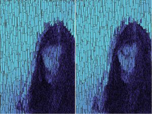
In the first phase of designing, the there were a lot of overlaps among the rectangles that are derived from randomly chosen pixels. I wasn’t sure if I liked the aesthetics of it. In order to lessen the traffic, I spaced out the distance between the chosen pixels along the x-axis. Spacing out both in the x and y axes would have made the computational portrait a little too ambiguous.
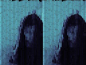
To continue the language of horizontality, I drew a grid that consists of vertical lines that span from the top to the bottom of the canvas. Moreover, the change in color of these vertical lines (from red to blue from top to bottom) adds to the dynamics.
![[OLD FALL 2017] 15-104 • Introduction to Computing for Creative Practice](wp-content/uploads/2020/08/stop-banner.png)