Xindi Lyu-Looking Outwards 07

Pixel Avenue

The installation project “Pixel Avenue” is installed on the underside of a tunnel where it can display the movements across the area. The creator of the project, digitalarti, designed it as a huge pixelated screen with white and blue lights to intimate a “clear sky” and when pedestrians, cars or any other movement occurs, the light bulbs to their positions would change their light colors red to reflect the movements. Its rhythm and forms are directly linked with the everyday life of the area.


I am inspired by this project because it again showed how the dynamic data can be visualized as something artistically dynamic but with the contexts of facts and statistics. It is a very innovative use of data visualization and the application of these visualizations is way more of an artistic approach.

Rachel Lee Project 07 Section E

sketch

/* Rachel Lee
Section E
rwlee@andrew.cmu.edu
Project 07: Curves */

function setup() {
    createCanvas(500, 500);
}

function draw() {
    background(150, 200, 170);
    strokeWeight(1);
    fill(255);
	drawHypothrochoid();
}

function drawHypothrochoid() {
	// radius of circle a changes with mouseX within bounds
	var a = constrain(mouseX, 0, width / 3.5); 
	// radius of circle b
	var b = 10; 
	// distance from center of interior circle changes with mouseY
	var h = map(mouseY, 0, height / 5, height / 2, height / 4); 

    // t considers all values in a circle (360 degrees)
    for (var t = 0; t < 360; t ++) { 
    	// hypotrochoid equations affecting x and y (parametric equations)
        var x = width / 2 + (a - b) * cos(radians(t)) + h * cos(((a - b) / b)) * (radians(t)); 
        var y = height / 2 + (a - b) * sin(radians(t)) - h * sin(((a - b) / b) * (radians(t))); 
        // drawing hypothrochoid inspired ellipse
        ellipse(x, y, 5, 5);
    }

    // color of elements change depending on mouseY position
    if (mouseY <= height / 2) {
        stroke(247, 138, 100);
    } else if (mouseY > height / 2) {
    	stroke(170, 160, 200);
    }
}

For this project, I was inspired by the curves of the Hypotrochoid. I really enjoyed the curves that were being created in by the two simultaneous circles operating at once, and decided to add interaction to alter the tightness of the coils and play around with three dimensionality in space. While this project was initially challenging, I found it really fun to see what kind of results the curve would program.

Example of tighter coiled curve
Example of looser coiled curve

Lingfan Jiang – Looking Outwards 07

This week, I am particularly interested in this project called “skies painted with unnumbered sparks”. It was done by an interactive artist, Aaron Koblin collaborated with Janet Echelman in 2014. Made entirely of soft fibers, the sculpture can attach directly into existing city architecture.

Being an architecture student myself, I really like how the artist started to think about the space between the buildings and how art could be involved in it. I really like the contrast between the hard concrete buildings and the smooth, light installation. Most importantly, with computational information visualization and great lighting effects, it really became something its audiences are willing to interact with. It is also amazing how people could just use their phones to draw lines and that would project directly onto the installation.

I think the final form of this art piece is very successful. As I mentioned earlier, this project is done by an interactive artist,  Aaron Koblin and another artist, Janet Echelman, who mainly does amazing huge scale installation art. Therefore, I think the combination of the two artists really created something fascinating.  As for the algorithm behind it, I would assume that the installation becomes a bigger monitor of people’s phones. Whatever is drawn on the phones would project directly on to the installation.

Furthermore, I think this kind of techniques could really make some science fiction movie scenes come true where a lot of projecting figures are floating in the air in the future.

Eliza Pratt – Looking Outwards 07

A breakdown of one of Refik Anadol’s data paintings, “Wind of Boston”, shows how wind pattern data is visualized through abstract art.

Refik Anadol is a Turkish media artist who specializes in “parametric data sculptures.” As demonstrated in his computational paintings, “Wind of Boston,” Anadol uses Processing.js to visualize site-specific data in the form of abstract art and installation. In this specific project, he analyzed the wind patterns around Boston by collecting data from the Boston Logan Airport. By taking factors like wind direction, speed, temperature, and noise fields into account, Anadol created a set of moving, coded displays to reflect these numbers. In his own words, he was motivated to find a “poetic way” to visualize the invisible. I admire this type of work as it finds a method of displaying data that is primarily expressive rather than informative. By embodying large quantities of ever-changing data in the form of an abstract painting, the audience is able to connect with the feeling of the wind patterns rather than the numbers behind it. 

Victoria Reiter – Looking Outwards – 07

Computational interaction between humans and plants

Disney Research Pittsburgh has developed a project which uses a touch sensor to create an electromagnetic field around plants. The sensor detects minute disturbances in the field, and responds by creating a shapes and colors around the plant, in a type of aura, reacting to different forms of touch, movement, and proximity to the plant.

Orchid emitting an “aura” from the electromagnetic field

The video below demonstrates some interactions with the plants.

Video of interactions with plants

I think that this project is beautiful. It combines nature with technology, and although nature is already alive, it manages to animate it even further, giving these plants personalities, and making the interaction seem almost mutual rather than simply one-dimensional.

Furthermore, I thought it was fascinating that this project pertains to Pittsburgh, and in particular Disney Research Pittsburgh. Not sure how much the facts connect but shout-out to Randy Pausch just in case they do:) Just like how Randy Pausch combined technology and the arts, two “unlike forces,” so does this project combine technology and nature, another “unlikely” pair.

Full details on the project can be found here.

Kevin Riordan Project-07-Curves

kzr project 07

/*Kevin Riordan
Section C
kzr@andrew.cmu.edu
project_07*/
function setup() {
    createCanvas(480,480);
}
//this function checks whether a point is close enough to the step value to be drawn
function latticeCloseEnough(xc, yc, c1X, c1Y, c2X, c2Y, step, bSquare) {
    //define two variables that the function will return for the if case in draw
    var smaller = false;
    var bigger = false;
    //checking four corners of the "rectangle" i have defined around the point xc, yc
    for(var x = xc - step/2; x <= xc + step/2; x += step){
        for(var y = yc - step/2; y <= yc + step/2; y += step){
            //distance used to check
            r1r2 = dist(x,y,c1X,c1Y) * dist(x,y,c2X,c2Y)
            if (r1r2 <= bSquare) smaller = true;
            else bigger = true;
        }
    }
    return smaller & bigger;
}
//this is my curve function for cassiniOvals on mathworld
function cassiniOvals(c1X, c1Y, c2X, c2Y, colorStretch) {
    //this step variable determines how defined the latticegrid is, higher numbers make it very defined but lag the program badly
    var step = 8;
    //formula for this curve is dist1 * dist 2 = b^2
    var dist1 = dist(c1X, c1Y, mouseX, mouseY);
    var dist2 = dist(c2X, c2Y, mouseX, mouseY);
    var bSquare = dist1 * dist2;
    //these drew intermediate points used to test code
    //point(c1X,c1Y);point(c2X,c2Y);
    //these variables determine how wide and how many curves are drawn around the center points for each oval function
    var range = 3;
    var scale = 0.2;
    var start = 4;
    //converts bsquare into an array
    var bSquareArray = Array.apply(null, Array(range)).map(function (_, i) {return bSquare * scale * (i + start);});
    //drawing the ovals by checking across each point on the canvas, as determined by the step variable
    for (var y = 0; y <= height; y += step) {
        for (var x = 0; x <= width; x += step) {
            for (var pos = 0; pos < bSquareArray.length; pos ++) {
                var posColor = map(pos,0,range - 1,0,255);
                //changing the color for each size of oval in each cassiniOval
                stroke((posColor + 50) * colorStretch,(posColor - 50) * colorStretch,posColor * colorStretch);
                //calling the latticechecking function to see if a point should be drawn
                if(latticeCloseEnough(x, y, c1X, c1Y, c2X, c2Y, step, bSquareArray[pos])){
                    point(x,y);
                }
            }
        }
    }
}

function draw() {
    background(0);
    strokeWeight(2.5);
    //left center coordinates
    var c1X = width / 2;
    var c1Y = height / 2;
    //started by having two variables c1x and c2x when testing one cassiniOval, but both centers ended up only depending on c1x
    //var c2X = 7*width/8;
    var c2Y = height / 2;
    var amount = 4;
    //drawing the cassiniOVals
    for (var i = 1; i <= 2; i += (1 / amount)) {
        //declaring variable to change the color for each complete cassiniOval function
        var colorStretch = map(i,0,2,0.1,1);
        cassiniOvals(c1X * i,c1Y,c1X * (2 - i),c2Y, colorStretch);
    }
}

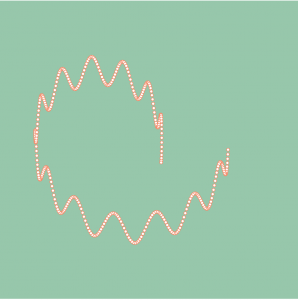
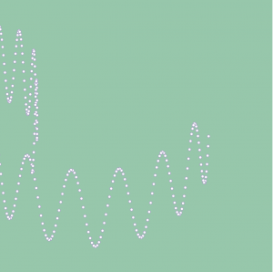
This project was really cool to me. I used the Cassini Oval curve for this project from the MathWorld site. The main part of this project for me was creating a lattice checking function, so that the points did not get wider apart as the distances from the centers increased for larger increments. When I used a basic distance checking function, when the b-squared distance increased, the “bands” of points got thicker. I also used the .apply function I found online, which was hard for me to learn at first because I did not know about lambda expressions.  Overall, this project really forced me to learn how to reorganize my code and the structure overall.

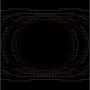
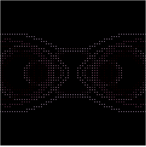
Below is a screenshot on the right of a standard overlapping Cassini ovals when distance is short, and another screenshot on the left when the mouse is towards one side of the canvas, making the distances from the two centers larger.

Jonathan Liang – Looking Outwards – 07

“I’m not a sheep” – Christopher Hitchens

The Sheep Market is a work by digital artist Aaron Koblin. Koblin payed 2 cents to 10,000 workers in Amazon’s Mechanical Turk to draw a sheep facing left in 105 seconds. Amazon’s Mechanical Turk is an intelligence department within the company that employs people to perform and coordinate tasks that computers and artificial intelligence could not currently do. This project is a direct reflection of the values of the department, showing that computers could not generate the little differences from human experience and individuality. Only people could generate completely different sheep, a computer would computationally generate sheep that have different traits, but are fundamentally similar. The emphasis on human individuality and experience is what I appreciate about this particular project.

http://www.thesheepmarket.com/


Jenny Hu — Looking Outwards 07

*the above video is the composed music alongside the data-visualization piece. (captioning not available)

Bruises— The Data that we don’t see, is a piece by Giorgia Lupi and Kaki King that uses Data Visualization to ask the following question:

“can a data visualization evoke empathy and activate us also at an emotional level, and not only at a cognitive one? Can looking at a data visualization make you feel part of a story of a human’s life?

What I love about this piece, is that the designers are not just asking how data is scientific and computational, but also sensorial. This piece, in particular, takes in information about a child’s clinical records and her emotional experience as her body changes.

a complete key to the visual piece
The full visual image

To read more about the piece, please read their medium article.

Yingying Yan — Project 07 – Curves

sketch

/*
Yingying Yan
Section E
yingyiny@andrew.cmu.edu
Project-07-curve
*/

var k = 1; // controls the numbers for the flower
function setup() {
    createCanvas(480, 480);
    angleMode (DEGREES)
    frameRate(15);

}

function draw() {
    background(220);
    translate(240,240);
    stroke(0);
    strokeWeight(2);
    noFill();
    // call the flower function and draw the curve
    flower();
}

function flower() {
    // x = cos(k data) cos(data)
    // y = cos(k data) sin(data)

    //identify all the variables from the equation
    var x;
    var y;
    var theta = 45;

    //map and constrain to make mouseX and mouseY control the size and 
    //number of panels of the flower
    var boundX = constrain(mouseX, 0, 480);
    var boundY = constrain(mouseY, 0, 480);
    var k = map(boundX, 0, 480, 0, 20);
    var theta = map(boundY, 0, 480, 45, 360);
    var sizz = map(boundX, 0, 480, 100, 250);
    //i has to start at 500 otherwise the size of the flower will be too small
    //then plug all variables into the equation from wekipedia
    beginShape()
    for (var i = 500; i < 1000; i++) {
        x = cos(k * theta) * cos(theta)
        y = cos(k * theta) * sin(theta)
        vertex(x * sizz, y * sizz);
        theta += 1; //keep theta changes to make more interesting shape
    }
    endShape();

}

I used the rose formula from Wikipedia. I think this project is very fun because it is not super hard but simple code creates a crazy result. This project also allowed me to understand “constraint” and “map” better. I never thought that they can be used together, and they are so cool! I do not have enough time to render my drawing, but it turned out fine after all. I enjoy this project a lot.

Sarah Yae Looking Outwards 7 Section B

“How Different Groups Spend Their Day” by Amanda Cox displays how different types of people (unemployed, employed, etc) spend their time during the day. I was intrigued by this visual because it was amazing how one could use computation to display such practical data. One could also easily pick out the type of data they wish to extract. For example, we can see that the unemployed sleep an hour more than the employed; the unemployed also spend an extra hour for house chores. It is amazing how Amanda Cox was able to get such data and display it in a visually appealing way, using computation. This type of display was not only highly informative, but also very visually pleasing.

To see more of her artwork, please follow the link: http://amandacox.tumblr.com/post/2709495753/a-peek-into-netflix-queues 

How Different Groups Spend Their Day