Jenny Hu — Project 07 Curves

jenny’s sketch

//Jenny Hu
//Section E
//jjh1@andrew.cmu.edu
//Project 07


var nPoints = 250;


function setup() {
    createCanvas(450, 450);
  }


function draw() {
    background(250);
    
    // draw the curve
    push();
    translate(width / 2, height / 2);
    HypotrochoidCurves();
    pop();
}


///////


function HypotrochoidCurves() {

    var x;
    var y;
    var a = 90.0;
    var a2 = 30.0;

    var b = a / 2.0;
    var b2 = a2 / 10;
    var b3 = a / 15;

    var h1 = constrain(mouseY/2, 0, width/5);
    var h2 = constrain(mouseY/8, 0, width/2);
    var h3 = constrain(mouseX/5, 0, width/5);
    var h4 = constrain(mouseX/15, 0, width/10);

    var ph1 = mouseX / 50.0;
    var ph2 = mouseY / 25.0;


    // Hypotrochoid Curve 1 (light purple)
    fill(210, 200, 250);
    stroke(255);
    strokeWeight(2);

    beginShape();
    for (var i = 0; i < nPoints; i++) {
        var t = map(i, 0, nPoints, 0, TWO_PI);
        
        x = (a2 + b3) * cos(t) + h1 * cos(ph2 + t * (a2 + b3) / b3);
        y = (a2 + b3) * sin(t) - h1 * sin(ph2 + t * (a2 + b3) / b3);
        vertex(x, y);
    }
    endShape(CLOSE);


    // Hypotrochoid Curve 2 (Pink)
    fill(255, 200, 200);
    stroke(255);
    strokeWeight(2);

    beginShape();
    for (var i = 0; i < nPoints; i++) {
        var t = map(i, 0, nPoints, 0, TWO_PI);
        
        x = (a + b) * cos(t) + h2 * cos(ph1 + t * (a + b) / b);
        y = (a + b) * sin(t) - h2 * sin(ph1 + t * (a + b) / b);
        vertex(x, y);
    }
    endShape(CLOSE);

    // Hypotrochoid Curve 3 (Purple)
    fill(100, 110, 200);
    stroke(255);
    strokeWeight(2);
    beginShape();

    for (var i = 0; i < nPoints; i++) {
        var t = map(i, 0, nPoints, 0, TWO_PI);
        
        x = (a + b) * cos(t) + h3 * cos(ph2 + t * (a + b) / b);
        y = (a + b) * sin(t) - h3 * sin(ph2 + t * (a + b) / b);
        vertex(x, y);
    }
    endShape(CLOSE);

    // Hypotrochoid Curve 4 (green)
    fill(50, 210, 200);
    stroke(255);
    strokeWeight(2);
    beginShape();

    for (var i = 0; i < nPoints; i++) {
        var t = map(i, 0, nPoints, 0, TWO_PI);
        
        x = (a2 + b2) * cos(t) + h4 * cos(ph2 + t * (a2 + b2) / b2);
        y = (a2 + b2) * sin(t) - h4 * sin(ph2 + t * (a2 + b2) / b2);
        vertex(x, y);
    }
    endShape(CLOSE);
    
}

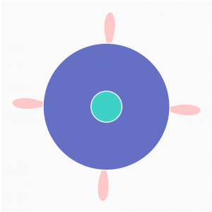
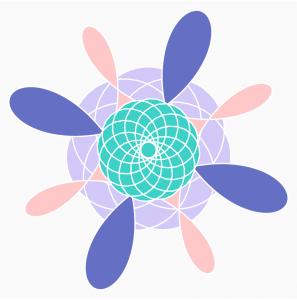
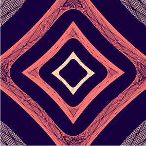
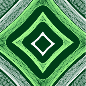
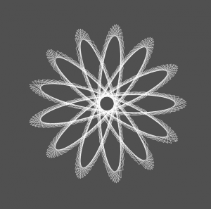
For this project, I created a layered set of different Hypotrochoids.  These parametric forms are altered differently and independently based on mouseX and mouseY. I found the Epitrochoid example from the blog really inspiring for its globby, blobby shape and movement and wanted to do the same for a roulette-like shape.

Please see the different shots below!

program capture in a simpler state
program capture in a complex state

Erin Fuller Project-07-Curves

//Erin Fuller
//SectionA
//efuller@andrew.cmu.edu
//Project 07 - Curves

function setup() {
    createCanvas(480, 480);  
}


function draw() {

	background(10);

    var a = map(mouseX, 0, width, 0, 200);
    var b = map(mouseY, 0, height, 0, 200);

    var r = map(mouseX, 0, width, 0, 255);
	var g = map(mouseY, 0, width, 0, 255);

	//var v = createVector( width / 2, height / 2);
    
	beginShape();
	for(var i = 0; i < 300; i ++) {

		noFill();
		stroke(r, g, -r);

		push();

        var t = map(i, 0, 200, 0, 360);
        var n = ceil(map(mouseX, 0, width, 3, 6));

        //http://mathworld.wolfram.com/Astroid.html

	    x = (2 * a * cos(t)) + (b * cos(n * t));
	    y = (2 * a * sin(t)) - (b * sin(n * t));
	    vertex(x + width / 2, y + height / 2);
	   
	    pop();
	}

	endShape();
}

I started this using the curve “Astroid” from Wolfram. The curve did not turn out how I thought it would but it looked better than I thought. In a very unscientific way, I messed around with different variables until I found something that looked nice.

Xiaoying Meng -Looking Outwards 07

(Visualization for Amersterdam SMS messages on New Year’s Eve)

This is a visualization for Amersterdam SMS messages data on New Year’s Eve created by Aaron Koblin. The data is visualized by representing each message with a colored dot vertically on a map. The dataset creates city-like animations.  Interestingly, the vertical tubes go up and down together almost like music beats. The colored dots are denser at certain areas and closer at others, like population. And at 00:00 on New Year’s Eve, the number of data reaches ultimate high. The artist used P5js and OpenGL for the visualization. I appreciate this visualization because it makes the data a lot easier to understand for the viewers.  I guess the artist could be using algorithms such as using one colored dot to represent one message sent, locating them geographically on a map.


Dani Delgado – Looking Outwards 07

The KUKA robot, ready to sculpt a new object.

The data visualization project I chose to explore was Valse Automatique – a wildly interesting project which uses various softwares to analyze and transform live music into an industrial design piece, combining the fields of music, design, performance art, and computer science. The project itself, developed by Studio.Nand in 2010, was made possible by programming a robot using a custom language (KRL) to move in tune with the musical notes as they were processed by the computers and then sculpt a block wax by using built-in bunsen burners to create the objects.

This project analyzes music real-time and uses this data to sync the lights and the robot’s moments to the notes.

This project is just absolutely incredible to me, as it places product design in a theatrical performance complete with a score, choreography, and lights.   The amount of vision and ambition that it took to complete this project is something that I hope to one day attain.

A video showing the process of this project.

Website: https://nand.io/projects/valse-automatique

Sarah Yae Project 7 Section B

sketch
//Sarah Yae
//smyae@andrew.cmu.edu
//Section B
//Project 7

var nPoints = 500; 
var sizeHeart = 150; 

function setup() {
    createCanvas(400, 400);
}

function draw() {
      background(220);
      drawHeartCurve();
}

function drawHeartCurve() {
    var t; //Theta 
    var x; 
    var y;

// Conditional to determine color of curve 
    if (mouseX > width / 2) {
        fill ('Salmon');
    }
    else {
        fill (148,141,179);
    }

// Draw the curve 
// Heart formula used: 
// x = 16 * sin^3(t)
// y = 13 * cos(t) - 5 * cos(2 * t) - 2 * cos(3 * t) - cos(4 * t)

    beginShape();
    for (var i = 0; i < nPoints; i++) {
        // Conversion of "i" into radians 
        var t = map(i, 0, nPoints, 0, TWO_PI); 
        // Moving the mouse horizontally controls how many curves are drawn 
        var x = (width / 2) + sizeHeart * sin(t * mouseX / 20) * sin(t) * sin(t);
        // Moving the mouse vertically controls how squiggly the lines get 
        var y = (height / 2) + sizeHeart * (cos(t)) - (cos(2 * t)) - (cos(3 * t * mouseY / 10)) - (cos(4 * t));
        vertex (x,y);
        }
        endShape(CLOSE); 
}
I originally intended to create a heart, so I started by using a heart equation, which is commented in my code above. However, along the way, I figured out ways to make the curves more interactive, and more fun, than just a regular heart. I also wanted to play with different colors, so I used a conditional to call different colors depending on the condition of mouseX. It would have been great though, if the colors could have gradually changed from lavender to salmon, instead of having a sudden change. In addition, I had trouble fully understanding the math equation part, but I was still able to understand functions used to create the curve.
Curve without “mouseY”
Curve without “mouseX”, “mouseY” 

KadeStewart-Project-07-Curves

sketch

//Kade Stewart
//Section B
//kades@andrew.cmu.edu
//Project-07


function setup() {
    createCanvas(480, 480);
}

var t = 10;
var x;
var y;
var col = 0;

function mouseClicked() {
    //when the mouse is clicked, change the color scheme to 1 of 2 options
    col = (1 + col) % 2;
}

function draw() {

    //fills the background a diff color depending on the state
    if (col == 0) {
        background(0, 59, 26);
    } else {
        background(18, 0, 58);
    }

    //sets variables in the equations to the mouseX and mouseY
    var a = mouseX;

    noStroke();
    fill(0);

    //this makes the coordinate reference frame in the middle of the screen
    push();
    translate(width/2, height/2);

    for (j = 0; j < 40; j++) {
        beginShape();
        noFill();


        if (col == 0) {
            //uses the green color scheme
            if (j % 2 == 0) {
                stroke(255, 255, 255);
            } else {
                stroke(190, 249, 156);
            }
        } else {
            //uses the blue and orange color scheme
            if (j % 2 == 0) {
                stroke(245, 134, 124);
            } else {
                stroke(253, 218, 183);
            }
        }

        //draws each astroid curve with a number of points determined by the mouseY
        for (i = 0; i < mouseY; i++) {
            x = (a - (width/2)*j) * cos(i) * cos(i) * cos(i);
            y = (a - (width/2)*j) * sin(i) * sin(i) * sin(i);
            //places the point to be drawn to
            vertex(x,y);
        }
        endShape();
    }
    pop();

}

I drew the astroid curve multiple times so that they could seemingly fold in and out of each other. This is manipulated by where the mouse is on the horizontal axis. I initially had the mouse’s y-height affecting the center of the curves, but it gave the user too much to vary in the curves. Now the mouse’s y-height affects the fidelity of each curve. Furthermore, clicking changes the color scheme between 2 options, just for some extra fun.

Eliza Pratt – Butterfly Curve

sketch
(Drag mouse to the pink circle to return to “butterfly” shape!)

/*
Eliza Pratt
Section E
elpratt@andrew.cmu.edu
Project 07
*/

//butterfly curve 
//http://mathworld.wolfram.com/ButterflyCurve.html

var mX; 
var mY;
var dis;
var wing = 4;
var size;
var col = 255;

function setup() {
    createCanvas(480, 480);

}

function draw() {
    background(0);
    stroke("deeppink");

    //draws pink circle
    ellipse(width/2, height/2, width/2, height/2);

    textFont("futura");
    textAlign(CENTER);
    textSize(18);
    text("Click and Drag", width/2, 430);

    //constrains mouse position to canvas size
    mX = constrain(mouseX, 0, width);
    mY = constrain(mouseY, 0, height);

    //measures distance between curve center and mouse position
    dis = dist(mX, mY, width/2, height/2);

    //assigns distance to correspond with curve amplitude
    size = map(dis, 0, width/2, 0, 50);

    //draws butterflys
    butterfly(wing/2, size/2, col/4);
    butterfly(wing - 1, 0.75 * size, col/2);
    butterfly(wing, size, col);


}

//draws butterfly with parameters to change 
//frequency, amplitude, and color
function butterfly(b, a, c) { 
    var x;
    var y;
    stroke(c);
    var points = 400; //number of points on curve
    noFill();

    beginShape();
    //calculates many x and y coordinates using curve function
    //plots vertices at coordinate points 
    for (var i = 0; i < points; i++) {
        var t = map(i, 0, points, 0, TWO_PI);

        //written notation: x = sin(t)[e^cos(t) - 2cos(4t) + sin^5 (t/12)]
        x = width/2 + sin(t) *  a * (Math.pow(Math.E, cos(t)) - 2 * cos(b * t) + Math.pow(sin(t/12), 5));
        y = height/2 + cos(t) * -a * (Math.pow(Math.E, cos(t)) - 2 * cos(b * t) + Math.pow(sin(t/12), 5));

        vertex(x, y);
    }
    endShape(CLOSE);

}

function mouseDragged() {
    //changes frequency of function based on mouse position
    wing = map(dis, 0, width/2, 2, 6);
}

Looking through all these curve functions has made me realize how much math I’ve forgotten in the past year! Nevertheless, I wanted to play around with some of the more complex curves from the website. I saw some pretty cool spirals with integrals but I couldn’t figure out the notation for javascript. The curve I made here is called a “butterfly curve”, but I overlapped a few of them with altered frequencies to explore some of the other cool shapes this function can produce. Drag your mouse around the canvas to check out the other curves! Dragging the mouse to any point on the circle will return it to a butterfly shape.

Yingying Yan-LookingOutwards-7

Ross Spiral Curriculum by Santiago Ortiz represents the evolution of human consciousness through the integration between domains, mainly cultural history, to create a dynamic choreography of learning. The goal is to allow students to understand the past as a dynamical system, better understand the present and envisioning the future.

The left is an example of the spiral showing how data connects together. The picture on the right shows the domains of the system.

Visually it is a colorful spiral that has different points on it. But when you zoomed in, there are connections between the data. Then you can compare each grade’s data by clicking the menu on the right. I think it is a very interesting way to display data. Visually it is very attractive can be an art piece that someone can hang on their wall, just like an abstract piece of modern art. One criticism will be: the project is a bit hard to understand, and there is not a lot of correlation between the data and the visual representation.

Ross Spiral Curriculum: An Interdisciplinary Approach to Science (La Main à la Pâte 2015 Presentation) from Ross Institute on Vimeo.

Lingfan Jiang – Project 07 – Curves

lingfanj-07

// Lingfan Jiang
// Section B
// lingfanj@andrew.cmu.edu
// Project-07


function setup(){
    createCanvas(480, 480);
}

function draw(){
    background(80);
    //tranlate the center of the canvas
    translate(240, 240);
    stroke(255);
    strokeWeight(0.5);
    Hypotrochoid();
}

function Hypotrochoid(){
    //x and y defines the positions of points
    var x;
    var y;
    //use map and constrain to keep the shapes inside the canvas
    //Also, use mouseX and mouseY to change all the variables inside the equation
    var xbound = constrain(mouseX, 0, 480);
    var a = map(xbound, 0, 480, 0, 130);
    var b = map(xbound, 0, 480, 0, 60);
    var h = constrain(mouseY, 0, 270);
    noFill();
    //Hypotrochoid
    beginShape();
    for (var i = 0; i < 360; i++) {
        x = (a - b) * cos(i) + h * cos((a - b) / b * i);
        y = (a - b) * sin(i) - h * sin((a - b) / b * i);
        vertex(x, y);
    };
    endShape();

}

I think this is an easy but super fun project. Before working on this project, I have seen projects using the spirograph technique. I was very interested in how math was a natural art. However, I am surprised by how much I could do just using mathematical curves and p5.js.

This project also became more interesting adding the interactive aspect. By doing this project, I realized that sometimes the artist does not need to have a clear vision about how the final form looks at first. Design within the process can also be a great way to have surprising results.

early process
early process
final form

Jamie Dorst Project 07 Curves

sketch

/*
Jamie Dorst
jdorst@andrew.cmu.edu
Section A
Project-07
*/

function setup() {
    createCanvas(480, 480);
}

function draw() {
    background(0);
    stroke(255);
    noFill();
    // draw graph lines
    strokeWeight(0.25);
    line(width / 2, 0, width / 2, height);
    line(0, height / 2, width, height / 2);
    // move to center of canvas
    translate(width / 2, height / 2);
    // draw graph
    strokeWeight(1);
    epispiral();
}

function epispiral() {
    var nPoints = 1000;
    var r;
    // constrain mouseX and Y to canvas borders
    // multiply to give bigger range
    var a = 20 * constrain((mouseX / width), 0, 1);
    var n = 5 * constrain((mouseY / height), 0, 1);
    /*var a = 1
    var n = 6*/
    var theta;
    var x;
    var y;

    beginShape();
    for (var i = 0; i < nPoints; i++) {
        // theta goes from 0 to two pi
        theta = map(i, 0, nPoints, 0, TWO_PI);
        // function
        r = a / cos(n * theta);
        // compute x and y
        x = r * cos(theta);
        y = r * sin(theta);
        // draw points until end shape
        vertex(x, y);
    }
    endShape();
}

For this project I chose to develop the epispiral. I really liked that this curve was open and that I had two variables I could make attached to mouseX and Y. MouseX controls how far from the center of the graph it starts, and mouseY controls n, how many “branches” there are. I think it’s really interesting to look at, especially in it’s primitive forms when it is just a circle and something that reminds me of the golden ratio.

Examples of the epispiral from Wolfram

I had trouble getting started on this project, but once I figured out beginShape and endShape and examined the sample code some more, I got the hang of it. I really like how it turned out because you can see the in-betweens of these stages that Wolfram gave. You can see the lines getting longer from the center before they actually turn into this shape and I think it’s cool that you can visualize it like this and get a better idea of what’s going on behind the pictures.