Mimi Jiao – Looking Outwards 5 – Section E

Eggy (1990)
Created using custom algorithm derived from repetition in nature

Yoichiro Kawaguchi is a well known pioneer in the field of Computer Graphics since 1975. He is best known for his “GROWTH Model” and “metaballs,” which are algorithms that he developed from growth patterns in natural forms like shells and plants. These algorithms have helped him create and animate many life-like and fluid-like forms through coding. Although created in the 1900s, I am really intrigued by his algorithm generated works such as Eggy (1990) and Festival (1991). First off, the colors and texture of the works really capture my attention. I personally really enjoy a wide range of bright, saturated, and neon colors, and his work perfectly includes those colors. In addition, through his algorithms, he creates a very life-like and three-dimensional structure that almost pops out of the page. Eggy in particular embodies this three dimensionality really well, as it looks like the shapes are reflecting light. Each element is rendered with such attention to detail and nothing is left unfinished. The colors and texture perfectly transitions into one another. His other piece, Festival, continues on the same trail of colors, but this time, he took a more primitive approach to rendering the elements. Kawaguchi left out most of the reflective quality in Eggy and began to explore creating depth through contrast of form, contours, and colors. This really caught my attention as I am also currently experimenting with creating three dimensionality through contrast in color and form. Overall, his pieces really give off a psychedelic vibe and I am left wanting to see more. Something I want to see more of is how he would approach these works in the current time. He has definitely been able to develop his algorithms more and I want to see how he would interpret these past works with his current skillset and code. In addition, since many of his pieces are quite old, I want to see how they would look animated. Eggy and Festival already look so three dimensional; it would be crazy to see how that would translate when these elements are visualized traveling through time and space. These works really inspire me and it is close to what I want to create, so I would love to see more of his work as well as his process.

Jenny Hu — Looking Outwards 05

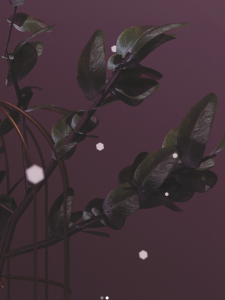
project titled 227 :: blooming thoughts, created in blender
post titled 234 :: breeze
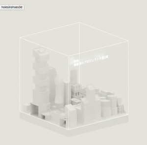
post titled 395 :: testing


Agatha Yu is a Designer at Oculus. Most of her non-Oculus related though exists on her  Instagram where she frequently posts 3D Graphic Art. I think what I admire a lot about her work is the ability to bring her personality and her childhood into the art she creates. The sensibility placed in the motion creates a style that is both grounded in reality while also being completely fictional.

I think this really speaks to the power of generated 3D realities (especially within the realm of VR), and the opportunities it brings to establish new perceptions of physics, the way things work together, and the interactions we can have with objects and the digital realm.


Sharon Yang Looking Outward 05 – 3D Art

Sergi Caballer is a 3D character modeler working at Walt Disney Animation Studios. He is the creator of 3D characters in various movies, some of the very well-known ones including Zootopia and The Pirate!. The 3D art project that I especially admire and so looked further into was Crocodile character from the film ‘Justin and the Knights of Valour’. As the film targeted towards quite young kids, the character is made to look both witty and friendly though crocodiles are typically described to be terrifying and vicious. Yet, the features of a crocodile in the character are mostly present and are quite realistic. As Caballer elaborates on this art work, it consisted of character modeling, facial shapes modeling and UV´s, which are all intricate processes, and it has taken two years (from 2009 to 2010) for completion. The work was done through using Softimage and uvLayout. He has fully adjusted the main facial structures as well as the additional corrective shapes, allowing for the character’s greater facial movements, once again, appropriate for the film’s audience.

Sergi Caballer’s Crocodile in the film ‘Justin and the Knights of Valour’ 2009-2010


Audrey Zheng-Looking Outwards-05

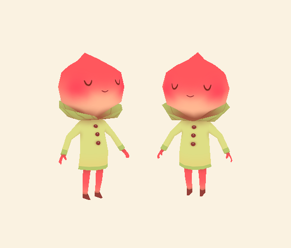
Peachy Character by Anneka Tran
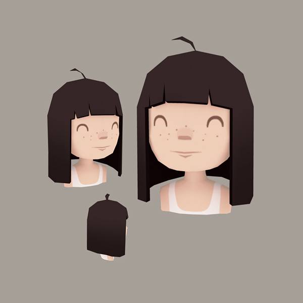
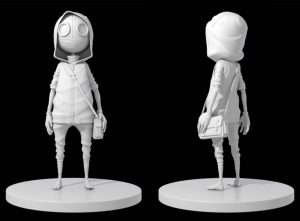
Girl Head
Girl Head
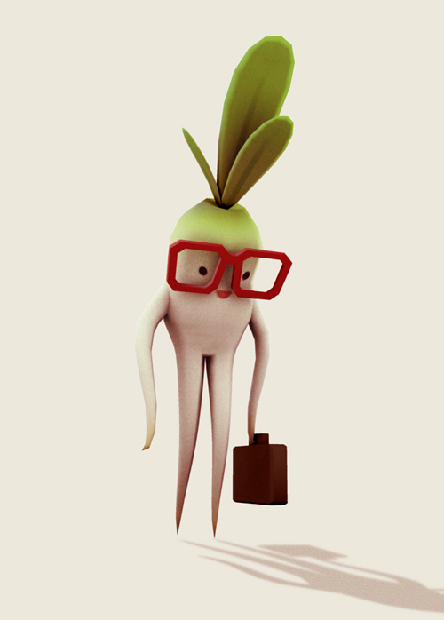
Mr. Radish
Mr. Raddish


I’m in love with Anneka Tran’s whimsical, simple 3D characters. They’re beautiful, charming and captivating. Something draws me into these low poly designs: they have a cute quality that the high rendered characters in first person shooter video games (say Overwatch or Fortnite) don’t have. I like Anneka’s style because it is unique, and the cartoonish quality gives her characters more life than semi realistic to hyper realistic 3D models. Anneka uses Maya, and having using Maya before, I know how time-consuming it is to model anything complex. I also admire the low poly style for how time efficient it is. She adds the texture in Photoshop. I think adding complicated texturing such as fur or grain would actually take away from the cuteness. She also doesn’t use any shaders. In the above examples, she only used Ambient Occlusion.

See more of Anneka Tran’s work here.

Lingfan Jiang- Looking Outwards 05

This project is done by four students from the University of Hertfordshire in 2016. I am always a big fan of 3d animation. Being an architecture student myself, I also do a lot of photorealistic renderings, and I understand how hard they are and how long they take to make perfect light and shadow. For animations, it is definitely even harder to do. I am always amazed by the smooth and realistic movement from the main character. The details of these characters are just incredible.

Also, animations are also very good ways to present ideas that sometimes cannot be accomplished in normal films. For example, different from other videos that calling on protecting the planet, the artists uses an alien background and hides the theme to the very end which really surprises me in the end. The authors really presented their idea well within three minutes.

Furthermore, it is also very surprising to to know that the project was done by four university students with some help from others, because the quality of the whole video and the idea behind it are both fascinating.

Kyle Leve-LO-Week 05-Section A

One of the first projects that made me notice graphics was the movie Avatar. Created by James Cameron, after years of waiting for technology to advance enough to capture the movie, the movie finally debuted in 2009. I remember watching the movie and being amazed at the depth the movie had. I felt as though I was on Pandora experiencing all the lights and sounds around me. Weta Digital was the leading visual effects company throughout the project, and they used about 4,000 Hewlett-Packard servers and 35,000 processor cores to create and store all the visual elements of the movie. Even though there were real human characters in the movie, most of the characters and the entire setting had to be computer generated. What made this project so special however, was the amount of detail put into every aspect of the setting. The setting was captured in a way that had never been done before. Even though it was computer-generated, it looked so real and even now looking back at the movie, I still get the same feelings as I did nine years ago.

For more info: https://en.wikipedia.org/wiki/Avatar_(2009_film)#Visual_effects

Kevin Riordan Looking Outwards-05-Section C

Troglodita Demonstration Video

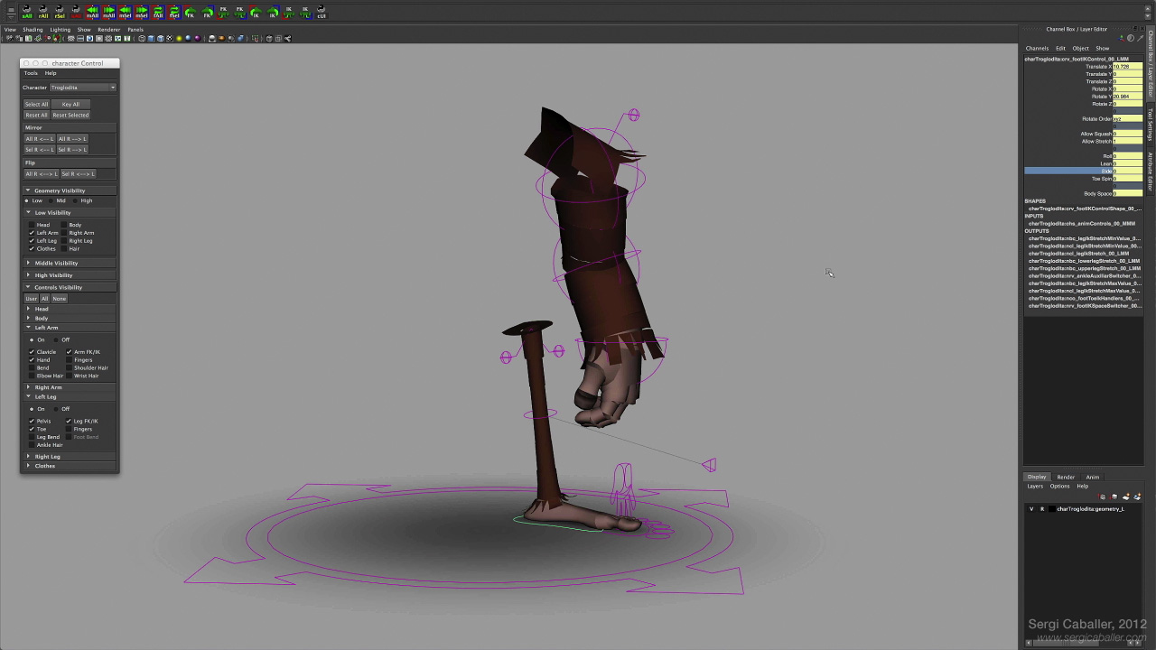
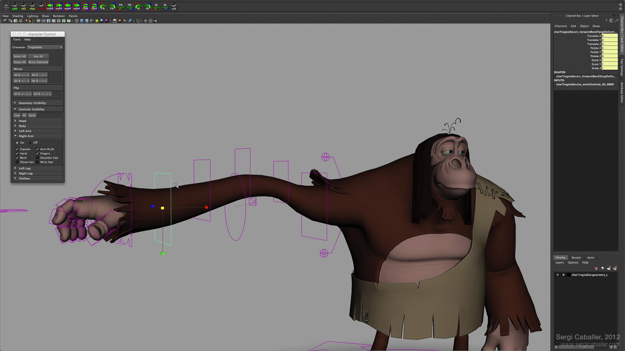
For this week’s Looking Outwards, I chose to look at a 3D modeling work done by Sergi Caballer. This project was done in 2012 for The Spa Studios, and was made entirely in Python and Maya. I admire how much control over the character the user has, as shown in the demonstration, and how much change there can be in the facial structure. The character’s body and face can be changed to any expression by playing around with the program, which I also admire. The facial rig was created with a joint-based system over a coordinate plane, which is how so many different details can be moved around. Below are some individual elements and closeups of the rig, showing how much movement is possible in the body.

Arm and Leg of Troglodita
Arm movement of Troglodita

Looking Outwards 05

I was very excited to see that this weeks topic was 3D generated graphics because I have always been very interested in fractals. In concept, fractals are rather simple to wrap your head around, but they can quickly become extremely intricate and complicated. Thus there are many programs on the web to generate them and I have perused for years.

Ok so my favorite one overall because it has some really cool GPU accelerated advanced ray tracing pretty picture features is Mandelbulber. This one has stuff like volumetric fog and advanced reflections as well as some really cool volumetric lighting.

Another really good one, which I think has a much better preview mode (and therefore is better for laptops) is Mandelbulb3d. This one has some really cool features like the ability to slice fractals (which allows them to be reconstructed into 3d models. It also has a powerful hybrid engine which allows for fractal combinations.

Mandelbulb Accretions of Fungal matter

I really like Mandelbulb in particular just because it introduces the concept of fractal generation in a very simple to use software so virtually anyone can create 3D fractals and artwork.

Sarah Yae Looking Outwards 5 Section B


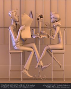
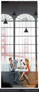
I admire this project, ‘Morning Fog’ because the artist was able to render a realistic, yet 3D cartoon characters in a picturesque setting. It almost feels as if the characters could move in any moment. The shadowing used in this 3D generated work makes the artwork more realistic.  The realistic background and the decorations used make the background more alive. However, the cartoon aspect of this work is shown from the physical appearance of human characters. In order to create this artwork, I suppose she used applications like Photoshop, Maya or ZBrush to create this artwork.

Morning Fog  was created by Leticia Gillet in 2015. Link to the work is: https://leticiarg.artstation.com/projects/Bv5or

Morning Fog by Gillet


Sophie Chen – Looking Outwards – 05

TedX Sydney 2018 – Rich Nosworthy

Still from the final video (TEDx Sydney Love Is Love)

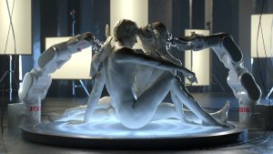
Rich Nosworthy is a 3D motion designer located in Auckland, New Zealand. TedX Sydney 2018, directed by Scott Geerson, explores the theme of humankind and takes the audience through museum galleries where the past, present and future collides. At first glance, I had no idea that the entire video was created through 3D motion graphics with Cinema4D. Seeing sculptures that are traditionally still and in museums be animated and put in an entirely new setting successfully conveyed the theme of evaluating our current place within humanity’s short timeline. I think Nosworthy not only did a beautiful job with the motion graphics, but also used it in a meaningful way in that he created something that combined computer graphics with something that we associate with history and the past, mixing classical art with modern subjects.

Process of one of the clips created for TEDx Sydney 2018.