Victoria Reiter – Looking Outwards – 09

This week I looked at the Looking Outwards post of my classmate Samantha (October 5th, 2018), from her Week 6 Looking Outwards post. In this post, she reviews the Randomly Generated Insect Species project created by Chaotic Atmospheres, specifically Geneva-based artist Istvan.

The Cloaked Chrysalid, insect designed by artist Istvan

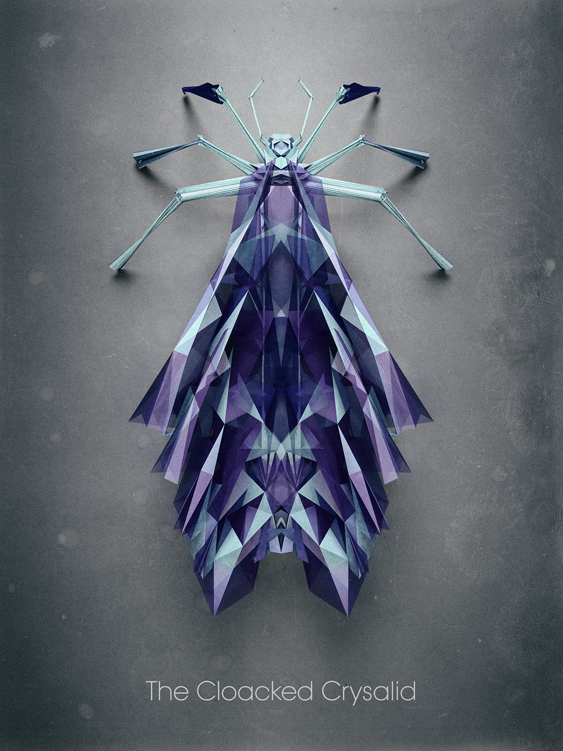
Istvan created several species with distinct characteristics, such as a certain number of legs, wings, etc. as the basis for his insects, then adjusted parameters on deformers to allow for the variations between species.

The Longhorn Mismisa

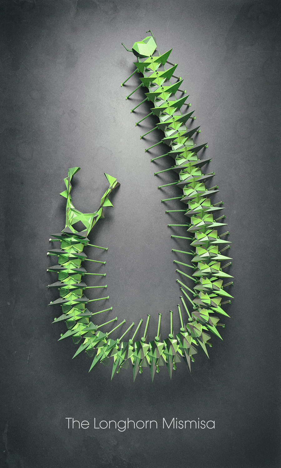
I think his project is interesting because all his insects, although distinct, follow a similar aesthetic style, making them look like they really do all come from some like alternate planet…or DIMENSION.

I also found out that he posts his insects as trade-able art trading cards on the website NeonMob, which I thought was really cool!

A bio on Istvan can be found here.

Romi Jin – Looking Outwards 09

For this week’s looking outwards post, I looked at Ying’s looking outward-05. She is my architecture mentee and posts a lot about interesting architecture projects. What especially intrigued me was this post about a three-dimensional rendering project called Somerset Isle by Tomer Meltser. It is fascinating to see how much is put into this rendered landscape:


Sample image of the rendered landscape.

Architecture set placed in the rendering.

Foliage set used throughout the rendering.

One day I’d love to do something like this; it seems like so much fun to create and to see the final outcome come together so beautifully created like Meltser’s final rendering video. This makes me think of how far an architect can take their drawings and ideas — into a realistic three-dimensional journey that displays in depth details of each plant, landscape element, building, objects, etc.

Anthony Ra – Looking Outwards 09

Meandering River - Kling Klang Klong
Meandering River – Kling Klang Klong

For this looking outwards post, I looked into the post of randomness that Curran Zhang wrote. An art installation by Kling Klang Klong in 2018, this piece that spans through multiple screens utilizes sound composition from the audience to generate parcels of data arranged to create unpredictable currents.

Large-scale art installation

I guess a part of the common ground in which Curran and I were impressed with this work is the involvement of the audience into an already finished final work. As if we, the people, contribute to this well-generated piece.

One thing that is difficult in choosing this project is that I only see articles on this installation and no videos of it in the works. As much as the photos that are available are intriguing and eye-catching, I think that watching its movement and its randomness with a video will allow me to appreciate this installation much more.

material close-up of each particle

What Curran said at the end is very important to the direction of where art and design should go. The importance of collaboration and the uses of different fields in ways that people would think be impossible.

Meandering River – Creative Applications

Christine Seo – Looking Outwards 09

Ariel view of Janet Cardiff’s The Forty Part Motet, 2001 at At the Fort Mason Center for Arts + Culture, Gallery 308

This installation was by Janie Cardiff, which displayed forty separately recorded voices are played back through forty speakers strategically placed throughout the space. It was exhibited in a lot of different locations and was recorded by the congregational choir of the Gothic Salisbury Cathedral. This project was mentioned by Joanne Lee, in her Looking Outwards 04; she is in my Section C recitation. She pointed out that “There is something unique about the way all of the voices travel to the audience and mesh together to hit you at once, and that can only be experienced live. This installation seems to emulate that experience despite using speakers by giving each voice a different speaker channel.” I agree with what she said because the installation has 40 speakers playing a track in the recording, where each singer has their own individual mic attached to them.

Additionally, I am very intrigued by the experience the audience can interconnect with the installation. I think it is interesting to be able to place yourself into this installation. The interaction that happens where you, as the audience, can control (by where you are standing in the room) is a different level of technology and experience that people can have with sound. I actually was able to experience this installation myself at the Nelson Atkins Museum of Art, so I know how intricate each voice and connectivity is.

Caption: experiential video representation of The Forty Part Motet at The Art Gallery of Ontario

https://www.cardiffmiller.com/artworks/inst/motet.html

Alexandra Kaplan – Looking Outwards – 09


I chose to look at Sophie Chen’s Looking Outwards Week 5, a 3D animation for TEDx Sydney 2018 created by Rich Nosworthy and directed by Scott Geerson. When I read Sophie’s comments about how unbelievable it is how the project is all computer generated, I knew I had to take a look. I completely agree with Sophie, I can’t believe the amount of work and detail that went into this animation. If I didn’t know beforehand it was all made on the computer I probably would not have realized that fact most of the video. I thought that the project itself was very impactful. The visuals and audio paired well together to create a surprisingly powerful and emotional piece about humankind.

Eliza Pratt – Looking Outwards 09

“Norman,” a 3D drawing tool made by James Paterson, 2017

This week, my interest was piqued by Dani’s Looking Outwards 08. Her post details the work of James Paterson, an animator and software developer who uses javascript and VR technology to create computational art. For Paterson’s project Norman, as seen in the video above, he uses Javascript to create a tool that allows the user to draw in 3D space.  While learning about this artist, I found Dani’s analysis to be very informative in describing his creative process. Moreover, I agree with her remark that creating software such as this makes an intangible artistic concept more accessible to the public. One of the most beautiful aspects of this project is that Paterson has posted the source code for this drawing tool online so he can share this creative experience with others.

Audrey Zheng – Looking Outwards – 09

Yiran Xuan’s Looking Outwards 08  caught my attention because Yiran wrote about Darius Kazemi, who programs “Meme machines”. As a meme lover myself, I was surprised that there is a formula to be followed in the creation of memes. Memes have always felt so surreal and witty that only people would be able to come up and relate to them because of their shared experiences.  I was confused by exactly how ConceptNet works: “ConceptNet, a program that links words with each other by their meaning.”, so I did more research. ConceptNet is a freely-available semantic network, designed to help computers understand the meanings of words that people use.ConceptNet originated from the crowdsourcing project Open Mind Common Sense, which was launched in 1999 at the MIT Media Lab. It has since grown to include knowledge from other crowdsourced resources, expert-created resources, and games with a purpose, according to ConceptNet.io. It makes more sense  that using crowdsourced relations some of the Meme machine jokes are funny due to their vague nature that’s often open to interpretation.


Read about Darius Kazemi here.

Han Yu Looking Outwards 09

I found Min Jun Kim’s Looking Outwards 7 very interesting. He talked about a data visualization project called Shifting Causes of Death. Nathan Yau, creator of this project, used D3.js to show how causes of death changed over the years, across sex and age groups. You can see the different causes of death shifting up and down as years go by. For example, death of HIV gradually fell out the rankings as years go by but death of intentional self-harm is slowly climbing up over the years. I agree with what Min Jun said in his post that Nathan Yau managed to present “a vast amount of information in such a limited space and does it elegantly”. Just by looking at the gradually shifting data visualization, you can tell what’s the most cited causes of death and which cause is becoming increasingly common.

A screenshot of Nathan Yau’s Shifting Causes of Death at year 2011.

I also agree what Min Jun commented on the algorithm that is used to create this project. He said that a counting variable locates the data and a sorting algorithm that restores the structure of the graph each year. Adding on to his point, I think there also might be a overall mapping function that assigns different hues of red to each box of death cause based on the data processed earlier. Overall, I think this project is artistically crafted and successful to convey the information it contains.

Yingying Yan – Looking Outwards 09

This week I looked over Romi Jin’s looking outwards 5. She is my mentor from architecture, so I thought I could learn from her. Her looking outwards was about occluder simplification. The reason why she chose this is probably that the occluder simplification used bunny as an example, and she loves bunny.

Example showing the abstraction
Shown by the picture above, the bunny changed from a normal bunny to a distorted one. This is because the algorithm takes in very few inputs and simplifies the geometry in an abstract way. As Romi mentioned, this can be very useful when applying to larger and more complex shapes. This algorithm produced a unique and interesting graphic compare to the original. Yet, I think it needs to be developed more because it could be more visually appealing.

Jenna Kim(Jeeyoon Kim)- Looking Outwards- 09

Installation piece in Senyai
Sound Vector Drawing

Peer Review Here!

This week’s Looking Outwards post is a review of Howard’s Looking Outwards post from Week 3. I came across this Looking Outwards because I was so familiar with the architectural installation picture; I have seen it in real life. EPIPTHYTE lab, created by Cupkova and Craig, is an installation piece rests in Senyai restaurant. The cited project amazes me because although it looks like a simple, patterned installation, there is so much meaning and thought into it. The project is combined of 275 different slats pieced together perfectly to control the lighting and the acoustic levels of the restaurant as a whole. The software created the form of each piece and it was finally produced with laser cutter. I agree with the part about vault rising and falling perfectly to demonstrate the sensitivity of the wave like form. As a design student who had visited Senyai before, I want to add that this installation brings the audience a whole new experience; the installation immerses the audience into the space because of its meticulous form and pure white color.

Link to Original Work