Above: Rhythm of Food-Selected Animations sourced from Truth & Beauty’s website.
Google News Lab and Truth & Beauty‘s Rhythm of Food (uses Google search interest to reveal food trends over the years. At first, they compiled this data in a normal line graph specific for every kind of trend in food. However, realizing the potential to dig deeper and better analyze this data, they collected weekly Google Trends data for hundreds of dishes and ingredients, over twelve years and plotted the results on a one year clock. What I find intriguing is this decision to plot the data on a one year clock, considering they had collected 12 years worth of data. It seems their rationale was to harrow in and have viewers see the correlation between seasons and food trends, in addition of time, versus only seeing the difference over time. I admire their decision to do this because it took the extra step of thinking of a new way to visualize food trends that people are most familiar with. The changing of seasons is something that is very prominently linked to food trends, a hidden trend we didn’t realize in terms of data. In addition, the decision to shape and orient the graph in such a way similar to a clock is interesting as it reminds us of the cyclical nature of this data, while still effectively demonstrating the scale of the number of these searches. According to Truth & Beauty, the project was built using ES2015, webpack, react, Material UI, and d3 v4. The color scale used for the years is viridis.
// Julie Choi
// jjchoi
// Project 07
// Section E

var nPoints = 360;

function setup() {
    createCanvas(480, 480);
}

function draw() {
	background(230, 171, 130);
	push();
    translate(240, 240);
	drawEightCurve();
    drawCruciform();
	pop();
}

function drawEightCurve() {
	// http://mathworld.wolfram.com/EightCurve.html
    var x;
    var y;
    var a = 300;
    var b = a / 2.0;
    var p = constrain(mouseY, 0, 480);
    var q = mouseX / 400;
    stroke(148, 79, 81);

    //create for loop to create eight curves in different sizes
    for(var r = 0; r < 1; r+=0.1){
    	// use push pop to rotate the forms with mouse location
        push();
        rotate(map(p, 0, 480, 0, 2 * PI));
        beginShape();
        noFill();
        // make the lines jitter by adding random function
        for (var i = 0; i < nPoints; i++) {
            var t = map(i, 0, nPoints, 0, PI * 2);
            x = a * sin(t) * (q + r) + random(-1, 1);
            y = a * sin(t) * cos(t) * (q + r) + random(-1, 1);
            vertex(x, y);
        }
        endShape(CLOSE);
        pop();
    }
}

function drawCruciform() {
	// http://mathworld.wolfram.com/Cruciform.html
    var x2;
    var y2;
    var a2 = 300;
    var b2 = a2 / 2.0;
    var p2 = constrain(mouseY, 0, 480);
    var q2 = mouseX / 400;
    stroke(255);

    //create for loop to create cruciforms in different sizes
    for(var j = 0; j < 1; j+=0.1){
    	// use push pop to rotate the forms with mouse location
        push();
        rotate(/*map(p2, 0, 480, 0, 2 * */PI);
        beginShape();
        noFill();
        // make the lines jitter by adding random function
        for (var i = 0; i < nPoints; i++) {
            var t2 = map(i, 0, nPoints, 0, PI * 2);
            x2 = a2 * (1/(cos(t2)) * (q2 + j) + random(-0.5, 0.5));
            y2 = a2 * (1/(sin(t2)) * cos(t2) * (q2 + j) + random(-0.5, 0.5));
            vertex(x2, y2);
        }
        endShape(CLOSE);
        pop();
    }
}
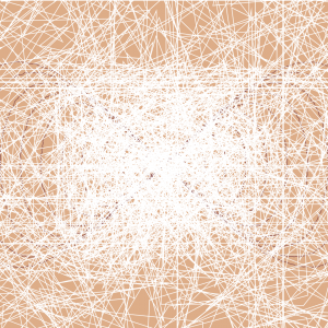
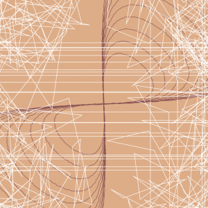
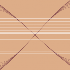
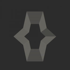
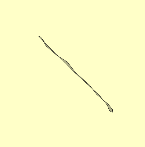
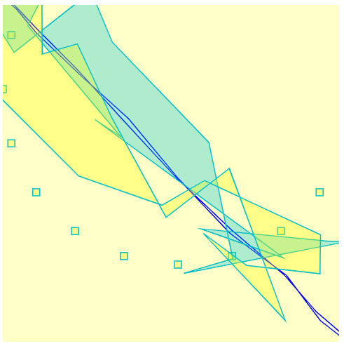
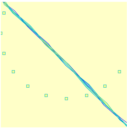
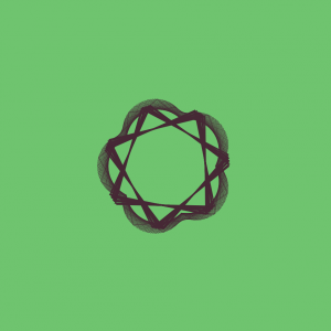
Approaching this project was challenging than I thought because it incorporated different sources of information from a website. However, I learned how to use it to my advantage to create this chaotic curve pattern. My initial idea was to put two different types of curves: eight curves and cruciform. I got the eight curves to jitter and move based on the mouse, but for the cruciforms, I ended up jittering throughout the whole canvas creating a spiderweb-like visual. This was not my initial idea, but just playing around with the different variables and adding it to the formulas provided in the website helped me explore all the different variations of the lines. Down here are the steps of how my curves transform:
var nPoints = 100;

function setup() {
    createCanvas(480, 480);

}

function draw() {
	background(60);

	//in this for loop, we draw the bakcground element of the randomized curve
    push();
	translate(width / 2, height / 2);
	for (r = 0; r < nPoints; r ++) {
		stroke(200);
		drawRandomDevil(r);
	}
	pop();

    //in this loop, we draw the primary forground element
    //which is the center devil's curve
	push();
	translate(width / 2, height / 2);
	rotate(mouseX / mouseY);
    for (v = 0; v < nPoints; v ++) {
    	stroke(mouseX - 200, v, mouseY - 300);
    	drawDevilBoi(v);
    }
	pop();

    //this loop is to create the six rotating deveil's vurves
    for ( c = 0; c < 6; c ++) {
    	push();
    	translate(width / 2, height / 2);
    	rotate(radians(60 * c));
	    translate(width / 4, height / 4);
	    rotate(mouseX / mouseY);
            for (v = 0; v < nPoints; v ++) {
    	    stroke(mouseX - 100, v, mouseY - 100);
    	    drawDevilBoi(v);
         }
	    pop();
    }
}


function drawDevilBoi (x) {
    //draw the devil's curve in this function
    //first declare all the variables
    var x;
    var y;

    var c = constrain((mouseX / width), 0, 1);
    var co = constrain((mouseY / height), 0.0, 1.0);

    var a = c * ((mouseX - 200) / 3 * (100 + v) / 100);
    var b = co * ((mouseY - 200) / 3 * (100 + v) / 100);

    //set desire stroke
    noFill();
    strokeWeight(0.25);
    //draw the curve
    beginShape();
    for (var i = 0; i < nPoints; i += 5) {
    	var t = map(i, 0, nPoints, 0, TWO_PI);
    	x = cos(t) * sqrt ((pow(a, 2) * pow(sin(t), 2) - pow(b, 2) * pow(cos(t), 2)) / (pow(sin(t), 2) - pow(cos(t), 2)));
    	y = sin(t) * sqrt ((pow(a, 2) * pow(sin(t), 2) - pow(b, 2) * pow(cos(t), 2)) / (pow(sin(t), 2) - pow(cos(t), 2)));
    	vertex(x, y + 10);
    }
    endShape(CLOSE);
}

function drawRandomDevil (x) {
	//draw another devil's curve, this time there is an element of randomness with it

	var x;
    var y;

    var c = constrain((mouseX / width), 0, 1);
    var co = constrain((mouseY / height), 0.0, 1.0);

    var a = c * ((mouseX - 200) / 3 * (100 + r) / 100);
    var b = co * ((mouseY - 200) / 3 * (100 + r) / 100);

    //set the desired stroke
    noFill();
    strokeWeight(0.075);
    //start to draw the curve
    //this curve will be in the background and looks like noise
    beginShape();
    for (var i = 0; i < nPoints; i += 7) {
    	var t = map(i, 0, nPoints, 0, random(radians(350, 360)));
    	x = cos(t) * sqrt ((pow(a, 2) * pow(sin(t), 2) - pow(b, 2) * pow(cos(t), 2)) / (pow(sin(t), 2) - pow(cos(t), 2)));
    	y = sin(t) * sqrt ((pow(a, 2) * pow(sin(t), 2) - pow(b, 2) * pow(cos(t), 2)) / (pow(sin(t), 2) - pow(cos(t), 2)));
    	vertex(x, y + 10);
    }
    endShape(CLOSE);
}
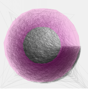
This project was a bit of a mixed bag for me, as I did struggle to implement the curve into my work at first and make it appear in a way that I wanted it to. (Also choosing the curve I wanted to pursue took me a while, but I ultimately settled on The Devil’s Curve because I thought that it’s shape was very unique and could produce some nice variation). However, once I figured that out and began to play around I really enjoyed myself. I never really knew what changing the variables would make my code look like, so it was an exciting process of trial and error to create a nice form.
The initial Devil’s CurveExploring withe the for loop functions and variables of the curveFirst noise and expanding loop ideafirst try at repeating the curve and changing the color
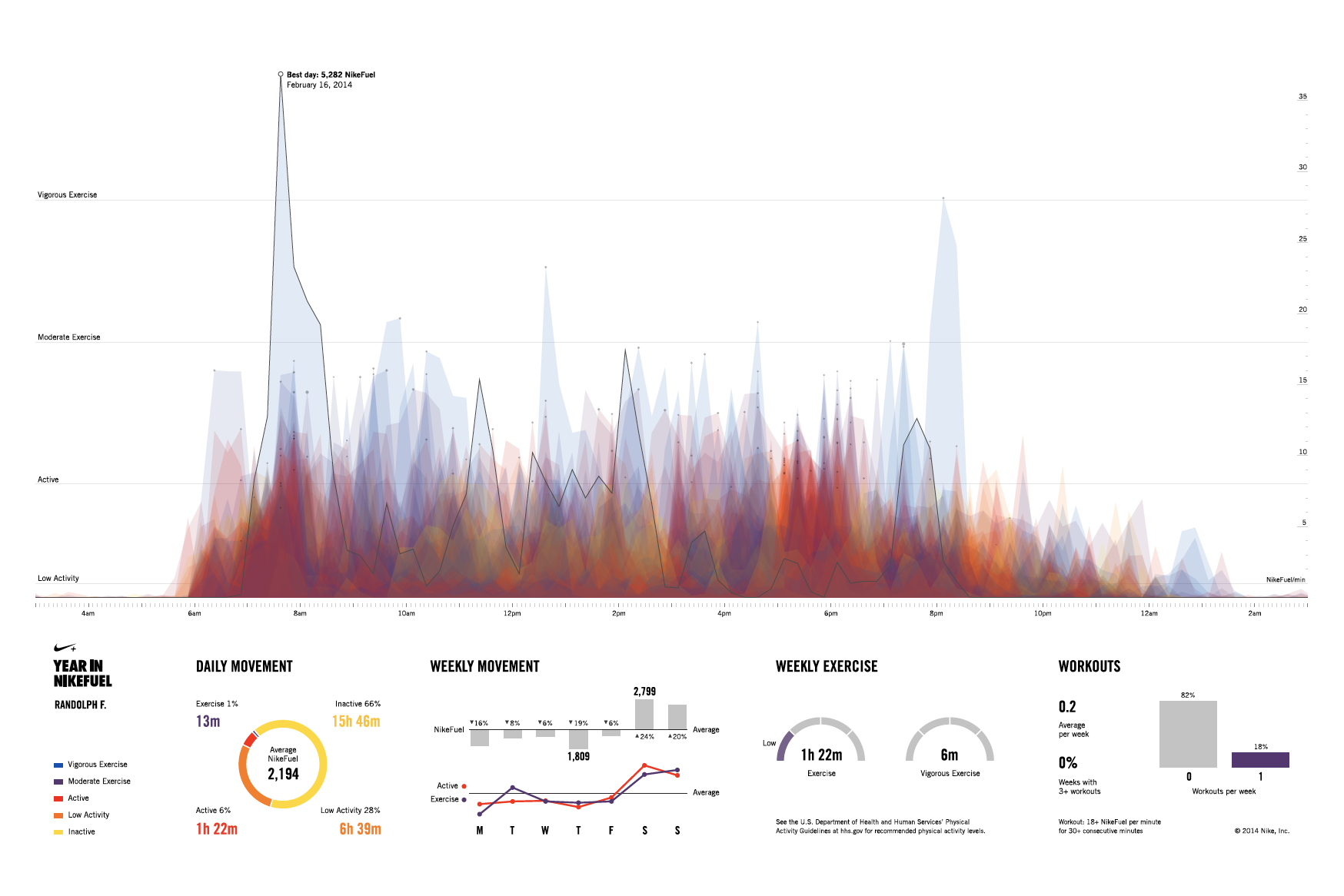
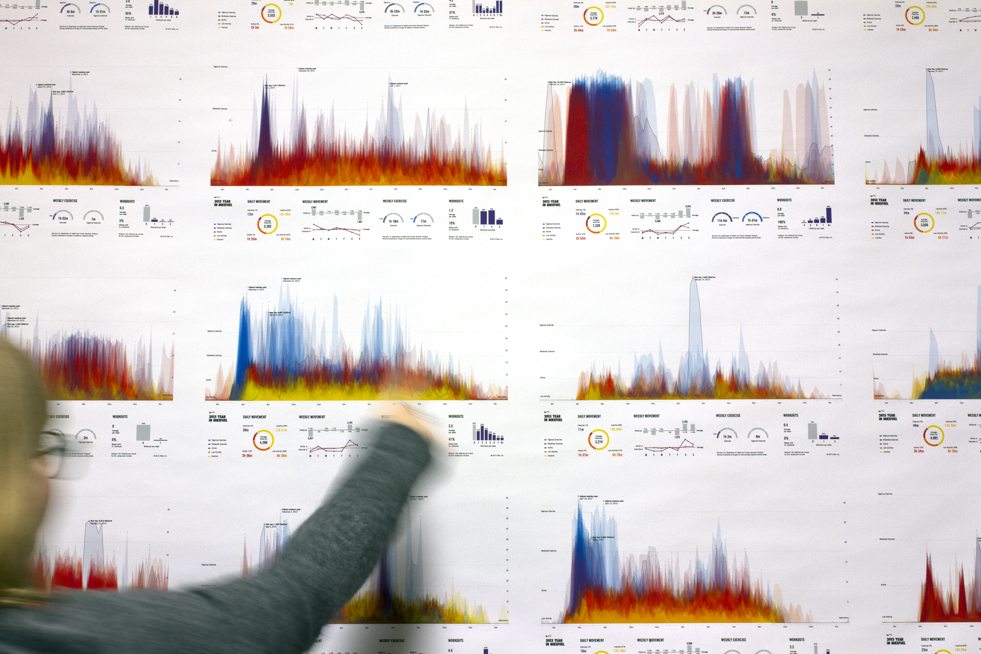
The above video shows the website “YEAR IN NIKEFUEL” built by Fathom for Nike+ FuelBand for users to view their personal physical activity patterns (couldn’t find exact year created) Link: https://vimeo.com/151097197
What I admire most about the various aspects of computation visualization information is how they bring so much convenience and assistance into our daily lives. The website that Fathom, a design agency, created in collaboration with Nike for Nike+ FuelBand users perfectly illustrates this. On this website, users are able to download and share posters with information of their daily movement for everyday of the year. Different colors are used to depict different levels of activities. Different concentrations of colors are also utilized to depict patterns and behaviors of activities. Unfortunately, I couldn’t find the algorithm and software that Fathom used to create the actual website, but the software that they used to create the model is Frame.
As someone who is having a hard time finding motivation to work out, I think this website is great for motivating those with low daily activities. Because of all the different usages (entertainment, easy access to various sources of information…etc.) that technology provides to us, most people today spend their time sitting in front of their TV or computer or scrolling away on their phone. Thus, they end up not “moving” around enough to build a healthy body. I really love how this app displays visually the differences of low and high areas of activities, reminding people of how their lifestyle is like as they can easily visualize it. The “sharing” aspect of the website also motivates people as others will be reminded or motivated to workout when they see their friends posting from YEAR IN NIKEFUEL.
The team’s choice of using the three primary colors (blue, red, and yellow) as the main theme colors for the website also helps to give the whole website a “simple” vibe that is user-friendly, which encourages people to try and experiment with the website. The various graphics that helps to organize information are also designed and considered so well that it minimizes distractions and helps users to understand the information right away. The graphics are designed so well that they seemed to be designed without effort. As a designer-in-training, I only realized how hard it is and how many things are needed to be considered when I entered the program of design at CMU. Thus, this is one of the many things that I am trying to learn from, which is why I admire this design from Fathom so much!
/* Samantha Ho
Section E
sch1@andrew.cmu.edu
Project 07*/

var x;
var y;


function setup() {
	createCanvas(480 , 480);
        frameRate(25);
	}

function draw(){
 background(255, 255, 200);

    var nPoints = 20;
    var radius = 250;
    var separation = 125;

    // draw the squares in the back
    push();
    translate(2*separation, height / 4);
    for (var i = 0; i < nPoints; i++) {
        var theta = map(i, 0, nPoints, 0, TWO_PI);
        var px = radius * cos(theta);
        var py = radius * sin(theta);
        rect(px - 5, py - 5, 10, 10);
    }
    pop();


    // draw the baseline squiggle
    strokeWeight(1.5);
    stroke(0,0,255);
    fill(250, 255, 250, 80);
    push();
    translate(2*separation, height /2);
    beginShape();
    for (var i = 0; i < nPoints; i++) {
        var theta = map(i, 0, nPoints, 0, TWO_PI);
        var px = radius * sin(theta);
        var py = radius * sin(theta);
        vertex(px + random(-5, 10), py + random(-5, 10));
    }
    endShape(CLOSE);
    pop();

    //green squiggle
    strokeWeight(1.5);
    stroke(0,190,200);
    fill(0, 195, 220, 80);
    push();
    translate(2*separation, height /2);
    beginShape();
    for (var i = 0; i < nPoints; i++) {
        var theta = map(i, 0, nPoints, 0, TWO_PI);
        var px = radius * sin(theta);
        var py = radius * sin(theta);
        vertex(px + random(-mouseX/3, 10), py + random(-mouseX/3, 10));
    }
    endShape(CLOSE);
    pop();

    //yellow squiggle
    strokeWeight(1.5);
    stroke(0,190,200);
    fill(255, 255, 0, 80);
    push();
    translate(2*separation, height /2);
    beginShape();
    for (var i = 0; i < nPoints; i++) {
        var theta = map(i, 0, nPoints, 0, TWO_PI);
        var px = radius * sin(theta);
        var py = radius * sin(theta);
        vertex(px + random(-mouseX/3, 10), py + random(-mouseX/3, 10));
    }
    endShape(CLOSE);
    pop();

}
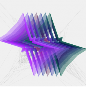
After playing around with the circles and the graphs, I liked the animated rendering effect so I continued to play around. I created this layered squiggle and baseline whose form is contingent on the cursor’s X-position.
initial vibrating squigglemax-position squiggleminimum position squiggle
I really liked Fathom’s project with Nike because not only is it visually stunning, but also it’s extremely interactive with the user. The charts break down a user’s daily movement and visualizes their active lifestyle. This is really cool because this feature is enhances the entire Nike+ FuelBand system. It creates a collaborative community aspect to the product that further engages the user
year in NikeFuel
Additionally to the community aspect, the details and features of each graph are unique to the user completely.
The top of the poster serves as a unique “fingerprint” of a person’s behavior, routines, and lifestyle, while the bottom portion offers a detailed summary of their year in hard numbers.
No user will receive the same graph, thus the sharing aspect is further encouraged so people can share with their friends and compare.
Nicholas Feltron is a designer and artist whose work centers around exploring different ways of information visualization and translating data into meaningful and digestible experiences. He is widely known for his multi year project, the personal annual reports. In this personal annual reports, he summarizes his yearly activities in a series of graphic representations. These statistics track his living habits such as amount of time spent sleeping, working, relaxing, etc. as well as information about the external environment such as weather. I found out about him last year through my design professors and I was really interested in how he used Processing to map out his information in a visually interesting way. Since he collects a ton of information everyday, he uses coding to filter out unnecessary data and find patterns within the data. I really enjoy the layout and visual elements of his annual reports; they are very readable and easy to understand. It’s interesting seeing him map out his own behaviors as well as the environment’s behaviors through bar graphs, population density clusters, and other information visualization techniques. In addition, it is also really easy for viewers to jump to specific sections of his report since there is an overwhelming amount of information throughout the entire report. His use of colors unify his report and adds emphasis to the information he wants to highlight. All in all, Feltron’s annual reports demonstrate the effectiveness of creative coding while maintaining good design conventions for optimal information digestion. As a piece of design, I think it is very interesting and effective, however, his reports don’t really explore the aesthetics of information visualization as much. There are probably much more interesting and fun ways of visualizing the data in his annual report. But, I really enjoy this for the content of the work rather than the aesthetics, and I think it is really interesting seeing someone’s life represented through numbers, graphs, and text.
/* Eunice Choe
Section E
ejchoe@andrew.cmu.edu
Project-07
*/

function setup() {
    createCanvas(480, 480);
    frameRate(10);
}

function draw() {
// changes color depending on mouse position
    var r = map(mouseY, 0, height, 0, 255);
    var g = map(mouseX, 0, width, 0, 100);
    var b = map(mouseY, 0, height, 0, 180);
    background(r, 200, 100);
    stroke(r, g, b);
// position of curves to the center of canvas
    translate(width / 2, height / 2);
    noFill();
    strokeWeight(2);
    drawHypotrochoid();
    strokeWeight(0.5);
    drawRanunculoid();
}

function drawHypotrochoid(){
    var x;
    var y;
    var h = constrain(width / 2, 0, mouseX / 2); // distance from center
    var a = map(mouseX, 0, width, 0, HALF_PI); // size of inner circle
    var b = map(mouseY, 0, height, 0, PI); // size of outer circle

    beginShape();
        for(var i = 0; i < width; i+=10){
            var t = i / 2;
            // equation of hypotrochoid
            x = (a - b) * cos(t) + h * cos(((a - b) / b) * t);
            y = (a - b) * sin(t) - h * sin(((a - b) / b) * t);
            vertex(x, y);
        }
    endShape();
}

function drawRanunculoid(){
    var x;
    var y;
    var h = constrain(width / 4, 0, mouseX / 4); // distance from center
    var a = map(mouseX, 0, width, 0, 12 * PI); // size of inner circle
    var b = map(mouseY, 0, height, 0, 12 * PI); // size of outer circle

    beginShape();
        for(var i = 0; i < 400; i++){
            var t = i / 2;
            // equation of ranunculoid
            x = a * (6 * cos(t) - cos(6 * t));
            y = a * (6 * sin(t) - sin(6 * t));
            vertex(x, y);
        }
    endShape();
}
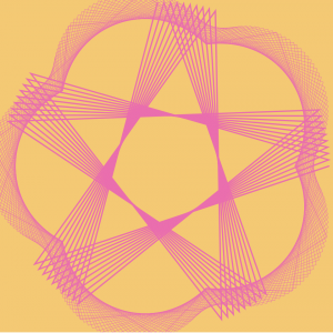
When I started this project, I was intimidated by the equations because I have not done math like this in a long time. It took me a little while to figure out how to use the for loop with the equations and the variables within them. Even though I faced some difficulties coding my first curve, which was the Hypotrochoid, I decided to add another curve called the Ranunculoid because I like how they interacted with each other. This project also helped me understand the map() and constrain() functions, which I used to control the colors and sizes of the curves. The curves when the mouse position is in the top left of the canvas.The curves when the mouse position is in the bottom right corner of the canvas.
/*
Alice Fang
Section E
acfang@andrew.cmu.edu
Project-07-Curves
*/

// http://mathworld.wolfram.com/EightCurve.html

// click to begin! and keep clicking to see it change!

var nPoints = 100;
var clickCount = 0;

function setup() {
    createCanvas(400, 400);
    frameRate(10);
    strokeWeight(3);
    noFill();
}

function draw() {
    background(0, 128, 128);
    var rad; // scale of expansion (how much wider the petal becomes)
    var angle; // angle of rotation the curve is translated

    for (i = 0; i < clickCount; i++) {
    	rad = 0.1 * i; // becomes wider with every click
    	angle = 30 * i; // rotates with every click
    }

    // curve in top right corner
    push();
    translate(3 * width / 4, height / 4);
    rotate(radians(angle + 45));
    drawCurve(random(0, 255), rad); //random color, angle
    pop();

    // curve in bottom left corner
    push();
    translate(width / 4, 3 * height / 4);
    rotate(radians(angle + 45));
    drawCurve(random(0, 255), rad);
    pop();

    // curve in top left corner
    push();
    translate(width / 4, height / 4);
    rotate(radians(angle - 45));
    drawCurve(random(0, 255), rad);
    pop();

    // curve in bottom right corner
    push();
    translate(3 * width / 4, 3 * height / 4);
    rotate(radians(angle - 45));
    drawCurve(random(0, 255), rad);
    pop();

    // center curve
    push();
    translate(width / 2, height / 2);
    rotate(radians(angle + 90))
    drawCurve(random(0, 255), rad);
    pop();

    // perpendicular center curve
    push();
    translate(width / 2, height / 2);
    rotate(radians(angle));
    drawCurve(random(0, 255), rad);
    pop();

}

// draw eight curve
function drawCurve(c, r) {
    var x;
    var y;
    var a = constrain(mouseX, 0, width / 2);

    stroke(c);
    beginShape();
    for (var i = 0; i < nPoints; i++) {
        var t = map(i, 0, nPoints, 0, TWO_PI); // map to unit circle

        // parametric function
        x = a * sin(t);
        y = a * sin(t) * cos(t) * r;

        vertex(x, y);
    }
    endShape(CLOSE);
}

function mousePressed() {
	clickCount++;
}
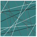
I struggled a lot with this project in particular, because I forgot a lot of the algebra related. I found it really difficult to implement any curve at all, and I originally wanted to use a more complicated curve. However, I enjoy the simplicity of this curve and how complex it can become when layered on top of each other. This reminds me of tangled strings, especially the more you click and zoom in! The greyscale flickering happened on accident, but I really liked it so I kept it, moving away from the filled hour-glass shapes I had originally.
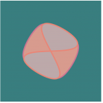
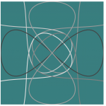
Playing around with fill; I like how this one looks like a round square!
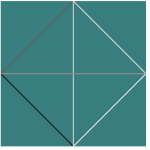
A starting position; curve with width 0 Looks like string! Zooming out from the previous screenshot Interesting patterns form when they overlap at certain zoom levels
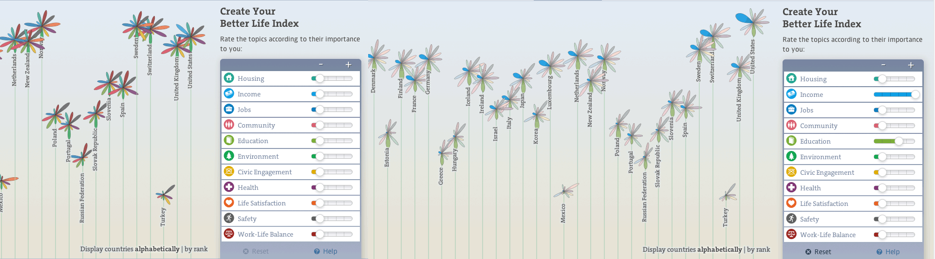
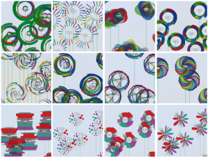
Final Product of OECD data visualization Exploration of different shapes and colors.
OECD Better life Index, a project by Moritz Stefaner, is a data visualization project that compares the well being of the world based on GDP. The purpose of this way to demonstrate the ranking of the world based on data visualization is to promote and brand OECD as a whole. Your Better Life Index helps the users compare the factors that relate to the GDP: education, environment, education, standard of living, and many more. The index as a whole is an interactive data visualization in which the height of the flower represents the total score of the country. Also, each length of the petal represents the topics like income, jobs, education, health, safety and many more. Therefore, the height of the flower becomes taller if the total score rises up, and the length of each petal becomes longer if the rating of the topic is higher than before. Users can also control the rates of the topics based on what they think is important to their lives. I admire this project because this project really thinks about the users and what they would be interested while using this data visualization. User/ Human centered Design, a creative method of problem solving and having strong ties with human perspective. is one of the most important topics we design students are learning through the CMU design. This project by Stefaner blends this major design concept well with how to make data visualization, one of the topics in 104. The algorithm that generated the work required various tools such as webpack, react, Material UI, and many more. He explored different design tools, and coded to make the final product. His artistic sensibilities are demonstrated in both the process work and the final work. He tried different colors and forms/ shapes to find the right fit for OECD. He looked for shapes and colors that users can view the brand as friendly and organic.
LINK: http://truth-and-beauty.net/projects/oecd-better-life-index –> Shows the code and the design.
![[OLD FALL 2018] 15-104 • Introduction to Computing for Creative Practice](../../../../wp-content/uploads/2020/08/stop-banner.png)