Ian Kaneko LO – 07

Visual of United States immigration trends

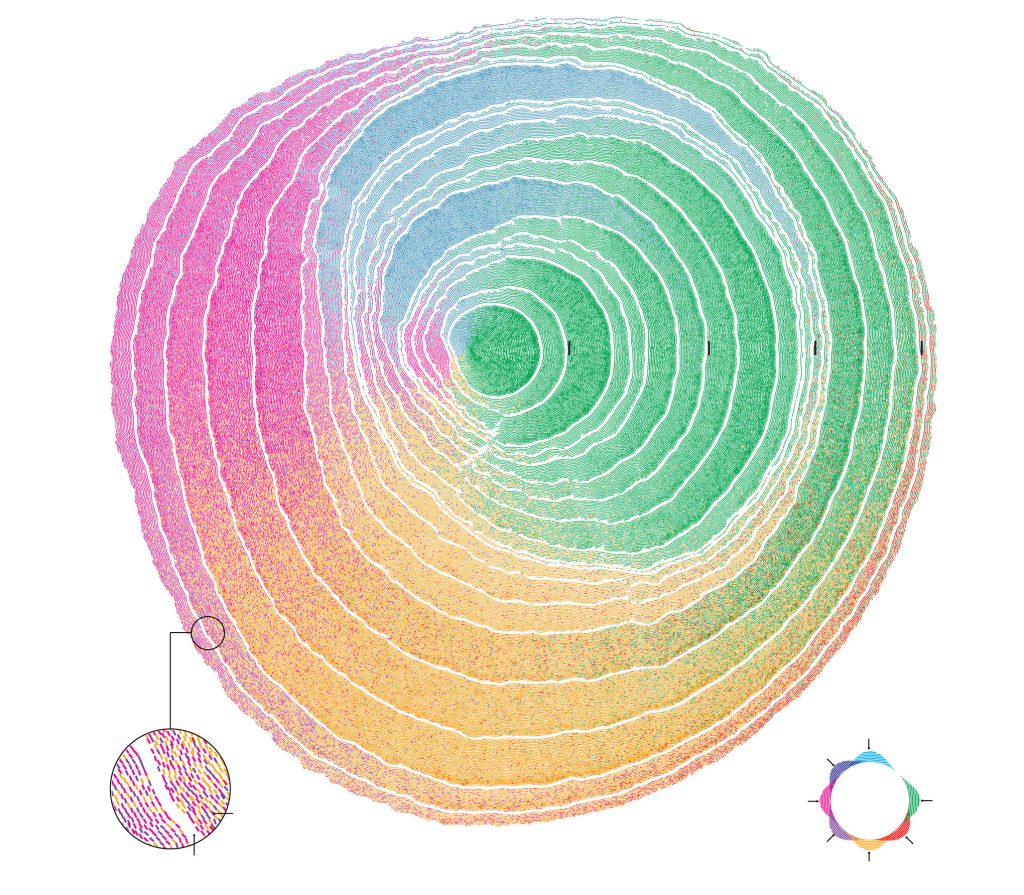
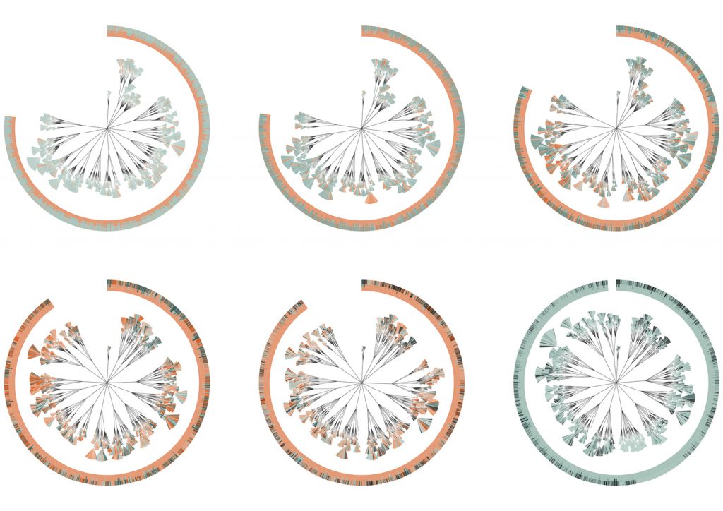
The project I chose was a visual representation of immigration trends done by Pedro M. Cruz and John Wihbey. Both of whom are researchers based at Northeastern University. This project shows immigration trends to the United States based off of the immigrants’ place of birth.

They stated that they were inspired by the way we can see trends in natural history through the rings of a tree. I thought this was a very clear and creative way to represent their data because of the way it shows large trends rather than specific data points.

Each ring of the tree represents 10 years and each color is a region that immigrants are from. The creators obviously took time to make sure it looked visually appealing, through their choice of color and texture. I was not able to transfer the text of the key over to this post, so I highly encourage anyone interested to follow the link posted below.

https://www.nationalgeographic.com/culture/2018/07/graphic-united-states-immigration-origins-rings-tree-culture/

Steven Fei – Looking Outwards – 07


It is interesting to visualize a world from radiowaves. Through collecting WIFI signals, GPS information, and the radio-active data created by the built environment, the Dutch designer Richard Vijgen successfully constructs an “infosphere” in which people are able to see how the radio waves and dots are bounced back and forth under different network condition. What attracts me about this project is that under this digital tool, people are able to visualize how the radio signals are transmitted not only from a plan view but also from a person’s standing position. Moreover, such a way of navigation in any built environment has implied different network construction and social infrastructural conditions such as the satellite services and cell tower managements.

Meanwhile, the program allows diverse datasets to show on the screen, which creates the opportunities for different visual information to join and compose a dynamic drawing for artists to experience and observe the information-industrial world. What’s more, the real-time info software also provides the chance for people to see which area of the information traffic is busy or not to help guide people to explore into different worlds and places.

Click here to see the social influence report of the software

Click here to view the original site

a real world experience through the ArchitectureRadio

Sewon Park – LO – 07

-Multiplicity by Moritz Stefaner

One information visualization project that I found most inspiring was Multiplicity by Moritz Stefaner. His machine learning algorithm conducts a full view of thousands of photos taken of Paris and organizes them through similarity in content and color. Such organization creates a massive mosaic composed of Paris’s favorite tourist spots, unvisited places, and the people of Paris.

I find this project inspiring as it used such advanced technology to really portray the culture of Paris. Through analyzing the myriad of photos taken by locals and tourists, it captures the beauty of the city. The project uses neural networks trained for image classification with t-sne mapping to find the optimal layout of similar images.

-layout configured through t-sne mapping

The artist proclaimed the focus of the project was on the visualization piece and the data-collection mechanics was merely a tool to facilitate the realization.

Alec Albright – Looking Outwards – 07

Image result for cool ggplot2 examples
Example scatterplot from the ggplot2 R package by Hadley Wickham, Winston Chang, Lionel Henry, and Thomas Lin Pedersen.
Image result for cool ggplot2 examples
Example time series plots from the ggplot2 R package by Hadley Wickham, Winston Chang, Lionel Henry, and Thomas Lin Pedersen.

The ggplot2 package for the R programming language, as created by Hadley Wickham, Winston Chang, Lionel Henry, and Thomas Lin Pedersen in 2016, is a data visualization tool that innovated the process of creating graphs in R. It outlines a “grammar of graphics” that is extremely versatile and easy to implement, which are its most admirable traits. The algorithm allows users to map different variables from a dataset to a variety of different aesthetics (shape, x or y axis, color, etc.) with very easy customization. In this versatility, the authors were able to manifest their dedication to allowing for flexible visualizations beyond traditional methods. Overall, this package incredibly useful in computational data visualization and has revolutionized how data analysts look at their data.

Kristine Kim – Looking Outward – 07

Emoto installation , Studio NAND

Emoto Installation, created by Studio NAND, is a  computational information visualization project that executes the global response/data collected from  Twitter around the London 2012 Olympic Games in an interactive online visualization and physical data sculpture. Based on approximately 12.5 million Twitter messages which were collected in real-time, this project recorded trending topics and how they were discussed online in an interactive visualization which was running live during the same time as the Games in July and August 2012. Each Tweet was annotated with a sentiment score by the project’s infrastructure using software provided by Lexalytics. This data formed the basis for an extensive profiling of London2012 which was finally documented in this interactive installation and physical data sculpture at the WE PLAY closing exhibition of the Cultural Olympiad in the Northwest. I was drawn into this installation because not only it was executed well online, but it was also presented in a physical form/installation.  It was easily recognizable and accesible to understand the project and the data visualization.  The video captures the intentions and content of the project really well and it helped me to understand Emoto Installation more. I love the details of the usage of light projection, color, laser cut, and text all incorporated very well into one installation. I admire the level of detail and effort that was put into this project, the depth of the research and data visualization is very inspiring. 

Emoto Installation Video, Studio NAND

Fanjie Jin-Looking Outwards 07

wind map simulation from http://hint.fm/wind/ created by  Wattenberg and Viegas

This map shows the delicate tracery of wind flowing over the US. From this data visualization, there are a number of information that have been weaved together to show the flow of wind in a visually aesthetic way. From the map, we can understand the directionality, speed, as well as the top and average speed. As indicated in the website, the wind map website has used National Digital Forecast Database. These are near-term forecasts, revised once per hour. So the map is a live portray of the wind current condition over us.

This is a really interesting project to me as it gives a strong and dynamic visualization of how the wind moves and from the map so that we can potentially assume how the wind might have responded to the particular terrain and topology condition of US. Also for natural disaster such as hurricanes, the map would indicates the progress of a natural disaster and serving as a educational tool for viewers.

CJ Walsh – Looking Outwards 07 – Data Visualization

6 charts created for (En)tangled Word Bank (2009)

The piece I chose this week is a collaboration between Stefanie Posavec and Greg McInerny. These pieces were created by analyzing insertions and deletions that occurred between six editions of The Origin of Species by Charles Darwin. On her website, Posavec outlines that McInerny completed all of the programming and gathering of data and together they worked on the visual form. While it does not describe the particulars of the programming used to analyze all of the editions, it says that C++ and R were used in terms of programming languages. My guess is that an algorithm was used that analyzed all the sentences within each edition and then checked how many times that sentence was seen again in future versions.

Posavec modeled this form after another project that she did while working on her Masters in Communication Design. She calls the structure a ‘literary organism.’ Each diagram represents an edition, which is then broken down into chapters and subchapters. After that, the subchapters are divided into the paragraph ‘leaves,’ which are then broken into sentence ‘leaflets.’ The sentences in each edition are colored to indicate whether they survive to the next edition (blue) or have removed (orange).

Banners created for Darwin Anniversary Festival at the University of Cambridge

I enjoyed this project because it’s not a dataset that would come to mind when I think about content usually depicted in data visualization. It is interesting to see the way that the content within the editions changes over time. It shows a progression in both scientific thought and how Darwin was developing his theories and knowledge. I think that the form is also pretty interesting. It feels heavily inspired by natural forms and the way that natural species are charted based on relations.

Sources: http://www.stefanieposavec.com/entangled-word-bank https://www.moma.org/interactives/exhibitions/2011/talktome/objects/145525/

Chelsea-Fan-Looking Outward-07

Wes Grubbs created an interactive data visualization software to collect data about Hate Flyering across the USA for the Southern Poverty Law Center.

Users are able to zoom to view, select each state to see the statistics, and also see the change in Hate Flyering over time. The interactive visualization allows you to select the time range from 2018-2019, see the different groups of flyers and the types of flyering.

I really admire that Grubbs created an interactive visualization for something very prevalent in today’s society. I don’t know what algorithms generated this work, but I am astounded by the creativity of Grubbs to create an actual map drawing of the USA with 3D bar graphs. The bar heights increase with the number of Hate Flyerings. In addition, the bay is specifically located (on the map) on the location (in the US) where the data was gathered. This seems like such a simple idea, yet the creativity manifests in this form of presentation.

Grubbs Interactive Data Visualization (n.d.): USA Map Hate Flyering Bar Graph
Grubbs Interactive Data Visualization (n.d.): Winchester Hate Flyering Statistics in 2018

Sammie Kim – Looking Outwards – 07

Artificial Arcadia is a collaborative project between the KOSMOS architects and Fragmentin, an art practice based in Switzerland. With its spatial design inspired by the Swiss infrastructures like snow cannons, irrigation systems, and more, Artificial Arcadia inspires visitors to interact with the dynamic landscape in a performative scenographic landscape. This landscape is mapped with “bauprofile” markers, which are construction poles that show the intended location of future buildings, and they are topped with a white textile roof evoking the Swiss mountain range. The interactive element comes alive as visitors enter and move through the installation, where the poles position themselves at different heights and gradually fall to reference the melting levels of ice. The algorithms derives from the Swiss topography data, where a new portion of the Alps snow level map is randomly selected and analyzed every few minutes, then translated within the landscape. This project was inspiring as it provides a perspective towards our environment, particularly how it sparks debate regarding the artificial integration to a natural area. Likewise, Fragmentin’s work crosses the boundary between art and engineering, exploring the complex systems through form and interaction. 

“bauprofile” markers (Fragmentin)

Interactive installation space prompts visitors to move through (Fragmentin)

Charmaine Qiu – Looking Outwards – 07

Facebook Flowers

Image of “facebook flowers”

Stamen design is a visualization design studio that provides for clients across different industries such as artists, architects, and museums. One of their projects that I find particularly interesting is the “Facebook Flowers”.The project took the activities on Facebook of the American actor George Takei and translated it into a digital art piece where a flower grows following the activity of the actor. The team looked at one facebook post specifically, and translated the shares to a flower as each follow-on shares becomes a strand on their own. The pattern created drew relationship to a living organism when the evolving movement is captured to create a video. I find the work of Stamen design very eye opening since it interpreted a technological flow and transformed it to resemble nature. It is fascinating how we as humans are constantly surrounded by the theme of nature even in this ever changing world. 

Find out more on their website: https://stamen.com/work/facebook-flowers/