![[OLD FALL 2019] 15-104 • Introduction to Computing for Creative Practice](../../../../wp-content/uploads/2020/08/stop-banner.png)
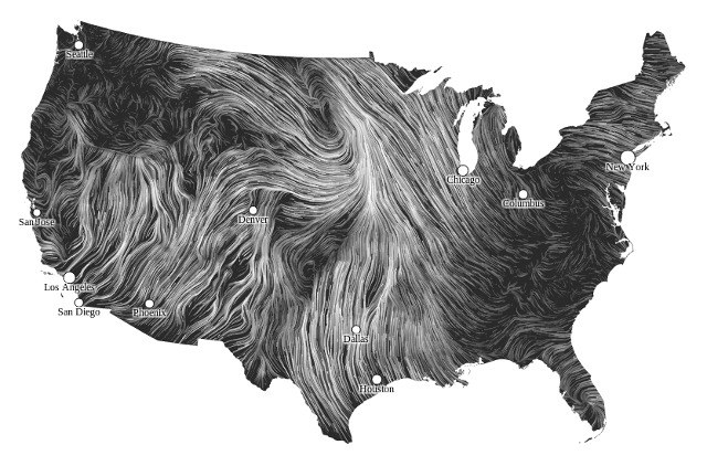
New York Talk Exchange

The New York Talk Exchange, a project worked on by Aaron Koblin, illustrates the global exchange of information. It does this in real time by using data collected from long distance telephone and IP data flowing between New York and the rest of the world. The project is on display at the Museum of Modern Art.
In the above image, the weight of the glow corresponds to the amount of IP traffic flowing between a particular city and New York. A greater glow means a greater IP flow. Other pieces in this project show a similar connectivity using data collected from New York’s telephone network.
The purpose of this project was to show how connected New York is to the rest of the world, especially in the information age with the wide accessibility of telecommunication and internet connectivity. The project shows which cities New York has the strongest connections to. I admire that the project aims to show how connected the world is, despite the constraint of distance.