Chelsea Fan-LookingOutwards-08

Leah Buechley is a designer, engineer and educator. She is the developer of LilyPad Arduino Toolkit, smart textiles, and other soft circuit solutions. From 2009 to 2013, she was an associate professor at MIT Media Lab. There, she directed the High-Low Tech research group. Currently, she runs a design firm exploring the intersection of technology and design.

Buechley’s body of work embodies a new trend of “making.” I admire that she relates her work to “making,” a bigger idea of how building and”making” relates to the world. She discusses how “making” things defines who and what humans are. In addition, Buechley’s work is different from the normal artists we talk about. This talk doesn’t discuss her own gallery of art pieces. Instead, it discusses how she writes papers, gives talks, and seeks to educate others about everything she has done and learned. This talk is a great example of how she is using her knowledge to share her understanding of “making” and the world and the new trends we see through the connection of the two. In her talk, she discusses “who” is a maker and how they’re not representative of the actual population.

Buechley speaks comfortably and casually. Which helps makes the audience feel at ease. Rather than a monotone, she speaks with passion and emphasis on certain words, which helps engage the audience. She also uses hand gestures to show her involvement and enthusiasm in her talk. These are all good strategies that I can use to make my presentations less boring and un-engaging.

Link to Leah Buechley’s website
Leah Buechley’s talk on how Thinking About Making (2014).

Alec Albright – Looking Outwards – 08

Brian House is currently an Assistant Professor of Art and Studio Head of Digital Media at Lewis and Clark College in Portland, Oregon. He holds a PhD in Computer Music and Multimedia from Brown University. His artwork primarily involves the relationship between natural rhythms in the human body, the environment, and technology. He describes some of his current interests as “extractive industries and urban rats,” attesting to his research-oriented artworks.

His work is particularly admirable to me because it is largely data-driven, often incorporating music as well. One of his works, “Decomposition”, was a series of double bass music pieces derived from data describing the thousand-year process of plastic decaying if not properly disposed of.

His presentation skills involve a lot of trying to make the audience understand his methods of thinking throughout his creative process, embedding first point of view videos, quotes, etc. that make his presentation very intriguing. This could definitely be helpful for me in the future.

His website can be found at https://brianhouse.net/ .

Xiaoyu Kang – Looking Outward – 08

The artist Rachel Binx introduces herself as an only child who grew up in Mexico. And her work started with her dream of becoming a world traveler by herself when she was younger. She would handwritten the location CSV of every city she travels to and tracted that information for years. What she did with the data was that she generated an image from all the places that she has been to through programming. She started collaborating with a jewelry company that use shapes that are generated from places to make jewelry, and the idea of the whole project is to take people’s experiences as data points and visualize them, thus summarizing someone’s life through the medium of a map. 

As the first project became successful, she started to create more products. For the people who didn’t move as much in their lives, she connects the streets that people walk every single day to generate patterns and creates them into jewelry. She also incorporated maps into other items such as skirts and pillows. 

In addition, she also did projects that used programming to document her life. For example she programmed her laptop to take pictures whenever she uses her laptop in a new environment. All of her works focused on data journaling, either through automated data or memory. What she was trying to do is to take the data points that are important and personal to people and turn the data points into something visual and physical.

The speaker talks about her project by connecting her work to her own stories and experiences. In this way, she made the lecture much easier to understand and much more relatable since a lot of her experiences are commonly shared among many people.

https://rachelbinx.com

Emma NM-LO-09

Jenny Lee’s LO-06

eCLOUD by Aaron Koblin

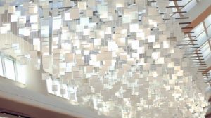
I took a look at Jenny Lee’s Looking Outward post for week 6. It examined the project eCLOUD, which is an every change sculpture of a cloud. I think this project is so cool. The way the cloud changes the degree of brightness based on the weather to emulate a real cloud is so fascinating. I saw a bit in the video of when it was storming, the cloud flashed white briefly to mimic lightning. I would agree with my peer’s thoughts. She and I both agree this project is really cool based on it’s physical appearance and the connection to real weather. One thing that I don’t like very much is that the eCLOUD changes cities every few moments. I feel like the audience would not even realize that the cloud changed city when looking at it for a longer time than minute. I would also love to visit this airport to see it in person, but I wonder if updates could be provided after so many years? Maybe look into changing the shape of the cloud in addition to the brightness of each panel?

eCLOUD installed in San Jose Airport

Permanent Installation between gates 22 and 23 in San Jose International Airport

Nadia Susanto – Project 07 – Curves

sketch

// Nadia Susanto
// Section B
// nsusanto@andrew.cmu.edu
// Project-07-Curves

var angle = 0;

function setup() {
    createCanvas(480, 480);
    background(220);
    angleMode(radians);
}

function draw() {
    //making the fill to be a combo of random colors
    var r = random(0, 100);
    var g = random(100, 150);
    var b = random(200, 275);
    frameRate(5);
    push();
    fill(r, g, b);
    translate(width/2, height/2); //drawn to be in the middle
    //rotating the asteroid
    angle += 1;
    rotate(angle);
    drawCurve(); //calling function
    pop();

}

function drawCurve() {
    var b = mouseY/2;
    var t = map(mouseY, 0, 200, 40, 120); //constraint

    //creating the astroid
    beginShape();
    for (var i = 0; i < 100; i++) {
      t = map(i, 0, 100, 0, TWO_PI);
      //reference from http://mathworld.wolfram.com/Astroid.html
      var x = 3 * b * cos(t) + b * cos(3 * t);
      var y = 3 * b * sin(t) - b * sin(3 * t);
      vertex(x, y);
    }
    endShape();


}

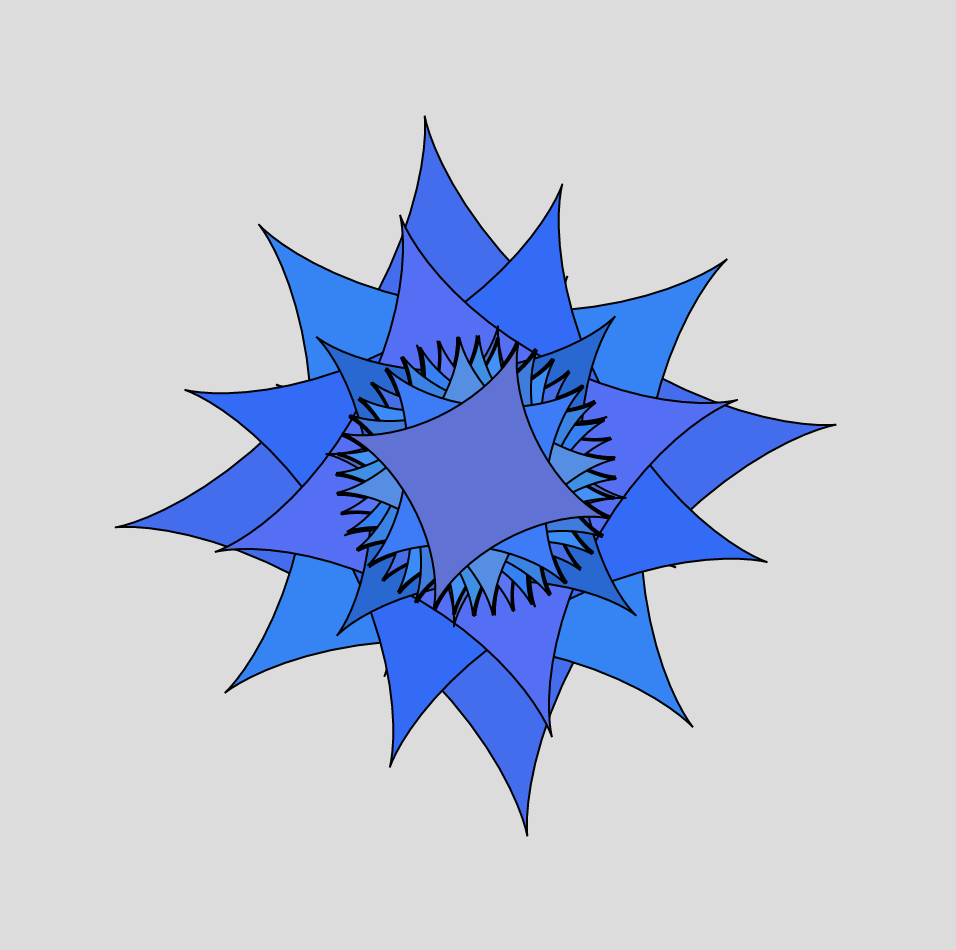
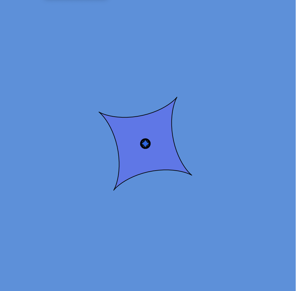
It was hard figuring out which curve to use as there were so many that were pretty, but I ended up choosing to go with the asteroid curve. I figured that a star-shaped curve could be beautiful especially when rotating. With the rotation it looks like a christmas tree star or it even looks flowerly-like. I also played around with the random colors and constrained it to be only blue/purple shades. I then used mouseX and mouse Y in order to determine the size of the asteroid. Overall, I am pretty happy with the result and it looks beautiful.

An example of this “flower-like” asteroid with multiple rotations
Another possible asteroid curve that looks like a ninja star

Claire Lee – Looking Outwards – 08

I decided to read about Mary Huang, one of two joint speakers at the 2013 Eyeo festival that founded a software-based apparel creation company called Continuum Fashion. Huang graduated with a BA in Design/Media Arts from UCLA, and went on to receive a MA from the Copenhagen Institute of Interaction Design.

Eyeo 2013 – Huang & Fizel

I really admired Mary’s projects under Continuum Fashion, which served as a reflection the emerging role of technology in society while also giving the masses an accessible outlet with which anyone could design their own apparel and see it come to life. I really liked that Mary considers her work a continuation of the constantly evolving definition of “fashion” and the social commentary behind her work. I also really liked that she put a lot of effort into the user-interface design of these projects so that they were easy for people with no coding experience to use.

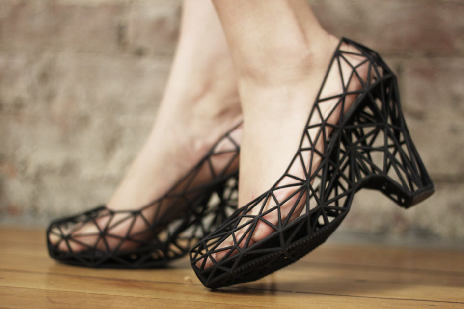
Strvct, Continuum’s first collection of 3D-printed shoes.

Some of the strategies in her presentation that I thought were most effective were that she gave a lot of visuals and included examples of some concepts and projects (2-dimensional pictures to knitwear, different types of weaves) that served as the foundation on which her work was based. I think it did a lot to enhance my understanding of her goals for these projects and her thought process behind them. I also liked that she went in and actually gave her audience a look inside the user interface of her apparel-making programs, so they could see some of the customizations and adjustments available for the users to make on their pieces.

Fallon Creech-LookingOutwards-07

Video portrays the public art piece in the context of its place (Calgary, Alberta)

Twenty-two thousand years ago, the Bow Glacier slowly carved its way east from the Rocky Mountains, briefly sculpting the land on which the city of Calgary sits upon today. Today, the glacier melts into Bow Pond before finding its way to Bow Lake, leaving waterfalls at many of these intersections. Drinking water in Calgary commonly originates from the melted ice of the glacier, so the glacier quite literally resides in the residents of the city.

Collaborators Ben Rubin, Shah Selbe, and Dr. Jeffrey Kavanuagh curated a data visualization of the interrelationship between the Bow Glacier’s everchanging physical transformations and human activity in Calgary. The visualization connects the urban fabric with nature, suggesting that humans are never actually without it. 

To visually represent the “heartbeat” of the glacier, the collaborators wrote programs that produced a cardiotocograph, turning live seismic feed recorded at the glacier into crisp lines against a white background. 

This public piece is compelling because it demonstrates the record of data in a style that appears much less crisp and neat than is typically in data visualizations; it aims to suggest a correlation.

Ankitha Vasudev – Looking Outwards – 08

Jesse Louis-Rosenberg and Jessica Rosenkrantz are generative artists who founded the design studio Nervous System (New York) in 2007. They created this studio as an outlet for interdisciplinary experiments that did not fit within their respective educations (Rosenberg was studying math and computer science while Rosenkratz was studying biology and architecture). Their body of work emphasizes an interaction between science, art and technology.

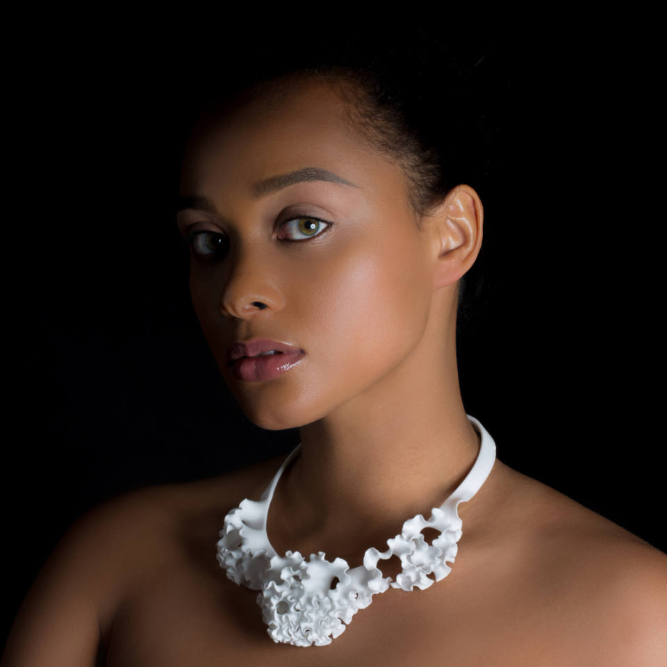
One of the projects highlighted in their video: Flora Collar(2015), uses the concept of computation geometry, plant morphogenesis, differential growth

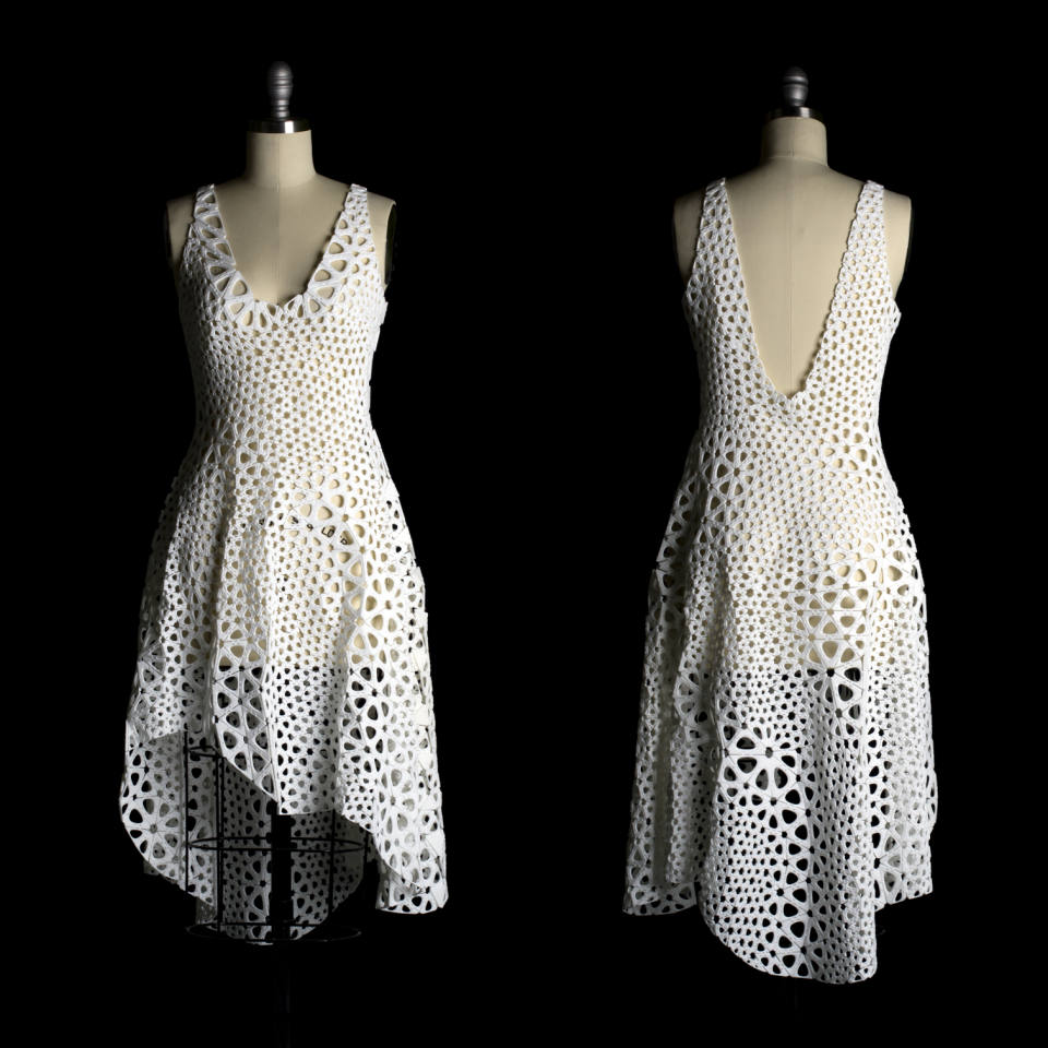
I find their work inspirational because of the methods they use to create computer simulations and digitally fabricate designs and products that draw inspiration from nature. In their Eyeo video, the artists talk about their interest in digital fabrication techniques, plant morphogenesis and differential growth, algorithmic gardening and the creation of objects such as jewelry and clothes using these processes. This video was interesting because it showed multiple experimental fabrication and computational techniques. Both artists also touched upon their interest in making these objects affordable and functional rather than just aesthetically pleasing. 

Another project talked about in their video is Kinematic Dress(2015), which is a 3D printed dress consisting of interlocked panels
The artists’ video from the Eyeo Festival in 2015

Nadia Susanto – Looking Outwards – 07

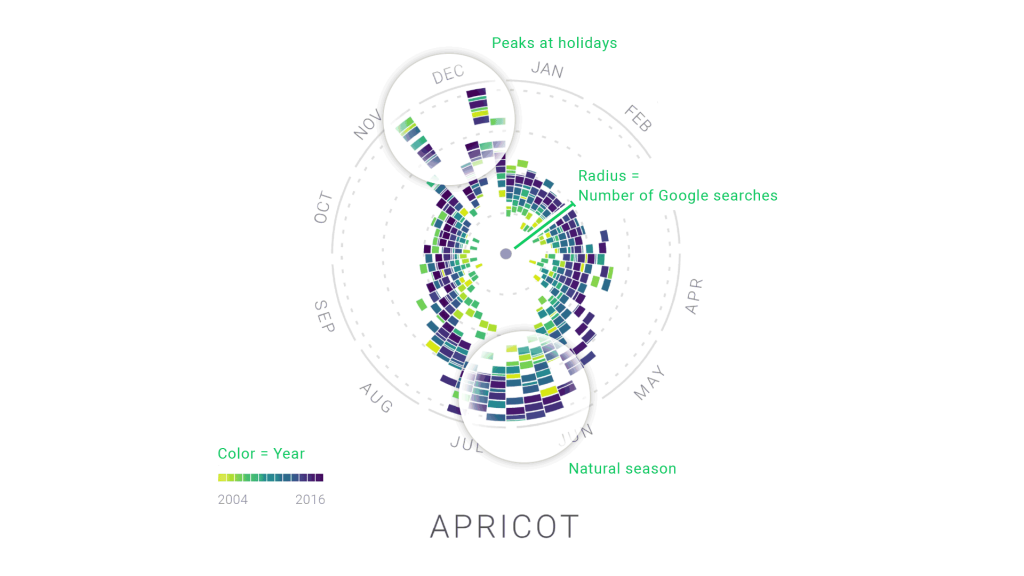
The Rhythm of Food is a visualization project led by creative director Moritz Stefaner in collaboration with Google News Lab. It takes 12 years of google search data and analyzes food seasonality. They developed a radial “year clock” chart to reveal season trends for specific food items like an apricot. The distance from the center shows the relative search interest and the different colors indicates a specific year. By having this, it allows an easier visualization of the year by year trends and rhythms.

Closer look into an example of a “clock” for apricots in which the years are shown through the various colors and the radius is clearly visible.
Video that demonstrates how the chart/”clock” should be read. It answers the question of how to go from simple bar charts to the radial chart.

In order to make this project, Moritz used many different softwares like ES2015, webpack, react, Material UI, and d3 v4. What I admire is that Moritz took something usually boring and difficult to read in chart data, but now it is very aesthetically pleasing and easy to understand.

If you want to learn more about this amazing project, click this link:

http://truth-and-beauty.net/projects/the-rhythm-of-food


Rachel Shin – LO 7

“Flight Patterns” by Aaron Koblin is a computation information visualization composed by a history of air traffic. Data was collected from FAA data, and it was put together and computed via Processing programming. Koblin used Adobe After Effects and Maya to put together this visual. I personally admired the cohesive nature of this visual. While it showed chaos of air traffic, it portrayed a simple, calm, and unified visual. I personally never considered air traffic like the way I thought about road traffic, so it was an interesting outlook for me to see Koblin’s creation. I suppose that the algorithms used were tracking the departure and destination location and creating curves with those points and using a specific color for each one to specify which curve represented which flight. The creator’s artistic sensibilities were manifested in portraying a unity of air traffic with a variety of curves and color.