Fallon Creech-LookingOutwards-08

Eva Franch i Gilabert’s lecture at Eyeo Festival

Eva Franch, currently based in New York and serves as director of StoreFront for Art and Architecture, is a Spanish architect who excels in experimental architectural and art forms. Her work addresses the need for change in cultural, political, social, and technological realms through “architectural doubts.” She categorizes these doubts into three fields. “Utopias” target a range of historical and political doubts; “metaphors” target a range of cognitive and formal doubts; and atmospheres target primarily experiential doubts within architecture.

Franch’s work aims to showcase the untruths of perceivably utopic realms through highly experimental forms and publications. Her work is admirable because she uses her categorical doubts to juxtapose one another, highlighting flaws and factors that typically remain unnoticed within urban fabrics. She uses a wide range of material and media to demonstrate these “architectural doubts,” including clothing and newspaper clippings, suggesting that architecture is highly dependant on various contextual factors.


Link to Franch’s website: http://eva-franch.com/

Ankitha Vasudev – Looking Outwards – 09

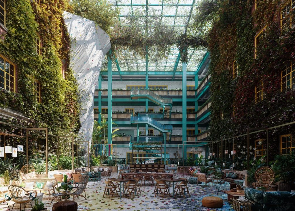
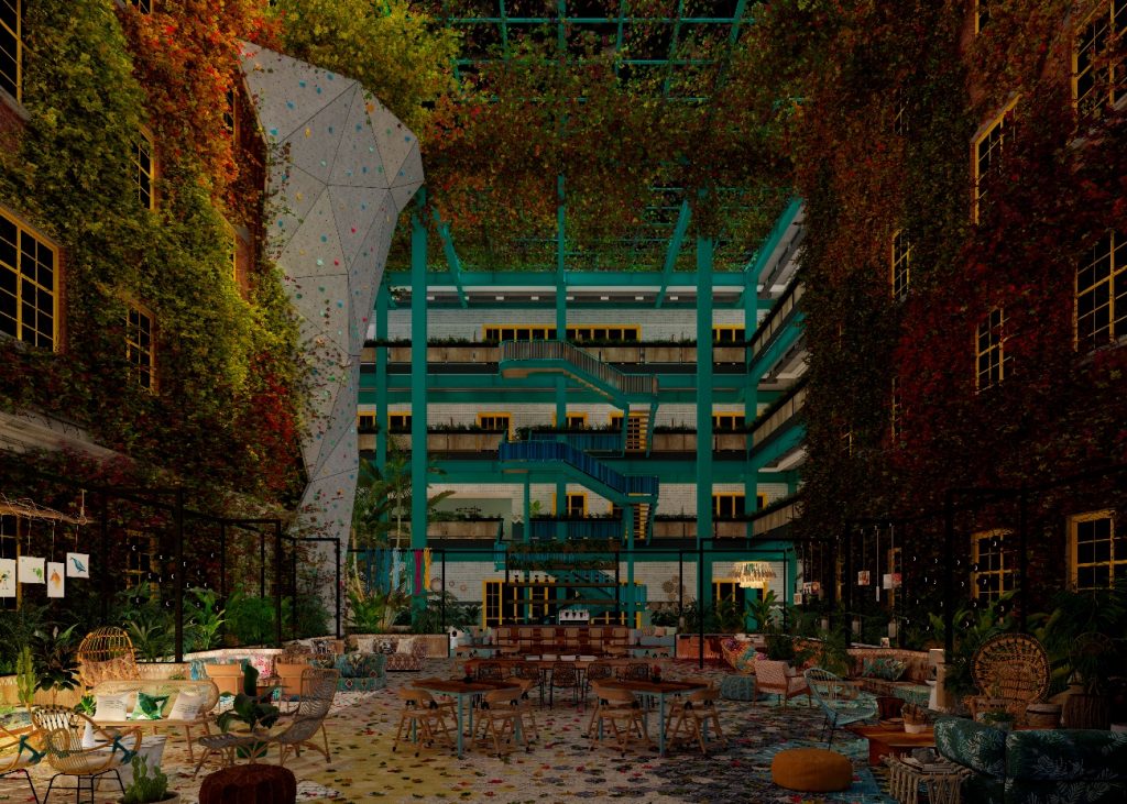
A Looking Outwards assignment that I found interesting was Mari’s post on 3DQ, which is a digital agency based in Barcelona that specializes in Hospitality and Interior Design and Architecture Computer Generated Images (CGI). In her post, Mari focused on the project The Coworking 2040, which was made using Corona Renderer in 2017.

I found this project intriguing because of how realistic it looks and how efficient the process behind making it seemed. Usually, photo realism rendering is a very time-consuming process; however, 3DG is able to create detailed design, composition, lighting and texturing in a very creative and flexible way. I agree with Mari’s comments about the usefulness of creating a tool to visualize a space without actually creating it since it allows people to get a feel of the space without jeopardizing money or time.

As an architecture student, the work by this studio is inspirational because the designers know how to build realistic scenes fast with the right amount of detail versus geometry. Their workflow seems ideal because they have a good balance between technique and creativity.

Video showing the blending of layers

Siwei Xie – Looking Outwards 09

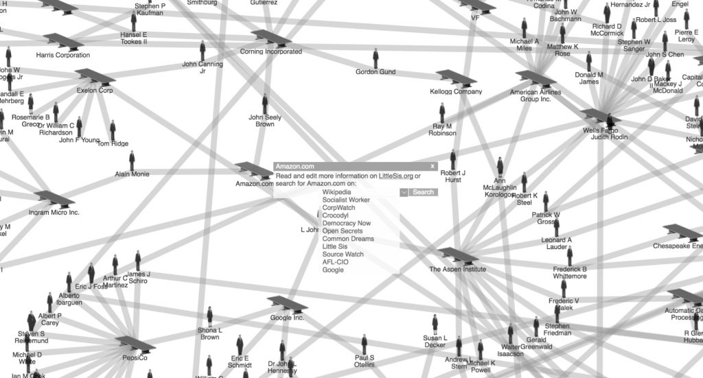
“They Rule” is one of the pioneers in revealing the implications and power of data visualization, as well as the role that data designers play in them in a scenario where data was starting to be abundant. My peer did not add her thoughts in the assessment, she mainly described what the project is, which I agree with the facts. 

I can add more of my original thoughts to her assessment. I think “They Rule” is a starting point for research on these powerful individuals and corporations. Network visualization allows corroborating things that are known but not seen until then as directors of powerful companies repeating themselves in more than one company, concentrating power in a few. 

However, “They Rule” is not a real-time representation of a dataset as the formation of company directories is constantly changing. Currently, we find many representations of power networks of politicians, businessmen, corporations, knowledge networks, etc. What makes “They Rule” is that it was one of the pioneering projects in making visible the relationships between individuals that constitute the power class.

Link to my peer’s assessment. SooA Kim, Looking Outwards 07, 10/11/2019.

Link to the original source. Josh On, “They Rule”, 2001.

Josh On, “They Rule”, 2001.

Julia Nishizaki – Looking Outwards – 08

I am using one of my grace days for this late submission.

Maya Ganesh’s 2013 talk at Eyeo, “Visual Influence”

The individual I chose to listen to and learn more about was Maya Indira Ganesh. On her website, Ganesh identifies as a “feminist technology researcher, speaker, and writer working with arts and culture organisations, academia and NGOs.” I was drawn to her work because she focuses on technology in advocacy, by exploring how to bring together data and art in order to progress social issues. In 2013, at the time of her Eyeo festival talk, Maya Ganesh was the Evidence and Action program director at Tactical Technology Collective, and organization that works with activists, right advocates, and data specialists to help visualize information and enact change. Ganesh is a writer and speaker, rather than a designer or technologist, so during her talk, she referenced her interests, focuses as a researcher, and “Visualising Information for Advocacy,” a book that she had worked on with Tactical Technology Collective, rather than personal works or projects.

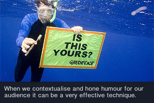
A photo taken from the website for the book, “Visualising Information for Advocacy,” describing an example of how we visualize information and move those around us to enact change

I really admired how she spoke and presented her ideas. Throughout the presentation, she used the space around her very effectively. Rather than just reading notes or relying on her slideshow, she kept eye contact with the audience, and spoke almost like she was talking directly to you. Moreover, she framed her presentation with stories and examples of how people used technology and design to shift people’s perspectives. By framing her talk through narratives, she helped the audience to better understand the power of information and data visualization, and ultimately, her goals and inspirations.

Crystal Xue-LookingOutwards-08

Speaker: Jake Barton

Jake Barton is a Brooklyn born and raised designer. He is the founder of the Local Projects that focuses on expression of emotions in technology in all ranges of projects such as museums, education, architecture, and memorials, etc.

In the Eyeo Festival 2012 video, he mentioned the Cleveland Museum of Art project which is very intriguing. Breaking the traditional way of how visitors engage in an art museum, Jake successfully turned presentations into experiences. People make active interactions with the exhibit instead of being passively receiving the information.

The team made very different interfaces using technology like face recognition to experiment with a whole different way of learning. At the end of the day, a museum is all about story telling. Instead of reading a tedious paragraph of words, museum visitors enjoy and learn more with interactive processes.

Rachel Shin – LO 8 – Mapping Police Violence

In 2015, Deray Mckesson and Samuel Sinyangwe shared their beliefs in the imbalance of social roles between police and population and sought out to create a data visualization that shone light on the police violence that was shoved under the carpet.

Deray Mckesson, a government and legal studies from Bowdoin College, found his passion and embarked upon his path as an activist as he participated in a protest and discovered the ability of Twitter to tell stories in real-time. Prompted by police brutality tweets tweeted at him minutes after occurrence, Mckesson sought out to translate quantitative data into one of many stories to be told. Samuel Sinyangwe is a researcher and activist who studied race, politics, economics, and class at Stanford University who found his passion for activism after the shooting death of Trayvon Martin in Florida where Sinyangwe had regularly gone to for sports practice. After discovering how real the scenario of police brutality could be, Sinyangwe sought to develop an organization that used digital media to support Black Lives Matter activism.

In the video, Mckesson and Sinyangwe presented their ideas and beliefs through three main points: data, lived reality, and numbers & policy in a comfortable manner rather than with a business/professional tone to eliminate the presenter-audience barrier. They also answered audience members’ questions to better persuade them the benefits of their data visualization.

Mckesson and Sinyangwe developed a dataset-based map that pictured a timeline that can be scrubbed through that colorized and highlighted locations of police violence. I believe that this was created through loops, arrays, and functions that allowed the program to run through the dataset of cited police violence accounts and locations. The loop and functions then allowed Mckesson and Sinyangwe to develop an interactive map that allowed audience members to see for themselves how often police violence occurs. I admired this particular project because it allows an Internet-user like me to visually see how real this modern-day issue really is. Growing up in a sheltered bubble, I never considered the weight of police brutality, so this data visualization map breaks that wall of ignorance.

Xu Xu – Looking Outwards – 08

Artist Rachel Binx is a data visualizer, developer, and designer who works in Netflix in Los Angeles, and she had previous work experiences in Mapzen, NASA, as well as Stamen Design. As an only child from Mexico, her childhood dream was to become a world traveler, which is her source of inspiration for her works. Throughout the years she has co-founded Meshu, Gifpop, and monochōme: all small companies that explore creating one-off physical objects from the data that customers find meaningful. Meshu, a jewelry company that is based on geographic data of customers, was co-founded with Sha Hwang, another Stamen alumni. Gifpop is a kickstarted project that creates service prints from uploaded gif files. She also founded monochōme, a clothing company that allows customers to use maps to create a custom print on various clothing.

Her intent for these projects and startups was to connect people’s experiences (countries they visited, or even streets they walk every day) as data points and visualize them, creating a sense of summarizing one’s life and adding personal touches to each design.

She is also interested in data journaling, where she would program her laptop to take photos whenever she is in a new environment. She collects data from automated data or memory, and store those that are important and personal to people, then turn them into something visual and physical.

Binx talks about her projects by introducing her stories and personal experiences, which makes the project intent and outcome easier to follow. It is also more relatable for the audiences, and the idea of “customizing” and collecting personal data seems intriguing to most people since it adds a special touch to the project. I admire her creativity and her ability of turning data points into something artistic and acceptable by the general public, but I also admire her will to hold on to her childhood dream and focusing on things she truly loves. (Although the products are quite pricy: I’ve checked her websites)

https://rachelbinx.com/

Minjae Jeong-Looking Outwards-08

Daniel Shiffman is an Associate Arts Professor at the Interactive Telecommunications Program at NYU’s Tisch School of Arts. He uploads creative coding tutorials every week on his youtube channel “The Coding Train”.

Daniel Shiffman is definitely one of the most inspiring person among the other speakers. Before I registered 15-104, I wanted to explore what p5.js is, and I found Shiffman’s youtube channel, The Coding Train. His lectures were very easy to understand, fun, and less overwhelming than other programming lectures or tutorials I used to see. It is very obvious that he provides quality lectures rich in information when the reading assignments are his youtube videos. Although I do not watch his videos often, but as I continue learning p5.js, it is one of the websites I would go on if I don’t understand or need more studying.

Nadia Susanto – Looking Outwards – 08

Kim Rees is the Head of Information Visualization at Periscopic, a socially conscious data visualization firm based in Portland, Oregon. Kim has garnered many awards and has presented herself to be a prominent figure in the world of information visualization. Kim’s work has been featured in the MOMA, the Parsons Journal of Information Mapping, and was an award winner in the VAST 2010 Challenge.

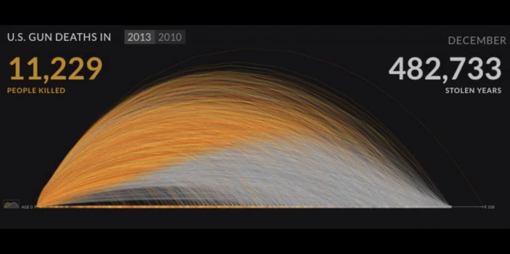
I really admire her work because she is taking her skills of creating beautiful pieces of information visuals to talk about bigger societal issues that are needed in this day and age. Below is one of her famous works regarding gun violence. What many don’t understand is that there is an overwhelming magnitude of loss from US gun deaths. The orange line depicts the person that died, and the white line that continues from the orange depicts how long they could’ve lived for. By this heart-wrenching visual, its easy to see how many years of life were stolen at the hands of guns.

An example of what Kim Rees did at Periscopic to visually describe gun violence

To see the whole visual from above come to life, click the link below:

https://guns.periscopic.com/?year=2013

While Kim Rees was unable to showcase her works with Periscopic at Eyeo, her talk on the future of data was inspiring. She was not afraid to seem controversial and had great insights into privacy, actualized data, and more. Kim values open data and believes that using more and more data can help solve social issues. Watch her talk below at Eyeo 2014.

Video of Kim Rees’s talk at the 2014 Eyeo Festival

Sydney Salamy: Looking Outwards-08

Mimi Son is a teacher of Interactive Storytelling at Korea’s Kaywon School of Art and Design and art director at Kimchi and Chips, an art and design studio she founded with Elliot Woods which is based Seoul. She studied Interaction Design at Copenhagen Institute of Interaction Design after finishing her MA degree of Interaction Design at the Landsdown Centre of Middlesex University, located in London. Currently, she is researching the effects of technology when approaches creatively and the interactions between emotional and tangible things. In her presentation, she and Woods talk about their projects that deal with the relationship between the material and the immaterial (ie: objects with lights displayed over them). She would describe herself as loving nature and art and experimenting with them, which is what led her into the field she is now.


  • Son’s work deals a lot with computers mixed with physical objects. Her projects would be aided with computer programs, such as with Lunar Surface, where a sheet moves back and forth in the wind. A sphere was created inside a program, corresponding to a light projection. The projection is of a circle and is shone onto the sheet. The movements of the sheet are included in the program over the sphere and as it moves, the circle size changes. Basically, if the sheet is blown forwards or backwards so it is toward the end of the sphere, then the circle will be small, and if it’s in the middle it will be big. A similar project is Line Segments Space which is shown below. Strings are set up in a black room, and light is shone and varied on specific strings to create a pretty light show. Because the strings exist in a computer program as well, the lights are able to be mapped very specifically.
  • I admire the way she is able to mix stuff that isn’t physically real with stuff that is in order to create her works. Her Lunar Surface project really stuck out to me for this reason. The fact that the sheet exists and the sphere doesn’t, yet they are still able to interact is very cool to me, especially since decades earlier this would be impossible. Besides all this, the resulting work is pretty. 
  • The projects I admire the most are the ones where light is projected onto objects. This would include Lunar Surface, Line Segments Space, Assembly, Lit Tree, and Link. I admire these ones the most because of how they look visually and the effort it took to make them. Most of the projects listed have to have a number of physical objects created and placed for something to be projected onto them, and this is all done by hand, which is obviously difficult. The results are beautiful. The way the projections interact with the physical pieces looks so amazing and cool, it’s hard to describe them. The sounds accompanying the pieces also help place the viewer into a certain “atmosphere”, which enhances the viewing experience.


  • In this presentation, Mimi Son is presenting with Elliot Woods. They present their work through explanation. They don’t move around much, just stand near a podium and talk. They discuss their projects and processes. When doing so, they use visually aids that are projected on a screen near them. These aids are either pictures or videos demonstrating their projects, studio, diagrams, and other art. This gives the audience something to look at which is also relevant to what they are discussing. The videos sometimes had sound as well. They would also tell jokes every once in a while, which made the audience laugh. What I can learn from this is that what I say has the most importance. However, I can aid my dialogue with things that are both pleasing visually and aurally. This helps the audience get a better idea of what the speaker is talking about. This is important since it gives the audience something to focus on during the presentation. With presentations this long, people can start to doze off, so giving them something to look at can help keep their attention. Jokes have a similar effect. Since they occur even more sporadically, they surprise and wake up the audience. Presentations I give will probably follow this format, maybe adding anything I think could improve it, such as walking along the stage/moving around more to keep the audience up.
Mimi Son and Elliot Woods’s Eyeo Festival Presentation, 2014.
Project of hers that I admire”Line Segments Space” (2013).