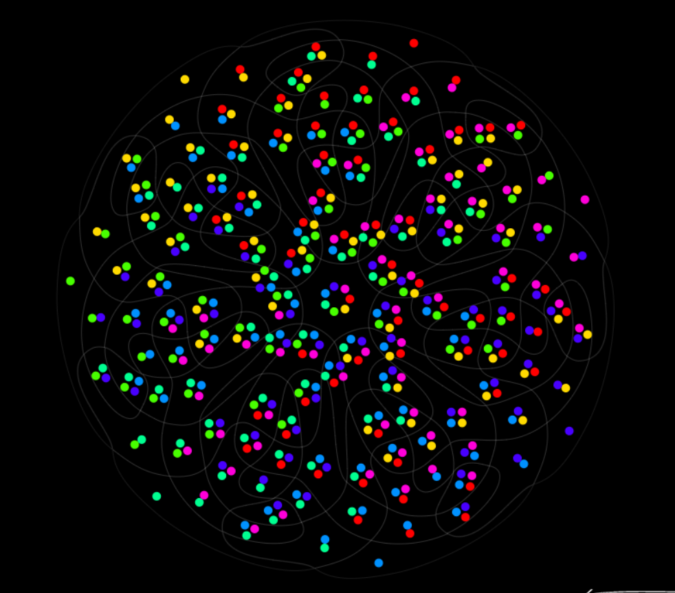
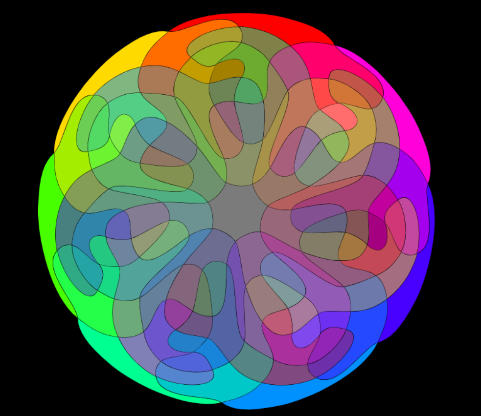
7 Sets Venn Diagram is a creative visual by Santiago Ortiz that replicates the color wheel in a way that represents different mixtures of colors. He was inspired by Newton’s theories on light and color spectrum and used the actual colors instead of numbers. Ortiz created the wheel so that on Side A, there are little circles that when you hover your mouse over the names of the colors appear in the bottom. On Side B, the mandala consists more of filled in sections, but similarly has the names of the hues shown after you hover over the color.
Santiago Ortiz is the Head at Moebio Labs which consists of data visualization developers and designers. Ortiz also specializes in interactive information visualization which this project is an example of the type of work he may do in that field.
//Carly Sacco
//Section C
//csacco@andrew.cmu.edu
//Project 07 - Composition with Curves

var points = 200 //number of points
// for an episprial this will be sections
//the equation for an epispiral
//r = a sec (ntheta)
function setup() {
	createCanvas(480, 480);
}

function draw() {
	background(186, 112, 141);
	//calling the curve functions
	drawCraniodCurve1();
	drawCraniodCurve2();
}

function drawCraniodCurve1() {
var x;
var y;
var r;
var a = map(mouseX, 0, width, 0, width / 2); //makes the first epispiral relate to mouseX
var c = map(mouseY, 0, height, 0, height / 2); //makes the second epispiral relate to mouseY
var b = a / 5;
var p = 100;
var theta;

	//calling the curve functions to be drawn
	push();
	translate(width / 2, height / 2);
	fill(158, 200, 222); //blue
	beginShape();
	for (var i = 0; i < points; i += 1) {
		theta = map(i, 0, points, 0, TWO_PI);
		r = (a * (1 / cos((i + points) * theta))) //epispiral equation
		x = r * cos(theta);
		y = r * sin(theta);
		vertex(x, y);
	}
	endShape(CLOSE);
	pop();
}

function drawCraniodCurve2() {
	push();
	translate(width / 2, height / 2);
	fill(255, 77, 77); //red
	beginShape();
	for (var i = 0; i < points; i += 1) {
		var c = map(mouseY, 0, height, 0, height / 2);
		theta = map(i, 0, points, 0, TWO_PI);
		r = (c * (1 / cos((i + points) * theta))) //epispiral equation
		x = r * cos(theta);
		y = r * sin(theta);
		vertex(x, y);
	}
	endShape(CLOSE);
	pop();
}
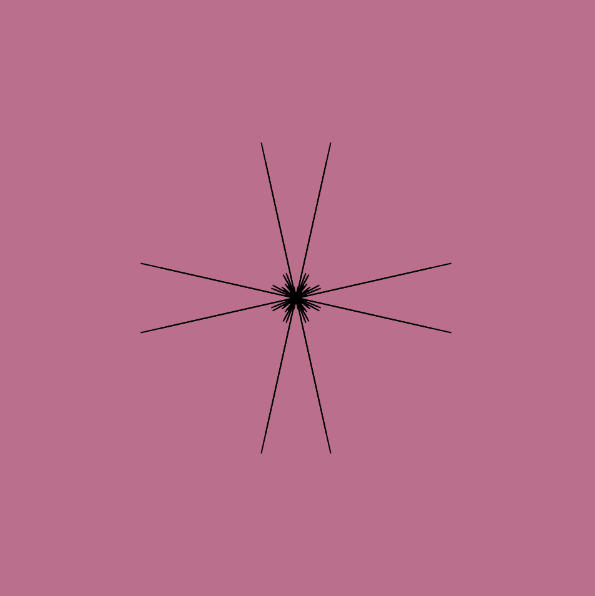
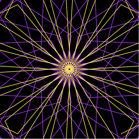
For this project, I at first was trying to create an image more similar to a typical spirograph. However, after choosing to work with the epispiral, I liked how it almost looked like shattered glass. It reminded me of a comic strips and when an action was done there would be action bubbles. I then chose to animate it similarly to a “POW” action that could be drawn in the comics. Therefore, I overlayed the original epispiral with another with colors that could seem comic book like.
/*Katrina Hu
15104-C
kfh@andrew.emu.edu
Project-07*/

var nPoints = 100;

function setup() {
    createCanvas(480, 480);
    background(0);
}

function draw() {
    push();
    translate(width/2, height/2);
    drawHypotrochoid();
    drawAstroid();
    pop();

}

function drawHypotrochoid() {
    var x;
    var y;
    //mouse used to change color
    var r = constrain(mouseX, 0, 255);
    var g = constrain(mouseY, 0, 255);
    var b = constrain(mouseY, 200, 255);
    //stroke appearance
    stroke(r, g, b);
    strokeWeight(1);
    noFill();
    //hypotrochoid equation
    var a = map(mouseX, 0, 600, 0, 300);
    var b = 10
    var h = map(mouseY, 0, 600, 2, 105);
    beginShape();
    for (var i = 0; i < nPoints; i++ ) {
        var angle1 = map(i, 0, nPoints, 0, TWO_PI);
        //equation of hypotrochoid
        x = (a - b) * cos(angle1) + h * cos((a - b) * (angle1 / b));
        y = (a - b) * sin(angle1) - h * sin((a - b) * (angle1 / b));
        vertex(x, y);
    }

  endShape();
}

function drawAstroid() {
    //mouse used to change color
    var r = constrain(mouseX, 200, 255);
    var g = constrain(255, mouseY/4, 50);
    var b = constrain(mouseY, 200, 255);
    //stroke appearance
    stroke(r, g, b);
    strokeWeight(2);
    noFill();
    //asteroid equation
    var a = int(map(mouseX, 0, width, 4, 10));
    var b = int(map(mouseX, 0, width, 0, 100));
    beginShape();
    for (var i = 0; i < nPoints; i++){
        angle1 = map(i, 0, nPoints, 0, TWO_PI);
        //equation of Astroid
        x = (b / a) * ((a - 1) * cos(angle1) + cos((a - 1) * angle1));
        y = (b / a) * ((a - 1) * sin(angle1) - sin((a - 1) * angle1));
        vertex(x,y);
    }
    endShape();

}
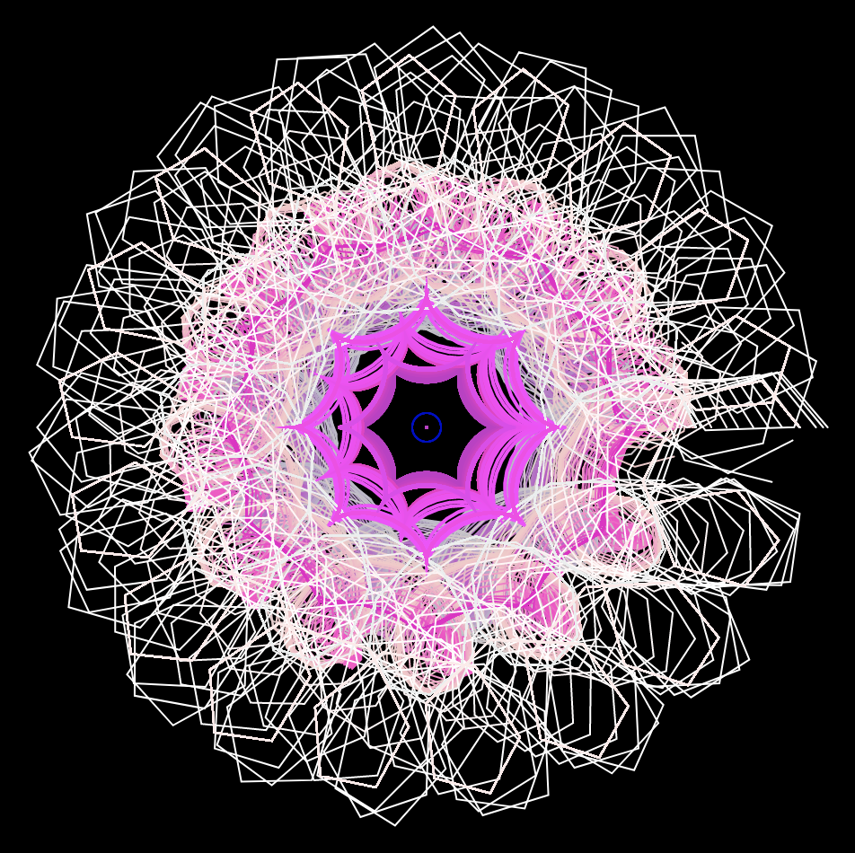
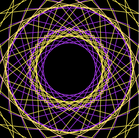
In my project I used a Hypotrochoid and an Asteroid. I decided to use my mouse to play around with the RGB values, which change depending on mouseX and mouseY. The project has a large Hypotrochoid on the outside with the Asteroid on the inside.
I decided to let it draw over itself, as it adds more curves when you move the mouse. I thought it added a cool layering effect where you could see all the colors on top of one another.
Overall, the project was fun to do as I learned a lot about experimenting with the different curves and parametric equations.
The starting Hypotrochoid curveThe curve layered over itself
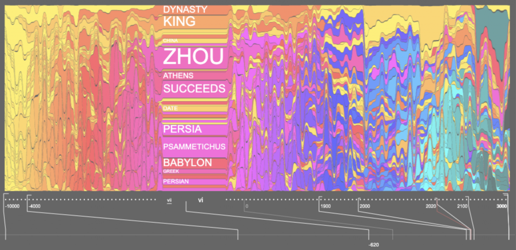
I chose Santiago Ortiz’s “History Words Flow” because I found the way he represented the data really intriguing and visually captivating. He represents the words found in Wikipedia articles about different time periods. In a video, he talks about the way he chose to represent the words. He uses scale and color to indicate the frequency and type of word, and arranges these words on a timeline that looks like melting or flowing paint. Moreover, the information is not absorbable at once glance. The viewer must scroll through the timeline in order to parse through and view each of the most common words at a single point in history. I liked this project because it was an interested concept executed in a creative and unique way.
// Nawon Choi
// nawonc@andrew.cmu.edu
// Section C
// Project 07 Composition with Curves

// number of points
var np = 100;

function setup() {
    createCanvas(400, 400);
}

function draw() {
    background("black");

    stroke("#f7fad2");
    noFill();
    strokeWeight(2);

    // center the curves
    push();
    translate(200, 200);
    drawHypocycloid(100);

    // color of second curve depends on mouseX
    fill(255, 200, mouseX);
    drawHypocycloid(-200);
    pop();
}


// http://mathworld.wolfram.com/HypocycloidEvolute.html
function drawHypocycloid(xy) {
    var x;
    var y;
    var a = xy;
    var b = mouseY;

    beginShape();
    for (var i = 0; i < np; i++) {
        var t = map(i, 50, np, 50, TWO_PI);

        var one = a / (a - 2 * b);

        x = one * ((a - b) * cos(t) - b * cos(((a - b) / b) * t));
        y = one * ((a - b) * sin(t) + b * sin(((a - b) / b) * t));

        vertex(x, y);
    }
    endShape();
}
For this project, I chose to draw a curve called Hypocycloid Evolute. It was fun playing around by plugging in different variables at different points and seeing how it affects the shape. I eventually decided on having one of the variables, b, be dependent on the y-position of the mouse. I originally drew one curve, but decided to add another one to create depth. I drew another, larger curve and filled in the shape to create different flower-esque shapes as a result. I really enjoyed seeing how the changing colors and varying number of edges and angles created significantly different images with a single curve.
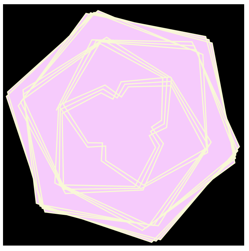
/*
Joanne Chui
Section C
Project 6
*/

var nPoints = 200;

function setup(){
  createCanvas(400,400);
  frameRate(10);
}

function draw(){
  background(227, 127, 190);
  stroke(227, 175, 127);
  spirograph();
  push();
  translate(200, 200);
  for(var a = 0; a < 5; a++){
    rotate(a * PI/2);
    strokeWeight(3);
    spirograph();
  }
  pop();

}

function spirograph(){
  var x = constrain(mouseX, 0, width);
  var y = constrain(mouseY, 0, height);
  var r = 40;
  var s = 100;

  push();
  translate(200, 200);
  beginShape();
  noFill();
  for(i = 0; i<nPoints; i++){
    var t = map(i, 0, nPoints, 0, 5*TWO_PI);
    x = (s - r)*cos(r*t/s) + i*(mouseX/100)*cos((1 - r/s)*t);
    y = (s - r)*sin(r*t/s) + i*(mouseX/100)*sin((1 - r/s)*t);
    vertex(x, y);
  }
  endShape(CLOSE);
  pop();
}
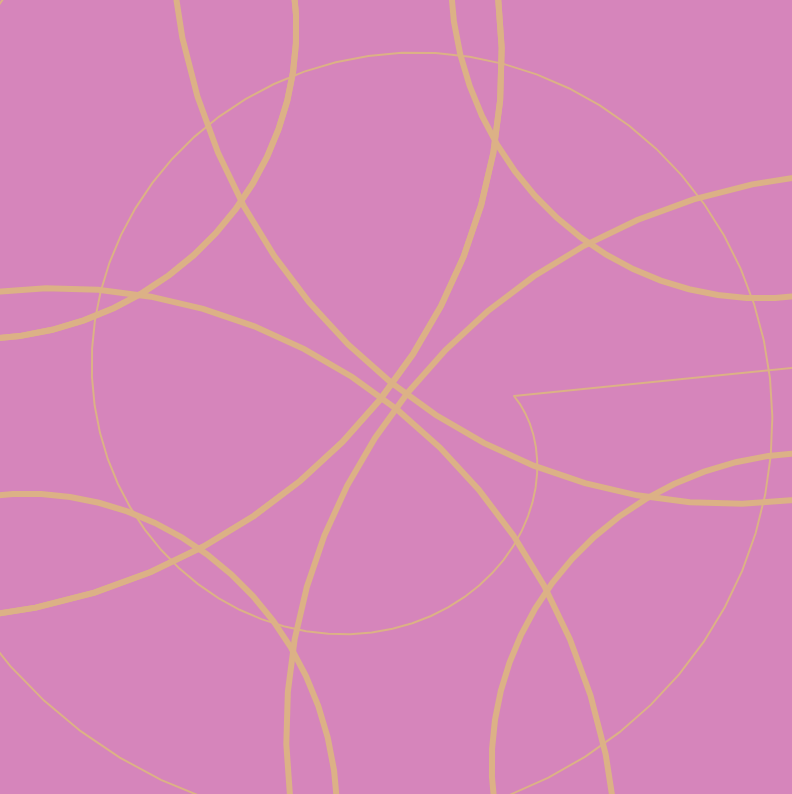
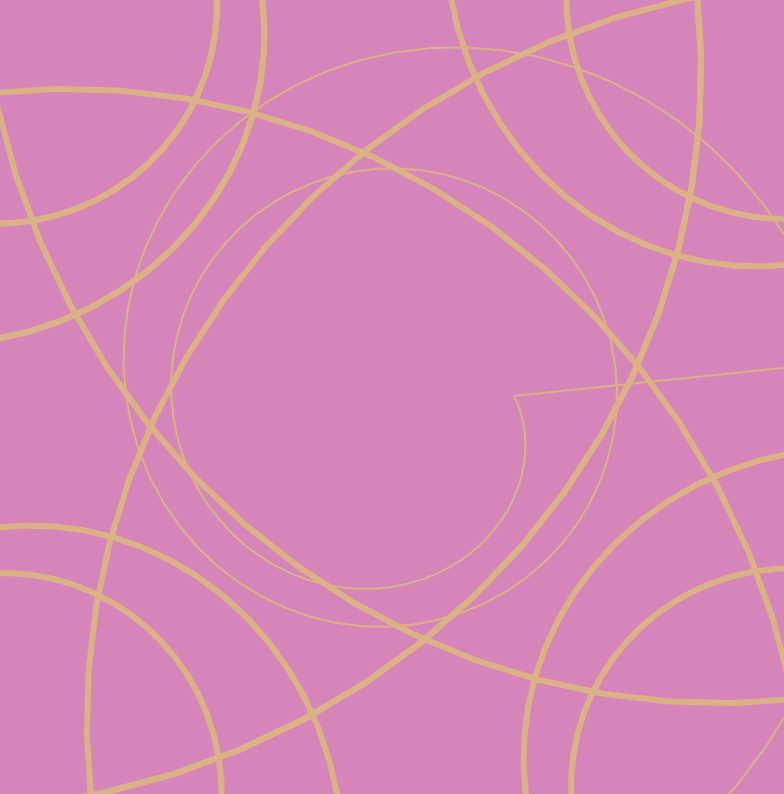
I made the original curve visible so that when a pattern is generated on the screen you can see where the pattern is derived from. I also liked the look of fewer lines so that the pattern seems more abstract.
Nicholas Felton is both a designer and artist who transcribes numbers into something more meaningful whether it is an object or experience. One of the projects that I was interested was his collaboration with MoMa Store and art screen company Framed. They were using a year of data to come up with an app called BikeCycle.
The app visualizes a year of data in New York’s bike sharing program CitiBike focusing mainly into five different aspects. 1) Activity 2) popular routes 3)stations 4)bikes and 5)cyclist demographics.
I was mainly drawn by this project because I was interested in how bike rental apps developed over the course of the year. This project was done and released back in 2015, and obviously there are many more apps like this today. I was surprised to find how this app looks very similar that of today but also perhaps more artistic. It’s hard to know more about the specific algorithm behind the project but I could still read the creator’s artistic sensibilities.
/* Kimberlyn Cho
Section C
ycho2@andrew.cmu.edu
Project-07 */

function setup() {
	createCanvas(480, 480);
};

function draw() {
	push();
	background(0);
	strokeWeight(2);
	noFill();
	translate(width / 2, height / 2);
	stroke(188, 19, 254);
	drawHypotrochoidCurve();
	stroke(250, 237, 39)
	drawEpitrochoidCurve();
	pop();
};

//Hypotrochoid Curve
function drawHypotrochoidCurve() {
	//http://mathworld.wolfram.com/Hypotrochoid.html

	//equations
	var x;
	var y;

	//parameters to control curve
	var a = map(mouseX, 0, width, 0, 200)
	var b = a / 20
	//curve radius
	var h = map(mouseY, 0, height, 0, 200)

	//drawing curve
	push();
	beginShape();
	for (var i = 0; i < 100; i ++) {
		var t = map(i, 0, 100, 0, TWO_PI)
		x = (a - b) * cos(t) + h * cos(((a - b) / b) * t)
		y = (a - b) * sin(t) - h * sin(((a - b) / b) * t)
		vertex(x, y)
	};
	endShape();
	pop();
}

//Epitrochoid Curve
function drawEpitrochoidCurve() {
	//http://mathworld.wolfram.com/Epitrochoid.html

	//equations
	var x;
	var y;

	//parameters to control curve
	var a = map(mouseX, 0, width, 0, 250)
	var b = a / 20
	//curve radius
	var h = map(mouseY, 0, height, 0, 250)

	//drawing curve
	push();
	beginShape();
	for (var i = 0; i < 100; i ++) {
		var t = map(i, 0, 100, 0, TWO_PI)
		x = (a + b) * cos(t) - h * cos(((a + b) / b) * t)
		y = (a + b) * sin(t) - h * sin(((a + b) / b) * t)
		vertex(x, y)
	};
	endShape();
	pop();
}
I found the flexibility of this project to be fun in the multitude of possible outcomes it allowed for even with the same kind of curves. The initial exploration of the various equations and curves was interesting– especially in discovering cool, interesting shapes or curves with just math equations. Although the complex equations were intimidating in my first approach to the project, it was pretty amusing to see how the curves reacted to changes in the different parameters. I chose to layer two different types of curves to create an illusion of depth and overlap. Overall, I enjoyed this project and think it was a great introduction to a mathematical approach to design through p5js.
Phantom Terrains by Stefanie Posavec, Frank Swain and DanielJones
This week, I read about the work of Stefanie Posavec in Information Visualization. In her case, she used the silent wireless signals that surround us, converted into a sound that can be heard through specially modified hearing aids. She created a system of visualizing the wireless signals as they were heard on walks around London.
Stefanie describes this as an “experimental platform which aims to answer this question by translating the characteristics of wireless networks into sound”. I find the graphic not only very interesting but find the premise in which it was derived interesting as well. She essentially brings a sonic ambiance into a visual resolution, creating a conversation about what else can we not visualize but can represent it through information visualization.
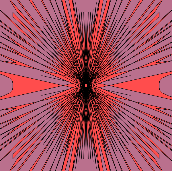
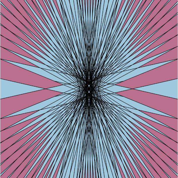
//Jai Sawkar
//Section C
//jsawkar@andrew.cmu.edu
//Project 07: Abstract Clock

function setup() {
    createCanvas(480, 480);
    frameRate(60);
}

var pts = 200;

function draw(){
    background(0);

    // using push & pull to orient the Bicorn
    push()
    translate(width/2, height/2) //center focused
    drawCurve();
    pop();

    push();
    rotate(PI);  //upside down
    translate(-width/2, -height/2);
    drawCurve();
    pop();

    push();
        rotate(PI/2); // clokcwise
        translate(width/2, -height/2)
    drawCurve();
    pop();

    push();
    rotate(-PI/2); //counter clockwise
        translate(-width/2, height/2)
    drawCurve();
    pop();

}

function drawCurve(){

    //fill(255)
    noFill();
    stroke(255)
    //noStroke();
    var g = map(mouseX, 0, width, 0, width/2); //moving the parameters of mouse x
    var g = map(sq(mouseY), 0, height, 0, 1); //moving parameters of mouse y

    beginShape();
        for (i = 0; i < pts; i++){
            var j = map(i, 0, pts, 0, radians(360));
            x = g * sin(j); //forumla
            y = (g * cos(j) * cos(j) * (2+ cos(j))) / (3 + sin(j) * sin(j)); //formula
            var w = map(mouseX, 0, height, 1, 70) //remapping width
            var h = map(mouseY, 0, width, 1, 60) //remapping heigth
            ellipse(x, y, w, h); //ellipse
        }
        endShape(CLOSE);
}
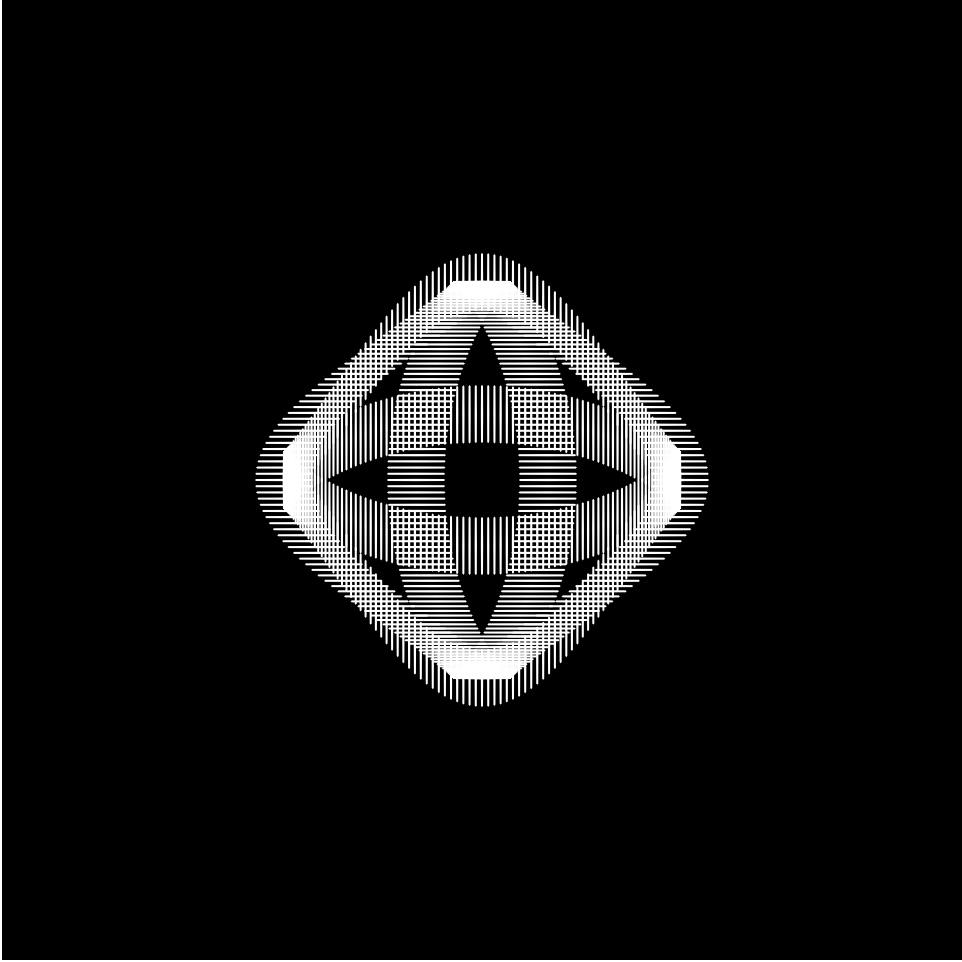
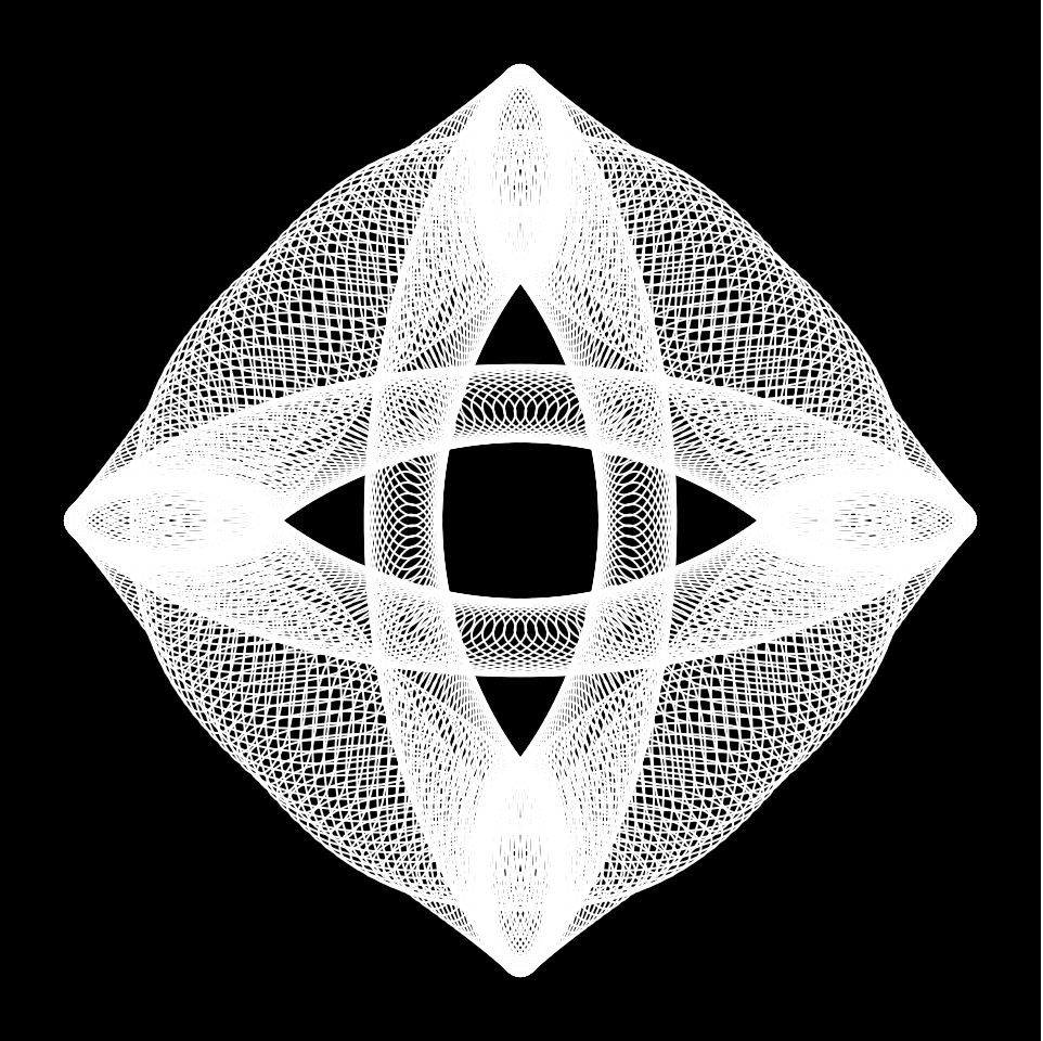
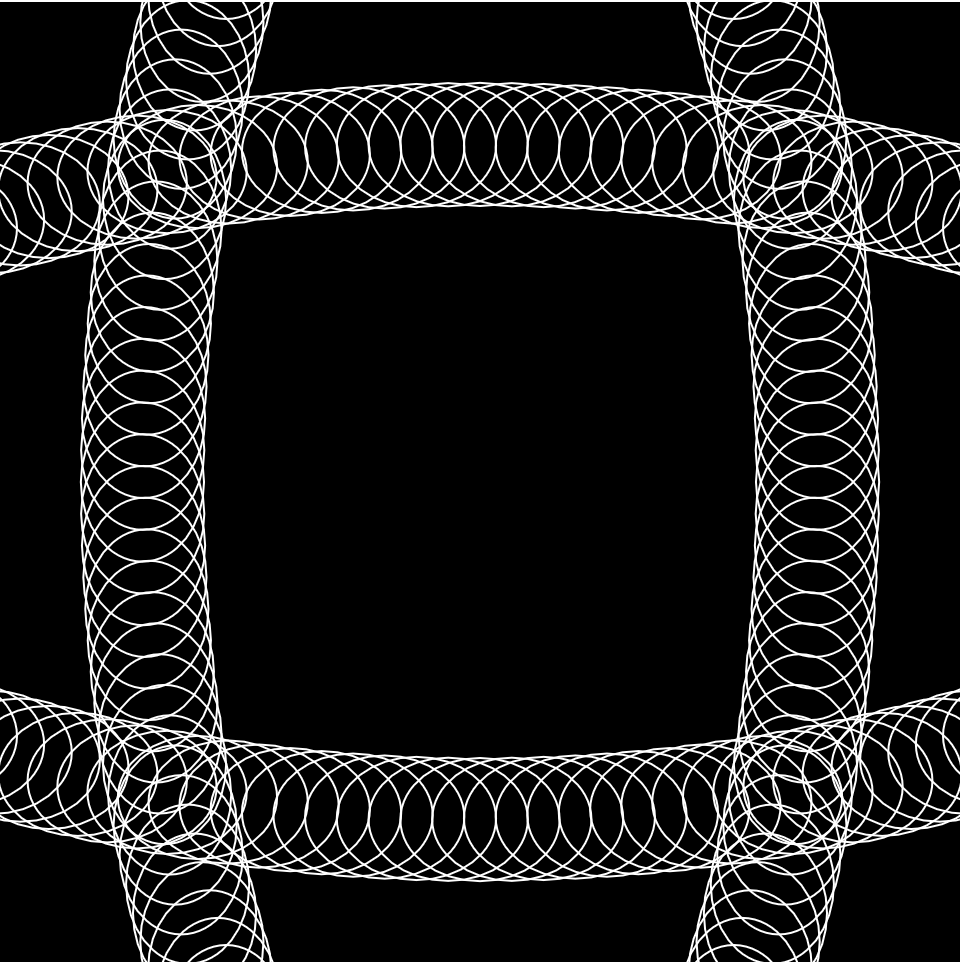
For this project, I found the Bicornal Curve interesting, so I decided to explore its possibilities. Once I drew it using the math equation provided, I found it a tad dull. I then decided to create 3 more, creating 4 bicornal curves
![[OLD FALL 2019] 15-104 • Introduction to Computing for Creative Practice](../../../../wp-content/uploads/2020/08/stop-banner.png)