Red Shoes is a Korean animation movie that was released in July 25, 2019. This movie is so far titled as the most quality animation ever made in Korea, and the reason behind this is from the movie’s character designer, Sangjin Kim. Sangjin Kim worked in Disney the past few years and was once responsible for designing characters in the world’s most representative animation, Frozen. For this reason, we can clearly see Kim’s artistic sensibilities in the movie, in other words, we can see how similar the characters of Red Shoes and Frozen look alike. Not only that, but there were people in the production crew who worked for DreamWorks as well, making people proudly announce the animation to be made by the most skilled, influential people in Korean animation history. As a Korean and as a design major student, I admire this work so much because of its quality 3d computer graphic techniques applied to the movie. In the actual movie, audiences are able to see many detailed computer graphics applied. Also, the characters of the movie themselves are designed exquisitely that the 3d computer graphics in the movie are nearly flawless. According to Sangjin Kim, his dream was to collaborate with Korean animators as a Korean himself. He wanted to create a major work in Korean animation industry and show people that Korea can also create quality 3d animations as well. I can really see how much time and work he has spent to create this animation just by watching the movie from the beginning to the end, which makes me admire this work even more.
Category: SectionD
Monica Chang – Looking Outwards – 05
Instagram: universaleverything.
Website: Universal Everything
Universal Everything is a digital art and design collection based in Sheffield, England founded by creative director Matt Pyke. Most of their projects incorporate combine technology and humanities in hopes to also utilize the viewers’ sensations and participation. They gather a group of video artists, experience designers and future thinkers to bring a variety of artwork that allows the observers to witness immersive installations, exotic architecture and huge launch events.
I chose to talk about these two pieces created by UniversalEverything because they both pertained to the idea of immersive installations which is something that I have always been interested in trying. Not only are the visuals absolutely spectacular but the calculations and the concept put into the work is astounding.
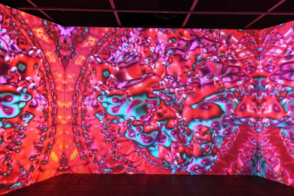
The first piece is called “Future You” and its this video installation that computes the viewer’s movements into something so beautifully mapped and structured. The fluidity of this digital movement was what drew me towards this project as I know that for smooth movement in a digital piece like this requires an insane amount of calculations and observation to conclude with a smooth representation.
The second piece called “Inside the Sound” was a piece where the designers explored the idea of the audiovisual “synaesthetic experience”. This child-like experience becomes elevated when the designers utilized this visual to create a virtual reality; this offers so many inspiration to artists working towards a digital field of vision and audio in their future. The colors and the design were exquisitely drawn and I will absolutely have this piece in mind as I think of digital and computational works.
I admire the integration of interaction and aesthetics and both projects really displayed both ideas seamlessly.
Sammie Kim–Project-05-Wallpaper
//Sammie Kim
//Section D
//sammiek@andrew.cmu.edu
//Project 05 - Wallpaper
function setup() {
createCanvas(600, 480);
background("black");
}
//Calling pattern function in consistent intervals by using for loop
function draw() {
for (var x = 0; x < width + 50; x += 100) {
for (var y = 0; y < height + 50; y += 70) {
pattern(x + 50, y + 30);
}
}
}
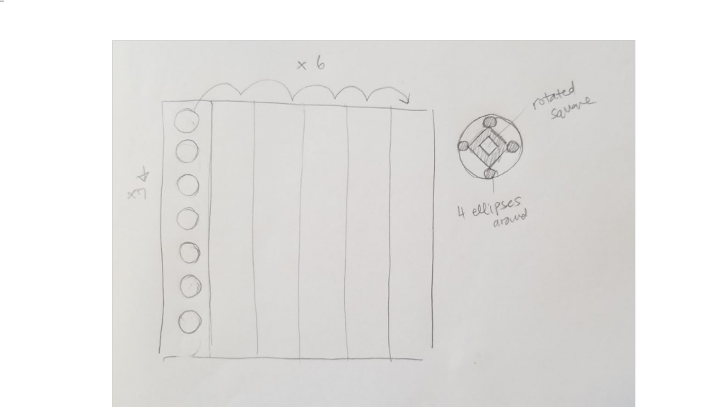
function pattern(x, y){
//variables controlling each shape's size
var size = 50;
var smallSize = 15;
var rectSize = 30;
noStroke();
//pink ellipse
fill("pink");
ellipse(x, y, size, size);
rectMode(CENTER);
//rotated center black square to make diamond shape
push();
translate(x, y)
rotate(radians(45));
fill("black");
rect(0, 0, rectSize, rectSize);
pop();
//inner red diamond inside the black diamond
push();
translate(x, y)
rotate(radians(45));
fill(255, 125, 122);
rect(0, 0, size * 0.3, size * 0.3);
pop();
//tiny left black ellipse
fill("black");
ellipse(x - 20, y, smallSize, smallSize);
//tiny top black ellipse
fill("black");
ellipse(x, y - 20, smallSize, smallSize);
//tiny right black ellipse
fill("black");
ellipse(x + 20, y, smallSize, smallSize);
//tiny bottom black ellipse
fill("black");
ellipse(x, y + 20, smallSize, smallSize);
//vertical white lines
stroke("white");
line(x + 50, 0, x + 50, height);
}
This project combined the materials I have learned so far in lecture regarding for loop and calling a function. I first created the pattern drawing of circles and squares as function “pattern” which I then embedded in the for loop to create repetition. Once again I realized how much more efficient it is to use this for loop rather than drawing all these elements numerous times.
Ian Kaneko Project-05 Wallpaper
var sx = 100; // Horizontal position of first column center
var dH = 50; // Height of diamonds
var dW = 50; // Width from center of diamond to outside edge
function setup(){
createCanvas(600, 600);
}
function draw() {
background(250, 230, 230);
noStroke();
fill(230, 100, 100);
for (var a = 0; a < 3; a ++) { // Creates small circles behind the diamonds
for (var b = 0; b < 12; b ++) {
ellipse(sx + 200 * a, (dH / 2) + (dH * b), dW, dH);
}
}
// This creates 3 columns of diamonds
for (var x = 0; x < 3; x ++) {
for (var y = 0; y < 12; y ++) {
fill(25 * y, 150, 220);
quad(sx + 200 * x, dH * y, sx - dW + (200 * x),
dH / 2 + dH * y, sx + 200 * x, dH + dH * y,
sx + dW + (200 * x), dH / 2 + dH * y);
}
}
rectMode(CENTER);
for (var z = 0; z < 4; z ++) { // 4 pink stripes
rect(z * 200, 0, 50, height * 2);
}
for (var c = 0; c < 4; c ++) { // This creates the lumpy bubble pattern
for (var d = 0; d < 30; d ++) {
fill(220, 100, 15 * d);
circle(c * 200, d * 25, 30);
}
}
noLoop();
}
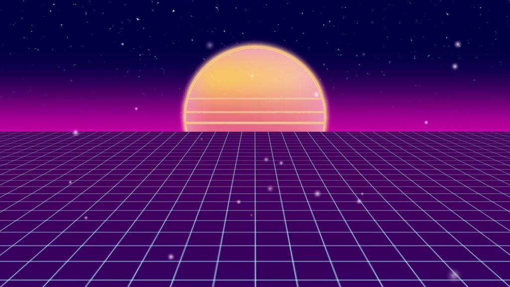
For this project I was very inspired by the colors of the vaporwave backgrounds. I wanted to keep my design very vertical in nature, so I opted out of creating anything that draws the eyes horizontally. While the background color stays the same, the gradient of the diamonds can sometimes trick the eyes into seeing the lower half of the design as lighter.
Sarah Choi – Looking Outwards – 05
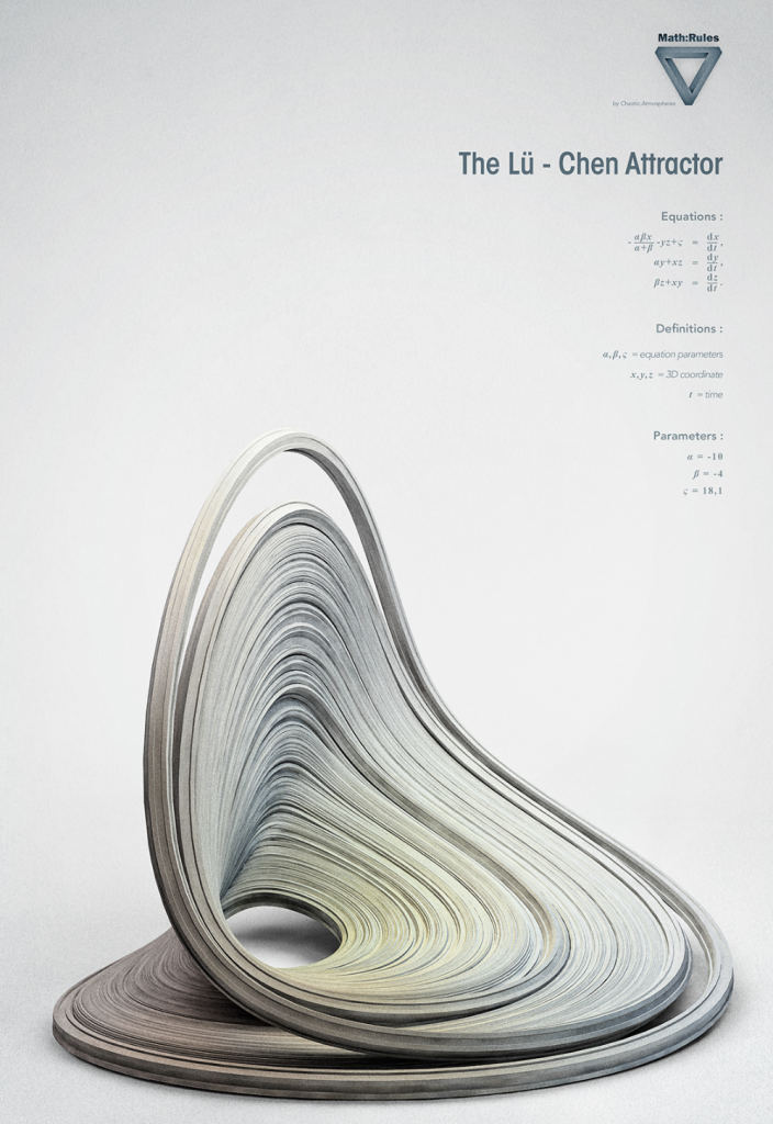
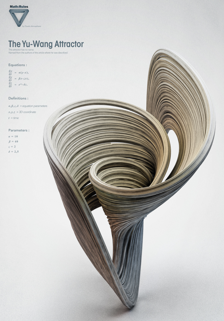
Chaotic Atmospheres, also known as Istvan, is a freelance digital artist based in Switzerland. He created a series of pictures called “Math:Rules – Strange Attractors” showcasing his interpretation of math with different shapes on a white background, showing various equations, definitions, and parameters for each shape. I admired the time and effort he wanted to show a field that was so computational with art. A background as a graphic designer in Paris for fashion, his passion is to tell stories with different forms of art, especially photography. Although admitting he wasn’t a mathematician, he studied “strange attractors” for their dynamic forms and feel of chaos, which is what he wanted to portray in this project. The algorithms he used was with Cinema 4D plugins that helped him configure the shapes.
His final product was able to portray the beauty of mathematics with beautiful and crazy art forms.
Raymond Pai-Looking Outwards-05
Henry Vargas is a 3D illustrator based in Vancouver. He makes 3D computer models of characters from popular shows and adjusts to lighting and background to render a final, 2D print. His style is clear with a matte plastic finish on all of his models. The lighting is often soft, with sharp reflections on certain body parts of the renders to show different materials.
Many of his illustrations are based on characters from video games, but they are only illustrations. His work is likely created in Cinema 4D, as they aren’t created for interaction, which might be done in Unity software instead. Cinema 4D allows for precise textures and lighting, which Vargas uses to express his artistic style.
More of his work can be found here:
Sammie Kim-Looking Outward-05
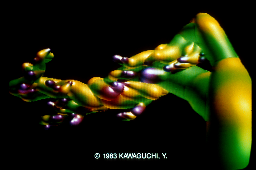
The Japanese computer graphic artist Yoichiro Kawaguchi was the first to build 3D computer generated images based on math and algorithms during the 1980s. He developed the course of image making, incorporating movements, realistic volumes, and high quality textures into his digital art. Kawaguchi calls this the “growth model,” a “self organizing, formative algorithm for computationally reproducing branches or cell divisions.” This specific artwork called Growth: Mysterious Galaxy was created in 1983, and it utilizes two essential techniques of ray tracing and metaballs. Ray tracing is an optical technique for calculating the luminance of each pixel, which defines the color to provide depth in the 3D image. I was particularly attracted to this piece due to its poppy and vivid colors and how the elements have such smooth and voluminous curves. As such, the recurring theme of his work is morphogenesis, reflecting on the principles of organic change and evolution—morphing the biological concept to create an artificial art piece. When creating his art, he has a step by step process, starting with black and white geometric shapes and then allowing computer commands to evolve them into more complex and unknown figures.
Raymond Pai-Project-05
//Raymond Pai
//Section D
//rpai@andrew.cmu.edu
//Project-05
function setup() {
createCanvas(400, 400);
}
function draw() {
background(200, 150, 160);
fill('yellow');
for (var y = 7; y < height - 5; y += 30) {
drawRow(y, 30);
}
}
function drawRow(y, spacing) {
spacing = max(2, spacing);
for (var x = 7; x < width - 5; x += spacing) {
strokeWeight(0);
fill(y, x + 50, x + 100);
rect(x, y, 25, 25);
}
}
I wanted to make a tile wallpaper that resembled the walls of a shower from the 90’s, with more contemporary colors.
Kristine Kim – Looking Outwards -05
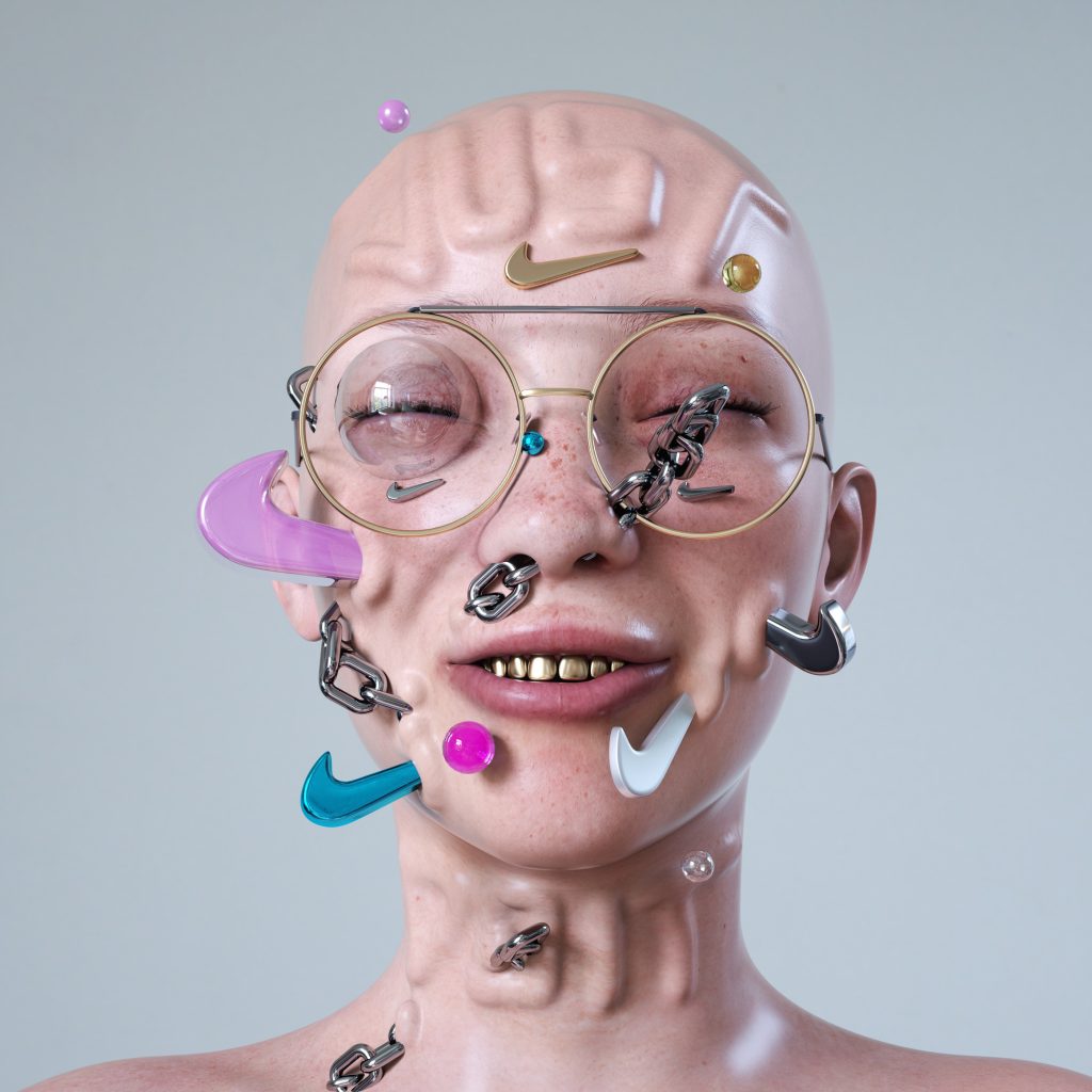
Antoni Tudisco is a German 3D artist and motion designer. The artist never revealed his technique and process behind his works. I can only assume that he uses already developed softwares like adobe creative cloud but I am also so interested and confused on how he creates all these hyper realistic textures with such limitation (computer generated). He creates many commercial arts and works for big companies. I was drawn into this piece because of his usage of collaborating realistic textures and abstract illustration together. The way Tudisco renders his 3D works and motion graphics is very unique and complex. The vibrancy and extremely abstract imagery helps Antoni Tudisco build his style and his pieces only work because it is computer generated and all done on a device. I admire Antoni Tudisco because of the endless amount of 3D works and motion graphics he produces with just a computer.
Lanna Lang – Project 05 – Wallpaper
//Lanna Lang
//Section D
//lannal@andrew.cmu.edu
//Project 05-Wallpaper
function setup() {
createCanvas(590, 480);
//navy blue for right quad
//that peeks out
background('#25363e');
}
function draw() {
//left triangle
//repeat every 100 pixels down the canvas
for (var y = 0; y < height; y += 100) {
//repeat every 60 pixels across the canvas
for (var x = 0; x < width; x += 60) {
//fill with lighter brown
fill('#af9477');
triangle(x, y, x + 30, y + 20, x, y + 40);
}
}
//right triangle
//repeat every 100 pixels down the canvas
//
for (var y = 0; y < height; y += 100) {
//repeat every 60 pixels across the canvas
//with additional 50 pixels off screen
for (var x = 60; x < width + 50; x += 60) {
//fill with darker brown
fill('#7e5535');
triangle(x, y, x - 30, y + 20, x, y + 40);
}
}
//center quad
//repeat every 100 pixels down the canvas
for (var y = 20; y < height; y += 100) {
//repeat every 60 pixels across the canvas
for (var x = 30; x < width; x += 60) {
//fill with cream color
fill('#fbe8bd');
quad(x, y, x + 30, y + 20, x, y + 40, x - 30, y + 20);
}
}
//lower left quad
//repeat every 100 pixels down the canvas
for (var y = -60; y < height; y += 100) {
//repeat every 60 pixels across the canvas
for (var x =0; x < width; x += 60) {
//fill with ochre color
fill('#dcae56');
quad(x, y, x + 30, y + 20, x + 30, y + 80, x, y + 60);
}
}
noLoop();
}
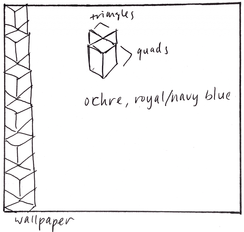
I wanted my wallpaper to be more geometric and include a bold, aesthetic color palette, but I didn’t want it to be a simple geometric design. I came up with this design that combined triangles and quadrilaterals, and that combination of shapes was the repeated image. I love the combination of ochre and blue, so I decided to revolve my palette around those two. This code relies solely on math and how the coordinates of each shape correlate with one another.