Mihika Bansal – Looking Outwards – 07

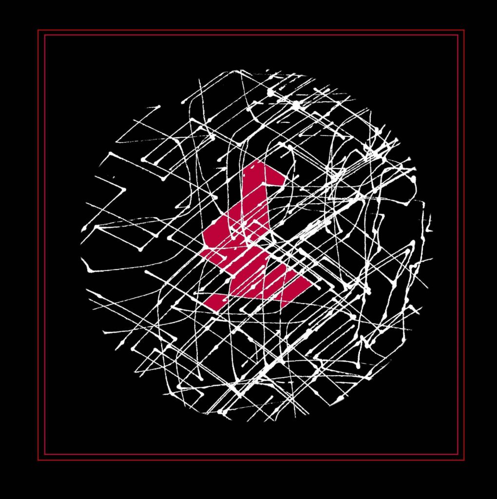
For this assignment, I analyzed the project, The Hindu Temple as a Fractal of Cosmology. This is a study of recursion within architecture. The article that I am looking at specifically is looking at the patterns that the architectures of these spaces have used when making these spaces.

Specifically the author of this article comments that the manner in which these temples is using the fundamentals of parametric architecture. They use a system called “Tala” which allow them to compute dimensional analysis of proportions. The way the recursion works in verbal times is expressed through this quote:

The layer of prahara (projection) will be above the chadya (eave of the roof). This is to be repeated again and again on the spire over the spire. A fraction of the prahara is to be constructed and again the spires are to be constructed. Each of the upper spires will be sprouted out with a measurement equal to half the size of the lower spire – Ksirarnava, 7.113

Indian Temple Fractals
An example of the temple in its recursive state

Link to post: https://www.dataisnature.com/?p=2138

Jamie Park – Looking Outwards 07

Studio NAND’s Emoto (2012)

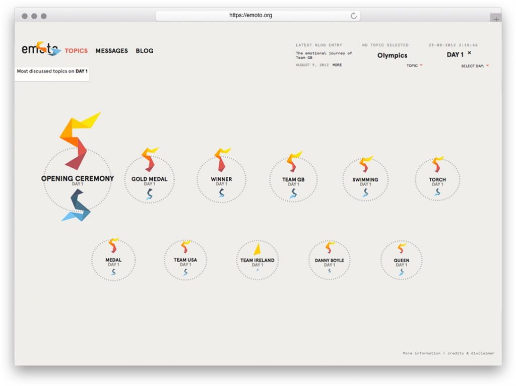
I was deeply inspired by Studio NAND’s Emoto, a data visualization for the 2012 London Olympics. This KANTAR-Information is Beautiful Awards winner collected responses to the Olympics through Twitter. The collected data was then used to determine the collective sentiment on individual topics, such as events, players, and teams. Unfortunately, the studio’s website does not specify which algorithm the team used to organize the data. I think it is really interesting that the studio decided to generate visuals using Twitter, and I am curious if they ever looked into other social media, such as Facebook or Instagram, for responses.

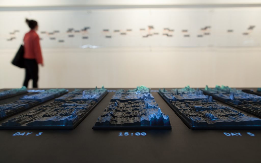
The studio also created a physical installation of the data that represents all responses over time with overplayed information from posted Tweets. I am, again, curious to know if the team had drafts of their installation before creating the data. The way they have represented the data is very particular, and I would like to know their thought process before designing it.

Caroline Song-Looking Outwards-07

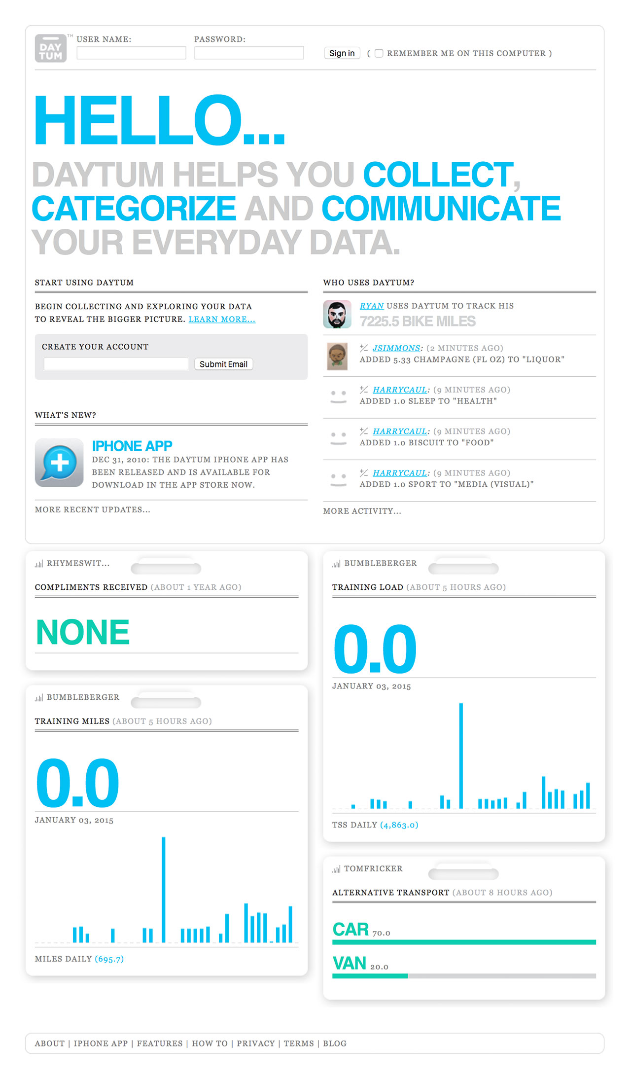
Created by Nicholas Felton and Ryan Case in 2008, Daytum is a web application, as well as a phone app, developed to allow users to quickly capture any personal data and share that information with others. It communicates such information through custom chosen data visualizations, charts, as well as different colors to represent the user’s desired information.

Image result for daytum
A look into the Daytum app’s functions by Nicholas Felton and Ryan Case

I’m intrigued by this app because of the functions. The purpose of it being to display absolutely any information the user wants is interesting. Furthermore, the way the information is displayed is also up to the user. I think I am intrigued by the app because it all depends on the user and therefore, the way people use it will vary from user to user. I find it interesting that even though the app will still look coherent overall, because the fonts and the style of the layout will probably stay the same, it is still personal/customizable for each person. It is interesting because Felton and Case seems to be playing with the idea of having his design be both coherent but distinguishable for each person.

Though I am not entirely sure of the algorithms that went into this work, I assume there were algorithms that changed the written information that the users put into the systems to a base format of visual information, and from there, the users decide what the visuals look like, which would change which algorithm the app was working with.

I see both Felton and Case’s artistic sensibilities come out through this app because both of them are passionate about the different ways written data can be visualized, and because this is the purpose of Daytum itself, the app existing even shows Felton and Case’s interest in this subject of design.

William Su – Looking Outwards – 06 – Section E

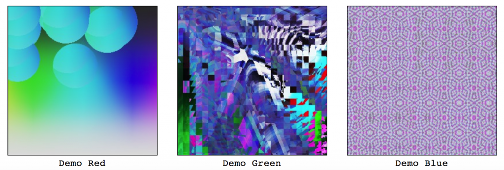
A sample from Random Art Generator. The program accepts the name of a picture and uses it as a seed from which a picture is generated randomly. The same name always yields the same picture.
http://www.random-art.org/about/

The Random Art Generator is a free to download python program which is why I was initially interested in this project as i’ve frequently used python for a lot of my work in the past. According to the site, the picture name is the seed and is used for a “random number generator” (nothing is truly random) which constructs a mathematical formula. The formula determines the color of each pixel in the picture. The same name always determines the same sequence of random choices, and consequently the same formula and the same picture.

I appreciate the thought of using a random number generator to create completely new and cool pieces of art. Although random number generators aren’t actually “random”, it just shows the endlessness of possibilities you can make with just a bunch of pixels and changing their colors.

William Su – Project 06 – Abstract Clock

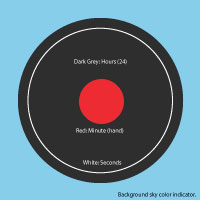
I used circles for time indicators. The circles “tick” larger as time passes and slowly fill the max size they could be. The background color also changes according to the time of day (morning, afternoon, evening).

sketch

// William Su
// Section E
// wsu1@andrew.cmu.edu
// Project 06

function setup() {
    createCanvas(480, 480);
}

//--------------------------
function draw() {
    background(255, 200, 200);
    noStroke();
    
    // Fetch the current time
    var H = hour();
    var M = minute();
    var S = second();
    
    // Compute the widths of the rectangles
    var mappedH = map(H, 0,23, 0,width - 50);
    var mappedM = map(M, 0,59, 0,width - 50);
    var mappedS = map(S, 0,59, 0,width - 50);

    if (H >= 6 & H <= 14) { //Change color of the background depending on time of day. (Morning, Afternoon, Evening)
      background('#87CEEB'); //morning sky blue
    } else if (H > 14 & H <= 17) {
      background('#fd5e53'); //afternoon sunset orange
    } else {
      background('black') //evening black
    }
    
    // Display the minutes and hours.
    fill('#2e2e2e');
    ellipse(width/2, height/2, mappedH, mappedH);
    fill('#ED2B33');
    ellipse(width/2, height/2, mappedM, mappedM);
    
    noFill(); //Second "hand"
    stroke(255);
    ellipse(width/2, height/2, mappedS, mappedS);
}

Margot Gersing- Looking Outwards-06

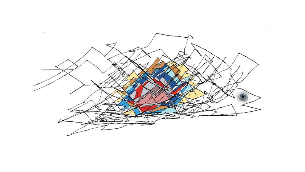
Fish or Bird?

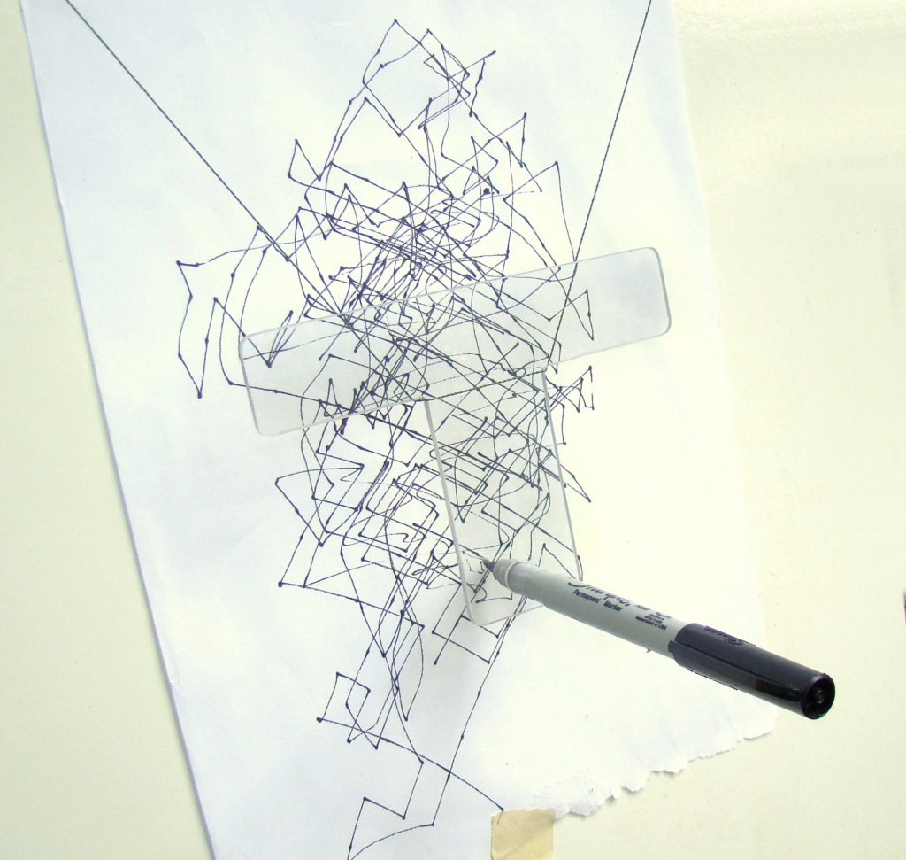
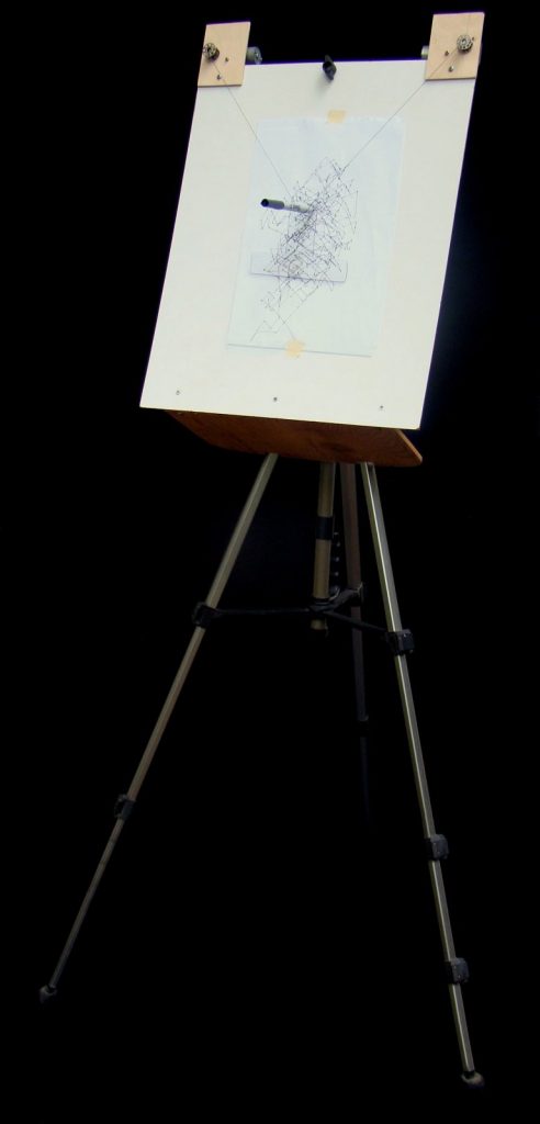
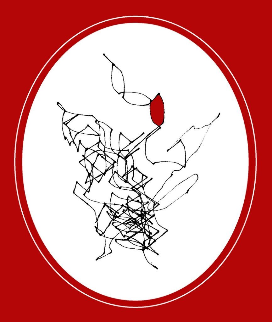
For this week I found this really fun project done by a man named Larry Cotton. He was is a power-tool designer and part-time community college math instructor. He was inspired by an article written by Charles Platt and Aaron Logue about a how to make a random number generator out of simple hardware that creates an unlimited amount of generated noises that could then be converted to high and low digital states. Larry Cotton, was inspired by this project and decided to use it to create abstract art. He took the RNG and made a drawing machine that used two motors to randomly control a pen.

Drawing machine with pen hooked up.
drawing machine

I love this project because of the hybrid digital and physical nature. It is so cool that the project came from a digital RGN, to physical hardware, to another machine (drawing robot) which makes physical mark making. In the final images, he also scanned them in digitally again to color and finish.

More drawings from Larry Cottons project
scanned in and colored

The other great part about this project is Larry lays out all the steps he did in an article so others can also do it.

Margot Gersing – Abstract Clock

mgersing-06

//Margot Gersing - Project 06 - mgersing@andrew.cmu.edu - Section E

function setup(){
    createCanvas(480, 480);
    angleMode(DEGREES);

}

function draw() {
    background(255, 237, 233);
    translate(width/1000, height); 
    rotate(270); // to start at top of screen

    //time variables
    var s = second();
    var m = minute();
    var h = hour() % 12;

    //outline of ellipse - mapped to reflect time
    var ah = map(h, 0, 12, 0, 360);
	var am = map(m, 0, 60, 0, 360);
	var as = map(s, 0, 60, 0, 360);

	//ellipse size - mapped to reflect time
    var eh = map(h, 0, 12, 300, 400);
	var em = map(m, 0, 60, 150, 250);
	var es = map(s, 0, 60, 10, 100);

	// ellipse - radius increase to reflect time
	noStroke();
	fill(255, 192, 44); //hour circle
    ellipse(width/2, height/2, eh, eh);
	fill(111, 163, 118); //minute circle
    ellipse(width/2, height/2, em, em);
    fill(246, 195, 203); //second circle
    ellipse(width/2, height/2, es, es);

    //outlines
    //seconds
    noFill();
    stroke(229, 56, 26);
    strokeWeight(5);
    arc(width/2, height/2, es, es, 0, as); //outline to reflect seconds passing
    
    //minutes
    noFill();
    stroke(14, 94, 67);
    strokeWeight(10);
    arc(width/2, height/2, em, em, 0, am); //outline to reflect minutes passing

    //hours
    noFill();
    stroke(255, 233, 105);
    strokeWeight(15);
    arc(width/2, height/2, eh, eh, 0, ah); //outline to reflect hour passing


}

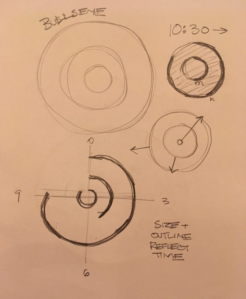
For this project I wanted to create a bullseye shape that reflected the time in two ways, the outline and the size. I tried to make each circle proportionally sized so that the hour is largest, and second is the smallest. The outline is a more obvious way of showing the time and the size of the circle is much more subtle especially when it comes to the minute and hours.

Charmaine Qiu – LookingOutwards – 06


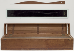
Image of the artwork “3 Standard Stoppages”

Marcel Duchamp was a French American artist who enjoyed the creation of conceptual art. He created an artwork in 1913-14 called “3 Standard Stoppages”. The artist dropped three meter long threads from one meter above three canvases, and the threads naturally adhered to the canvases with the random curves upon landing. The canvas was later cut along the threads, and the shapes were being preserved. The artwork was intended as a satire against the metric system that Duchamp described as an “intellectual construct rather than a universal absolute”(moma.org). I found it interesting how Duchamp utilized chance operations to distort the unit of length, creating a breakthrough to conventional measuring systems. The artwork is now displayed in MoMA in Manhattan.

Yoshi Torralva-Looking Outwards-06

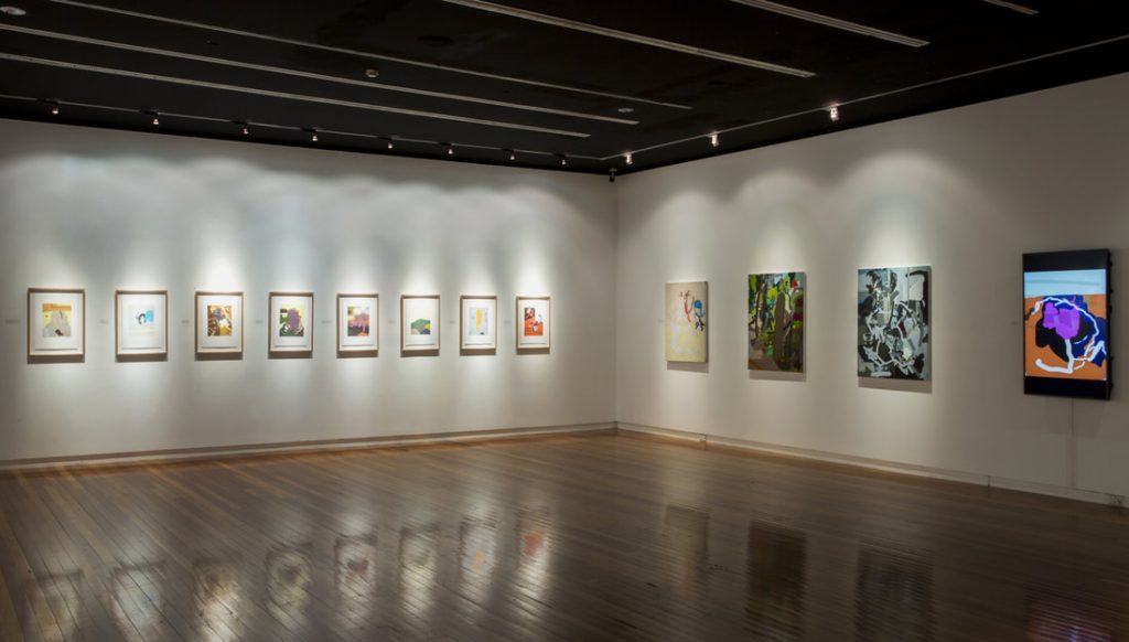
Tony Curran’s Random Feels Familiar in the Wagga Wagga Art Gallery
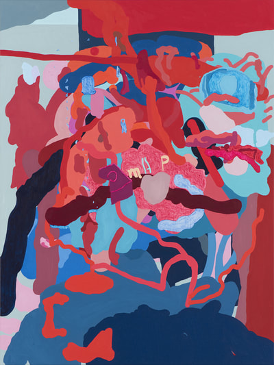
Art titled: ‘Just not enough blue to hold it down’ in the exhibition

Random Feels Familiar by Tony Curran is a randomly generated series of art pieces on oil on linen. Created in 2017 and currently exhibited at the Wagga Wagga Art Gallery, art hangs on the wall encompassing the viewer in fine art that feels familiar but is quite different. Abstract designs hang on the wall are printed on canvas yet are, in reality, randomly generated by code. The art piece use texture and expressive techniques to confuse the viewer if it’s created by code or done by a human. What I admire about this series is how it blurs the lines between who has ownership of the painting. Although the computer uses pseudo-random generation, the foundation remains on the artist’s visual language.

Gretchen Kupferschmid-Project 06-Abstract Clock

sketch

//Gretchen Kupferschmid

function setup() {
    createCanvas(480,480);
    
}
 function draw (){
    
    //gradient picking color
    var gradient1 = color(223, 202, 252); 
    var gradient2 = color(202, 252, 238); 
    createGradient(gradient1, gradient2); 

    //creating time veriaples 
    var h = hour();
    var m = minute();
    var s = second();
    
    //mapping time variables
    var dripsS = map(s, 0, 59, 200, height);
    var colorLemon = map(m, 0, 59, 0, 30);
    var highLight = map(h, 0, 23, 110, 240);
    
     
    //lemon shadow
    noStroke();
    fill(211,180,117);
    ellipse(235,274,124,33);
     
    //changing color of lemon with minutes
    var Yellow= color(244-colorLemon,216-colorLemon, 100-colorLemon);
    fill(Yellow);
    noStroke();
    ellipse(211,181,161,208);
    ellipse(289,182,28,19);
     

    //drawing lemon interior
    noStroke();
    fill(247,234,181);
    ellipse(182,185,107,208);
    strokeWeight(2);
    stroke(196,141,32);
    fill(244,226,149);
    ellipse(182,185,73,178);
    strokeWeight(1);
    line(181,95,181,274);
    line(209,126,153,240);
    line(145.5,185,218,173);
    line(153.3,130,213.3,229.3);
    
    //lemon highlight every hour
    noStroke();
    fill(255);
    ellipse(193,highLight,8,18);
     
    //drip goes down every second
    fill(247,223,119);
    ellipse(170, dripsS, 10.5, 31);
    
    //text of time
    fill(255);
    text(h+":"+m+":"+s,350,50);
 
    
 }

 //background 
function createGradient(top, bottom) {
    for(var i = 0; i <= height; i++) {
      var mapColor = map(i, 0, height, 0, 1);
      var interA = lerpColor(top, bottom, mapColor);
      stroke(interA);
      line(0, i, width, i);
    }
}

As I tried to decide what form to make my clock, I based it heavily on my love for simple graphic elements such as lemons and the simplicity that comes from them. I wanted to also try various techniques for showing the time in the illustration itself from the drip of the lemon, to the hue of the actual lemon itself. It was important to me to show time in subtle ways that didn’t take away from the illustration but added to it in a form of animation.