lemonbear—MidSemester

I decided to add color to revamp my tiling project from a couple weeks ago (where I coded a pattern to laser cut onto some fiberboard). Because I was dissatisfied by how strongly the grid dictated the piece, I thought of ways to make the piece more free flowing while still maintaining the original rules for the piece (edges want to match up). I devised a simple logic for the coloring, where the smaller shapes were colored warmly, and the larger swaths of color were cooler. I made sure none of the colors continued over edges, and disregarded the tile boundaries, opting to create a composition defined by only the drawn arcs.

Here’s the mockup for the coloring scheme:

I elected to only color a chunk of it as the original piece was somewhat overwhelming in scale. It came out like this:

The finished product.
Another fun doodle with the complementary colors.

grape – Tiling Pattern / MidSemester

I was half complete with the tiling pattern project when it was due (hence the combined title) so I figured I’d finish it for the MidSemester review.

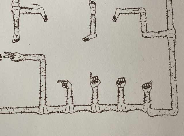
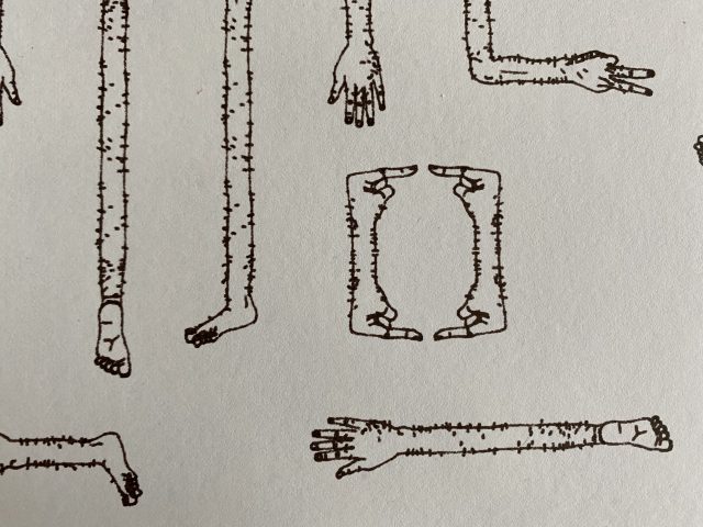
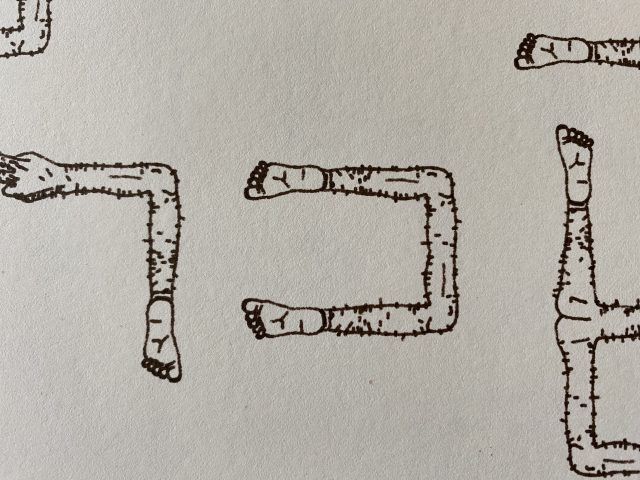
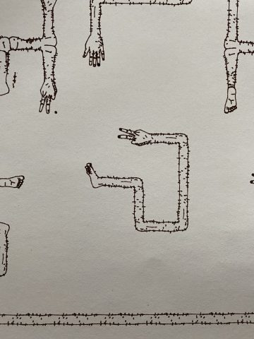
I first created a 16×16 tile generator so I could draw my name (I made 15 tiles, 3 for each letter). Here are some examples:

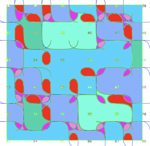
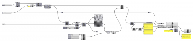
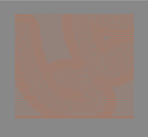
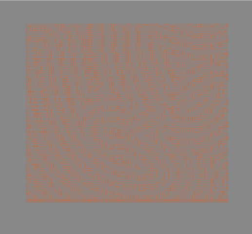
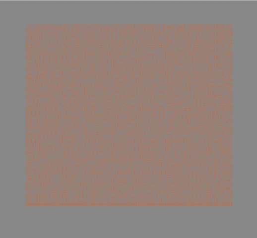
I then modified a wave function collapse implementation (after reading up about WFC’s and how they work) mentioned in this Processing thread which is based off of mxgmn’s original implementation to generate tilings of each of the letter tiles I produced as a sort of signature.  And then I converted it to svg using marching squares.
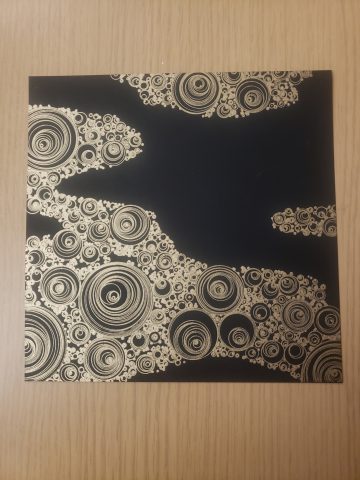
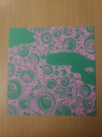
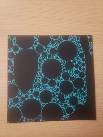
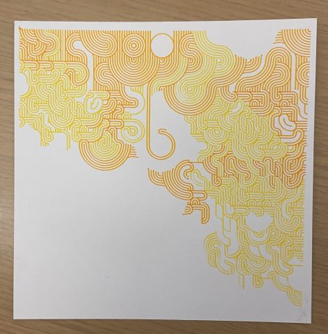
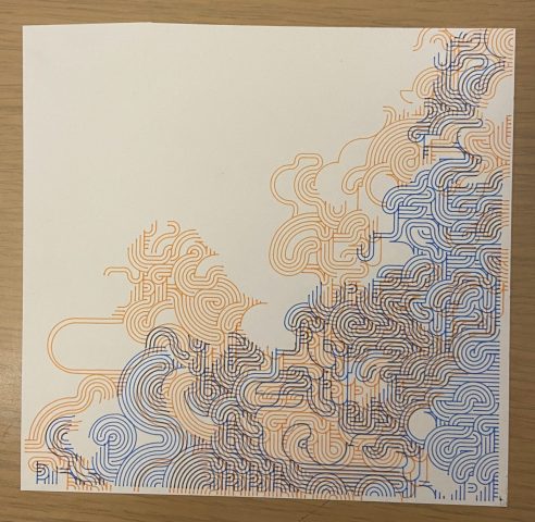
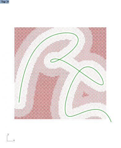
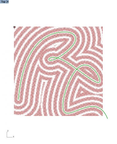
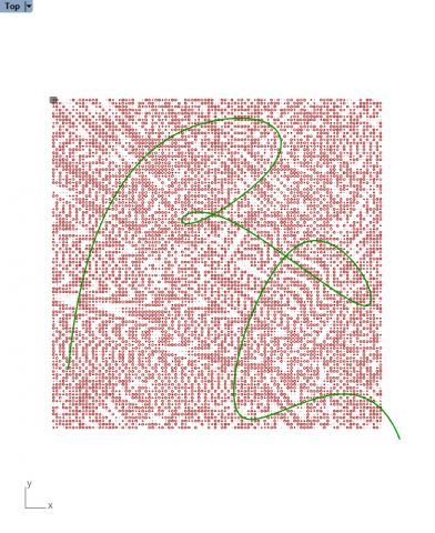
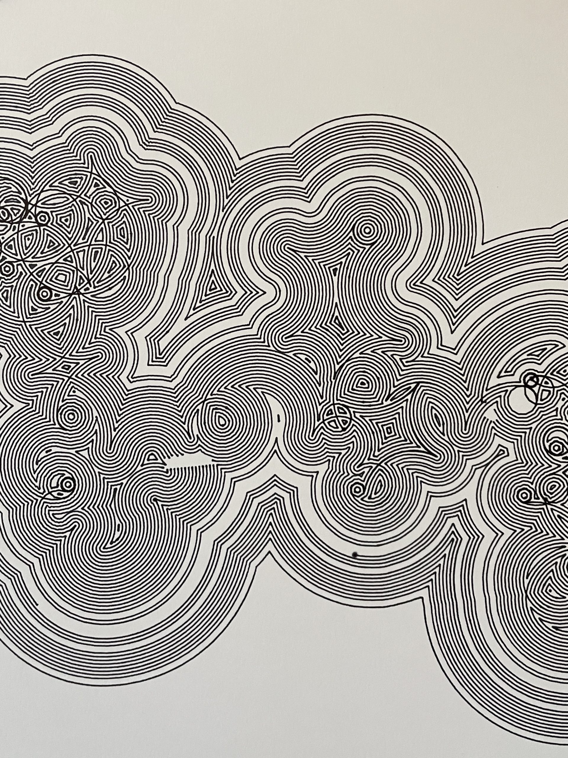
Here’s one

I sort of like how it’s almost a gradient and depending on the type of font the wave function collapse algorithm generates tilings with varying amount of order/disorder.

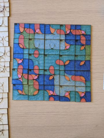
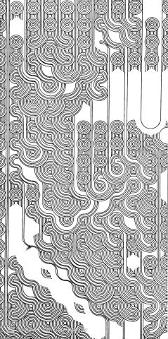
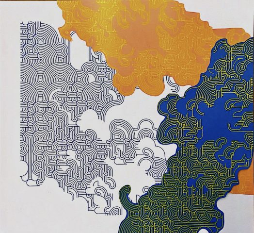
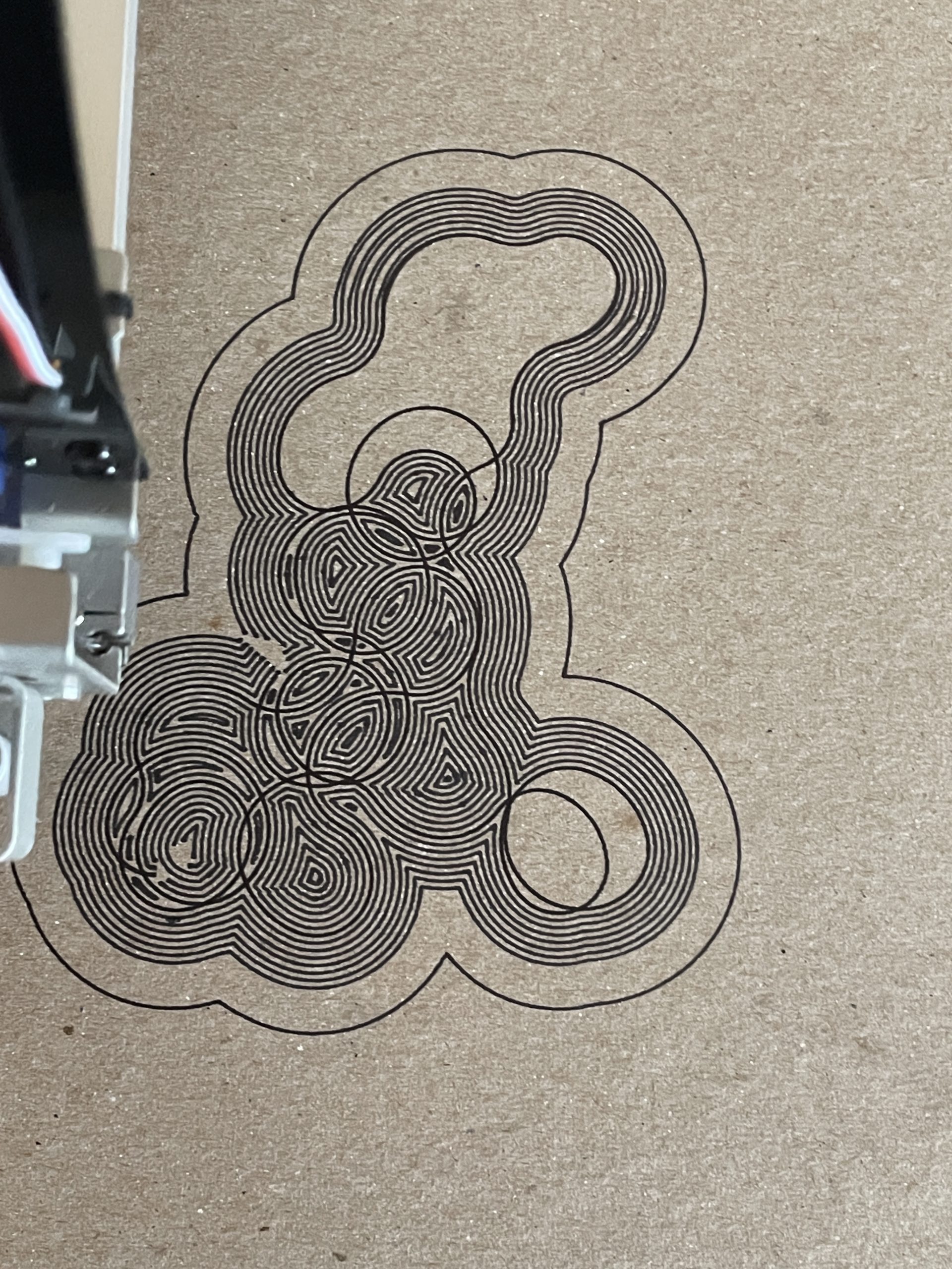
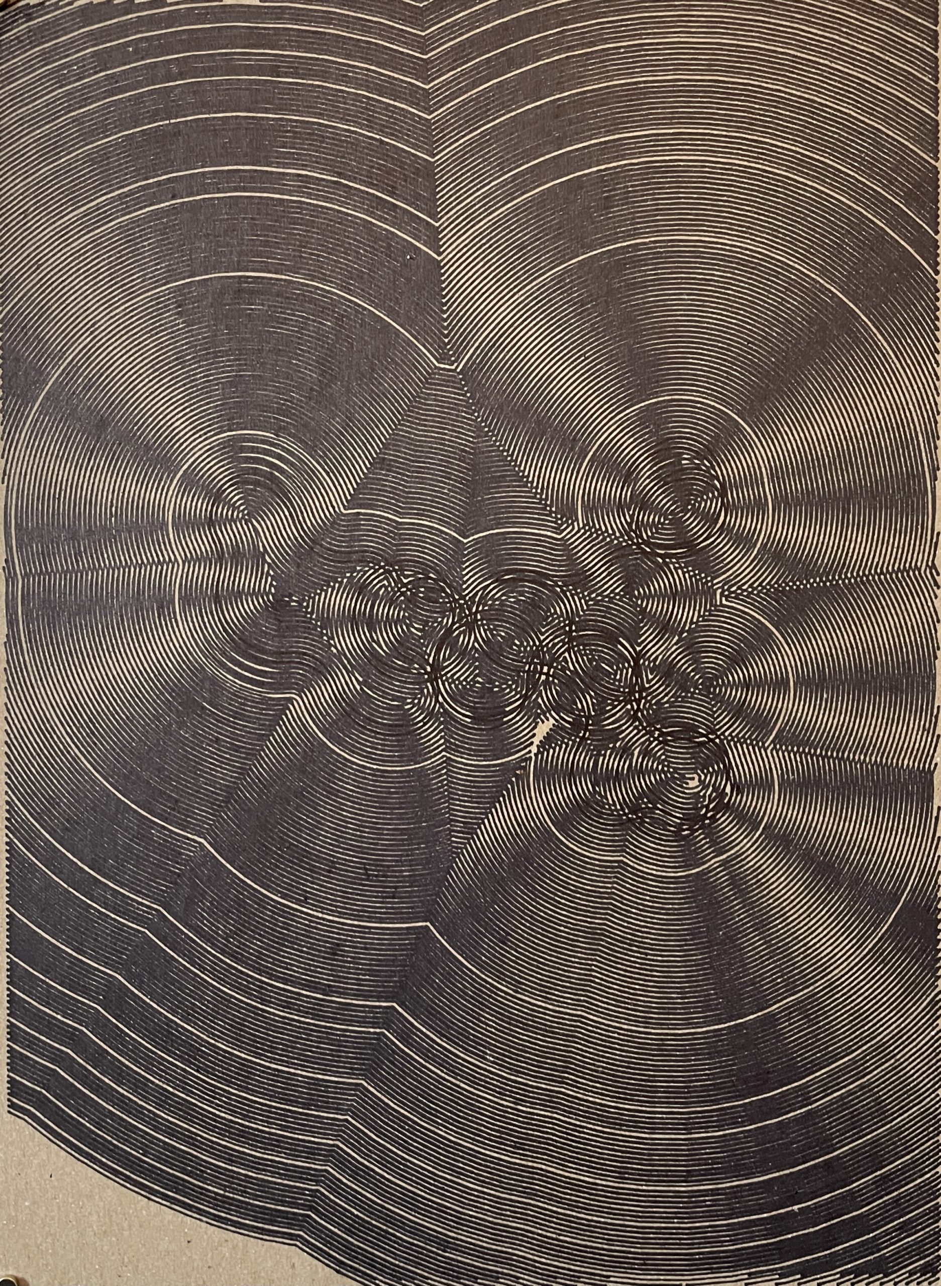
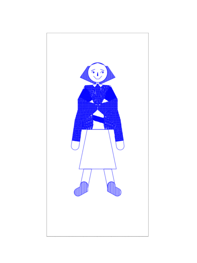
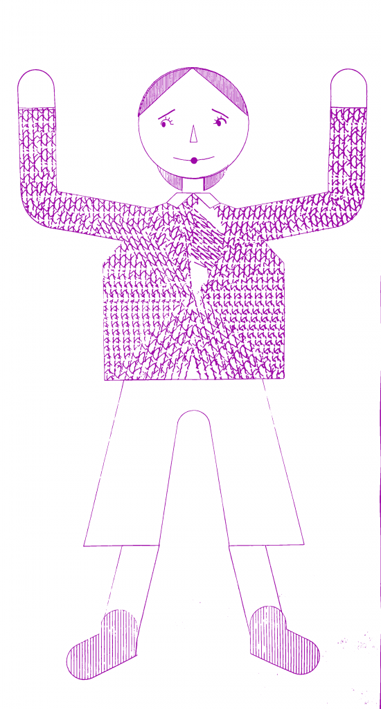
I also presented a single tiling with used a brush pen, a willow stick, and a fine pen (just to play with the different textures.

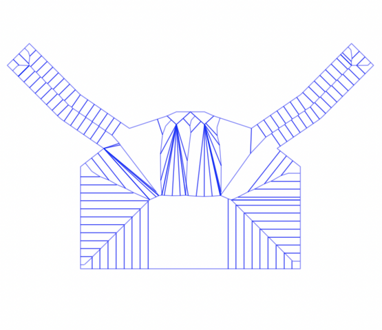
I was also interested in exploring different ways of manipulating these tiles. Here are two experiments I did:

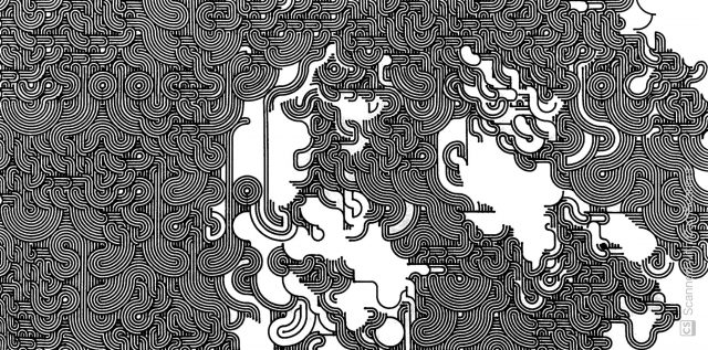
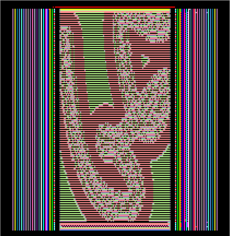
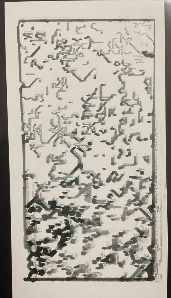
In one I wanted to do almost a “where’s waldo” with WFC, so I created a 16×16 waldo tile in my tile maker in processing and then generating multiple tilings.

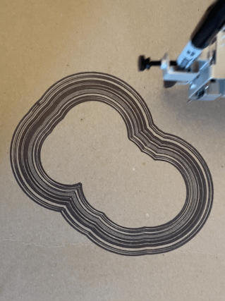
I sort of want to make this my wallpaper.

Anyways, I ended up not plotting it because I ran out of time. I also think this would look better at a larger scale, so think of this as a little swatch test.

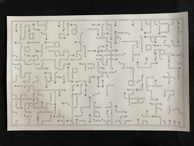
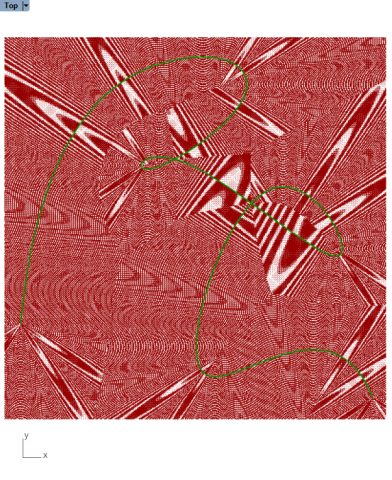
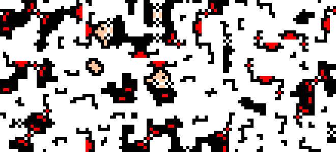
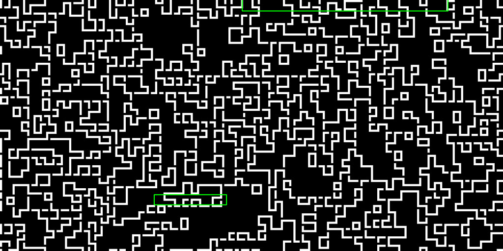
Another thing I wanted to do was see if the original letter appeared in any of the produced tilings. But I also didn’t want to hand annotate/circle any letters I found, just because I thought that would be boring/time consuming imo.

So instead I found another time consuming way to identify letters, trying to implement OCR(Optical Character Recognition)!

I implemented it in python and it generated the following results.

Some examples:

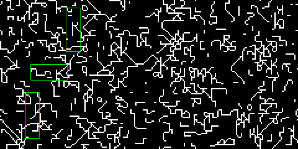
I think it was sort of interesting to uncover what the computer reads as “text”, but I ultimately didn’t plot any of them bc I didn’t think showing that part of the tile as a different color really added much + I didn’t have a lot of time.

Something interesting to note though…while generating these WFC patterns using the tiles I created, the letter R had the most contradictions I’ve ever seen. It was almost infuriating trying to get a single tiling to finish, because there was (like ~85% of the time) always a contradiction. I’m not too sure why exactly, maybe the diagonal bit of a “R” is prone to contradiction? But I also personally find the R’s the be the most visually appealing.
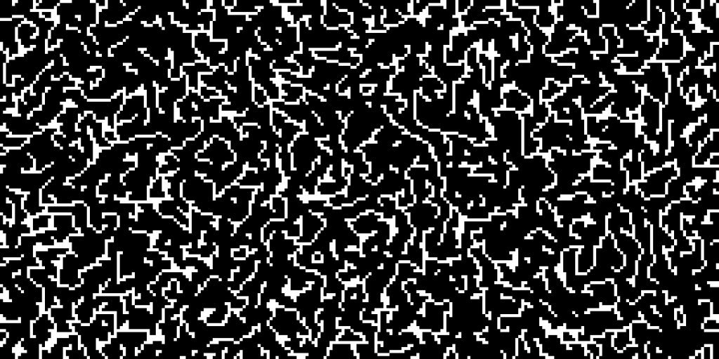
It looks itchy.


miniverse – MidSemester/public exhibit

I decided to revise my work on the truchet body tiling project. This essentially included me revising my work flow on getting hand drawn tiles into my truchet quickly to make “exceptions” to my rule set and create funny moments in the piece.

I added the creation of adam hands reaching to god. I also added some variation in the hands and the feet (middle fingers, peace signs, acrylics, etc). In line with my hairy framed blobs, I also added a hairy frame to this piece. To sign my work I included the sign language for HIMA in the bottom right. I also tweaked the truchet probabilities per Golan’s suggestion to have less piping and more disjoint pieces in the tiling.

Here’s the SVG for the final plot. (this is rendering small. click on it to see it larger).

(this are a lil crappy)

Full size pic of the 25×42 plot:

a few close ups:


frog-MidSemester

For this project, I made use of a modified circle packing algorithm that would use a thresholded noise field to generate a cool blobby form, fill it with circles, and apply a drawing step. At the drawing step, the circles can be drawn in different ways. Above I tune some parameters to produce the different circumscriptions and packing densities. I can also shut circumscription off at will.

It was exciting to seriously push myself with this project this time and I feel like I learned a lot about ways of filling a page and ways of considering and solving geometric design problems. Through testing I would devise different visual debug methods to give me an effective visual description of the code state.

Going forward, I want to use more color.

spingbing-MidSemester

For my midsemester project, inspiration came from many places. First, the concept of manipulating concentric circles came to mind after a failed hatch pattern. This concept was furthered by seeing Madeline Gannon’s circular truchet pattern . Upon seeing her plot, my mind immediately connected her arcs to the style of clouds drawn in traditional Korean art. With that initial interest, another aspect that struck me about this plot was how the contrast between how organic the repeated arcs looked against each other versus how structured and rigid tiling can look. I recreated a version of this in my tiling project, so for MidSemester I revamped that plot by making it a multiscale Truchet pattern that used Perlin noise to influence the scale of the size of each tile. A previous iteration of this project used Perlin noise to influence the placement of specific tiles. One way I interacted with this piece more personally was that I also made the choice to stop the plotter before it finished drawing in an attempt to attain an organic feel as well. Another was the use of color-the way I had originally intended to use it was a failure, as the paint marker “ran out” of paint midway through the plots. To work around this, I ended up collaging the successful parts of the plots together.

Initial iteration:

  • black micron pen on Bristol
  • the pen was not calibrated correctly or some other error was happening with the machine which resulted in wobbly, sometimes intersecting lines (seen best in the waves near the bottom)

Using color:

  • orange and blue microns, yellow paint pen on Bristol
  • the blue and orange one was mistakenly lined up incorrectly, which to me makes it look like the colors are fighting

Collage:

  • blue micron on Bristol and yellow paint pen on construction paper
  • Different colored papers were attached to the white plot with a glue stick. The placement intentionally hides errors in each one’s original plot

Final project:

  • black thin sharpie on drawing paper
  • The plot was interrupted last minute, resulting in less whitespace than the others. this as well as it being monochromatic worked to give this final piece a much different vibe.


gabagoo-MidSemester

I decided to redo my blobs project. I decided to look back at some old sketches of my linewalks and found ^these^ curves formed from a sweeping radius that is always continuous.
I used offset curves to fill my blobs and played more with the physicality of the plotter, via interrupts to create gaps in the offsets (left), and shifting the page to achieve a Moire effect (right).

The blobs are generated via a central spline from generated via the aforementioned linewalk technique. Generated spline reminded me of a hair on the walls of a steamy shower. To contrast the abnormality of the hair with the uniformity of the Moire, I decided to frame a hair (shown below).


sweetcorn – MidSemester

What good is a party without attendees?

For my mid-semester project, I chose to revise my generative people. I had lost a lot of charm when I ported my face generation code from JavaScript to python implementing vsketch with shapely, particularly due to the loss of curves that I had originally written with p5.js’s beginShape(), endShape(), and curveVertex(). I could have figured out the Bezier curves, but I don’t really care to do that. I rewrote the head and its associated coordinate system using a parametric cranioid equation that Golan sent me. I was not very smart in how I had set up a lot of placements last time. Instead of prescribing positions, this time I more often got the boundaries of previous geometries and used their positions to relatively place other geometries.

I also found my previous sweaters’ pattern to be a missed opportunity for variation. I implemented trimesh’s medial_axis functionality on the sweater (after adding arms and hands, which were unfortunate things to have left off last time) in order to get a simple structure off which I could base a faux-dimensionality. I broke the sweater into polygons using this medial axis and filled each polygon with the sweater’s original hershey-symbol-character-based pattern, this time sheared proportionally to the polygon’s centroid’s distance to the nearest point on the axis. This breaks the sweater into sections, each with a not very accurate three-dimensionality. Below is an image of the boundaries of each section that composes the sweater. I’m reminded of my Grandma on my Mom’s side, who would make and sell little flat paper-clothed dolls.

Below is a gif of several .svgs created, showing some of the range of the generativity. Note that the angle of the arms sometimes pushes them past the bounds of the paper (which in the here-horizontal direction is strict for the plotter) which is an error I have yet to fix. Often if the arms are generated in the down position, they form an internal polygon between the elbow and the body. That’s only natural, but trimesh and shapely are not handling that internal polygon very well for various reasons. The result is that most of the successfully-generated people have their arms in the air, which contributes to a certain anxiety to these figures which Mali pointed out.

These .svgs are converted into HPGL files using a custom config file for vpype to be plotted life-sized on the USCutter MH871-MK2. Below is a photo of a completed plot. For my last two projects, I had made the mistake of using too thin a drawing instrument for such large paper, leading to some legibility issues. This time, I used a thick purple sharpie and set the USCutter up such that significant pressure was applied to the paper with the sharpie, making a thicker line. I do wonder if the child-like quality of thick Crayola markers would be appropriate to use as I had for the first plot. Longevity isn’t exactly a concern, given the relatively short length of parties these figures are to attend. Most of the plotter-communication error I ran into last time must have been somehow due to the concentric filling of the hair, which I have since changed to simple vertical hatching. I also filled the pupils and sometimes the lips to the point where they appear solid. I fortunately ran into no plotting problems other than my laptop falling asleep before I plugged it in, stopping the transmission of data to the plotter. This put a big line right through my first plot. Not the first time I’ve made this mistake.

And for fun, a video of the sweater being plotted:

Future directions for this project include better sorting out the sweater-sectioning and shearing method to completely fill the sweaters dimensionally, adding more detail to the pants and shoes, implementing flow-field-based hair filling, multi-color plotting, and variance in pose/activity for each person. The goal in the end is to be able to generate and plot enough figures to have a lovely party.

~xoxo