JiyoungAhn-03-Looking outwards

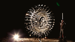
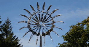
This artpieces just blew my mind when I first saw it. They are sculptures that are created by Anthony Howe. I was really surprised that these sculptures are moving by kinetic wind, and the movement is so lively that I could not believe that these are made by stainless steel. They weigh up to 1,600lbs, and because they are too heavy and huge, he had to test them if they actually work by computer program.(CAD) He tried to express the vivid movement as lively as possible, and for some of his works, he wanted to express natural movements without any electronic features.

Howe tested his sculptures by driving down the freeway. He wanted his sculptures to be strong enough to tolerate wind.

He did not explain how each pieces of sculpture is designed and built, however each pieces have their own curved shape in order to show vivid movement when it is attached all together.
howe-2howe-1

Di-Octo. All stainless steel kinetic wind sculpture. Silent operation. 25’6″h x 10’w x 4’6″”d (7.8m h x 3m w x 1.4m d) 1,600lbs (725kg)

In Cloud III. 7.6 meter tall all stainless kinetic wind powered sculpture. Engineered for extreme high winds yet spins in 2mph. (25′ h x 10’w x 5’d, 1,500lbs), shown here not on pedestal.

This is a video that shows an actual movement of a sculpture.

Sarah Ransom-Looking Outwards-03

The Silk Pavilion (2013 – CNC Deposited Silk Fiber & Silkworm Construction; MIT Media Lab) is a fascinating project inspired by the natural constructive habits of actual silk worms. The basic premise of this project was to study the silk worm’s ability to create relatively large scale fiber structures starting with a single multi-property silk thread in an attempt to create a structure in which the surface varies in density based on outside stimuli such as sunlight. The algorithms used to create this structure were derived from documenting actual silk worms placed in a controlled environment where they were allowed to do what they do best. I thought the final product of this structure was especially fascinating when you considered how the algorithms accounted for what  silk worms might have wanted to accomplish by leaving gaps or creating more dense patches of silk based on exposure to sunlight and heat. The ultimate goal of this project may have been to explore “the formation of non-woven fiber structures generated by the silkworms as a computational schema for determining shape and material optimization of fiber-based surface structures” but resulting structures look like works of art in their own right.

Silk Pavilion

SILK PAVILION from Mediated Matter Group on Vimeo.

Sarita Chen – Looking Outwards – 03

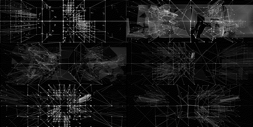
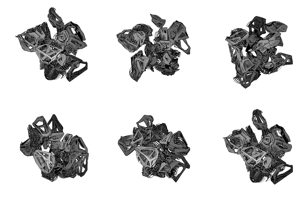
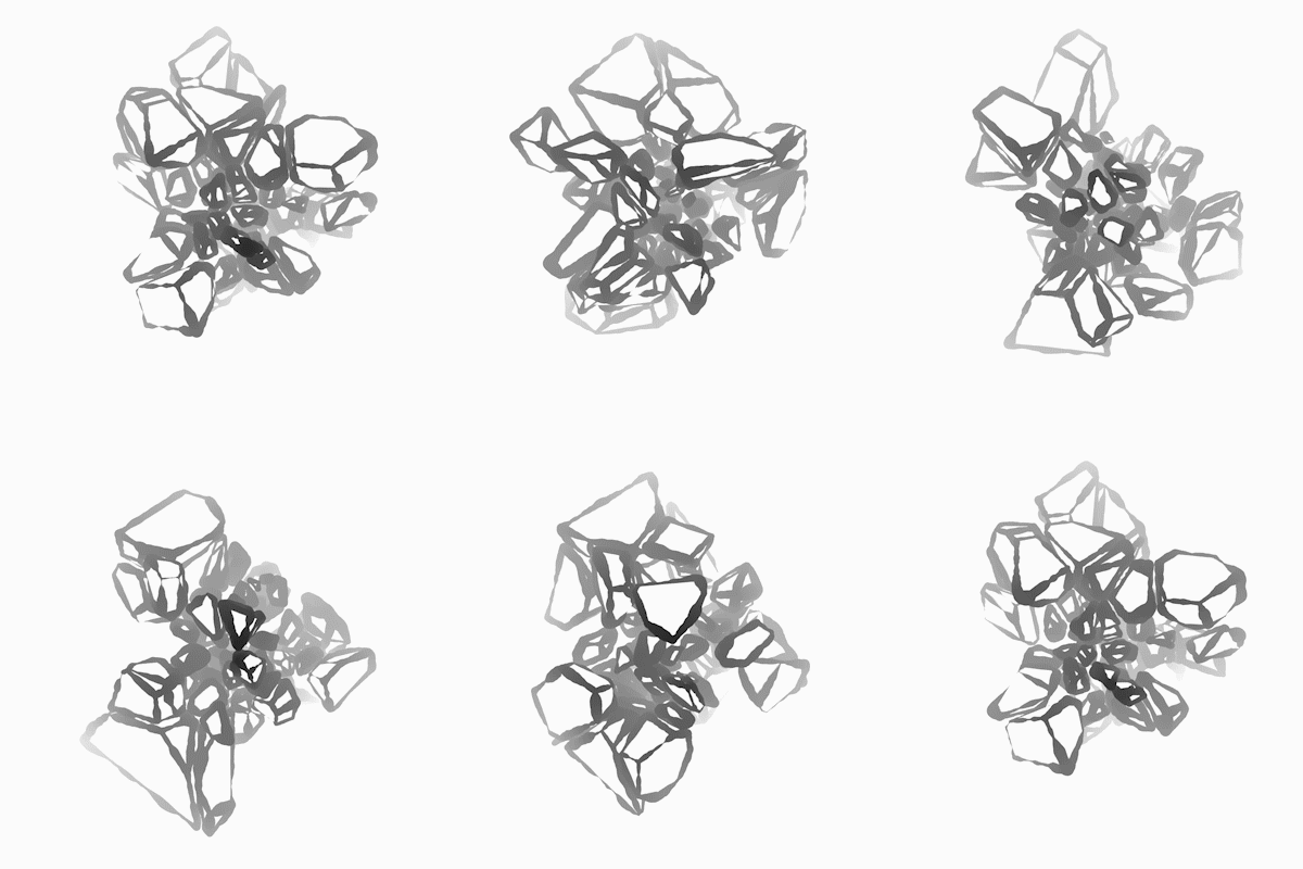
(Above are examples of the Raven Kwok’s work.)

Taken from his tumblr bio: ” Raven Kwok is a visual artist / animator / programmer. His artistic and research interest mainly focuses on exploring generative visual aesthetic brought by customized algorithms and processes created through computer programming.”

One project of his that I admired was a music video called Skyline that he created. The music video was created with a coding software known as Processing. Kwok talks about how he uses a geometric model known as “Voronoi Tessellation”, used in René Descartes theory of planetary motion. What I admire about the work, personally, is how trippy yet fluid the movements of the works are. In the Skyline music video, the audio of the song influences the movements, which creates an original outcome for the work.

Soyunk – Looking Outwards -03

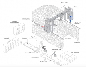
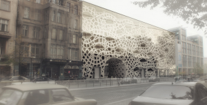
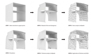
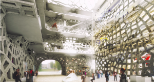
ZArchitects challenged the idea of traditional masonry by combining digital fabrication and automated construction system, creating Smart Masonry. Traditionally, large heavy weighted stones are used for masonry with lack of natural light entering through the structure. But ZArchitects decided to use geometric mesh patterns to replace walls and columns which opened up a lot of space and save more money for the building. Using the mesh pattern I think was a great idea here because not only did it replace the  main parts of the building and created a cohesive environment, it also naturally created a portal for natural light to enter through the space and with the geometric and precise patterns due to robotic construction techniques, they were able to achieve a unique aesthetic. Another element which surprised me was that 3D printing was used to build this architecture by using prefabricated materials. Starting off with 3D printing, robotic art construction station was able to replicate and create a precise sized materials which reduced the cost of labor by fractions and the time it would’ve took by using only 3D printing method or by using human labor. This Smart Masonry technique, state off in Berlin, can be a start of a new way of building living and public space. Reduced price for labor and lighter material which contrast the traditional heavy weighted materials will decrease the price of buildings and houses if practiced further. 

http://www.archdaily.com/609108/digitized-bricks-zaarchitects-develop-smart-masonry

http://www.zaarchitects.com/en/public/125-smart-masonry.html

screen-shot-2016-09-15-at-5-28-32-pmscreen-shot-2016-09-15-at-5-28-52-pmscreen-shot-2016-09-15-at-5-29-07-pmscreen-shot-2016-09-15-at-5-29-14-pm

Sihand – Looking Outwards – 03

The Fahz

Pretty much everyone has seen the famous optical illusion of the Rubin vase, where two face shape matches the contour of a vase. But the “Fahz” brought this intriguing visual effect into the 3D world.

First, the Brooklyn-based computational designer Nick Desbiens generated vector geometry from the profile pictures of the loved ones. Second, he visualized the negative space between the two face outlines that make up the contour. The result was then moved to a 3D working space, where it was morphed into a 3D model with the artist’s algorithm. The stunning final result was created by a 3D printer.

I am very impressed by the simplicity of this idea and how it gives a peek into how 3D modeling and printing have brought endless opportunities, not just to large scale productions, but also to simple acts of love.

Check out their website here

Become a backer of their business on kickstarter here

Diana Connolly – Looking Outwards 3

Lustre, 2015
My friend Rehan Butt created a clothing line named Lustre for the 2015 Lunar Gala show with two of his friends, using algorithms to help produce their clothes. Their clothing line was termed by the audience as being the “origami line” because thick white paper was laser cut and then folded in geometric shapes to fit the models. The algorithms to do this were as follows: The team scanned each of their models using an ABB robot equipped with a camera to take many photos of each person, to then be compiled on AutoDesk’s 123D Catch for the sake of creating a 3D mesh model. With the 3D model of each person, the team was able to fit their 2D drawings of the clothing designs onto the 3D models, using the program Rhino to create the shapes of the clothes digitally. Taking it from 2D to 3D required an algorithm to determine where the volume of the clothing would be, and thus where to create the folds. These algorithms helped to manifest the team’s artistic sensibilities in the line’s final form because they used software and math to create the geometric shapes of the clothes, which all required high levels of detail, as well as consistency with the other geometric components. Once these geometric paper components were cut and folded, the team added iridescent, multi-chrome fabric accents to each of the clothing pieces. I absolutely loved this juxtaposition between the two polarized components, as the fluidity and colorfulness of the fabric contrasted with the rigidity and stark whiteness of the paper. I thought that the overall look of each piece was very enticing, and effective in highlighting the key features of both the paper elements and the fabric elements. Below are images of a few of the pieces, as well as a video of the models walking from the 2015 show!

Link to Rehan’s website page about the clothing line: http://rehanbutt.com/fashion

untitled-1
5 selected images from Lustre


Video of Lustre being modeled in the 2015 Lunar Gala show

Janet Lee Looking Outwards-03

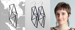
The project that I found the most inspirational was the jewelry item project by Rachel Binx and Sha Hwang (year not mentioned). I was inspired mostly because it had a sentimental meaning to the customer who was buying the jewelry. The algorithm that the creators used was to aim for the sentimental value I suppose. The creators’ artistic sensibilities were that they aimed to make a meaningful product such as the cities that meant a lot to the customers and they produced it by using graphs. Most of the time it is hard to connect graphs and accessories because two of them seem so different from each other. That is why this particular jewelry project has inspired me.

Parametric 3D Form


meshu-rachel

James Katungyi-Looking Outwards-03

Artist: Madeline Gannon, MADLAB.CC

Title: Reverberating across the divide

Year: 2016

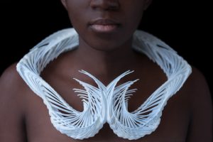
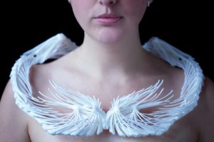
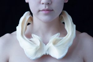
‘Reverberating across the divide’ follows a 3 step process – 3D scanning, 3D modeling and 3D printing – to generate complex artifacts. 3D scanning captures and reproduces a real life model in the virtual space. 3D modeling then shapes the artifact around the model, all in virtual space. 3D printing generates the physical artifact. I was impressed by the logical sequence that yields a made-to-measure artifact in such an organic way akin to how nature works.

The algorithms are not shown. Nevertheless I imagine the modeling unit (an octopus was used in the attached video) as a mouse location whose movement is directed by the designers hand but also constrained by the virtual model’s proportions.

The organic flowing movement that is captured – frozen in time – in the printed artifact reflects MADLAB’s successful and seemless interaction between the physical and virtual worlds (MADLAB.CC, 2016).

collar1-front

collar2-front

collar3-frontcropped


References:

MADLAB.CC. (2016). Reverberating across the divide. Retrieved 9 13, 2016, from MADLAB.CC: http://www.madlab.cc/reverberating-across-the-divide/


GraceCha- Looking Outwards-3

Andrew Thomson’s  Geodesic Pendant Lamp

screen-shot-2016-09-13-at-10-20-46-pmscreen-shot-2016-09-13-at-10-29-25-pmscreen-shot-2016-09-13-at-10-29-19-pm

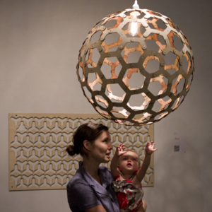
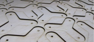
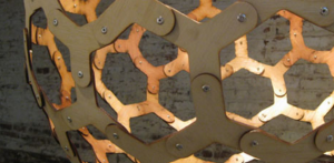
Andrew Thomson’s  Geodesic Pendant Lamp really resonates with me because it reminds me of a similar design project I was involved in. We were told to make paper lamps, and the planning behind making what seems so simple is actually quite difficult because of the considerations of use of material, particular context, and I think what makes this particular piece so impressive is the use of simple shaped wood cut outs to create a complex system of shapes.      Although it was machine made, I appreciate the process and planning that went into it.  This lamps was made by a technique called CNC Machining which is short for Computer Numerical Control which basically means a machine was used to cut the wood.  Machine made objects certainly help us humans perfect craft within an product, but I think the process of planning will always be part of designing products such as these.

http://www.core77.com/posts/23340/andrew-thomsons-geodesic-pendant-lamp-20-and-more-23340

Kyle Lee Looking Outward 3

standley-1

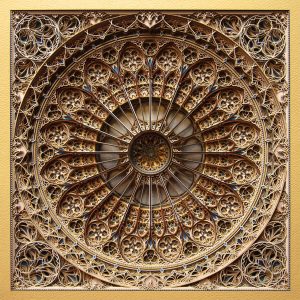
When I first saw this project, I was immediately drawn in. I think there are three things that I most admire about this project. First is the intricate detail and form of the “stained glass window.” Needless to say that Eric Standley did a terrific job in forming a compelling and intriguing structure. Furthermore, I find the fact that this beautifully complex piece is done with simple paper makes this project even more fascinating. Finally, the craft is marvelous. In my design classes, I have come to greatly appreciate and be sensitive to fine craft. I strive to reach fine craft in my drawings, physical project, and every aspect of my work and this project certainly is an inspiration.

The basic algorithms underneath this project are all fairly simple and not to far from the simple drawing that we have been doing in class. Each layer by itself is comprised of simple shapes and curves. Its the advanced layering that really makes this project more than just a visual. Standley didn’t actually map this out in 3D, but drew each layer separately. His ability to visualize multiple negative spaces effectively is truly expressed through this proeject.