Jess Medenbach-Looking Outwards-3

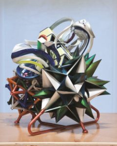
Frank Stella is an abstract artist who has been making work since the 1950’s. Initially making work that was minimalist illustration, paintings and abstract sculpture, Stella has recently moved on to creating images in 3D computer programs and then printing those out to be huge scale 3D sculptures.

I find this work to be really inspiring because he is making use of new technology to further artistic impulses and ideas he has already been working on for 50+ years. The flexibility of a computer program to extend those impulses and grant the ability to think even bigger is really inspiring.

One can now take an image they would draw and render it out with dimensionality while still playing with philosophical ideas and emotional impulses the way one would with painting, illustration or metal sculpture. Instead of the work in a computer program being dictated by the constraints of the program itself, he conceives of the idea or the feeling first and then uses the tools to render it out. Due to the comparative ease of 3D printing, he is then able to make these ideas larger scale and with more complexity, which I find very inspiring.
ink_032014_04-250x312

Looking Outwards 03: 3D Print Gown

Wardrobing and jewelry designer Michael Schmidt teamed up with architect Francis Bitonti to create the world’s first fully articulated 3D printed gown. Using inspiration from Fibonacci’s sequence and the Golden Ratio/Spiral, the dress represents the merge between art (particularly pertaining to beauty) and mathematics. The gown itself is made up of nylon by Shapeways and thousands of unique components, which all pare down to 17 printed pieces dyed black and hand-adorned with over 12,000 Swarovski crystals. The gown was completely custom 3D printed to fit model Dita von Teese.

This project stands out to me because of its unique approach with transforming a mathematical formula for beauty into a tangible, ready-to-wear piece. The gown’s form adheres to and accentuates the contours of von Teese’s body, thus illustrating the makers’ attention to the gown’s ability to spotlight the beauty of not only the gown but of the human body. The project also highlights the possibilities of 3D printing, especially in regards to solving unique fitting problems and the ability to create a true “perfect fit.”

ShanWang-LookingOutwards-03

7d517913144003-562711b5b8664

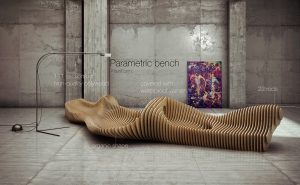
The Parametric bench is one of the elements the collection of “Parametric furnitures”. Oleg Soroko crafted the project in 2014 with 18mm plywood sections that were fasten with iron rods, wound on the mounting bolts. The high-quality wood material, the waterproof varnish, the curvatures and the fact that the entire piece was composed by sections, all together generated a dynamic form that emphasized the shape of the bench better than a whole piece of solid wood would do.
Since there is no specification on the algorithms used by the artist for this bench, I looked into his other projects and found that in a similar project that accentuates the curve patterns used “gradient descent”, “marching cubes” algorithms as well as scripting in Rhinoceros. I suppose that he took similar approach in this project. The precise cut of the sections can be generated in Rhino through relatively simple and fast commands.
It is a relatively easy and inexpensive way of prototyping, and I can see its application in greater fields other than furniture design, such as architectural model and industrial design.

https://www.behance.net/gallery/18982743/Curve-descent-pattern

Christine Kim – Looking Outwards – 03

london-flower-kiosk-with-a-wavy-timber-exterior-by-buchanan-partnership_dezeen_9

london-flower-kiosk-with-a-wavy-timber-exterior-by-buchanan-partnership_dezeen_1

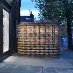
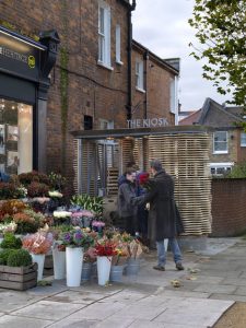
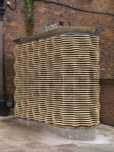
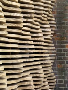
A project I’ve come across this week is The Kiosk by the British firm, Buchanan Partnership. They’ve built the St. Helen’s Gardens flower stall in 2013 by using digital and hand fabrication. The timber exterior was cut by the CNC mill, which is computer run to control machine tools. With a steel structure and concrete base. This project was originally inspired by the electron scanning of the flower petals which had ridge patterns. Therefore, the lozenge shape of the kiosk is a contemporary interpretation of the floral motif. I admire that the shape of the flower kiosk was deeply inspired by the flower itself and by using digital fabrication the similar shapes were repeated to create the exterior. By doing so, it shows that this project does not lose the essence or the purpose of the project. The information about the exact algorithm used is not mentioned, but since it used digital fabrication as well as hand fabrication, a computational algorithm was used to produce the physical model. The Buchanan Partnership’s artistic sensibilities manifest through their choice of the external shape of the kiosk and the way to open the doors of the kiosk during the day, which is by rotating.

london-flower-kiosk-with-a-wavy-timber-exterior-by-buchanan-partnership_dezeen_10

london-flower-kiosk-with-a-wavy-timber-exterior-by-buchanan-partnership_dezeen_14

Jihoonp_LookingOutwards-03

hypnos4

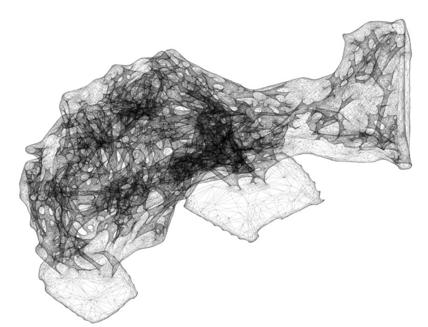
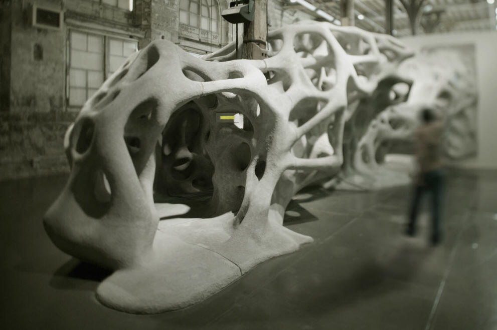
This porous structure called the Hypnosis Chamber, was installed in Modern Art Museum of Paris in 2005, by an architecture firm R&Sie(n). Their focus is on exploring the relationship between architecture, context and human.

“Urban form no longer depends on the arbitrary decisions or control over its emergence exercised by a few, but rather the ensemble of its individual contingencies.”

The firm explains the thought behind their theoretical computational design project, “I’ve heard about…,” which has become the motif for the subsequent Hypnosis room.


hypnos5

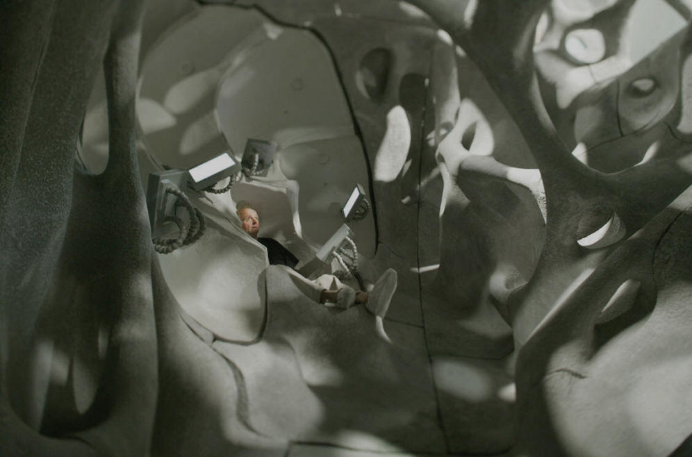
The Hypnosis chamber is to be experienced from the inside as a cognitive room. The vocal recordings makes the inhabitant indulge in a “wake up dream,” in which one becomes no longer human but an organic part of the chamber.

hypnos8

Honestly, there are a lot of study to be done in order to fully understand this work. However, what I took from it was the sense of movement into a new form of formlessness which post-modern, post-capitalism society might lead to.  The hypnosis chamber is truly inspiring of the fact that spaces we inhibit no longer acknowledge us as separate, dominant beings but as an integral part of architecture, as to say the structure is not complete without us being in there.

hypnos12

Also, the nature of the structure provokes what other forms would be only waiting to be created with the aid of computation. The limit is constantly being extended into the future.

GraceSimmons-LookingOutwards-03

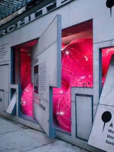
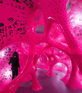
A piece I admire is called Situation Room by Marc Fornes, made in 2014. It is a series of 20 large, pink, perforated circular structures that surround visitors to form an installation (the piece is supplemented with a soundtrack made by Jana Winderen). The structure is one continuous form made up of the individual aluminum spheres, each of increasing incremental diameters, which connect at certain joints and are smoothed over. These forms are generated using boolean mathematical operations. I admire how many different elements are used to create a sense of space, through the physical tunnels created, the lighting shining through the holes, and the soundtrack that is acoustically amplified.

OLYMPUS DIGITAL CAMERA
Entrance into the installation piece

I feel that the artist’s sensibilities are definitely reflected in this piece; Fornes has always focused on known versus unknown, and creating environments which can be both comforting or smothering. This piece allows viewers to explore, and prompts questions about what constitutes a space, and what factors make a place feel real or imagined.

Walking around within the piece

https://theverymany.com/14-storefront/

http://www.dezeen.com/2014/10/15/marc-fornes-pink-aluminium-situation-room-installation-storefront-art-architecture-new-york/


Looking Outwards 03

Line Number – Jennifer Jacobs MIT 2015

Used Algorithms to generate patterns using simple forms, and this was one example that was translated onto wooden panels

I think what I admired the most about this project was how intricate and expressive it was. I normally wouldn’t relate these types of projects to computer generated art, and to see that this was created with an algorithm really inspired me to gain more perspective on what is achievable through this median.

The art was created from a series of simple shapes, and if you look closely it is noticeable. The algorithm isn’t given, but it is very possible to create similar forms of art using specific shapes, and I think that’s very interesting.

I also think that even though it was algorithmically generated art, it still does present the artists own vision and style. Although it is generated, there is still an element of control in the constraints of generation, which I think shows the artists personality.