Liu Xiangqi-Lookingoutwards-03

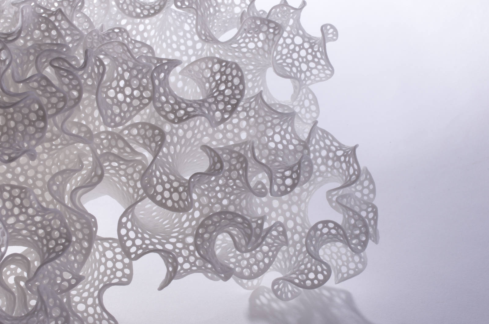
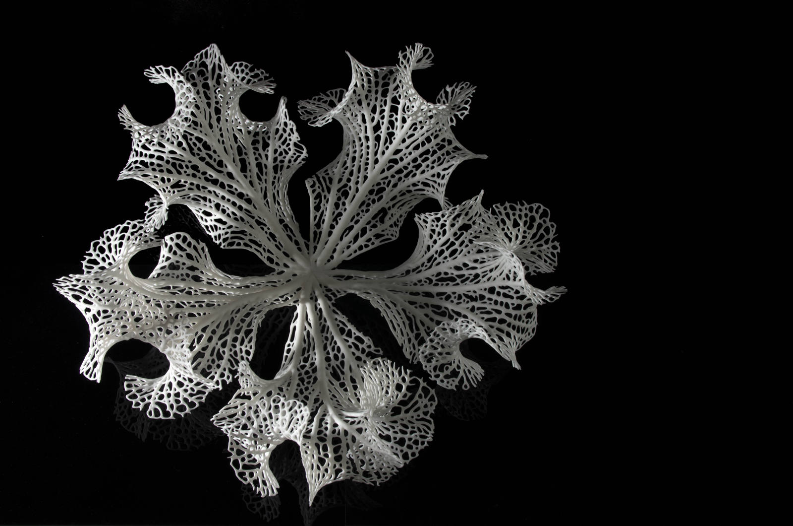
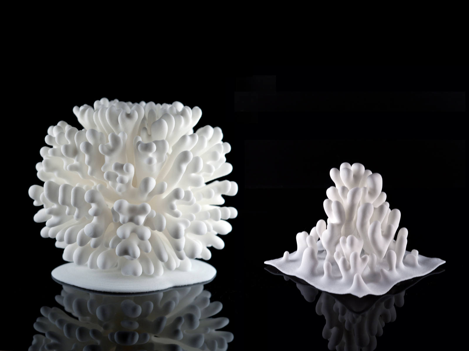
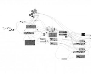
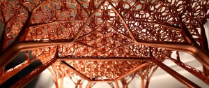
The project “A Unified Approach to Grown Structures” by MIT Media Lab interests me a lot. It utilizes computational approach and associated protocol to imitate growth-a natural process. I admire this a lot because it reminds people of a neglected truth that growth is achieved by duplication of cells and mutations. And also it challenges the definition of life–if life can be artificial? Is life developed randomly? The growth procedure is essentially a deformation and iteration. The initial geometric representation is deformed by data from geometric input representation(phenotype), intermediate representation(genotype) and a coarse implicit representation(developed from two previous representations). As the input representation changes, the deformation is repeated.
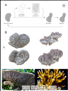
unified-approach

A Unified Approach to Grown Structures by MIT Media Lab

<A Unified Approach to Grown Structure

Looking Outwards 3 – Lydia Jin

24665717146_a4b22340b2_b

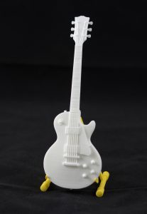
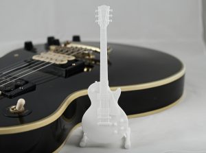
The project is a mini guitar printed out by a 3D printer. I really like how guitar looks delicate and actually shows a lot of details in its design. The tiny guitar sculpture serves as a guitar stand making it both artistic and practical. The material is plastic with a white matte finish. The guitar can also stand by itself. I am not very sure about the algorithm behind its design. There is limited description on the making of the product. The guitar is for sale of 20 dollars each. It shows that the artist Georg Kreuter is really into details and his products look very exquisite. In the ads on his website, the artist put the white guitar next to a regular sized black guitar. This shows that he likes contrasts. The creation was printed in 2016 and the name is Gibson Les Paul.
24665717086_1fb616395d_h

http://www.shapeways.com/product/P6LSXDESU/gibson-les-paul-scale-1-6?optionId=58806394

mdambruc-Looking Outwards-03

weather-forecast-box-tempescope-ken-kawamoto-5

The Tempescope; A Bedside Visual Representation of Weather

Video of The Tempescope

http://www.tempescope.com/


Ken Kawamoto “The Tempescope”

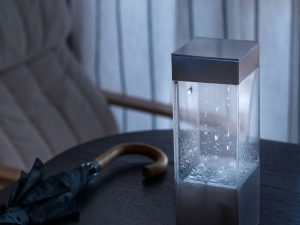
The Tempescope, created by Japanese software engineer Ken Kawamoto in 2015 is a physical display of weather that is wirelessly connected to a computer in real-time to show a visual representation of the world outside – who needs windows? I admire this project because the simulation of weather in a small compact box is amazing to me. It is taking an aspect of life that I used to believe was out of the hands of humans and manipulating it to a size that fits on a bedside table. Kawamoto’s sensibilities have manifested in rain droplets, mist and even personal thunderstorms. Starting as a shampoo bottle prototype, crowdfunding has single-handedly brought the tempescope to consumers. The entire programming of the product is available on GitHub which allows the public to create their own Tempescope if they wish. Kawamoto’s goal for the project was to “always have the sunshine (and occasional tropical thunderstorms) of the Okinawa Isles in the living room”, which I believe he has achieved quite successfully. Kawamoto is very generous in allowing open access to his opensource GitHub of the Tempescope, and I believe it is a response to the overwhelming support he received through crowdfunding.  

LookingOutwards-03

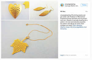
My dad is a Mechanical Engineering professor here at CMU, and for the longest time I assumed that, being a humanities person, I would never understand exactly what my dad does. A few months ago, he brought home some metal rings and some plastic bracelets and necklace pendants. I’d been amazed when he told me that it was a computer algorithm that made aesthetically pleasing patterns. This was the kind of programming that I could be interested in. I’m sorry to admit that I know very little about the actual algorithm other than my dad and some of his students created it.  The goal is for users to be able to design their own creations from home and then be able to print them themselves.

screen-shot-2016-09-13-at-6-36-56-pm

http://phys.org/news/2016-05-complex-d-jewelry.html

Michal Luria – Looking Outwards – 03

Growing Objects / N-e-r-v-o-u-s System

The project I chose this week is an exhibition presented in 2014 called “Growing Objects”. The notion behind this work is to explore how structures are created in nature. The artists translated complex scientific theories and mathematical growing models into algorithms, and allowed 3D printers to generate objects according to these rules.

nervous.com

What I like about this work is that the artist, like in all generative art, does not know what will be the outcome on their art. But even more so, the artist experiences a creation of something that is structured in the same mysterious way as in nature. They can learn something new, and allow others to learn – how models evolve in nature, sometimes over hundreds or thousands of years, is now presented in an art gallery, by using fabrication.

nervous.com

Furthermore, this type of art using a set of rules creates beautiful sculptures that would be hard to create otherwise. The rules are already determined. The artist just needs to choose an inspiration (in this case, structures from nature), analyze their scientific rules, and then must let go and allow the art to create itself.

nervous.com

Yugyeong Lee Looking Outwards 03

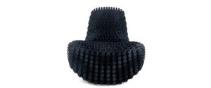
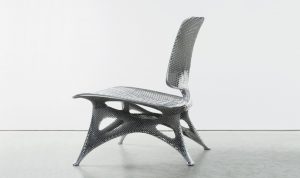
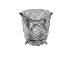
Joris Laarman, a Dutch designer, known for his experimental designs studying variety of shapes, worked on the microstructures series—Soft Gradient Chair, Aluminum Gradient Chair, and Adaptation Chair. The first chair of the project used polyurethane in furniture design by intergrating 3D printing technology in cellular level to specify functions for different needs. Utilizing algorithm based program, Grasshopper in Rhino as shown in the image below, Joris Laarman Lab designed part of the chair to be structurally stable while the rest—more open—acted to give comfort in one print. The second chair is made out of aluminum through Laser Sintering—a generative design tool. Similar to the first chair, the furniture was designed also to specify functions for different needs. Lastly, the third chair known as the Adaptation chair is made out of vertical long module that, like a tree, branch out to form into different geometric shapes to also serve the different needs of the chair. This chair is 3D printed by a SLS machine then coated with metallic material. Through these project, the artist articulate the change of form/shape to adapt to the different needs of a chair allowing comfort as its priority of design.

gradient_soft_gh3-845x684gradient_chair11-1500x630

Soft Gradient Chair

bone-armchair-side_site2-1500x889 schermafbeelding-2014-03-26-om-13-36-18-845x684

Aluminum Gradient Chairadaptation-chair_first-845x684adaptation-chair_close11-1500x630

Adaptation Chair

http://www.jorislaarman.com/


LookingOutwards-3 sehenry

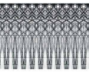
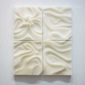
The reason why I chose the project below as my focal point for LookingOutwards-3 is because the sculpture speaks to me. It is a computer generated sculpture of 4 separate but aligned pieces. Each piece has ripples through and through and when you take a step back and look at the sculpture as a whole, it looks very similar to a blanket or sheets on a bed. The ripples within each piece look to be randomly placed so I would have to guess that the algorithm used for this portion of the sculpture would have had a lot of random variables include. Just like I can make a background produce random colors with background(random(30,200), 50, random(40,150)). I also admire how simple this sculpture is. Not every computer generated piece of work has to be filled to the brim with colors and shapes. This one was simple with complicated algorithms. If you click on the link you will actually see that the sculpture is made of tiny little bristles. This really shows the artist’s sensibilities. There is more to see, the closer you get.

lookingoutwards-3

Creator: BREAD
Project Name: Cilia

zhuoyinl looking outward 03

brick
Those polybrick use digital technology like three dimensional printing, and advanced shapes and different material. It is an ongoing project in the Sabin Design at Cornell Architecture. The project makes use of algorithmic design techniques to make those nonstandard ceramic bricks and then fired them into stable shapes. By using digital data to control the shaping of clays from the earth, people are able to make dynamic wall shapes and facades like this with low cost printing materials. Also this kind of brick could be highly customized and spread across the field. I found this project especially interesting because it digs into the possibility of future architectural structures and creates a brand new way to think of customized building materials. What’s more, the hollow structure of each brick gives the material more possibility in environmental aspect.

Link:

Rachel Griswold – LookingOutwards-03

Elytra Filament Pavilion

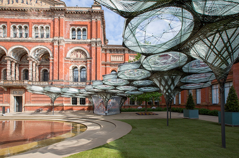
The Elytra Filament Pavillion is located in the Victoria and Albert Museum in London. It is kept in the John Madejski Garden where it will be on display from May 18th – November 6th, 2016. It is made by a robot called KUVA, which was programmed by a team from the University of Stuttgart. The robot weaves fibers across hexagonal structures, the weaving on the hexagons being denser in the center of the overall structure and lighter on the edges. It is incredibly lightweight and waterproof, and resembles a real-life spiderweb. Its design is inspired by the elytra beetle.

The beetle the design was based on.

Each piece of the hexagon takes around 3 hours to create, and the robot continues to build the canopy even as the exhibit is open to the public. Sensors are placed in the canopy fibers, allowing the robot to collect data and monitor how visitors use the pavilion, which will influence how the canopy grows. This means that everyone who visits the pavilion actually takes part in how the art develops, intentionally or not. The team’s goal was to create an “urban greenspace” that can “evolve, reconfigure, and adapt with the use of the courtyard.”

Here’s a link to the museum’s official page on the project. The page also includes the video below, which gives more information about the project and how it was created. I could not find any information about the algorithm that they used, except that they created it themselves.

Sofia Syjuco – Looking Outwards 3

Incidental Space
Christian Kerez
Swiss Bienale 2016
http://www.kerez.ch/
(No link to the artwork itself exists on the artist’s website, but there are pictures of it and his process)

The outside of Incidental Space

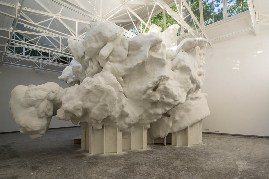
Incidental Space was a work of architecture created by Christian Kerez as the Swiss entry to the Venice Architecture Binenale. It originated from a small model made of sugar and dust, and the larger model is sprayed fibre cement. I admire this work because it is a work of architecture that is not just a model, drawing, or smaller scaled-down representation of something that “could” possibly be built. It is a space in which the viewer can exist in, can experience first-hand, and is not forced to dedicate some of their imagination to simply try and provide a topic for their mind – the structure is right there for them to think about.

Not much information is given on the specifics of the algorithms that generated the work, but Kerez states that his work is, “a combination of a physical model and also a very refined technology, and if you look at the result it is both very sophisticated but it’s also very primitive.” He combines hand craftsmanship with digital processes, and creates something new, unexpected, and beautiful. His sensibilities are manifest in the way the piece makes the viewer question what it means for something to be architecture, and gently leads you to a new perspective by offering you space to explore new possibilities.