Naomi Shimada-Looking Outwards-1

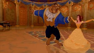
For years, I’ve been a fan of the ballroom scene and the Be Our Guest number in Disney’s Beauty and the Beast. As a potential Animation and Special Effects minor and a 2D artist, I’ve marveled at Pixar’s ability to combine both traditional animation and computer animation. Though the projects are somewhat dated and technology has improved since then, the four years of intense work that 600 animators poured into a single film astounds me.

Beauty and the Beast was made using the software, Computer Animation Production System (CAPS), that was created by Pixar specifically for Disney. Beauty and the Beast was actually the first Disney film that utilized computer animation. Though the filmmakers had originally been against computer animation, the backgrounds that they were able to achieve through CGI eventually won them over.

Clearly Disney and companies like Pixar use computer animation today. Films like Tangled and Frozen would not have been made without Beauty and the Beast paving the way. As a 2D artist who tends to cling to the past, Beauty and the Beast has always been a reminder of a way to bridge tradition with innovation.

Disney Films Beauty and the Beast

Link to the Video:

https://www.youtube.com/watch?v=9qtTPTxvoPA

Research Information:

http://www.digitalmediafx.com/Beauty/Features/originalbeauty.html

Image:
Beauty and the Beast

vtavarez LookingOutwards1

Several people worked on this piece of performance art. The Freckledsky team consisted of producers Val Siganevich, Natalia Siganevich, and Katya Korobko. The Art Direction team included Oleg Bodnarchuk and Front Pictures studio. The dances were choreographed by Olga Goldys and Maxeknyi. The dancers consisted of Olga Sokolova and Jalen Preston. The technical director was Natalka Zheludova. The video engineer was Front Pictures studio.

These artist used Screenberry technologies (produced by Front Pictures Studios). Front Pictures Studios has been on the forefront of multimedia innovations for years. The technologies they used in this video uses large, high resolution projections to deliver immersive visual effects. I believe the artist and technicians were inspired by story telling and technological immersion.

This project is an example of the usage of multimedia for enhancing the fine arts. Here we see live performance (dance) improved by the technological advances of Front Pictures technology. On the negative side, the technology does not look as intuitive for the common user.

Charlie-looking outwards-1

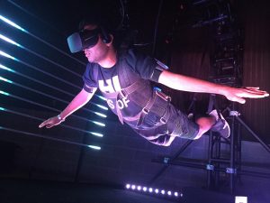
This particular project, called “Airflow”, is future of gaming and entertainment. Developed by Mindride, a company famous for creating unique immersive experiences, “Airflow” is a VR ride that suspends participants in air and simulates the feel of flight by incorporating a virtual reality headset and wind.
vr ride
This project caught my attention because it shows the growth of the gaming industry as it gradually moves out of the bounds of controllers and keyboards to something that involves the movement of the entire body. For example, during the gameplay, the user will move his arm backwards for speed up, throw his arms forwards to slow down, and change flight direction by adjusting his arms and head position.

I think this is also a great step forwards for VR, because until now, virtual reality had been seen as a gimmick with lackluster games and limited usability. While I do not see the likes of “Airflow” being available for consumers anytime soon, I believe this is a great concept that the gaming industry should learn from to move forwards.

Brandon Darreff – Looking Outwards – 1

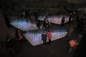
I chose the project inter(e)scapes GLOW by the company SHO in collaboration with ULR Studio which was presented to me by one of my professors, a collaborator on the installation, Gregory T. Spaw. I admire how the project team focused on mimicking a natural element like prairie grass through digital fabrication to start to integrate the technological and natural words. The collaborative project team was comprised of between ten and fifteen people from both studios which worked together in pairings throughout various phases, including pre-planning, design, fabrication, and finally installation.

In order to achieve the desirable response to the implemented system, a custom interactive software and imaging system was developed to react to surrounding kinetic energy and forces such as wind, human touch, and shifting of weight on the ground surrounding the installation. I feel the integration of response to both human and natural forces increases this project’s potential because there is more activity in the system even when individuals are not present.
I think this project begins to hint at further, large scale integration between technology and the natural environment to develop interesting spatial experiences for users.


Project Link: http://www.sh-o.us/intr-e-scapes-GLOW-2015

DSC06845_2_1500

Intr(ə)Scapes @ Georgetown GLOW 2015 from SHO Architecture on Vimeo.

Isabella Hong-Looking Outwards-01

The Basel School of Design has created a six day long workshop that is designed to expose students to other fields of study, ones that supplement their main areas of interest well. The workshop focuses on layout & design, drawing, and interaction. On the fifth day of the workshop, the students use the new skills that they have acquired to merge elements of typography, audio, and lasers into innovative and jaw-dropping animations.

I was particularly intrigued by this project because of my interest in typography and hand lettering. I’ve studied typefaces on my own and for class and have plunged deep into creating vector designs – it had never even crossed my mind that the incorporation of technology was possible.

Six days does seem to be quite a short period of time to be able to fully comprehend the nuances of the hardware used and all the potential of the student’s ideas. They had critiques, revisions, and final presentations all in one day. In my opinion, this is not a sufficient amount of time to bring a project into full fruition.

The Basel School of Design is focused on “image making in the broadest sense” taking into account the ever changing medium of design. The current portal of communication is the world wide web – everything is becoming digitized, and with that has arisen a heightened sense and concern for the user. It has now become extremely essential for designers to do and create with intent. The Basel School of Design effectively teaches their students this by introducing programs such as this one.

Michal Luria – Looking Outwards – 01

Writing Without Words / Stephanie Posavec

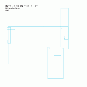
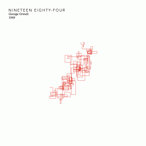
This project by Stephanie Posavec takes literature masterpieces, and presents a new perspective on the classics we are all familiar with. The project compares different styles between authors, as well as different periods in literature, by presenting each piece in a graphical way:

FaulknerOrwell

In the project, Posavec took the first paragraph of each book and broke it into sentences. Each line represents one sentence in that chapter – the longer the sentence, the longer the line.

I find this work inspiring because it takes a form or art we are familiar with, breaks it down to data, and then creates something completely new. This allows us to think about a masterpiece in an alternative way. Furthermore, the project is handmade, which creates an additional aesthetic layer to it.

In my opinion, the downside of the execution of the project is that it only looks at the first chapter. In many pieces the first chapter is a type of prologue, and does not represent the entire work. A different approach would be to create an average of all the chapters in a piece, and only then represent it in a graphical way.

Credit: http://dar.pressible.org/jihiijolly/writing-without-words

Stephen M. Eckert – Looking Outwards – 1

STEVE OF TOMORROW

Lisa Clair and David Commander operating two of the digital puppets.

Steve of Tomorrow is a digital puppetry and toy theatre performance piece created by David Commander and Rob Ramirez also featuring performances by Lisa Clair and video animation by Janelle Miau.
Using cutting edge video puppetry and David Commander’s signature style of live camera toy Theater, Steve of Tomorrow asks if humanity’s well-being is reflected in the recent explosion of technological advancements. Defying the idealistic promise of the future portrayed in science fiction the piece asks if humanity is instead moving towards a future even more apathetic and vapid than today; if capitalism and technology will one day give us exactly what we want and that we’ll find it just as unfulfilling.
My understanding of the tech is that it utilizes the existing software Max MSP.
The creators were heavily inspired by the designs of social media, particularly the limited emotional range that websites like Facebook and Twitter offer.

ShanWang-LookingOutwards-1

Fig.23.12

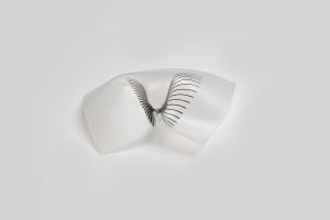
The Traces project that I found in the exhibition section of processing website is particularly interesting to me due to its parametric manipulation of the form of everyday materials. Based on the collaborative research of master students and faculties across several academic institutions,  Dana Zelig created the project that She explored the “spatial, structural and “geometrical” conditions  of letter size polystyrene sheets with both digital tools such as Processing and physical techniques. With light as an activator, the “folding”, or the transformation of the sheet is accomplished through the absortion of heat according to the black line patterns.

Studies and eventually manipulation on the characteristics of light-weight materials like polystyrene can become extremely useful and informative in their application in architectural and industrial design.

However, the fact that the folds are irreversible and the transitory feature of light have resulted in the limitation of this practice. If more researches were be devoted into this project, different activators such as sound, humidity should be tested out so as to broaden the possibilities of future applications various professions.


Traces, Physical Programming of Freeform Folding in Soft Matter. from dana zelig on Vimeo.

Denise Jiang – Looking Outwards – 1

Screen Shot 2016-09-02 at 5.28.42 PM

http://www.modelo.io/

Before taking Computing for Creative Practices, I was introduced to Modelo, an interative 3D modeling collaboration platform. In one of my architecture course, this platform allows a 3D view of our models, and can easily make sections and even animation. Using the program was very useful in visualising the design, and it is accessible because it runs on a web page. According to their website, an architect and an industrial designer founded Modelo. Their profession were very design-based and they probably have used and compared some different 3D modeling software, such as Rhino and AutoCAD. To my knowledge, architects all know their project very well since they have developed the whole project and modeled digitally. However, others like clients who don’t have access to those modeling software wouldn’t be able to visualize the project in a 3D environment. So the founders of Modelo must experienced that inconvenience in offering a visual presentation to others, and often for presentation there aren’t too many functions required. Rather than making animations, Modelo allows everyone enjoy the project in his own willing. Since it is interactive and web-based, it let communication within the team or with the client easier. During my use of Modelo, I received feedback(screenshots and comments built in the program)from my TA and the professor, and I could also look at other people’s work in a 3D form(I could rotate and make sections as I wish).


Sarita Chen – Looking Outwards – 1

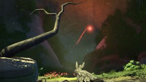
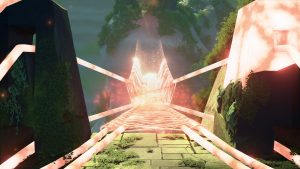
Lost Ember is an open world, indie video game that is currently in development by Mooneye Studios. The game is set for release in 2018. In this game, the player controls a wolf with the ability to control other animals, and can freely walk around to explore the world. What I found admirable about this game is that the studio only consists of five men from Hamburg, Germany. The game itself has some impressive graphics for an indie game, and I also really like the concept. This project is inspiring to me as I’ve always been a fan of small studio projects like this. I used to be interested in game design, and this game is exactly the kind of game I would’ve liked to have worked on if I had continued down that path. What’s also admirable is that the game developers have a clear cut path for what they want to do with the gameplay and plot, rather than getting lost in the aesthetics. The game developers took inspiration from the popular game series The Legend of Zelda and another indie game, ShelterThe upcoming Legend of Zelda game is also an open world game, and Lost Ember has similar vibes and theme.

Mooneye Studio’s blog provides video guides as to how they did the graphics for their game. http://www.mooneyestudios.com/blog/26-inside-lost-ember-1

wolf_cave

memory_bridge_01