Sarah Ransom – Looking Outward – 01

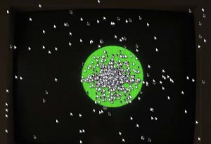
The Automatic Orchestra project is an audio installation created from a collaboration of students of the University of the Arts, Bremen and the Copenhagen Institute of Interaction Design which explores a unique marriage of algorithmic composition and networked music. Before the audio installation was created the project existed as several software prototypes, developed in Processing and Java, designed to simulate the network logic and behavior of what would eventually become the final framework. Now the final product consists of 12 pods/MIDI devices wired together to form a circular network transmitting and responding to musical data uniquely from one another. More specifically, all of the pods are synchronized and exchange encoded musical messages on a shared framework. Each pod, however, interprets and alters the data it receives based on its individual algorithmic rule set.  The result is a unique musical performance where the composition has a lot of room for variability.

This project was so fascinating to me as a musician because of its seemingly random nature. It seems to be based on the Indeterminacy movement of music from the early 1950’s while also recreating the feel of a live ensemble performance where musicians are still collaborating with each other in real time. The responses that each MIDI device constructs, however, seem more solid and well crafted than you might find in most indeterminate music performed by live musicians. While some professional musicians might take issue with this kind of simulation and how it could effect the music industry in the future, I think it presents an exciting new possibility for  music performance where the decisions of the “performers” are more unique, unconventional, and less prone to human error.

More Examples of music produced by The Automatic Orchestra:


LookingOutwards – 01

Love Has No Labels

In homage to the Selma March in 1965, the “Love Has No Labels” campaign by AdCouncil was based on a public service advertisement filmed at a live event in Santa Monica on Valentine’s Day 2015. During the filming, a large X-ray display created by Mindride LLC, a studio based in LA and NYC, was set up to show skeletons kissing, hugging, or dancing behind the screen, after which people stepped out and reveal their faces. The visual effect was not generated by an X-ray machine, however, instead was created by lifelike models powered by Xsens sensors and Maya. Xsens wireless sensors, which were hidden under clothes during the event, were used to capture and perfect the naturalistic motion for the event. As the center technology in the production, Xsens sensors possess promising features such as live-delivery, easy setup, superior compatibility with commonly used software, and affordability.

We are driving through this live motion capture, but we can really control any type of avatar; I feel like the digitization of the human is a very exciting space to be in.

– Yehuda Duenyas, Mindride LLC

In the meantime, AdCouncil is currently expanding the social impact of the “Love Has No Labels” campaign. The campaign this year, “#WeAreAmerica”, continues to circulate around social media newsfeeds, battling implicit biases by pushing videos and images of inclusion and acceptance.

Learn more about the creating process

Learn more about Mindride LLC 

Learn more about #WeAreAmerica

Learn more about other campaigns promoted by AdCouncil here

LydiaJin-LookingOutwards-1

I really liked this idea of saving retail space by placing a huge screen inside stores to give buyers a high tech and visual experience. The idea isn’t new and has been around for a few years. However, CenterStage is unique in that it blurs the lines between broadcasting and interactions without undermining the potential of either by incorporating with Creative Director Lutz Vogela nd visual effects powerhouse Method.
Despite the wonderful concept of CenterStage, one concern that I have for it is the unstableness of technology. In case the machine breaks during store hours then it will be a great damage to the company’s reputation and will be detrimental to their revenue for the period the system is down.

Hannah K-Looking Outwards-01

The Fallen Star installation is the final prototype built by the Architectural Association (AA) DLab Visiting School. This installation can be manipulated by user feedback, and it sits at the intersection of biomimetics, perception, and interaction. Student teams built a 3D-model and used video mapping, as well as algorithms and digital fabrication.

Time lapse of the Fallen Star (Photo: Architectural Association)

This installation caught my eye because I feel that while technology enhances it, it is already quite impressive on its own. With the use of technology, especially because it is interactive, the piece becomes so much more than simply the sum of its parts.

This project is effective at challenging one’s sense of perception about space, and by incorporating music with the project, the overall effect is much more powerful because it is both visual and auditory. It shows the potential for the kind of impact that pieces that create an experience for viewers can have.

In 2012, the year that this installation was created, the DLab chose green as its color in which to carry out experiments. The green color served as the ultimate inspiration for this project, in which creators had to observe the natural world and create their own abstractions and interpretations into designs.

Sofia Syjuco Looking Outwards-01

Do Not Touch
Studio Moniker
do not touch

Do Not Touch is an interactive, crowd-sourced music video that is constantly re-created and regenerated every hour. Studio Moniker, a team of ten people, created this video as the backdrop for the song Light Light by Kilo. Although the team that created it is quite small, the number of participants who make its continuous evolution possible is over four million. It took, on-and-off, one year to make this project, which was coded in javascript.

A work that served as the primary inspiration for Do Not Touch was a video recording of the game “Nemesis.” The video had many recordings of the same level overlaid atop one another, with more and more recordings stacking until one recording showed the player finally beating the level.

This project points to a future in videos (not only just music videos, but perhaps movies as well) that depend on viewer interaction to tell a story. A story that can change with every telling, as each new participant brings something new, but always holds true to some constants – because those who are interacting and changing the story in minute ways share common human experience and instincts.

Jiyoung Ahn-Looking outwards-01

This video absolutely fascinated me when I first saw it. Colorful and sophisticated effects looks so real, and different dance moves show different effects more lively. I think the language of dance move really works well to show creativity and technical skills at one time. This awesome video is created by Motion graphic/ animation studio ‘Method Design’ which is based in New york.

This video is executed for ‘AICP(Association of Independent Commercial Producers’  and this video is a intro video for AICP. This was directed Rupert Burton. It is really amazing that Method Design studios delivered this video in two months with a core team of only three people, with 3 part-time workers.

Because there are so many different effects showing, they mostly used Houdini software program to create this video. I would say this video is the evidence of successful use of Houdini program. This reel includes not only motion capture skill but also dynamic effects and animation simulations.


Jess Medenbach Looking Outwards-01

AlterBahnhofscreengrabblur

The Alter Bahnhof Video Walk was designed for the old train station in Kassel, Germany as part of dOCUMENTA (13). Participants borrow an ipod and headphones and go to the abandoned train station where they then watch a film on their phones that takes place in the abandoned space they are standing in.

What I think is really effective about this piece is that the uncanniness of the event brings up a lot of thoughts about memory of experiences, as well as memory of places, and how a space contains many past and present happenings within it.

The project could be more effective if in addition to the ipod there are other interactive elements within the space…such as actors or objects that bring the participant even more into the world of the story and the nostalgia of the piece.

It’s unclear the exact influences for this piece but the experience seems to be inspired by immersive theater pieces such as Sleep No More, as well as site specific video installation, as well as traditional historical art walks.

Looking Outwards “Infinite Space” -sehenry

This article peaked my interest in design and raised it to a new level. Art that is made by technology can sometimes be superseded by the fact that its clear that technology is behind the experience. One of the owners of Nonotak Studios, Takami, talks about how their light sculpture, “Infinite Space” is meant to immerse a person in art and in a state of fascination so that it is hard to imagine that technology is behind the sculpture. Takami and his partner, Noemi, have been trying to relate architecture, space, and sound, and fuse them into one piece of art. There seems to be 3 people working on the project currently along with Toyota and the Creators Project as well as a team of engineers. The things they used to put the piece together was a mixture of custom software scripts and probably some of the “off-the-shelf” software. The development of this project shows that the evolution of technology may well break the barrier between reality and the virtual. Currently they have one prototype called ‘Plume Version One’. Although I am unsure what they may have been influenced by to make this sculpture, it is still so fascinating to see that people are taking steps to do what many don’t try and can’t imagine.

GraceSimmons-LookingOutwards-01

21 Balançoires (21 Swings) is an interactive artwork installation set up each spring in Montreal. The project involves a giant swingset, and participants use their bodies to prompt the notes to play; the project encourages cooperation because swings moving in different alignments create different melodies. The colors of the swings indicate which instrument is playing (piano, harp, guitar, vibraphone) and the pitch is determined by the height reached. It’s a project from the creative group Daily Tous Les Jours, headed by Mouna Andraos and Melissa Mongiat, and their team of 30+ people including design, conceptual, technological, and programming experts. It uses custom software – each swing has a sensor that networks its position and relays this information to a computer via a fiber optic data link. Continuous monitoring allows for adjustment of volume depending on time of day.

swings

I admire this piece because of its intent, which was to bring the drab urban environment alive with lots of people working together and conversing in pursuit of a playful, engaging goal. However, I do believe the placement of the swings could be even closer together, to promote more conversations and exchanges. The artists were probably inspired by previous works that focus on urban engagement, such as numerous billboard projects that film live crowds, or walkways that light up in various ways depending on crowd movement. For the future, I think this project shows that items that are often overlooked or ignored (like playground equipment) can be easily modified with technology to inspire strangers to partake in something outside the realm of their daily routines.


http://awards.ixda.org/entry/2013/21-balancoires/
http://www.dailytouslesjours.com/project/21-balancoires/

Looking Outwards 01

“Loved” is a short story told in the format of a platformer type video game. It was created by Alex Ocias using Flash, Pixelmator, and Audacity. The purpose of its creation was to see if games could present a story in a meaningful way like books and movies do, and to get people to really think about the games they were playing. Ocias was able to create the story in just a month, and since its release in 2010 the game has been played over 5 million times. Hopefully this means that others will take inspiration and make other emotionally-charged, meaningful games and that video games will be seen as a legitimate form of storytelling. Ocias himself was inspired by games like The Last Guardian and Deus Ex: Human Revolution, as well as game companies Thatgamecompany and Edios Montreal. The gameplay, while being quite simplistic, quickly becomes irrelevant once you begin playing. You’re completely immersed in the story, and even the less-than-perfect controls can’t overshadow that. I’d highly recommend this game to anyone – it only takes max 15 minutes, and is best if you play alone and with the sound on.

You can play the game here. (Please note that this game deals with heavy subjects such as abuse, and in the words of Ocias, “contains content that some players may find disturbing”)

loved_splash_alt2