egrady-LookingOutwards-02

http://marcinignac.com/projects/city-icon/

This work of generative art by Marcin Ignac is a virtual city, that features intersecting systems such as traffic jams, water streams, nature enclaves, emergency states and energy sources interacting with each other to form complex patterns. A city is one giant and complex organism, with an abundance of unique patterns forming as a result. The generation of a city is much like the process for which generative art is developed, with the final piece being a rendering based upon the random values of different variables that all add to the final work. In the author’s “about” page he states that he finds inspiration in “structures of biological organisms” and in “patterns emerging from data and complexity of computer algorithms.” His inspiration makes perfect sense in reference to ‘City Icon’, as it represents a biological organism with emerging patterns formed with complex computer algorithms.

I think that this project is particularly interesting because it shows that programming (and generative art) also has the function of creating entire complex systems that very nearly simulate organic life. This project has inspired me to think of programming as a tool for which I can turn my ideas into reality. As for how this work was made, I think it has to do with assigning random variables for different events to happen, like if there is a traffic jam or natural disaster, there is a variable that determines when and where it occurs.

Creator Name: Marcin Ignac
Title of Work: City Icon
Year of Creation: 2012

sunmink-LookingOutwards-02

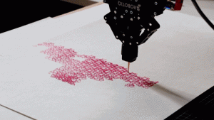
Turbulence by Dr.Woohoo is a collection of paintings drawn with robot arm using the algorithm of Perlin Noise effect. Perlin Noise effect is usually used for generating randomness in films when creating water effects in sceneries, however, Woohoo used it to instruct the robot to repeatedly draw a hexagon shape. With this algorithm, Dr.Woohoo created a delicate and organic art piece.

Dr.Woohoo as an artist combines various fields of his interest such as 3d printing and robotics to create interesting artwork that is delicate and organic. Although he used water color for the Turbulence, he is known for incorporating mediums in various methods to create his art piece. He not only pushes himself to integrate different fields but also desires to break through the traditional idea of art and introduces innovative styles to produce art. This for me is inspirational because he proves that art is not something that has an outline. For him, using the same medium does not mean the same. Depending on how he uses the medium it can turn into shoes with a wonderful pattern or a beautiful painting.

Matthew Erlebacher LookingOutwards-02

Robert Hodgin/flight404 “Taxi, Taxi!” 2/26/2016

The piece of generative art that I found to be the most interesting was “Taxi, Taxi!” by Robert Hodgin. The main thing that I admire about it is how much the piece has going on at once. The video has a bird’s eye view of a large city and has several glowing dots moving across the street (these presumably represent taxis). I also feel that it provides an interesting and meta perspectives on large cities. From the bird’s eye view you realize how large the city is and how many different people are moving around in it. One critique of the project that I would make is that it keeps cutting between shots. While cuts are good so that the audience doesn’t get bored they use this to often, and it becomes more distracting than anything else.

dayoungl – LookingOutwards02

Kyuha Shim’s Formation (2016) commissioned by Alliance Graphique Internationale (AGI).

I found this project on his portfolio website. Q is currently here at School of Design teaching communication design. Q is famous for creating his projects using the concept of data visualization. There isn’t a lot of description about this project other than “Commissioned by Alliance Graphique Internationale (AGI) for the Special Project Exhibition during AGI conference in Seoul 2016. A generative system that presents a critical view of responsive systems through multitudinous transitions and scaling of graphic forms.” What I found interesting about this work was that it transformed simple elliptical shapes into something more interesting by randomizing proportion and colour. I was also amazed by despite how random the colours are, no one colour seems unfitting.

jwchou-LookingOutwards-2

This post features the work of an artist/designer right here at CMU! His name is Kyuha Shim, or “Q” for short. He teaches communication design in the School of Design.

Q has done multiple projects based on generative typography. He used custom software to patterns and forms to create and present traditional letterforms/type in interesting and unique ways.

His work on generative type: http://generativetypography.com

Typography is very delicate. It depends on a set of somewhat-flexible rules that govern letterforms, thickness of strokes, and how close characters should be to each other. I assume that in order for Q’s type to look like type, the algorithms he used included many rules and boundaries to ensure that the generated type still contained many of the important characteristics of standard type.

Q’s artistic sensibilities are reflected in the different typefaces, colors, textures, and patterns he used. As an extension, the sensibilities of type designer who might’ve designed a typeface he used also influenced the piece.

This project inspires me because it is still incredibly dynamic and beautiful, even though typography has a reputation for having a lot of intricate rules! If I were to change something, I would’ve loved to see some generative type in a bigger scale. A lot of his projects focus on a word or a short phrase. What would a paragraph look like if it was pushed through his algorithm?


mjanco – LookingOutwards02- Section B

Michelle Janco

LookingOutwards-02

Section B

I looked at the piece WAVES by Lia, created in 2016. WAVES is a generative installation that shows flowing virtual waves that continuously flow and never repeat the same way. I admire the beauty of this piece, as it appears like a moving painting. It does not change drastically, but with subtlety. The tiniest of details change and never repeat, which brings this scenic, digital “painting” to life. Lia describes that the direction of the waves is unchangeable, meaning the code written called for one directional movement. However, the patterns and layering of the waves themselves are always randomized, due to the randomized changes in details, rhythm, and scale. I also really liked that the project manifested into a backdrop for artistic performance, both enhancing itself and the performance, to make one beautiful piece. Lia shows that WAVES played at a concert, “Blades” behind the musicians. (link: http://www.liaworks.com/theprojects/waves/ ).

@C – Lâminas
(Pedro Tudela e Miguel Carvalhais) na Blackbox
2017.03.03 Gnration, Braga, Portugal
© André Henriques
www.facebook.com/ahphoto.portugal


mmiller5_Looking Outwards-2

Conway’s Game of Life, created by John Conway in 1970, is a generative “game” where cells live, die, or are created depending on the number of living cells around them.  Conway didn’t want the algorithm to lead to exponential amounts of growth but he also wanted the ruleset to be simple, so he based the rules around cell adjacency.  “Players” choose the starting conditions– which cells are alive– and from there the algorithm autonomously steps through generations leading to a wide degree of possible patterns including all cells dying, static lifeforms, self-replicators, and more.  What inspires me the most about this project is that from a simple ruleset, there is a great amount of complexity that can be created; that 4 basic rules leads to a system that creates wonderful patterns.  Communities have formed around discovering new properties in The Game of Life, and other versions of it have been created with different rulesets and cell types.

atraylor – Looking Outwards 02 – Section B

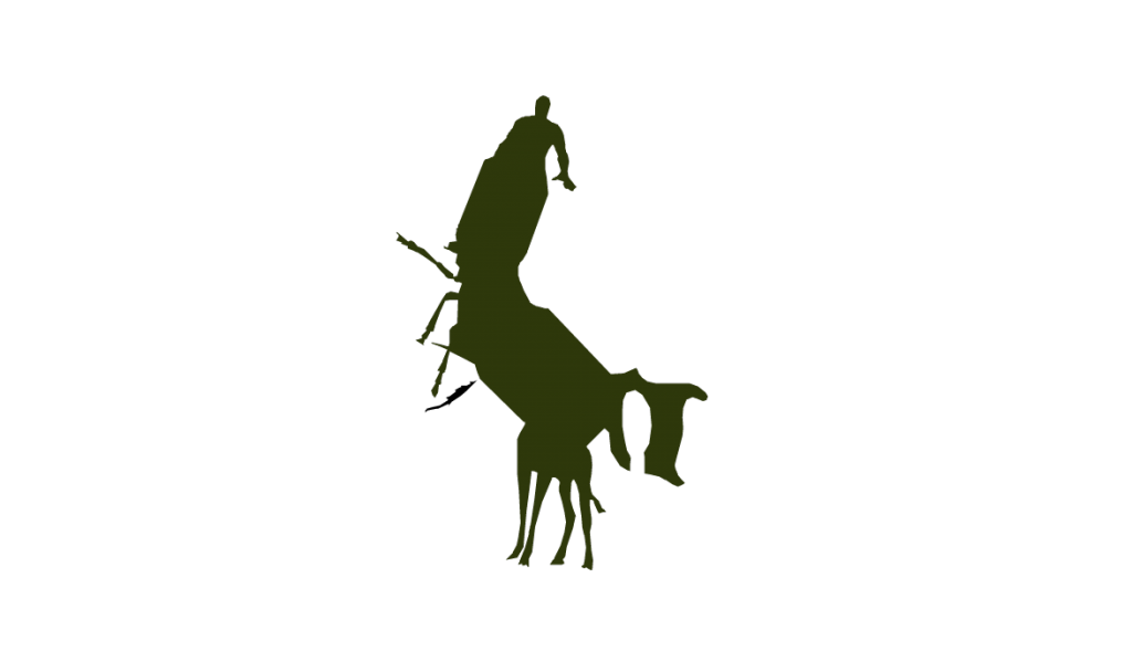
I spent a long time looking through different creative coding pieces and settled on Hydra a generative shadow maker, by Nicolas Barradeau. This piece takes silhouettes of animals, people, and objects and splices them together based on cuts the user makes. This results in blob-like hydra creatures and very satisfying sounds that accompany the creature creation.

I admire that this project is simple and yet is still fascinating. Taking pieces of objects that are recognizable, simplifying them and allowing the user to make decisions, makes this piece accessible, and yet it’s frustrating and exciting when you don’t get the result you expected. This piece allows the viewer to use their imagination similar to looking for shapes in the clouds or watching shadow puppets on the wall.

Lrospigl-LookingOutwards-02

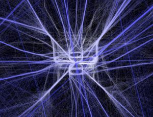
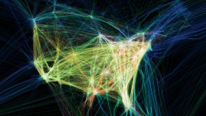
The project I looked at was Flight Patterns by Aaron Koblin. As I was scrolling through the list of projects, this one stood out to me. There was so much happening I couldn’t look away. Unfortunately, there wasn’t much information on the site to let me know how this project came to be. From what I found on the site, they put in information from the FAA into a program that allowed them to visualize the information. This to me is really interesting, mostly because it resembles the most to what we are taught in design about being able to translate quantitive information visually to communicate a certain aspect of it.

flight pattern 1
flight pattern 2

It is also incredible how beautiful the outcome of these numbers and patterns are. By giving a visual aspect of the information, it also gives a better understanding of exactly how much america uses planes in concentrated areas.


abradbur-Looking Outwards 02-Section C

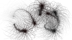
Just one of the limitless images that can be created by Tentasho.

This is an image that was created by the program Tentasho, an interactive exhibit displayed at galleries that will draw different images depending on the sliders guests use and how they move their finger on the touchscreen. Tentasho was created by LIA in 2016, and while it can be experienced as an interactive exhibit it is also generative, as it will begin to draw on its own if left to itself for too long. It is described as “impatient” taking control of the art out of the artists hands should they become to hesitant in their strokes. I find this exhibit inspiring because every image crafted by Tentasho is entirely unique, like several thousand art pieces in one. The images it produces are alien, yet the processes Tentasho uses to draw appear meandering and calming. The generative qualities of Tentasho also make the piece feel alive and whimsical. The algorithm used to make Tentasho must have had some aspect of randomization to it, and I think the organic look of the pieces it generates reflects LIA’s artistic sense in that they appreciate art that occurs by chance.

Here is the Tentasho page on LIA’s website.