heeseoc – Looking Outwards 01

http://frankensim.animade.tv/

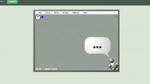
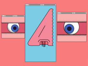
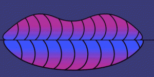
FrankenSim is a web-toy produced by a team of animators and developers called Animade. I chose this project because it is, first of all, fun. The color is fun, the graphic elements are visually engaging, and many unexpected interactions such as sound and motion could be found while clicking around. Also, the fact that this web piece is in a shape of old Windows interface makes it more interesting. It draws an initial nostalgic feeling when the viewer first encounters this piece, and surprises them with  There are numerous little details that would make the user feel awe of their creativity and wit.

The producers were inspired by how Frankenstein might have experimented with modern web tools. Even though it does not hold a necessarily practical purpose other than providing entertainment, modern remakes of famous classics as such give the audience an opportunity to think about the signification of the originals and get inspired. Also, the fact that people still visit this website even though it doesn’t really “do” anything, proves that the interactions that are embedded in this piece are truly innovative and creative, in itself accentuating how smart interactions and delicately crafted details are crucial in engaging people even without tangible contents.

adev—Looking Outwards 01


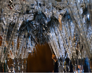
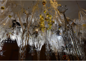
SENTIENT CHAMBER, Philip Beesley, 2015

Philip Beesley is a groundbreaking architect who does extremely experimental, research-based work with organic forms and inorganic materials. His work lies at the cross-section between architecture, art, microbiology, ecology, engineering and machine learning. This particular project is a responsive ecology-like pavilion that is built extremely efficiently, with synthetic materials and built-in sensors. This ecology has micro processors and micro sensors through which it carries out pre-scripted behaviours. This particular installation is being used to research a curiosity-based learning system.

I find this work to be riveting not just because of the technology but because of the possibilities it makes me think of. I find biology fascinating and it is really interesting to see how the organic and inorganic are fusing to create the intelligent systems that are extremely aware of their environments. These pieces don’t just exist in isolation, they are very much a part of the space they’re in. On a phenomenological level, I think this work is a vital insight into the anthropocene as it sheds an almost optimistic light on the future of things, materials, spaces and how we will interact with them. I also attended one of Philip Beesley’s lectures and his take on the philosophy of his work was really inspiring.

rkondrup-Looking Outwards-01

Tore Knudsen and Justin Daneman have developed
a system to help people to better understand RGB color theory. This system consists of three cylinders, representing red, green, and blue. Water is then added or subtracted from these cylinders, which is detected by built-in sensors and translated by software into RGB color intensities imposed on a projected image.

I find this project to be a very effective medium for communicating the abstract idea of RGB color in a manner which is more tangible and intuitive than is generally the case on a computer screen. This sort of analog representation of a generally digital concept is very helpful in understanding the relationships among the three primary colors of light. Certainly a person would have a much easier time learning RGB colors using this system than is possible changing three number values on a screen and having to wait to see the color output. I am curious to see what other types of learning systems can be developed which can aid in helping people to better understand abstract concepts in a fashion similar to this.

juyeonk-Looking Outwards-01

Creator: Paige Smith

Title: Urban Geodes

Year of Creation: 2012~

Link to the project: http://www.thisiscolossal.com/2017/09/crystalline-artworks-by-paige-smith/

Urban Geode by Paige Smith is a set of projects created by filling in the gaps and cracks of the urban structures with paper-folded geodes. These projects not only turn the ugly faults on the buildings in to a piece of artwork, but also bring nature into the urban landscape by introducing the organic form of the geodes’ natural growth. The geodes appear in various colors including bright purple, pink and yellow, and are intended to give these holes more liveliness than the monotonous speckle that is usually used to repair them. The main purpose of the project, according to Smith, is to signify the beauty of the urban landscape and to discover beauty in the mundane. These installations could be found in San Francisco, Madrid, Philadelphia, Dubai, Mali, Istanbul, but most notably in Los Angeles.

I found it interesting that this project used perhaps the most ‘unartistic’ setting to create the artwork. Cracks and rifts along the buildings and sidewalks are something that we hardly recognize as beautiful; if anything, they represent the destruction of the hard work by architects and urban planners. But by filling them in with beautiful crystalline structure, Paige showed the extent to which media outside of the convention could be used to convey that seemingly frivolous and ugly features could be turned into a work of art.


ssharada-Looking Outwards 01

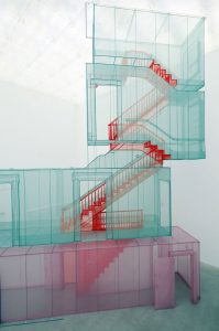
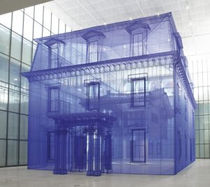
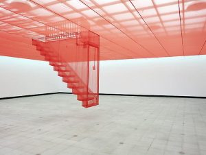
Do-ho Suh is a Korean sculptor and installation artist. His creates beautiful and delicate replicas of houses that he has lived in using wireframe structures and translucent, organza like fabric.

The fabric is used to highlight the “invisible memory” that one develops from experiencing a given space; the fabric also is an easily found material in Korea giving the viewer’s experience more value rather than the skin. Suh’s work is a 1:1 replica of the houses that he grew up in allowing for visitors to walk through them and live Suh’s memories of these houses. To create such large and complex pieces, Suh had to use a 3D scanning machine to get precise dimensions.

Suh’s work is a traditional representation of what a house is – when you look at the sculpture of his Rhode Island house, it is exactly what you would imagine an American house to be. Yet, the experience is different when you can see through the floors,ceilings, and walls.

You experience how one space in the house relates to another. I appreciate his work because it’s a physical manifestation of what we are taught in our architecture studios – understand the relationships between spaces and then only create them.

His work serves to show how the meaning of home can be different to everyone – the architect creating the space, the person occupying the space for a number of years, and the foreigner who has never experienced the space before. It also shows how technology can let us know what these experiences are for without it Suh would have not been able to create his sculptures and without it no one would have been able to see his experiences through a different view.

Technology could be the way to help us better understand other people.

keuchuka – Looking Outwards 01

‘A Musical Wall where Little People Live’ is an interactive exhibition projected on a wall that responds to physical objects placed onto the wall. Depending on the type of the object that has been attached, the little people projected on the wall will slide, jump, or climb on. Different tones are also played when different types of objects are placed on to the wall, as well as when the little people interact with such objects.

This project is effective in its simplicity. Little children understand what objects do to the little people and are able to play with them easily, even though the objects and the little people seem to live in two different realms. The engagement of different senses also produce a wonderful sense of delight.

This installation signals an integration of the physical world and the virtual. The objects are “real” and the little people are merely projected, but they interact well together with logic that determines the tones they produce. The technology helps us rethink and expand the field of art in a few ways. It suggests the scale of virtual space created can expand within a relatively small physical space, allowing us to understand and be part of the virtual world in a creative way as well. It also means that we are able to easily manipulate the art around us, making it ultra subjective. A suggestion may be to encourage the use of physical touch as well.

teamLab (the artist collective) is mostly interested in how one experiences space and how to change that. It was founded in 2001 by Inoko, who gathered programmers, engineers, and designers for a digital agency. They believe “The digital realm, free from physical constraints, allows for unlimited possibilities of expression and transformation. Digital technology is a tool for change and a platform to express complex ideas and details.”

Looking Outwards 01 Thomas Wrabetz

Interactive Buddy

Interactive Buddy is a flash game created in 2004 by shock-value, a single user on DeviantArt. The goal is to interact with a small grey dummy using various objects to earn money. It was one of my favorite childhood games.

Humble graphics bely a novel and entertaining concept.

The original project description states that Interactive Buddy was partly inspired by material on Bit-101, a website for programming tutorials and projects. In return, the idle/interaction concept pioneered by Interactive Buddy was undoubtedly influential on later successful flash and mobile games such as Doodle God. It is unclear how long it took to create Interactive Buddy, although it seems it may have taken between one and several months based on the author’s journal entries. It was programmed using Adobe Flash.

Interactive Buddy

dahyec – Looking Outwards 01

Groupon

Groupon is a service website and app where people are able to buy goods and services in groups for a discount. This project started as a side project for a small team who was working on a platform that focused on getting people together into online groups to solve problems. They decided on using the concept of group buying in order to make money.

https://youtu.be/c-40o3ZoXJU

“A modern groupon ad.”

Initially they sent emailed group coupons to people daily, but in around 2009, they developed their own software which people could use to easily browse the coupons in their local areas.

“The Groupon logo. Bold, simple, and practical.”

Their website is not artistic in the very least. But I am inspired by how such a small idea could turn into one of the most popular software in the world. As a designer, I wish that the website and app would adopt a more aesthetically pleasing form, but I can’t deny that it is practical.

For more information,  click here <https://www.forbes.com/forbes/2010/0830/entrepreneurs-groupon-facebook-twitter-next-web-phenom.html> and here <http://www.businessinsider.com/inside-groupon-the-truth-about-the-worlds-most-controversial-company-2011-10>.

ctv Looking Forward


https://www.youtube.com/watch?v=x3jkoIyJgoc


This project is a wall installation of black and white coins that flip to show imagery. I am fascinated by this project because of the hybrid digital/physical components working together to make an experience. Cameras and software control the black and white dots to interpret a viewer’s interaction. Software tells the display which frame should be shown. Ths image is a combination of videos, picture, text, and shapes. One of my favorite parts of this installation is not digital; the sound of each coin flipping in unison is elegant.

Many pieces of art use this type of display, but the scale of this installation is exquisite. I am unsure of the exact number of people who created this piece, but the video says it is a team from an artist collective in conjunction with TNT Network. Custom software was built to control this dot-board. In addition to writing software to determine the image to display, custom software was built to drive each pixel.

One specific type of work the creators were inspired by was airport/train station flip signs. This product is now commercially available to organizations to install. This technology was originally developed by Kenyon Taylor in the early 1960s. This specific piece is created by a team called Breakfast NY.

Looking_Outwards_1_Sontag

Last year, a group of 5 or so brothers in my fraternity competed in Build 18, and created a driving fish tank that was driven by our house goldfish (Scuba Suresh). The tank moved based on the location of the fish in the tank. The used a sensor mounted above the tank to determine the location of the fish. The further the fish moved to the forward determined the speed at which the motor propelled the tank. The tank would also turn based on the fish’s location right or left of center. Although it look minimal software and hardware, I took it as an inspiration because it was a quirky use of their knowledge and they were able to create it with a close group of friends. They actually became quite the internet sensation when the video when viral on Facebook, receiving half a million likes overnight.