amui1-LookingOutwards-07


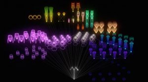
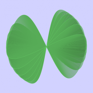
The project I chose to reflect on for this week’s Looking Outwards is called “Facebook Flowers.” This project is by Stamen Designs.

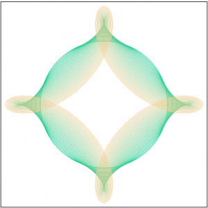
This first video is called “Marvin the Martian.” The artists follow the viral activity after George Takei, an American Actor, most well known as Hikaru Sulu in Star Trek, shares a “Marvin the Martian” picture on Facebook. They realized that the sharing and connections that follow a thread create this ever continuing strand, which branches indefinitely off of numerous points. The artists compare this large and complex data set to a living organism such as a plant or algae.

Caption: “Marvin the Martian.” This video is showing the thread after George Takei shared a picture on Facebook.

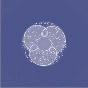
Caption: “Famous Failures.” Facebook thread after posting of the most famous failures.

This video is called “Famous Failures.” I admire this video in particular because it contrasts significantly to the video above. This “algae” is much more concentrated and sprouting much more quickly. This represents how fast and how far “bad news” spreads. I can only imagine how large and complex the data set behind this visualization was. So, it is really inspirational that the artists were able to symbolize and communicate the same meaning from the data set in such a representative, graceful experience.

I couldn’t find any information on how exactly the artists related the data set points to the points on the visualization. However, I suspect there is a mapping of points (each time the thread is continued) from an original point (the beginning post). I suspect, after that, maybe the points are transferred to an x-y plot.

The full page can be found here

akluk – Section A – Looking outwards-07


A still of what the animation looks like.
For this week the project that I have chosen to explore is a project called “The creatures of Prometheus” by Simon Russell which was created this year.


Demonstration of the animation

What I found interesting about this project is the fact that it utilizes both visual and audio data to convert into a beautiful animation. What is interesting is that the artist usually hand animates his own animations, but for this project, he simply created a self generative algorithm and plugged in the data, and the animations were as vivid and fluid as it is. While I do not know what exactly the algorithm that was used to generate this animation. It seems to utilize not only the current audio/visual data presented but also calculates and incorporates the rate at which the audio and visual data is changing to create a more natural and organic waves. What I most like about his style which is also present in this project is the use of more vibrant and neon colors, which the lines looking like electrical pulses and waves. It gives a very futuristic and sci-fi nature to his artwork. Below is the link to the project.
The Creatures of Prometheus

akluk-Project-07-curves

sketch

//Alvin Luk
//Section A
//akluk@andrew.cmu.edu
//Project-07


var nPoints = 200;
var edges = 2;


function setup() {
    createCanvas(400, 400);
    frameRate(10);
}


function draw() {
    background(255);
    // draw the frame
    fill(0); 
    noStroke();
    stroke(0);
    noFill(); 
    rect(0, 0, width-1, height-1); 
    
    // draw the curve
    push();
    translate(width / 2, height / 2);
    drawCurve(edges);
    pop();
}

//--------------------------------------------------
function drawCurve() {
    // Hypotrochoid
    // http://mathworld.wolfram.com/Hypotrochoid.html
    // draws multiple hypotrochoid with differeing h's
    for (var j = 0; j < 30; j++){
    var x;
    var y;
    
    var a = map(mouseX,0,width,0,200);
    var b = a/edges;
    var h = map(mouseY,0,height,0,4*j);
    //changes color gradient depending on which hypotrochoid currently at
    //and also the position of mouseX and mouseY
    var red = map(j,0,30,0,255);
    var green = map(mouseX,0,width,0,255);
    var blue = map(mouseY,0,height,0,255);
    stroke(color(red,green,blue));

    //draws single hypotrochoid
 	noFill();
    beginShape();
    for (var i = 0; i < nPoints; i++) {
        var t = map(i, 0, nPoints, 0, TWO_PI);
        
        x = (a - b) * cos(t) + h* cos(t * (a - b) / b);
        y = (a - b) * sin(t) - h * sin(t * (a - b) / b);
        vertex(x, y);
    }
    endShape(CLOSE);
	}	


}

//adds number of edges/ corners each time the mouse is pressed
function mousePressed() {
    edges +=1
    if (edges > 7){
    	edges = 2;
    }
}
//--------------------------------------------------

For this project. I first followed the guidelines provided in the assignments and chose a graph from the mathworks curves section. I chose the Hypotrochoid, since there was a lot of variables in the parametric equations of the curves that I could play with that enabled me to create varying versions and variations of the curve. I also thought that just one hypotrochoid seems kind of static. So I decided to use a for loop to generate numerous hypotrochoid super imposed on each other with a changed parameters. I also made it so the color changes based on the position of x and y. Clicking also changes the ratio of a and b creating new different classes of hypotrochoid. Below are some screenshots of what my program creates.

sntong-Project-07-Composition-with-Curves

sketch

//scarlet tong
//sntong@andrew.cmu.edu
// Section A
// Project 07 - Composition with Curves


//intitalize a value before using it for the x and y equations
var a = 0;

function setup() {
    createCanvas(300, 300);
    angleMode(DEGREES);
}

function draw(){
  //changing the alpha channel allows the movements of the dots to "lag" behind
  //creating interesting "tails" for each dot
  background(250,170,23,100);
  push();
  translate(150, height/2); // so that we can see the curve on the cancaus
  beginShape();
  for(var i = 0; i < 200; i++){
    var theta = map(i,0,100,0,360);
    // a controls how much the curve "bends" and loops
    var a = map(mouseX, 0,480,-7,7);
    //Conchoid of de Sluze equation from Wolfram MathWorld
    var x = (1/cos(theta)+(a*cos(theta)))*cos(theta);
    var y = (1/cos(theta)+(a*cos(theta)))*sin(theta);
    // color of the dots changes according to mouse position
    var col = map(mouseY, 0,300,0,255);
    var jitter = map(mouseY, 0,300,0,7);
    noStroke();
    fill(col);
    //"polar array" the Conchoid from the center
    rotate(90);
    //the first dotted line
    ellipse(x*20+random(0,1),y*20+random(0,1),2,2);
    //the second dots are rotated on a different angle of offset
    rotate(45);
    //the second dotted line
    fill(255-col);
    ellipse(-x*10+random(0,1),-y*10+random(0,1),2,2);
    // another layer of dots with larger diameters are then introduced to highlight
    //specific paths the curve took.
    if(i%4==0){
      ellipse(x*20+random(0,1),y*20+random(0,1),3,3)
    }
  }
  endShape(CLOSE);
  pop();

}

For this project I choose the to use the Conchoid of de Sluze equation found on Wolfram MathWorld as my base curve. I did more experimenting while I was coding and layer more alterations to the curve configuration each step. In this assignment I wanted to explore the use of density so that it implies a set of lines; however once the image is static it becomes harder to tell which dots make up a specific curve. I started off with a set of mirrored curves where one is scaled to a factor to another. Then I added motion of the curves by tracking mouseX and mouseY. From there color change is referred to mouse position and rotation is introduced to the curves.

mjnewman LookingOutwards-07, Section A


Through the Digg API, Chris Harrison was able to visually represent the most popular news stories of the day. Especially in today’s news cycle, there is so much content to absorb and process daily. With all that social media does to the news cycle, I wonder what those rings would look like in 2017 as opposed to 2007-2008. That was still a very busy and important era of the 21st century, but everything has grown and escalated since then. I admire how Harrison attempts to condense our everyday activity and attention into one artifact.

What I find interesting is how warm toned each circle is, which means there is a lot of “World & Business,” “Technology,” “Lifestyle,” and “Offbeat” Stories. However, the API is constantly being updated to better adapt to news stories, so the colors will change with that.

thlai-Project-07-Curves

My math is a bit rusty so my head spun when perusing the Mathworld website. I first played around with the equations given in the project example, which resulted in this:

I studied each part of the code until I was able to create another curve. I created a Cartioid Curve that increases size and rotates based on mouseX, and the background also changes based on the mouseX and mouseY positions.

sketch

// Tiffany Lai
// 15-104, Section A
// thlai@andrew.cmu.edu
// Project 07 - Curves

var nPoints = 500; // amount of points in curve

function setup() {
    createCanvas(480, 480);
}

function draw() {
    // background changes colors based on mouse position
    var r = map(mouseX, 0, width, 50, 200);
    var g = map(mouseY, 0, width, 150, 200);
    var b = map(mouseX, 0, height, 200, 255);
    background(r - 100, g - 100, b - 100, 130);

    drawCurve(); // draw the cardioid curve
}

function drawCurve(){
    //mathworld.wolfram.com/Cardioid.html

    var x; // defining x and y positions of vertices in curve
    var y;

    var a = map(mouseX, 0, width, 0, 100); // map mouseX from 0 to 5

    fill(100, 200, 255, 20); // blue
    stroke(255); // white
    translate(width/2, height/2);

    beginShape();
    for (var i = 0; i < nPoints; i++) {
        var t = map(i, 0, nPoints, 0, TWO_PI);
        x = a * (1 + cos(t)) * cos(t); // parametric equation of cardioid
        y = a * (1 + cos(t)) * sin(t); // parametric equation of cardioid

        rotate(radians(mouseX/500)); // rotate based on mouseX
        ellipse(x, y, 1, 1); // draw spiral of dots
        vertex(x, y); // draw the first curve (blue)
    }
    endShape();

    beginShape();
    for (var i = 0; i < nPoints; i++) {
        var t = map(i, 0, nPoints, 0, TWO_PI);
        x2 = a * (1 + cos(t)) * cos(t); // parametric equation of cardioid
        y2 = a * (1 + cos(t)) * sin(t); // parametric equation of cardioid

        rotate(radians(mouseX/500)); // rotate based on mouseX
        fill(255, 150, 150, 20); // pink
        vertex(x2, y2); // draw the second curve (pink)
    }
    endShape();
}

thlai-LookingOutwards-07

Wind of Boston: Data Paintings is an installation by Refik Anadol Studios that uses data from patterns of wind around Boston and turns them into a series of data paintings. Even though this visualization is not necessarily immediately readable by the viewer to gain valuable information, the final product(s) are beautiful installations on digital canvases. Refik Anadol Studios developed custom software to analyze and visualize wind speed and direction patterns throughout one year, and used that data to create the series. The visuals provide a very fluid, calming feel and make me reminisce about the oceanside, which may have been the artists’ intention. I truly appreciate the dynamics of each piece and the process documentation. The final results are incredibly beautiful.

mmirho – Looking Outwards 7

Shape in Scapes – Transporting architecture into audio-video performance

“Shape in Scapes – Transporting architecture into audio-video performance”

Created by Studio Antimateria and POLITECNICO di PIACENZA’s students.

The algorithms used in this program, especially seen in this first picture, were generated through a simple program I could design, with many points reflecting off walls and flowing together as a liquid. The rest of the animations were mostly designed specifically for the surface and created an incredible light show on the model and topography.

Here’s an example of a more designed formation from the project.

This work shows a large scale model of a sprawled town. The lights are what makes it significant, as they represent data points and patterns in the structure of the three models, and how they form spaces and direction.

This surface of light, although I’m unaware of the technology used to create it, had simple computationally generative design behind it, and lots of directly artistic, human-created design.

I really enjoy this project because it expresses a common architectural structure in a brilliantly flashy, even more artistic way. The initial idea of the project definitely reflects the artist’s sensibilities, as it was designed to do so, directly by the artist, of course. Little computation was used, so little randomness and unpredictability occurred. However, as a result, the entire project felt a lot less natural.

mmirho – Project 07 – Curves

I fiddled with the math for a while, trying to identify a form I liked and eventually settled on a sort of an hourglass figure.

I connected lines from every point on the hourglass to the center of the figure to create a visually central effect, and then varied the rotation of the figure and the size of the figure on the X and Y coordinates of the mouse.

I then looped the figure to splay out at different speeds when rotating, to layer the image on top of itself in a simple and satisfying way. If you drag the rotation around enough, it starts to look like a clover!

The rotating pairs of cloverleafs also create an even more central effect on the overall image.

sketch

function setup() {
    createCanvas(480, 480);
    frameRate(30);    
}

function draw() {
    
    stroke(100,200,100);

    background(210, 210, 255);
    fill(50, 100, 50, 70);

    for (var q = 500 ; q > 200 ; q -= 50) {

        push();
        translate(width/2, height/2);
        //Puts the hourglasses at the center of the canvas

        rotate(mouseY/q);
        //Rotates the individual hourglasses at a contantly
        //Increasing rate, so they seperate from each other

        hourglass();
        //Draws the hourglass
        pop();
    }
}

function hourglass() {

    beginShape();
    for (var i = 0; i < mouseX; i++) {

        var t = map(i, 0, mouseX/1.5, 0, TWO_PI);
        var a = i*4;

        var x = (a*sin(t)*cos(t))/t;
        var y = (a*sin(sin(t)))/t;
        //The mathematical equation needed to create the
        //reversing hourglass curve

        vertex(x,y);
        line(x,y,0,0);
        //Draws a line from the center of the figure to
        //Every point on the curve, creating a web-ish
        //effect that draws your eyes to the middle
        
        
    }
    endShape(CLOSE);
}

heeseoc-LookingOutwards-07

I chose this graph named Name Voyager which was developed in 2005 by Martin Wattenberg, which I thought was interesting and also practical. It basically generates a graph using people’s names, having it take more space based on their popularities. The user can type in a specific name and see how popular it was and is depending on the time period, and the interesting point is that as we type, the visualization shows, letter by letter, the overall popularity of the letters we’ve entered so far. It is interesting to observe what names get out of trend and what names get more popular. I feel like the algorithm here should be pretty simple, collecting the number data depending on names and placing them on a corresponding coordinate on a graph. I wouldn’t say that it has the most aesthetically pleasing visual, but I think it is good enough for something that has been developed in 2005.

http://www.babynamewizard.com/voyager