//Erin Fuller
//SectionA
//efuller@andrew.cmu.edu
//Project 07 - Curves

function setup() {
    createCanvas(480, 480);
}


function draw() {

	background(10);

    var a = map(mouseX, 0, width, 0, 200);
    var b = map(mouseY, 0, height, 0, 200);

    var r = map(mouseX, 0, width, 0, 255);
	var g = map(mouseY, 0, width, 0, 255);

	//var v = createVector( width / 2, height / 2);

	beginShape();
	for(var i = 0; i < 300; i ++) {

		noFill();
		stroke(r, g, -r);

		push();

        var t = map(i, 0, 200, 0, 360);
        var n = ceil(map(mouseX, 0, width, 3, 6));

        //http://mathworld.wolfram.com/Astroid.html

	    x = (2 * a * cos(t)) + (b * cos(n * t));
	    y = (2 * a * sin(t)) - (b * sin(n * t));
	    vertex(x + width / 2, y + height / 2);

	    pop();
	}

	endShape();
}
I started this using the curve “Astroid” from Wolfram. The curve did not turn out how I thought it would but it looked better than I thought. In a very unscientific way, I messed around with different variables until I found something that looked nice.
/*
Jamie Dorst
jdorst@andrew.cmu.edu
Section A
Project-07
*/

function setup() {
    createCanvas(480, 480);
}

function draw() {
    background(0);
    stroke(255);
    noFill();
    // draw graph lines
    strokeWeight(0.25);
    line(width / 2, 0, width / 2, height);
    line(0, height / 2, width, height / 2);
    // move to center of canvas
    translate(width / 2, height / 2);
    // draw graph
    strokeWeight(1);
    epispiral();
}

function epispiral() {
    var nPoints = 1000;
    var r;
    // constrain mouseX and Y to canvas borders
    // multiply to give bigger range
    var a = 20 * constrain((mouseX / width), 0, 1);
    var n = 5 * constrain((mouseY / height), 0, 1);
    /*var a = 1
    var n = 6*/
    var theta;
    var x;
    var y;

    beginShape();
    for (var i = 0; i < nPoints; i++) {
        // theta goes from 0 to two pi
        theta = map(i, 0, nPoints, 0, TWO_PI);
        // function
        r = a / cos(n * theta);
        // compute x and y
        x = r * cos(theta);
        y = r * sin(theta);
        // draw points until end shape
        vertex(x, y);
    }
    endShape();
}
For this project I chose to develop the epispiral. I really liked that this curve was open and that I had two variables I could make attached to mouseX and Y. MouseX controls how far from the center of the graph it starts, and mouseY controls n, how many “branches” there are. I think it’s really interesting to look at, especially in it’s primitive forms when it is just a circle and something that reminds me of the golden ratio.
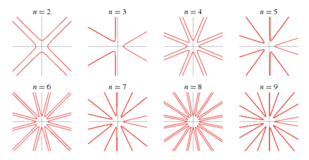
Examples of the epispiral from Wolfram
I had trouble getting started on this project, but once I figured out beginShape and endShape and examined the sample code some more, I got the hang of it. I really like how it turned out because you can see the in-betweens of these stages that Wolfram gave. You can see the lines getting longer from the center before they actually turn into this shape and I think it’s cool that you can visualize it like this and get a better idea of what’s going on behind the pictures.
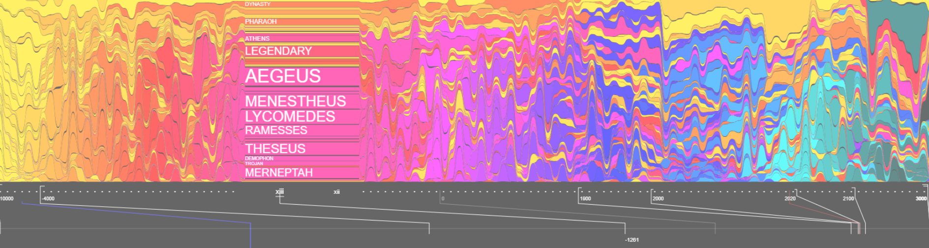
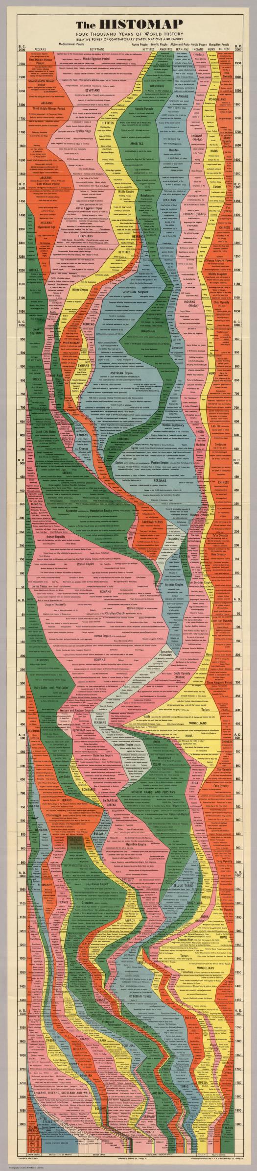
This is an exercice on representation done by Santiago Ortiz, remiscent of the Histomap, which is a visualization of 4000 years of History, created in 1931 by John B. Sparks.
Timeline of chronoligcal articles from Wikipedia: millenia (10 000 BC – 5 000 BC), centuries (40th BC – XIX), decades (1990s – 1990s), years (2000 – 2019), decades (2020s – 2090s) and centuries (22nd – 30th).
On this website histomap revisited, you could view the map zoomed in and click on the map, it would direct you to the wikipage.
This viedo is santiago ortiz talking about different ways to represent time.
What I admire of this project is all the theories behind to make data visulized especially focusing on the theme of time. It’s interesting to see the history not only in a linear way but you can ‘map’ it.
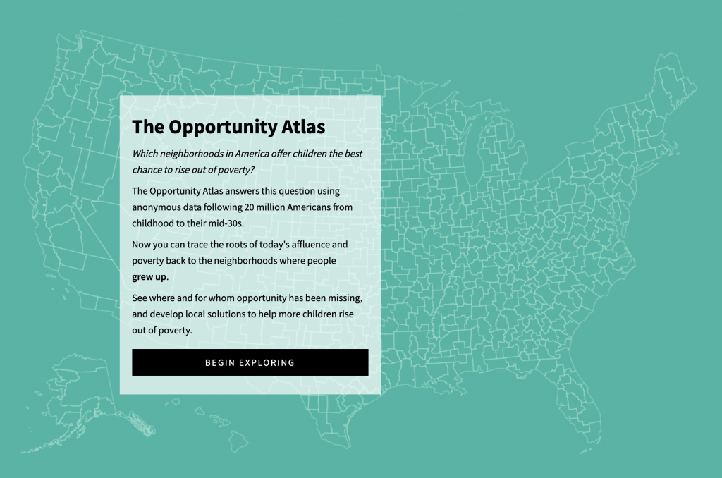
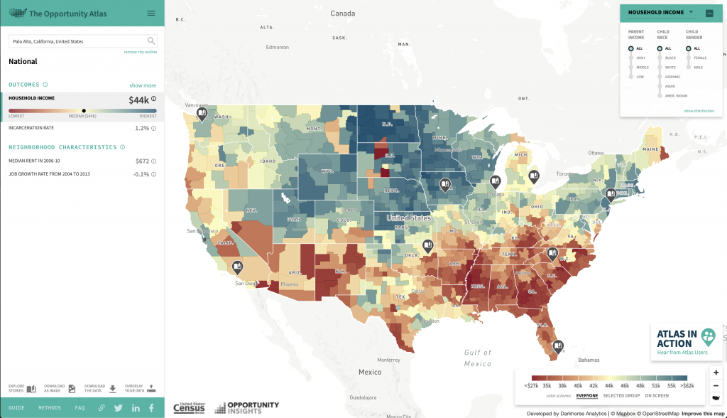
For this week’s looking outward, I am choosing to write about The Opportunity Atlas, a collaboration between Opportunity Insights and the Census Bureau. The map application was developed by Darkhorse Analytics.
A description of The Opportunity Atlas and what it can be used for.The Opportunity Atlas looking at the country as a whole, comparing household income currently for each area of the people who grew up there.
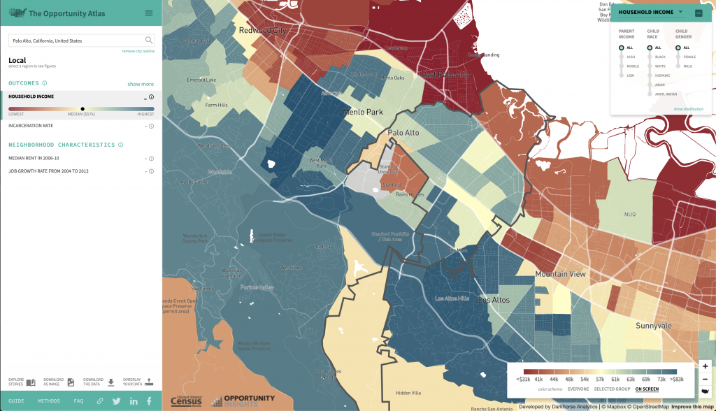
I really liked this project because I found it extremely interesting. I grew up in the Bay Area, where it isn’t uncommon to have a six figure salary coming from both parents–but I had a very different experience. It was really interesting just exploring the website, and seeing how different areas of the map, both in all of America and my hometown, had patterns. For example, my hometown is very affluent overall, but the town just next door is exactly the opposite.
My hometown–each colored section represents a different household income today for someone who grew up here, compared locally to the area
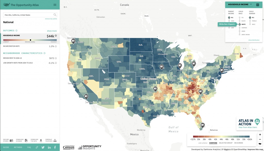
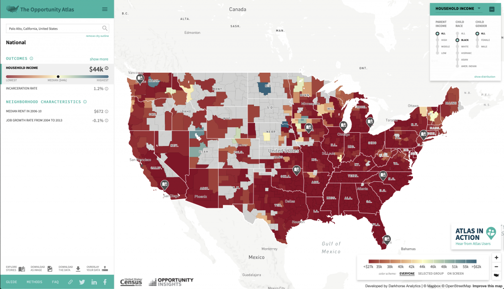
Another interesting part of this project was to look at racial differences. Overall in the country, when you compare household income from people who grew up in certain areas, the maps are extremely different for black people than they are for white people.
The Opportunity Atlas only looking at data from white people.The Opportunity Atlas only looking at data from black people.
I thought that this project was not only interesting, but very important. It shines light on something that a lot of people don’t notice, simply because their hometowns are usually in a slight bubble. When everyone around you is at the same place, it is much harder to notice the advantages or disadvantages you might have. It’s really inspiring to me that they were able to compute to visualize this data, because of how important I believe this is.
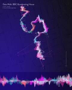
Stefanie Posavec is an information designer and data visualization designer based in London and focuses on data-related works. Her works of art depict non-traditional representations of data. In her Phantom Terrains project, she worked with Frank Swain and Daniel Jones to create a system that creates visualizations for wireless signals. Through specialized hearing aids, she was able to also convert wireless signals that surround us into sounds. The purpose of the project was to present a visual representation of the mass amount of streaming of wireless data surges that occurs in our everyday lives through internet exchanges and cellphone relays. I admire this information visualization project because amount of data that flows through has become a pervasive, yet invisible presence, and Posavec was able to develop a platform that makes us more aware of these data.
Phantom Terrains: Data Visualization, Stefanie Posavec (2014)
ATD, an organization dedicated to community college student success, approached Graphicacy to help them analyze and visualize member college performance data collected over their ten year history. They wanted to create a conversation starter for their 2014 Dream Conference.
This is an infographic created by the company Graphicacy. I thought this start up was cool because they specialize in making information visual, persuasive and shareable. Starting with an in-depth discovery process, Graphicacy builds websites and interactive applications, and produce data visualization and information graphics, motion graphic videos and data analysis. Their team specializes in open source solutions including Drupal, WordPress, and Angular.
The Center for American Progress asked Graphicacy to translate a report into compelling interactives. The report is about the economic benefits of closing the achievement gap between white students, hispanics, and blacks. They created an animated explainer video and interactive charts that show how pernicious gaps open even before a child’s first day of school.
There is something about the moving image that draws me to these statistics. It is much easier for me to visualize the difference between ethnic groups with the people, versus seeing a number (16 million). The chart allows me to toggle between ‘view as one group’ and ‘view as race’ and the people will run and change color.
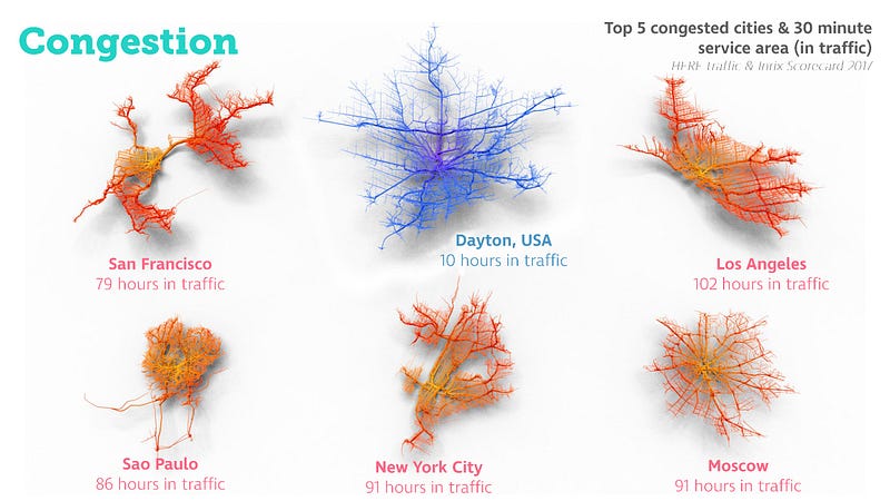
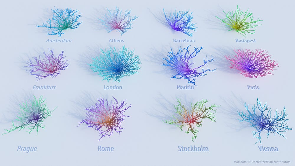
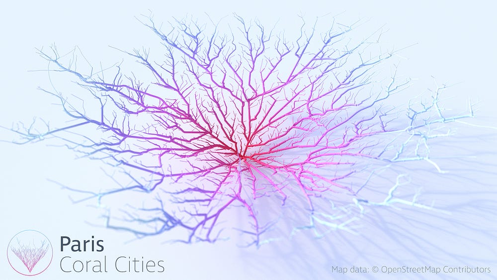
Coral City is a project produced by Craig Taylor that helps visualize a city in a non-traditional way. When we think about a map of the city, we would think about it as a drawing that shows the road, street names, and attractive spots. Craig on the other hand, wanted to use the raw data generate from a regular map and help produce geo-spatial analysis of the cities. Using this way of the representing the city, data such as political stability, crime rate, education, healthcare, and traffic are also used to not only represent the city but also assess how livable the city is.
Top 5 Cities with the Most Traffic
This project caught my attention because as an architecture student, the idea of mapping is used all the time in every project. The idea of map in our era is no longer the same, generic maps that we grew looking at. With the introduction of new technology and resources, map has taken a more informative and abstract way of being represented. Maps are something that should lure people into understanding the information that is presented.
Top Cities within EuropeClose-Up View of the Paris Coral City
The digital art and design studio, onformative, was commissioned by IBM to create a permanent installation for the new IBM Watson IoT Headquarters in Munich last year. The result was a data-driven art installation visualizing the different facets of the Internet of Things and cognitive technologies called “ibm flux”.
video of ibm flux
From ribbons of light to responsive gradients, the visual content is data-driven and interactive based on real-time time input of various sensor inputs and weather forecasting and culminates in an upward motion with a pulse and positive momentum. The shape was inspired by the IBM Watson and realized by using thirty-two curved screens span over eight ribbon displays.
Close up of the fabrication
“flux” activates the space and demonstrates the significance of cognitive technologies and A.I. in our present world and future – reflecting the ideation, innovation, growth and creative power of technology.
/*
Judy Li
Section A
judyli@andrew.cmu.edu
Project-07
*/

var nPoints = 100;
var EPITROCHOID = 0; // Cartesian Parametric Form  [x=f(t), y=g(t)]
var EPITROCHOIDTWO = 1; // Cartesian Parametric Form  [x=f(t), y=g(t)]

var titles = ["1. Epitrochoid", "2. Epitrochoid_Two"];
var curveMode = EPITROCHOID;


function setup() {
    createCanvas(480, 480);
}


function draw() {
    background("pink");

    // draw the frame
    fill(0);
    noStroke();
    text(titles[curveMode], 20, 40);
    stroke(0);
    noFill();
    rect(0, 0, width-1, height-1);

    // draw the curve
    push();
    translate(width / 2, height / 2);
    switch (curveMode) {
    case EPITROCHOID:
        drawEpitrochoidCurve();
        break;
    case EPITROCHOIDTWO:
        drawEpitrochoidTwo();
        break;
    }
    pop();
}

//--------------------------------------------------
function drawEpitrochoidCurve() {
    // Circle Orthotomic:
    // http://mathworld.wolfram.com/Epicycloid.html

    var x;
    var y;
    var a = 40.0;
    var b = 20;
    var ph = mouseX / 10.0;

    fill(255, 200, 200);
    beginShape();
    for (var i = 0; i < nPoints; i++) {
        var t = map(i, 0, nPoints, 0, TWO_PI);
        x = ((a + b) * (cos(ph * t))) - (b* cos(((a + b) / b) * (ph * t)));
        y = ((a + b) * (sin(ph * t))) - (b* sin(((a + b) / b) * (ph * t)));
        vertex(x, y);
    }
    endShape(CLOSE);

}

//--------------------------------------------------
function drawEpitrochoidTwo() {
    // Circle Orthotomic:
    // http://mathworld.wolfram.com/Epicycloid.html

    var x;
    var y;
    var a = 100.0;
    var b = 20;
    var ph = mouseX / 20.0;

    fill(255, 200, 200);
    beginShape();
    for (var i = 0; i < nPoints; i++) {
        var t = map(i, 0, nPoints, 0, TWO_PI);
        x = ((a + b) * (cos(ph * t))) - (b* cos(((a + b) / b) * (ph * t)));
        y = ((a + b) * (sin(ph * t))) - (b* sin(((a + b) / b) * (ph * t)));
        vertex(x, y);
    }
    endShape(CLOSE);

}

//--------------------------------------------------
function mousePressed() {
    curveMode = 1 - curveMode;
}
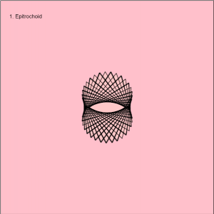
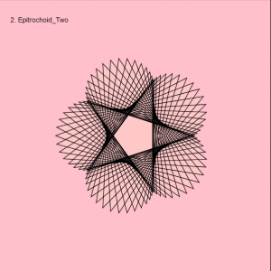
This project was a little bit challenging at first because I wasn’t sure which curve to choose and introduce it to the given code example. In the end, I choose to go with the epitrochoid curve because it resembles a shape I like and it’s almost like a flower/star. I like this curve because it seems like it’s being weaved into a different shape as you move your mouse from left to right. For this project, I included the two curves I liked the most, the asymmetrical shaped one, which looks like asymmetric reproduction and the other one with 5 outer petals/vertices.
Using Botanicus’s visualization to hem out an orchid
With this project, humans and other living plants can now interact with each other. I thought that this is incredible because it can be a start to next visualize a different data set for human interaction between each other through similar modes. In the making of this project, there had been a development of a touch sensor that is capacitive. It was able to create an electromagnetic field from a medium; which in turn, measures small disturbances surrounding and in the field. The program, SIGGRAPH 2012, was able to express contact between the two, visually through the use of sensors. An aurora-like interactive visual is triggered through gestures, both physically tangible and intangible through proximity, made from the engager to the plant. And the reason for this project was to create a space/tool in which interactive technologies are not manufactured, but living and real throughout the experiences with one’s senses.
![[OLD FALL 2018] 15-104 • Introduction to Computing for Creative Practice](../../../../wp-content/uploads/2020/08/stop-banner.png)