//Sammie Kim
//Section D
//sammiek@andrew.cmu.edu
//Project 07 - Curves
var nPoints = 360;

function setup() {
    createCanvas(480, 480);
}

function draw() {
    background(0);
    drawHypotrochoid();
    drawAstroid();
}

function drawHypotrochoid() {
    //constraining mouse within the canvas size
    var x = constrain(mouseX, 0, width);
    var y = constrain(mouseY, 0, height);
    //stroke color will also change based on the direction of mouse
    var rColor = map(mouseX, 0, width, 0, 230)
    var gColor = map(mouseY, 0, height, 0, 230)
    stroke(rColor, gColor, 200);
    strokeWeight(2);
    noFill();
    //Setting the parameters for the hypotrocoid
    push();
    translate(width/2, height/2); //starting the shape at the center of canvas
    var a = map(mouseX, 0, width, 0, 200); //the radius range of circle
    var b = map(mouseY, 0, height, 0, 50);
    var h = map(mouseX, 0, height, 0, 50);
    beginShape();
    //Hypotrochoid formula
    //http://mathworld.wolfram.com/Hypotrochoid.html
    for(var i = 0; i <= nPoints; i++) {
        var x = (a - b) * cos(i) + h * cos((a - b) / b * i);
        var y = (a - b) * sin(i) - h * sin((a - b) / b * i);
        vertex(x, y);
    }
    endShape();
    pop();
}

function drawAstroid(){
    var x = constrain(mouseX, 0, width);
    var y = constrain(mouseY, 0, height);
    push();
    noFill();
    strokeWeight(4);
    stroke("pink");
    translate(width / 2, height / 2);
    var a = map(mouseX, 0, width, 20, width / 3);
    beginShape();
    //Astroid formula
    //http://mathworld.wolfram.com/Astroid.html
    for (var i = 0; i < nPoints; i+= 0.5){
        var x = a * pow(cos(i), 3);
        var y = a * pow(sin(i), 3);
        vertex(x, y);
    }
    endShape();
    pop();
}
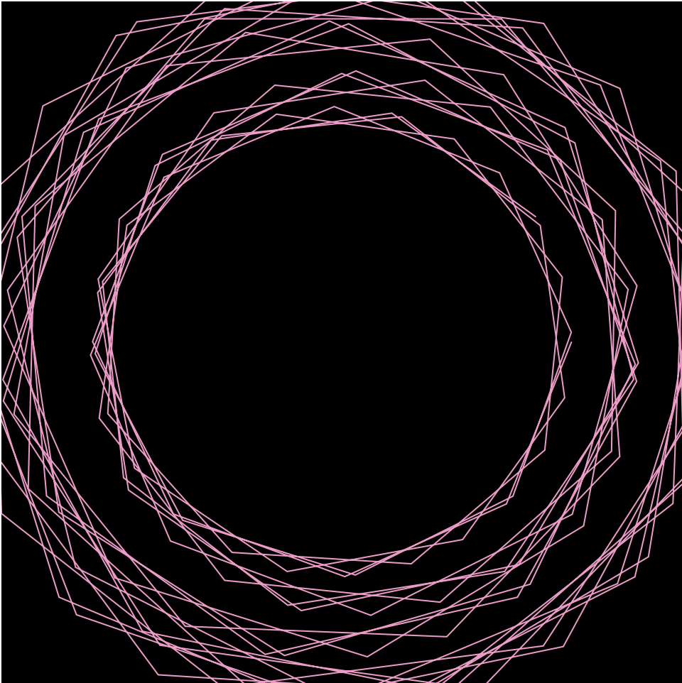
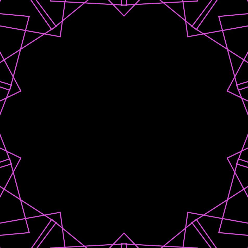
This project was challenging as I had to incorporate an interactive element within the hypotrochoid shape. It initially took a while to understand how I could flexibly use the map function, substituting different numbers to play with the range of mouse X and Y, then seeing the effects on screen. I also added a change to color as another element, where the R and G values would change depending on the mouse’s location. Afterwards, I created an astroid in the center that playfully interacts with the surrounding hypotrochoid. What intrigued me the most was how unexpected the shape would vastly change by rotating my mouse around the canvas, creating diverse shapes through intersection of lines.
When the max range of hypotrochoid value a is at (0, 10)
When the max range of hypotrochoid value a is at (0, 300)
// Timothy Liu
// 15-104, Section C
// tcliu@andrew.cmu.edu
// OpenProject-07

var nPoints = 1000; // number of points in each function. The more points, the smoother the function is.

// variables for white quadrifolium
var k;
var n;
var d;

// variables for blue quadrifolium
var k2;
var n2;
var d2;

// variables for flower center
var k3;
var n3;
var d3;

function setup() {
    createCanvas(480, 480);
    frameRate(30);
}

function draw() {
    background(160, 190, 255); // light blue background

    k = n / d; // k constant determines the number of petals on the white quadrifolium
    k2 = n2 / d2; // k constant determines the number of petals on the blue quadrifolium
    k3 = n3 / d3; // k constant determines the number of petals on the flower center

    arrow(); // drawing in the arrow function
    quadrifolium2(); // drawing in the blue flower underneath first
    quadrifolium(); // drawing in the white flower on top
    flowerCenter(); // drawing in the yellow center on top of the other two flowers
}

// the white flower/quadrifolium
function quadrifolium() {

    // these variables/constraints hold mouseX to the width of the canvas
    // mouseX1 slows down the speed of mouseX
    var mouseX1 = mouseX / 5;
    var mouseMove = constrain(mouseX1, 0, width / 5);

    // these variables/constants help determine the location of the flower via the equation and vertex
    var r;
    var x;
    var y;

    // n and d help determine the k constant, or the number of petals on the flower
    n = map(mouseMove, 0, width, 0, 36);
    d = 4;

    // a determines the size of the white petals
    var a = 150;

    // white flower colors
    stroke(255, 255, 255);
    strokeWeight(3);
    fill(255, 255, 255, 60);

    // drawing the white quadrifolium!
    beginShape();
    for (var i = 0; i < nPoints; i++) {

        var t = map(i, 0, nPoints, 0, TWO_PI * d); // determines theta (the angle)

        r = a * cos(k * t); // the equation that draws the quadrifolium

        x = r * cos(t) + width / 2; // these help compute the vertex (x, y) using the circular identity
        y = r * sin(t) + width / 2;
        vertex(x, y);
    }
    endShape();

}

// the blue flower/quadrifolium
function quadrifolium2() {

    // these variables/constraints hold mouseX to the width of the canvas
    // mouseX2 slows down the speed of mouseX
    var mouseX2 = mouseX / 5;
    var mouseMove2 = constrain(mouseX2, 0, width / 5);

    // these variables/constants help determine the location of the flower via the equation and vertex
    var r2;
    var x2;
    var y2;

    // n2 and d2 help determine the k2 constant, or the number of petals on the flower
    n2 = map(mouseMove2, 0, width, 0, 72);
    d2 = 6;

    // a2 determines the size of the blue petals (slightly longer than the white)
    var a2 = 155;

    // blue flower colors
    stroke(71, 99, 201);
    strokeWeight(2);
    fill(71, 99, 201, 140);

    // drawing the blue quadrifolium!
    beginShape();
    for (var u = 0; u < nPoints; u++) {
        var h = map(u, 0, nPoints, 0, TWO_PI * d2); // determine theta (the angle)

        r2 = a2 * cos(k2 * h); // the equation that draws the quadrifolium

        x2 = r2 * cos(h) + width / 2; // these help compute the vertex (x2, y2) using the circular identity
        y2 = r2 * sin(h) + width / 2;
        vertex(x2, y2);
    }
    endShape();

}

// the yellow center of the flower (also a smaller quadrifolium)
function flowerCenter() {

    // these variables/constraints hold mouseX to the width of the canvas
    // mouseX3 slows down the speed of mouseX
    var mouseX3 = mouseX / 5;
    var mouseMove3 = constrain(mouseX3, 0, width / 5);

    // these variables/constants help determine the location of the flower via the equation and vertex
    var r3;
    var x3;
    var y3;

    // n3 and d3 help determine the k3 constant, or the number of petals on the yellow center
    n3 = map(mouseMove3, 0, width, 0, 20);
    d3 = 5;

    // a3 determines the size of the yellow center quadrifolium
    var a3 = 30;

    // yellow center color
    stroke(247, 196, 12);
    strokeWeight(3);
    fill(247, 196, 12, 50);

    // drawing the yellow center quadrifolium!
    beginShape();
    for (var c = 0; c < nPoints; c++) {
        var e = map(c, 0, nPoints, 0, TWO_PI * d3); // determine theta (the angle)

        r3 = a3 * cos(k3 * e); // the equation that draws the quadrifolium

        x3 = r3 * cos(e) + width / 2; // these help compute the vertex (x3, y3) using the circular identity
        y3 = r3 * sin(e) + width / 2;
        vertex(x3, y3);
    }
    endShape();

}

// the blue arrow on the bottom that indicates which way to move the mouse... toward the right!
function arrow() {

    // variables for the line part of the arrow
    var lineH = height - 40;
    var lineS = width / 3;
    var lineE = 2 * width / 3;

    // variables for the arrowhead part of the arrow
    var arrowH1 = lineH - 5;
    var arrowHT = lineE + 10;
    var arrowH2 = lineH + 5;

    // the arrow!
    stroke(71, 99, 201);
    fill(71, 99, 201);
    strokeWeight(6);
    line(lineS, lineH, lineE, lineH);
    triangle(lineE, arrowH1, arrowHT, lineH, lineE, arrowH2);

}
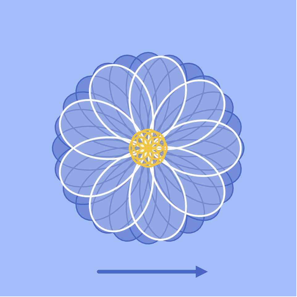
I struggled initially with this project because it had been so long since I mapped parametric curves in any class, let alone in a programming class. However, as I pored through Wolfram Alpha’s libraries, the Quadrifolium, or Rose Curve, immediately jumped out at me for its simplicity and elegance. I really loved how much it looked like a flower, and I thought it was really neat how the number of petals could be manipulated based on a simple constant k before the θ in the equation:
r = a * cos(kθ)
I knew that I wanted to make my quadrifolium feel like an actual flower, so I modeled my design after the blue Chrysanthemum flower.
Blue chrysanthemums, the inspiration for my flower design.
After I had drawn out the basic flower using multiple layers of quadrifolia, I decided to make my piece interactive by having the mouseX control the amount of petals on the flower. By doing so, I was able to make my design/curve “transform” from a basic circle into a beautiful flower!
The starting point of my flower……to the ending point, with petals!
//Caroline Song
//chsong@andrew.cmu.edu
//Section E
//Project 07-Curves

var nPoints = 800;

function setup (){
    createCanvas(480, 480);
}

function draw(){
    background(0);
    //calling functions
    drawHypotrochoid1();
    drawHypotrochoid2();
    drawHypotrochoid3();
}

function drawHypotrochoid1() {
    //Hypotrochoid
    //http://mathworld.wolfram.com/Hypotrochoid.html

    //setting variables for light pink hypotrichoid
    var x1 = constrain(mouseX, 0, width);
    var y1 = constrain(mouseY, 0, height);
    var a1 = 100;
    var b1 = map(mouseY, 0, 500, 0, width);
    var h1 = map(mouseX/10, 0, 500, 0, height);

    push();
    //light pink stroke
    noFill();
    stroke(251, 227, 255);
    strokeWeight(2);
    translate(width/2, height/2); //translate hypotrochoid to middle of canvas
    beginShape();
    for(var i = 0; i < nPoints; i++) {
        var t1 = map(i, 0, 100, 0, TWO_PI);
        x1 = (a1 - b1)*cos(t1) + h1*cos(((a1 - b1)/ b1) * t1);
        y1 = (a1 - b1)*sin(t1) - h1*sin(((a1 - b1)/ b1) * t1);
        vertex(x1, y1);
    }
    endShape(CLOSE);
    pop();

}

function drawHypotrochoid2() {
    //Hypotrochoid
    //http://mathworld.wolfram.com/Hypotrochoid.html

    //setting variables for pink hypotrichoid on the edges of canvas
    var x2;
    var y2;
    var a2 = 300;
    var b2 = 20;
    var h2 = constrain(mouseY/10, 0, height);

    push();
    noFill();
    stroke(237, 162, 250);
    strokeWeight(2);
    translate(width/2, height/2); //translate to middle of canvas
    beginShape();
    for(var i = 0; i < nPoints; i++) {
        var t2 = map(i, 0, 100, 0, TWO_PI);

        x2 = (a2 - b2)*cos(t2) + h2*cos(((a2 - b2)/ b2) * t2);
        y2 = (a2 - b2)*sin(t2) - h2*sin(((a2 - b2)/ b2) * t2);
        vertex(x2, y2);
    }
    endShape(CLOSE);
    pop();

}

function drawHypotrochoid3() {
    //Hypotrochoid
    //http://mathworld.wolfram.com/Hypotrochoid.html

    //setting variables for dark pink hypotrochoid
    var x3;
    var y3;
    var a3 = 600;
    var b3 = 50;
    var h3 = mouseY;

    noFill();
    stroke(227, 92, 250);
    strokeWeight(4);
    translate(width/2, height/2); //translate to middle of canvas
    beginShape();
    for(var i = 0; i < nPoints; i++) {
        var t3 = map(i, 0, 100, 0, TWO_PI);

        x3 = (a3 - b3)*cos(t3) + h3*cos(((a3 - b3)/ b3) * t3);
        y3 = (a3 - b3)*sin(t3) - h3*sin(((a3 - b3)/ b3) * t3);
        vertex(x3, y3);
    }
    endShape(CLOSE);

}
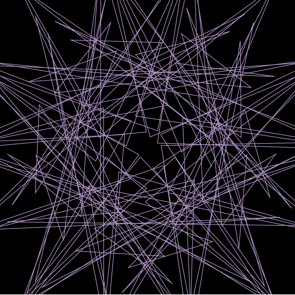
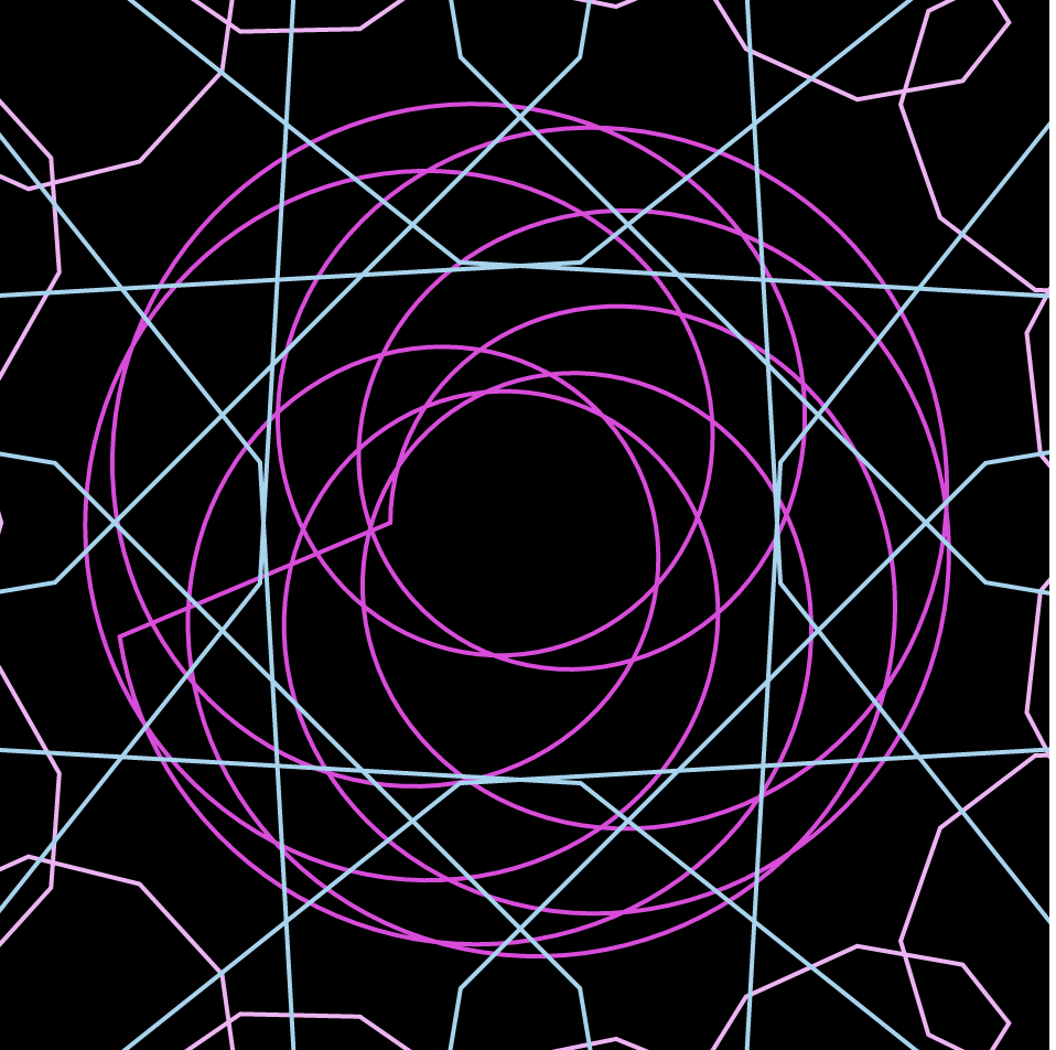
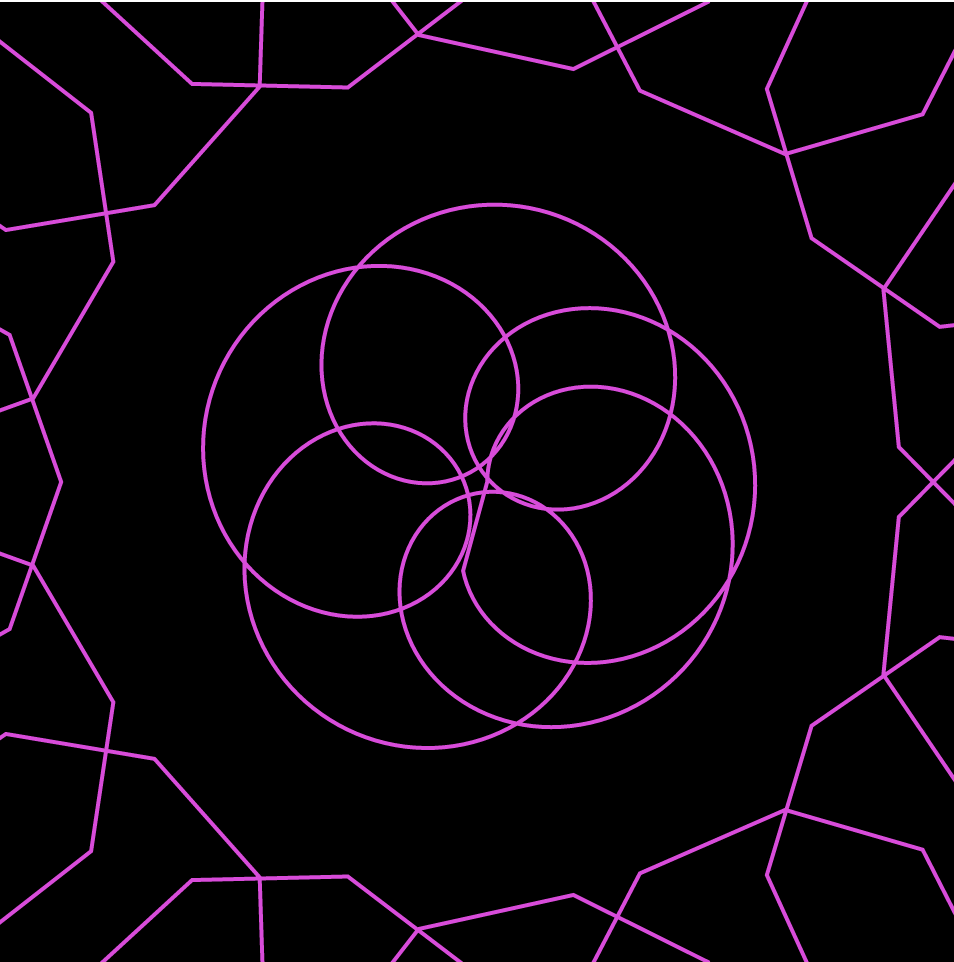
During the project, I didn’t know exactly what I was looking for. I spent a lot of time on the MathWorld site simply trying to decide what kind of curves to play with. I ended up playing with different epispirals and astroids before becoming intrigued with hypotrochoids. I started playing around with the equations itself, plugging in different numbers to simply experiments with how that affects the curve and the interaction it has with the canvas.
First iteration of my project
Playing around with different colorsSecond iteration of my project
Herald Harbinger is a piece created by Jer Thorp in 2018. The piece is a number of columns made up of bars of screens. These screens visualize both the human activity that occurs outside the plaza (ie: movements of people and of vehicles) and the real-time activity of the Bow Glacier located in the Canadian Rockies, and the glacier activity is made audible outside the plaza as well. These visualized data feeds are supposed to contrast with and show the relationship between each other (human activity vs. natural activity).
I admire how much effort is put into the project to get it to work. Not only did they have to go all the way to an iceberg to get the sounds, but instead of just getting a recording and leaving, they decided to set up their equipment so that the sound is collected in real time. I also like the idea of humans vs. nature. The way Thorp used moving lights to portray this relationship was interesting, and resulted in a pretty piece. I like their decision to play the sounds of the glacier outside the building. Since it’s an urban area, there isn’t much of a chance for interaction with nature, especially nature of this type, making the choice much more impactful and interesting.
I don’t know much about the algorithms that generated the work, but I assume it’s relatively complicated. The algorithms would need to be able to convert the information they are receiving from the two very separate areas into lights to be portrayed on the screens. I’m not sure if specific sounds got specific positions and/or colors on the screens, or whether it was all random, but this would have to have been written in the algorithms as well. This conversion would also have to be done in real time.
Thorp’s work revolves around data, and he is one of the world’s most well-known data artists. Herald Harbinger uses data collected from the equipment near the glacier and the urban area outside the plaza the piece is in to create the piece itself. The data is what is shown interacting on the screens.
Video demonstrating the art piece Herald Harbinger. It shows the piece in action, lights changing in correspondence to the changes in the sound that are being played during the video. It also shows outside the building where the sounds of the glacier is being played and where the sounds of human life are being taken from.
Equipment used to gather the sound data from the Bow Glacier in the Canadian Rockies. Pictured is a number of crates with wires and other equipment inside, along with a stand holding up pannels.
In this project, “The Shape of Song”, artist Martin Wattenberg demonstrates his explorations of trying to “see” musical form. I was intrigued by this project because adding a dimension of visual sense allows one to experience and interpret music in a brand new way. To achieve this experiment, Wattenberg created a visualization program that highlights the repeated verses in music using translucent arcs, called an “arc diagram”. This software, written entirely in Java. analyzes “MIDI” files of the musical piece which are commonly found on the web. Using this information, an arc connects a pair of identical sections of a musical piece. The arcs seem to be proportionally sized in terms of the spacing of the repeated sections. This allows the piece to be viewed in terms of its structure, rather than sound. The visualizations created by Wattenberg allow the viewer to analyze the entire musical piece as one visual composition in a matter of seconds, as opposed to the minutes it would take to listen to the entire song.
“Moonlight Sonata, by Beethoven” by Martin Wattenberg
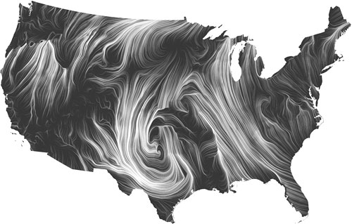
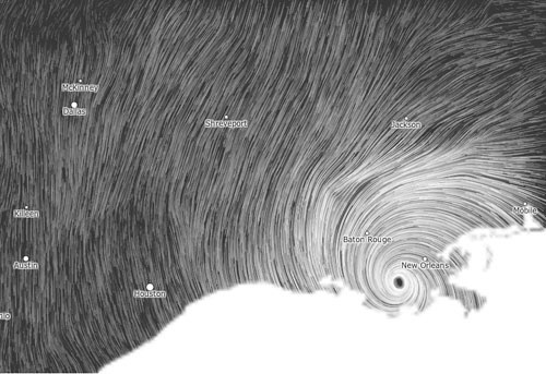
“The wind map is a living portrait of the wind currents over the U.S. “
Martin Wattenberg co-leads the People + AI Research initiative at Google. And he produced a lot of data visualization work.
The real-time wind map showed the tracery of wind flowing over the US delicately. The direction, intensity of the wind can be captured just at a glimpse of the map that can even be zoomed in.
Images from Hurricane Isaac (September 2012)
It is such a successful project to me is that it achieved the purpose of visualizing complex data artistically for people not in the academic field. Mentioned by Martin, “bird watchers have tracked migration patterns, bicyclists have planned their trips and conspiracy theorists use it to track mysterious chemicals in the air. ” Mostly using the simplest and strongest visual language, data visualization workers can produce complex but legible work.
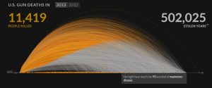
Kim Ree, co-founder of a data visualization firm Periscopic, is probably best known for her work in visualizing gun deaths in 2010 and 2013. The diagram above illustrates the overwhelming amount of deaths from U.S. owned guns. The orange strokes depict the actual lifespans of gun victims, and the gray projects an estimated lifespan according to the U.S. distribution of deaths and likely causes of death. By also counting the amount of hours that these victims were robbed of, the data is much more impactful than if it were simply a death count. Play with the visualizer here.
Not speaking in relation to this particular piece, but I think the most interesting aspect about data visualization is that it can be depicted in a way to sway or even change one’s impressions of anything.
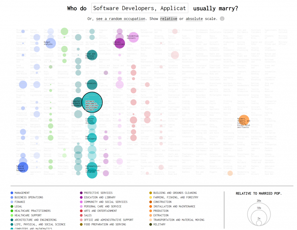
Created by Nathan Yau in 2017, Occupation Matchmaker is an interactive data visualization that looks at who people in certain occupations end up marrying. The project builds off an earlier project released by Adam Pearce and Dorothy Gambrell for Bloomberg.
Software developers often end up marrying within the same industry, notably to other software developers.Original visualization by Pearce and Gambrell.
Yau’s artistic sensibility is clearly visible in the way he chose to visualized the grouping of different types of occupations and how they overlap. The visualization of this project, compared to its initial development by Pearce and Gambrell, showcase a more holistic image across the board. The viewer is made clearly aware of the connections that exist between different occupations within the same industry whereas the earlier chart shows more linear connections. In creating this visualization, Yau made sure to take into account how some occupations are much more common than others, and used a relative scale to change the sizes of the circles. Yau created this visualization using R (to analyze) and d3.js.
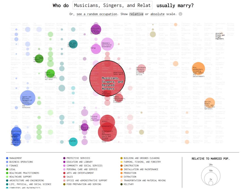
Musicians overwhelmingly marry other musicians, but also marry others from wildly different occupations.
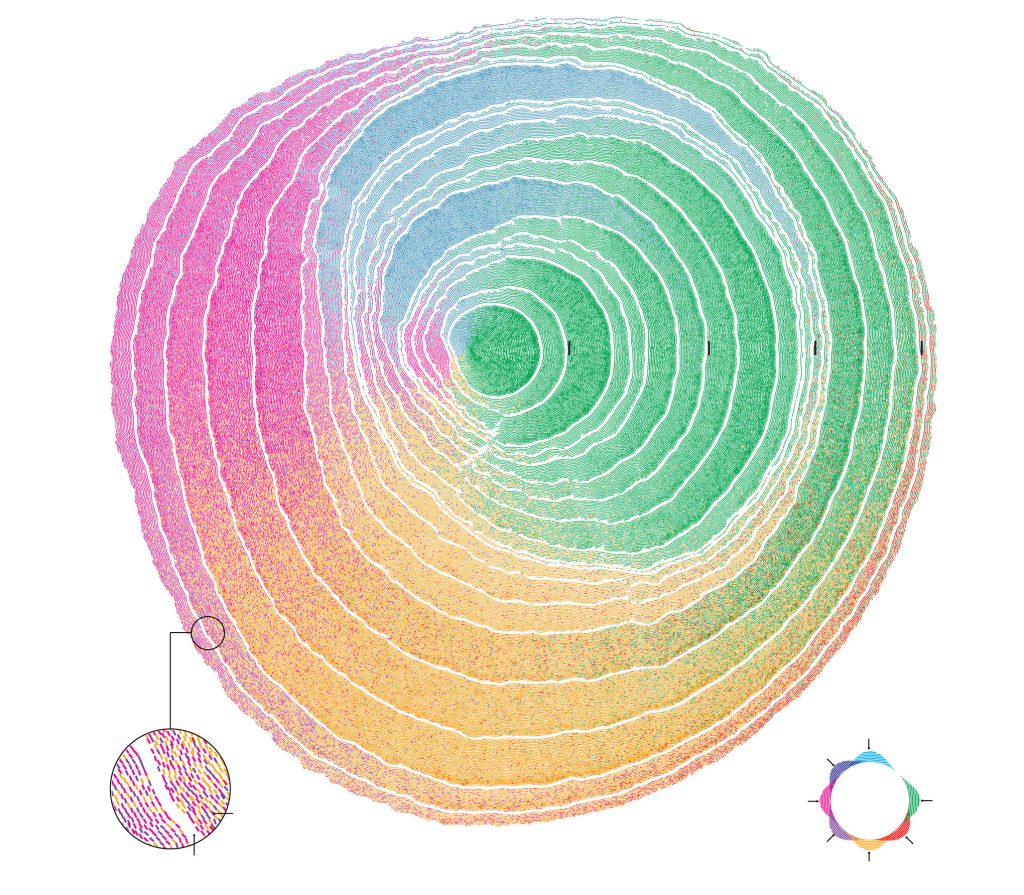
The project I chose was a visual representation of immigration trends done by Pedro M. Cruz and John Wihbey. Both of whom are researchers based at Northeastern University. This project shows immigration trends to the United States based off of the immigrants’ place of birth.
They stated that they were inspired by the way we can see trends in natural history through the rings of a tree. I thought this was a very clear and creative way to represent their data because of the way it shows large trends rather than specific data points.
Each ring of the tree represents 10 years and each color is a region that immigrants are from. The creators obviously took time to make sure it looked visually appealing, through their choice of color and texture. I was not able to transfer the text of the key over to this post, so I highly encourage anyone interested to follow the link posted below.
It is interesting to visualize a world from radiowaves. Through collecting WIFI signals, GPS information, and the radio-active data created by the built environment, the Dutch designer Richard Vijgen successfully constructs an “infosphere” in which people are able to see how the radio waves and dots are bounced back and forth under different network condition. What attracts me about this project is that under this digital tool, people are able to visualize how the radio signals are transmitted not only from a plan view but also from a person’s standing position. Moreover, such a way of navigation in any built environment has implied different network construction and social infrastructural conditions such as the satellite services and cell tower managements.
Meanwhile, the program allows diverse datasets to show on the screen, which creates the opportunities for different visual information to join and compose a dynamic drawing for artists to experience and observe the information-industrial world. What’s more, the real-time info software also provides the chance for people to see which area of the information traffic is busy or not to help guide people to explore into different worlds and places.
![[OLD FALL 2019] 15-104 • Introduction to Computing for Creative Practice](../../../../wp-content/uploads/2020/08/stop-banner.png)