The Creative Practice of an Individual: Mike Tucker

Lecture from Eyeo

https://mike-tucker.com/15/tanapura/

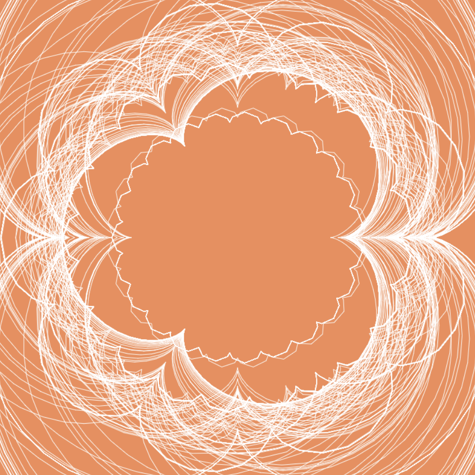
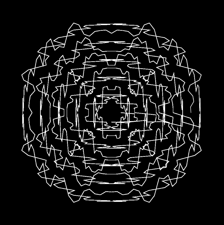
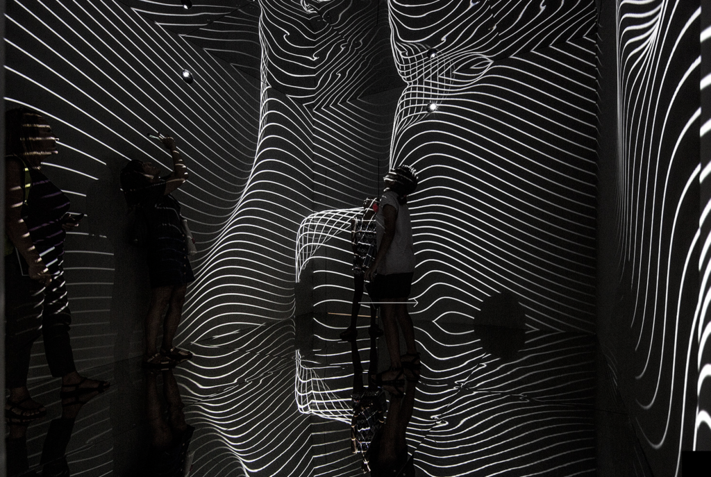
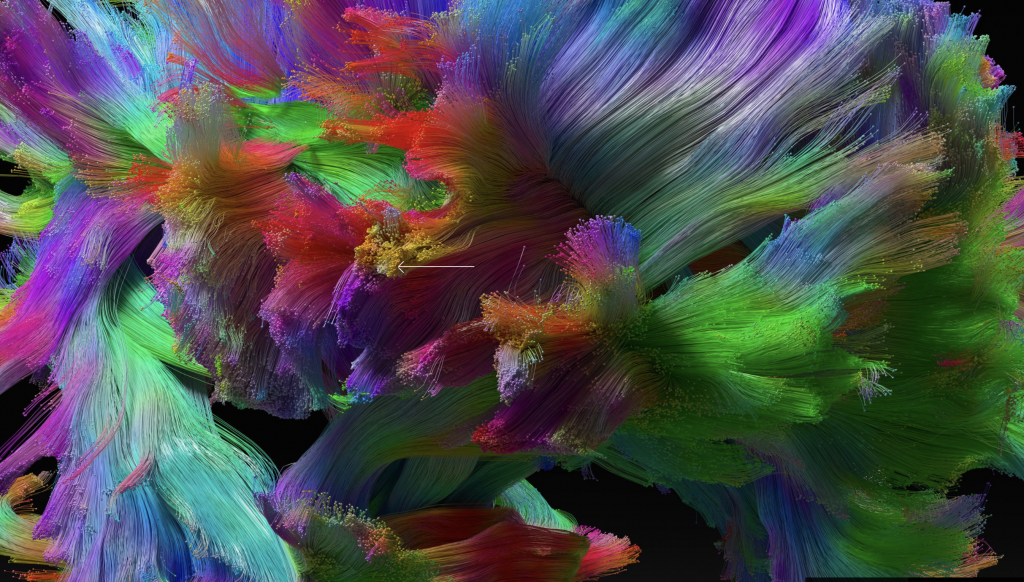
Mike Tucker has had quite the route to the work he has been doing for the past 5 years(from 2017). Most recently, he worked at Flash until it died due to Facebook and then to Magic Leap. He considers himself to be an Interactive Director, Designer & Develop. His most recent work has been Tonandi, Tana Pura, and PolyFauna. He works on spatial computing projects creating an augmented reality that turns sound into visual tech that you can touch and intact with the changed visuals, and therefore create your sound. People have described this as feeling a sort of synesthesia. Specifically his work with the Tonandi project at Magic Leap doing spatial sound and combining instillation withflexinility, making soundscapes. One thing that Tucker went on in his lecture to talk about was the importance of the environment in these augmented reality experiences. This struck home for me as someone who just did an AR reality project in my environmental design class. It was very easy for me to imagine the future of this project and how it could be used to re-image museum space. I admire his work on Tana Pura creating sound into a visual in real space. I think in the future there will be a real market for this especially for work for clients who want to integrate technology in spaces. 

Tana Pura YouTube Video
Image from Tana Pura Project

Tucker’s way of presenting reminded me a lot of listening to a Ted talk. I like how he explains his work first, but at the end also talks about ways and platforms that you can get into work like his and how this technology is being implemented now, and where the future most likely lies in it. 

Project 07: Composition with Curves

sketchDownload
// Jiyeon Chun
// Section C
// jiyeonch@andrew.cmu.edu 
// Project-07-Project

var nPoints = 100;

function setup() {
    createCanvas(400, 400);
    background(242, 140, 86);
    frameRate(20);
}

function draw() {
    push(); 
    //make origin the center of canvas
    translate(width/2, height/2);
    drawEpicycloidCurve();
    pop();

}

function drawEpicycloidCurve() {
    //Epicycloid:
    //https://mathworld.wolfram.com/Epicycloid.html
    var x;
    var y;

    var a = mouseX / 5;
    var b = a / int(mouseY / 25);

    stroke(255);
    strokeWeight(.5);
    noFill();
    beginShape();
    for (var i=0; i<nPoints; i++) {
        var t = map(i, 0, nPoints, 0, TWO_PI);

        x = (a+b)*cos(t)-b*cos(((a+b)/b)*t);
        y = (a+b)*sin(t)-b*sin(((a+b)/b)*t);
        vertex(x,y);
    }
    endShape(CLOSE);

}

function mousePressed() { //press mouse to clear canvas and restart
    background(242, 140, 86);
}

My project is a program that allows the user to build up a composition using their interaction with the epicycloid curve with their mouse movements. I started off with other curves at first, however, some of the others didn’t offer as many change-able variables, as I wanted the program to be very dynamic upon the movement of the mouse. After putting the curve into my program, I took away the background from the draw function so that the canvas could keep a “history” of the mouse movement every frame, creating a composition over time in which the canvas has responded to the user’s mouse movements and the user to the canvas’ current composition! Here are just a few of the infinite amount of possible compositions:

LO: Information Visualization

Atlas of Emotions

This Data Visualization, by the group Stamen Design, is a visualization of the atlas of human emotions, designed for the Dalai Lama and scientist Dr. Paul Ekman. It features scholarly findings about emotions and maps it into a series of graphs and interactions on their live website, which brings in different factors such as emotions, triggers, and responses to map how different triggers may cause different emotions in us. For the data itself, the studio and Ekamn conducted a peer-reviewed study among other emotion-studying scientists called “What Scientists Who Study Emotion Agree About,” from which they derived that five emotions in particular are considered and widely acknowledged as universal regardless of culture: anger, fear, sadness, disgust, and enjoyment. I admire that the project uses computation and code to map something so human, visceral, and natural as emotions themselves, and I particularly enjoy the way they graphed the different states of emotions from least to most intense, using shapes, colors, and line qualities that help visualize the emotions themselves, which also point to the design studio’s artistic sensibilities beyond simply plotting data points.

Project 07: Curves

sketch

// John Henley; jhenley; 15-104 section D

function setup() {
    createCanvas(480, 480);
    background(0);
}

function draw() { // draw loop for each spiral
    background(0);
    translate(width/2, height/2);
    spiral1(); // calls spiral functions
    spiral2();
}

function spiral1() { // horizontal spirals
    beginShape();
    noFill();
    stroke(255);
    for (var t = 0; t <= 100; t += 20) { // for loop for inner rings
        for (var i = 1; i <= 100; i ++) { // loop for each spiral
            var theta = map(i, 0, 100, 0, TWO_PI);
            var a = map(mouseX, 0, width/2, 0, 1); // maps mouseX onto 0 - 1 scale
            var x = a * t * cos(theta)^20;
            var y = a * t * sin(theta);
            vertex(x, y);
            endShape();
        }
    }
}

function spiral2() { // vertical spiral
    beginShape();
    noFill();
    stroke(255);
    for (var t = 0; t <= 100; t += 20) { // for loop for inner rings
        for (var i = 1; i <= 100; i ++) { // loop for each sprial
            var theta = map(i, 0, 100, 0, TWO_PI);
            var a = map(mouseX, 0, width/2, 0, 1); // maps mouseX onto 0 - 1 scale
            var x = a * t * cos(theta);
            var y = a * t * sin(theta)^20;
            vertex(x, y);
            endShape();
        }
    }
}

I wanted to make my curves very sharp and dramatic rather than the traditional smooth spiral. I accomplished this by using the equation for a spiral (r*cos(theta)^x, parametrically) and adjusted the exponent value and values in the map function until I achieved the desire effect. Below are two separate states of the program: the first is when the mouse is far to the left of the canvas, and the second is when the mouse is far to the right.

LO7: Data Visualization

For my Looking Outwards, I picked a project done by the data visualization firm
Pitch Interactive. The project, Decoding Asian Hate, is an interactive data visualization that shows a timeline of Asian Hate incidents over the span of January 2020 to present. For the client The Asian American Foundation, Pitch Interactive turned these incidents into fragments of shattered glass. The shards of glass rotate in 3 dimensions around the screen. Users can click an individual shard, and it will bring up an overlay of the news article and date information. I think that this project sheds light on such a critical issue in a really unique and engaging format. Rather than just a raw text timeline, the designers made it into an experience that brings a raw emotive reaction that provides a completely more dramatic outcome to sway audiences.

https://www.pitchinteractive.com/work/DecodingAsianHate/
Pitch Interactive, 2021

LO 08:

Eyeo 2019 – Refik Anadol from Eyeo Festival on Vimeo.

Refik Anadol is a director and media artist, who works with site-specific public art that uses a parametric data sculpture approach, and live audio and visual performances that use immersive installations. He was born in Istanbul, Turkey, and currently lives and works in LA, California. 

He describes himself as being intrigued by how the transformation of subjects in contemporary culture requires rethinking how we perceive space from an aesthetic, technical, and dynamic viewpoint. He also explores embedding media arts into architecture and encourages viewers to visualize alternative realities by presenting the possibility of redefining the functionality of architectural spaces. Anadol suggests that all spaces and facade have the potential to be a canvas for a media artist.

His body of work includes a lot of immersive indoor art installations and outdoor/public art installations, most of which use visual media based upon algorithms and data. I admire how he views the facades and spaces of architecture as potential for media artwork. Public art has a lot of potential to change a community for the better, while also exposing children in lower income communities to possibilities like art. 

I liked that he explained his own journey in terms of unique mentors and experiences that had helped him along the way. It helps explain how he got to where he is, while also exposing the audiences to many other helpful resources. Presentation wise, he utilized humor, quotes, and compliments (to his mentors) in such a way that his presentation was very dynamic.

LO 07: Data Visualization

Link: https://impfdashboard.de/
Project: Visualizing the vaccination progress in Germany
Creators: Nand.io

The project that I found interesting was one from Nand.io which visualizes vaccination progress in Germany. On the web page that they made, there are a plethora of interactive maps that the user is able to hover over and see the progression of vaccination rates. A part that I found extremely interesting was their tracking of different milestones within the pandemic (see below). The user is able to see a timeline with different milestones all piled on top of each other. They can then hover over different sections and see more information about them and when they took place. This is something I’ve never seen before in tracking covid cases or vaccinations which I think is really interesting to visualize. What I admire most about this project is that it is using data visualization for a very important purpose. I think especially now, being able to make progress tangible and visual can help people move forward and be hopeful for change.

Project: 07 Curves

sketch
//Jacky Lococo
//jlococo
//Section C
var nPoints = 50; // points on the epispiral and ranunculoid
function setup() {
    createCanvas(480, 480);
}

function draw() {
    background(255);
    push()
    translate(width/2, height/2)
    rotate(mouseX/2, mouseY/2)
    epispiralOne() //espiral - will repeat this shape to make more spiral lines
    epispiralOne()
    rotate(mouseX/4, mouseY/2)
    epispiralOne()
    ranunculoid() //flower curve -- will repeat to create spirals
    rotate(mouseX, mouseY)
    scale(2.0)
    ranunculoid() //flower curve scaled by factor of 2
    ranunculoid()
    scale(0.5)
    ranunculoid()
    pop()

    push()
    scale(2.0) //scaled up flower in top left corner
    ranunculoid()
    pop()
    ranunculoid() // flower in top left corner

    push()
    translate(width, height)
    ranunculoid()// flower in bottom right corner
    scale(2.0)//scaled up flower in right corner
    ranunculoid()
    pop()

    ellipse(width/2, height/2, mouseY/30, mouseY/30 ) //creates scaling ellipse


}

function epispiralOne(){ //episprial with two curves
    var a = 40
    var b = a / 2.0;
    var h = mouseX
    var ph = mouseX / 50.0
    noFill()
    strokeWeight(2)
    stroke(0, 100, mouseY)
    beginShape();
    for (var i = 0; i < nPoints; i++) {
        var t = map(i, 0, nPoints, 0, TWO_PI);
        x = (a + b) * cos(t) - h * cos(ph + t * (a + b) / b); //formulas
        y = (a + b) * sin(t) - h * sin(ph + t * (a + b) / b);
        vertex(x,y)
    }
    endShape()

}

function ranunculoid(){ // type of Epicycloid with four petals
    var a = mouseY / 30 // changes the size of the shape
    noFill()
    stroke(mouseX, 0, 100) // changes just the red value 
    strokeWeight(1)
    beginShape();
    for (var i = 0; i < nPoints; i++) {
        var t = map(i, 0, nPoints, 0, TWO_PI);
        x = a*(6 * cos(t) - cos(6*t)); //formulas
        y = a*(6 * sin(t) - sin(6*t));
        vertex(x,y)
    }
    endShape()

}


Project: Composition with Curves

For this project, I was excited to explore different types of curves and how you can create new ones through simple interactions. I started off my process by looking at and trying different curves in Sublime to see which ones were the most interesting to change. I also spent some time plugging mouseX and mouseY into different parts of the equation to see how they changed. I found it interesting that curves can look completely different based on which variables were changed. For instance, I used a Cayley’s Sextic curve for one of my curves, which looks like a rounded heart. However, when you control the ratio multiplied by cosine, it changes the number of curves and their rotation so it looks like a flower.

Astroid curve in different phases:

Cayley’s Sextic in different phases:

sketch

//Catherine Liu
//jianingl@andrew.cmu.edu
//Section D
//jianingl_07_Project

var type = 1 //keeps track of current type of curve

//draws two different types of curves that changes with mousePressed
function setup() {
    createCanvas(480, 480);
}

function draw() {
    //checks for current curve
    if (type == 1) {
        drawSextic();
    } else if (type == 2) {
        drawAstroid();
    }
}

function drawAstroid() {
    //Astroid
    //https://mathworld.wolfram.com/Astroid.html
    //creates a circular form with curves around the circumference
    var red = min(mouseX, 255); 
    var green = min(mouseY, 255); 
    fill(red, green, 0);
    noStroke();
    translate(width/2,height/2); 
    background(0);
    beginShape();
    var x ;
    var y ;

    var b = map(mouseY, 0, 480, 10, 20); //controls number of curves around circumference
    var a = constrain(mouseX, 0, width/2); //controls size of circle curve
    rotate(radians(mouseY/3));
    for (i = 0; i < 480; i++) {
        var theta = map(i,0,480, 0, TWO_PI); 
        x = (a-b)*cos(theta) + b*cos((a-b)/b*(theta));
        y = (a-b)*sin(theta) - b*cos((a-b)/b*(theta));
        vertex(x,y);
    }
    endShape();

}

function drawSextic() {
    //Cayley's Sextic
    //https://mathworld.wolfram.com/CayleysSextic.html
    //creates a flower form with different numbers of petals
    push();
    var blue= min(mouseX, 255);
    var red = min(mouseY, 255);
    translate(width/2,height/2);
    fill(red,0,blue);
    noStroke();
    background(0);
    beginShape();
    var x ;
    var y ;

    var b = map(mouseY, 0, 480, 0, 1); //controls rotation and number of petals
    var a = map(mouseX, 0, width, 0, 150); //controls size of form
    rotate(radians(mouseY/5));
    for (i = 0; i < 480; i++) {
        var theta = map(i, 0, 480, 0, PI * 3);
        x = (3*a*pow(cos((1/b)*theta),3)*cos(theta));
        y = (3*a*pow(cos((1/b)*theta),3)*sin(theta));
        vertex(x,y);
    }
    endShape();
    pop();
}

function mousePressed() {
    //switches current curve when mouse is pressed
    if (type == 1) {
        type += 1
    } else if (type == 2) {
        type = 1
    }
}

Looking Outward 7

Martin Wattenberg Application of the Embedding Projector

Martin Wattenberg works with computational information visualizations and one project that was particularly interesting to me was the one about machine learning. In this project he used the Embedding Projector, which is a visualization tool for high-dimensional data which he helped create. The algorithms generate the work by using the input data to computational visualize and display the information. Martin co-founded Google People + AI Research which has worked toward further understanding and improving human / AI interaction. The key goals of his research and projects into machine learning are to broaden interaction within AI and computational representation tools. The Embedding Projector is what’s shown above and is a key for creating interactive exploration into high-dimensional data. This type of interaction allows new patterns and connections can be made within the data as it’s visualized in various ways. Ultimately the artist’s sensibilities are able to be specific to each data set as it can be visualized in different ways.

http://bewitched.com/machine-learning.html