Sihand – Project Week 09 – Spiral

pixel-portrait-hillary
Finish View

sihand – pixel portrait

//Sihan Dong
//sihand@andrew.cmu.edu
//Section B
//Project Week 09: pixel portrait

var sAngle = 5;
var sRadius = 1;
var sFrameCount = 0;
var ellipseW = 5;
var portraitW;
var portraitH;

function preload() {
	var myImageURL = "http://i.imgur.com/GJ7CafK.jpg";
	portrait = loadImage(myImageURL);
}

function setup() {
    portraitW = portrait.width;
    portraitH = portrait.height;
    
    //canvas size is identical to that of the portrait
    createCanvas(portraitW, portraitH);
    background(240);
    portrait.loadPixels();
}

function drawSpiral() {
    //spiral starts at the middle of the canvas
    translate(width/2, height/2);
    var centerX = 0;
    var centerY = 0;
    var x = cos(radians(sAngle)) * sRadius;
    var y = sin(radians(sAngle)) * sRadius;

    //capture the color of the pixels
    noStroke();
    var theColorAtLocationXY = portrait.get(width/2 - x, height/2 + y);
    fill(theColorAtLocationXY);
    
    ellipseMode(CENTER);
    ellipse(centerX - x, centerY + y, ellipseW, ellipseW);
    
    //pixel dimensions
    sAngle = sAngle + 3; //the angle between rays of pixels
    sRadius = sRadius + 0.05; //the density of the spiral
    sFrameCount = sFrameCount + 1; //count of number of pixels
    ellipseW = ellipseW + .0003; //the increase in pixel size

    //when there are more than a certain number of pixels, start over
    if (sFrameCount > 10000) {
        sAngle = 5;
        sFrameCount = 0;
        sRadius = 1;
        ellipseW = 5;
        background(240);
    }

    print(frameCount);

}


function draw() {
	drawSpiral();
}

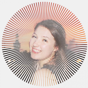
I experimented with a few images on pixel sizes, pixel distance, and spiral “density”. Overall, portraits with a focus in the middle work best for two reasons 1) when the distance between pixels is small,  more details are “smudged” towards the periphery; 2) when the distance is larger, the pixels are further apart towards the periphery, therefore depicting fewer details. Below are some screenshots.
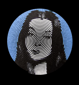
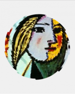
Morticia
Since it’s almost Halloween….I ran Mortica Addams with my code. It is portrayed with smaller pixel sizes that increase more over frames, and closer pixel distance.
sihand-pixel
Another variance contains multiple spirals. For this one, I did not reset the spiral every time it reaches a count. Instead, I let it run over and over with modified dimensions each time.

Kyle Lee Looking Outward 09

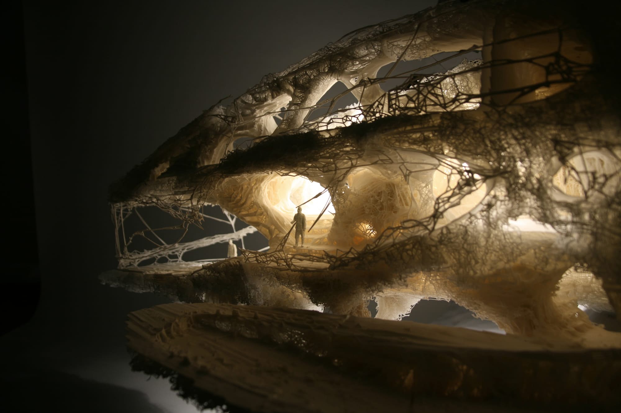
Softkill’s Protohouse

For this week, I looked at Yugyeoung Lee’s post from week 2. The project that Lee discussed is an experimental architectural prototype from the designer firm Softkill. Using bone structures as a basis for infrastructure, computer algorithms build a sound structure, that is then printed in material and cost effective plastics. A advanced algorithm coupled with a sophisticated laser technology makes this project possible.

I agree with Lee in saying that this kind of conceptual experimentation reveals much about how architecture can move towards a more cost and material efficient future. The additional features of no adhesives and lightweight fibers further shows promising signs for this technique and technology. I think this project certainly serves itself well as a concept project, but I do think there are several considerations that were not addressed in the article. While it was uplifting to see that these fibers were bioplastics, it certainly does not mean this architecture is completely sustainable. Although some of the bases for the fibers would be from renewable materials, the amount of energy needed to transform that material into structurally sound plastic might outweigh its own benefit. This is my guess as to why more projects using this bioplastic material technology have not come about in the three years since Softkill’s project; the process to use this seemingly green material consumes too much money and energy to be sustainable.

Project 09 – Computational Portrait – sehenry

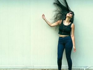
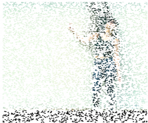
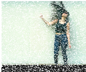
For this project I wanted to use a photo that looked really clear and artistic. So as I was scrolling through photos on my phone, I found a photo that my girlfriend took of herself and edited. I thought that the green background of the building would look really good split apart by many pixels. As I looked at the example on the deliverable page, I wanted to include a different shape and background to present itself as the picture comes together. So I decided to use small triangles while allowing the user to use their mouse to drag even smaller circles to reveal more detail in the face or clothing.

I enjoyed this project.

rachelhairflip

screen-shot-2016-10-27-at-5-23-29-pm

screen-shot-2016-10-27-at-5-27-25-pm

screen-shot-2016-10-27-at-5-34-36-pm

sketch

//Seth Henry

//Tuesdays at 10:30

//sehenry@andrew.cmu.edu

//Project 09 Computational Portrait 

//Global Variable 

var rachelImg;

function preload() {
    var rachelUrl = "http://i.imgur.com/z5nysOD.jpg" //Upload Picture
    rachelImg = loadImage(rachelUrl);
}

function setup() {
    createCanvas(600, 500);
    background(255); //white background
    rachelImg.loadPixels(); //Grab pixels
    frameRate(1500);//Pixels Appear Fast
}

function draw() {
  
    var rW = random(width); //Random x Loc
    var rH = random(height); //Random y Loc
    var posX = constrain(floor(rW), 0, width-25); //Will not appear past boundaries
    var posY = constrain(floor(rH), 0, height-25);
    var rachelColor = rachelImg.get(posX,posY) //Retrieve color pixels of image
    noStroke();
    fill(rachelColor);
    rectMode(CENTER)
    triangle(rW,rH, rW+4,rH-4, rW+8,rH); //draw triangles


}
function mouseDragged(){
    var rachelColor = rachelImg.get(mouseX,mouseY) //Retrieve color of pixel where mouse is
    noStroke();
    fill(rachelColor);
    ellipse(mouseX,mouseY,1,1) //Drags smaller, more defined pixels in shape of circle
}

mdambruc-LookingOutwards-09

https://courses.ideate.cmu.edu/15-104/f2016/2016/09/22/diana-connolly-looking-outwards-4/

http://www.patatap.com/

Patatap, by Jono Brandel and Lullatone, 2014

An example of what you can create with patatap!

At first I wasn’t that intrigued into the project, until I actually tried using the website. This website makes you sound like a professional tech musician simply by slamming your hand on the keyboard. I agree that this website stays interesting, because every time you press the spacebar you are given 26 new sounds and visuals to play with. I think the coolest thing about this website is that I believe that our class would be able to create something very similar to it with our skill set now. I think that websites like these really captivate the attention of younger audiences and would be great to be used to introduce programming in schools. If kids see that they can be cool DJs if they learn how to program, then I’m sure many would try to learn.

Diana Connolly – Looking Outwards 09

Response to Mairead Dambruch’s Looking Outwards 07:
https://courses.ideate.cmu.edu/15-104/f2016/2016/10/13/looking-outwards-07-mdambruc-informationvisualization/

wired_311_1

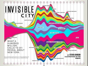
Pitch Interactive’s “Invisible City” 2010

http://pitchinteractive.com/work/Wired311.html

I think this graphic is really interesting. Mairead wrote this Looking Outwards for the information visualization Looking Outwards, and I really enjoy how this information was represented. The artist compiled information about types of phone call complaints, as well as what time the phone calls were made. As Mairead said, the loud colors and extreme waves of the graphic captures the irritable nature of the people calling to complain. I enjoy the clock icons to depict time of day, but the icons are so small that it was sometimes hard to locate what time of day was where.

I also found it funny to see exactly what kind of complaints are most common — New Yorkers apparently have a noise problem! It’s interesting to see how the noise wave progresses over time, and how large the wave becomes later in the day. The biggest amount of complaints are made during the middle of the day, but considerable complaints are still made late into the night. I think this graphic is effective in representing the volume of these complaint calls, and is a creative way of visualizing categories of complaints.

Denise Jiang-Looking Outwards 09

Looking through my peer’s Looking Outwards posts, one of Shan Wang’s posts on 3D computer graphics caught my eyes. I have heard about Alex Roman and the architectural rendering film of the Exeter Library by Louis Khan. After watching the video and reading Shan’s opinion, I agree with her that this computer generated project is full of great uses of lighting, shades and color. I also liked how she described him as an CG artists who has amazing aesthetic sensibility and techniques in rendering. In addition, I think Roman’s works are valuable because his mix uses of different software and the carefully interpreted details of nature. He added active human figures into his renderings, which made them more lively and vivid.


Computer Generated Graphic of Louis Khan’s library in Exeter 2009

Michal Luria – Looking Outwards – 09

Kinematic Dress / N-e-r-v-o-u-s System (2014)

source

Looking Outwards 03 by sajohnso

I was fascinated by the project of a 3D printed dress that is aimed to be flexible, and that would allow movement and would lay comfortably on the body, like other garments, rather than hard 3D printed wearable “sculptures” that were previously designed using 3D printed techniques.

I agree with the Looking Outwards post in that the most interesting aspect of this project is not in the dress itself,  but the sophisticated printing method – the dress was simulated being folded on a computer and was printed in a folded “chunk of a dress”. This allowed to print it in one piece, rather than hand assembly small parts.

I would like to extend on how this is important for the advancement of 3D printed garments. In my opinion, the ability to “fold” parts on the computer and only then print it allows easy home fabrication in one click. Anybody can create this kind of item, since assembly is not required. This indeed places us one step closer to a DIY fashion revolution, as sajohnso posted on this project.

AndrewWang-LookingOutwards-09

Jinhee Lee – Looking Outwards 03

Artist’s Work – Dot San 2016 “SUV”

I was looking through the work of my peers and stumbled upon this interesting looking outwards report. After reading the post and information about the piece, I really agreed with everything that Jinhee said in his original post. There were a lot of subtle things that were included in the artists work, such as the detail scaling that Jinhee had mentioned.

It was also interesting looking at some of the other pieces that Dot San made, in which he actually materializes and shows the printed versions of some of his concepts / digital works. Looking at these you can really see the intricacies and details that went into the work, and also notice that a lot of his work is created for tours and exhibitions which is definitely noticeable in the finesse that his finished products show.

ShanWang-LookingOutwards-09

copyright_laurian_ghinitoiu_israel_2_of_12-1

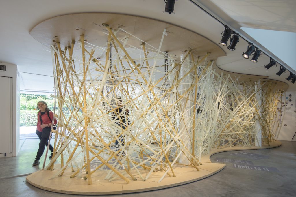
LifeObject Installation

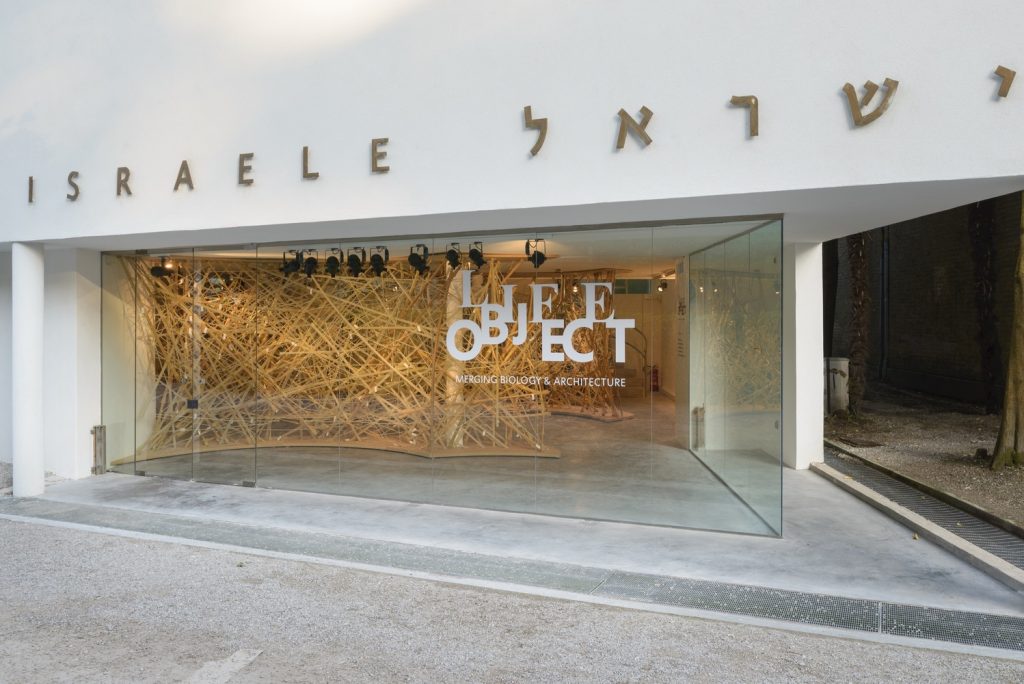
After browsing all the interesting post by my peers, I’m particularly drawn to the LifeObject project introduced by Yugy. This Israeli Pavilion is an architectural installation at  2016 Venice Biennale, that embodies the resilient properties of a bird’s nest. Curators of this project include Dr. Ido Bachelet, Bnaya Bauer, Arielle Blonder, Dr. Yael Eylat Van Essen, and Noy Lazarovich.

Specially, I’m fascinated by the spatial architectural forms generated through the scientific analysis, which materializes the abstract ideas into a architectural senses of thinness and volume.

I agree with my peer’s insight about this project bridging architecture and biology. The computational design of the fabrication process enables the realization of natural quality and randomness of biological characteristics. And the desired animation of the organic nest is successfully manifested through the dynamic yet inorganic material.

dacian-groza-israel-pavilion-venice-biennale-00012

Israel Pavilion

Project 9: Computational Portrait

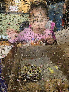
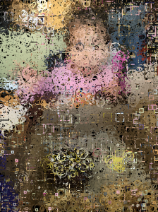
For this portrait project, I chose to feature a picture I took of my youngest sister eating a donut.

The original image.
The original image.

I wanted to play with varying shape and size of pixels, so I created a program that starts out with drawing large rings of the image, and then with each click of the mouse, the rings incrementally decrease in size (until a certain point). Additionally, in order to play with shape, rectangles instead of rings are drawn when the user moves the mouse across the canvas (and the rectangles also decrease in size as the mouse is clicked).

Below are two renditions of what the image could ultimately look like. Of course, there are many more possible images that could be generated, since the presence of rings or rectangles and their respective sizes are controlled by the user’s command of the mouse.

screen-shot-2016-10-27-at-12-51-59-am

screen-shot-2016-10-27-at-12-53-15-am

sketch

/*Emma Shi
Section B
eyshi@andrew.cmu.edu
Project 9
*/

var img;
var outlineWH = 30;

function preload(){
    var imgURL = "http://i.imgur.com/8xc0iz2.jpg"
    img = loadImage(imgURL);
}

function setup() {
    createCanvas(400, 533);
    background(0);
    img.loadPixels();
}

function draw() {
    var px = random(width);
    var py = random(height);
    var ix = constrain(floor(px), 0, width);
    var iy = constrain(floor(py), 0, height);
    var ColorXY = img.get(ix, iy);

    stroke(ColorXY);
    strokeWeight(2);
    noFill();
    ellipse(ix, iy, outlineWH, outlineWH);//draws circles that appear to make the image complete
    rect(mouseX, mouseY, outlineWH, outlineWH);//draws squares according to mouse movement
   }

function mousePressed() {
    if (outlineWH == 30) {
        outlineWH = 25;
    } else if (outlineWH == 25) {
        outlineWH = 20;
    } else if (outlineWH == 20) {
        outlineWH = 15;
    } else if (outlineWH == 15) {
        outlineWH = 10;
    } else if (outlineWH == 10) {
        outlineWH = 5;
    }
    //the size of the circles and squares decreases by 5 with each click

}