I am doing my Looking Outwards post on Hannah K’s post from Week 4. She did a post on Six Drawings, a joint collaborative effort between artist Maotik, percussionist David Espinosa, and musical director David Adamcyk. The project was presented in an audiovisual and instrumental performance at Société des Arts Technologiques in Montreal during the IX Symposium in the spring of 2014. The displays on the rubber orb were controlled through the program TouchDesign while the connected computer ran a Max multimedia software.
I also agree that the work is a completely immersive experience. When the first sounds are visually displayed on the giant orb, the room becomes silent and everyone is enraptured and fascinated by the erie, almost tribal, audiovisuals. One simply cannot peel their eyes away.
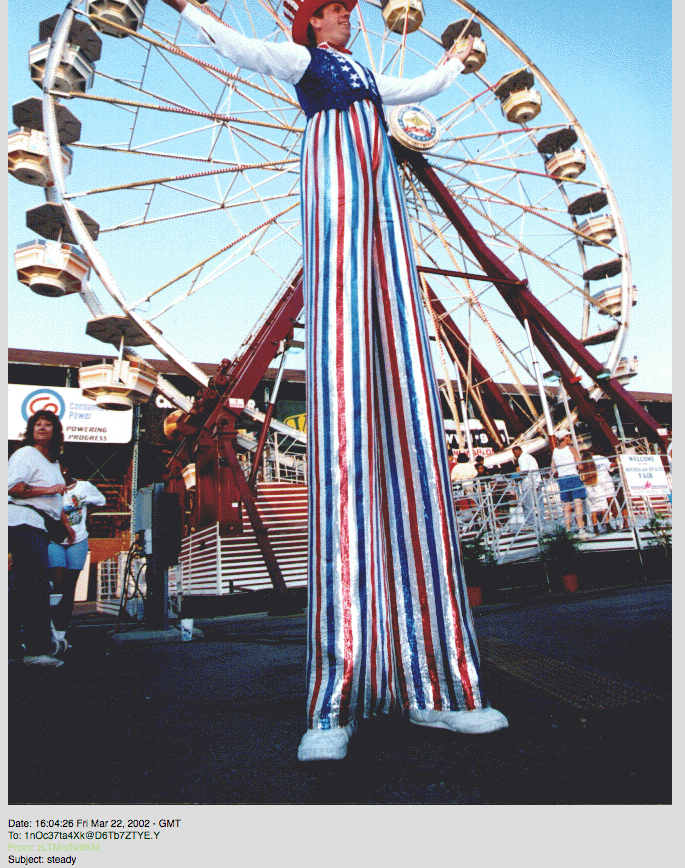
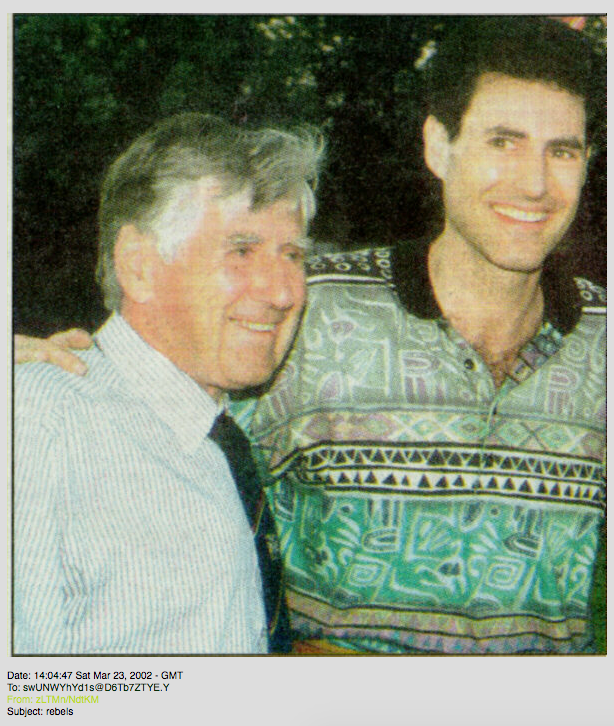
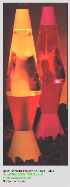
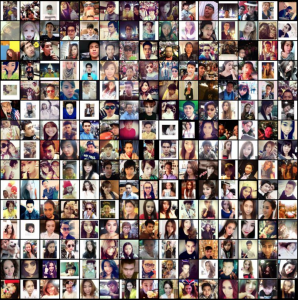
Syncro Mail by Lisa Jevbratt 2001An image sent in 2002 labeled “Steady” in Syncro Mail
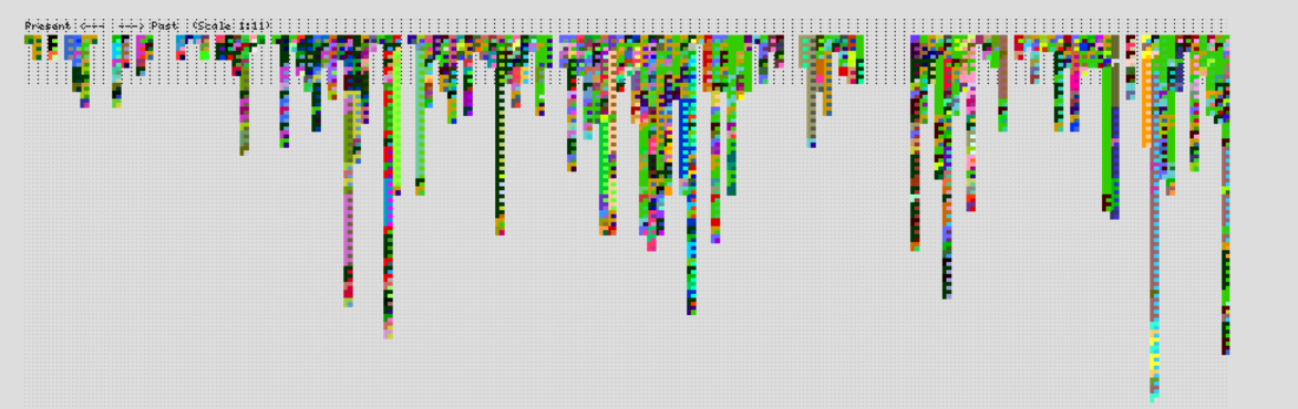
I thought the post MREYES-LOOKINGOUTWARDS-SYNCRO MAIL – UNCONSCIOUS COLLECTIVE by Mreyes posted in 2016 was interesting so I decided to look into this project. This website by Lisa Jevbratt sends a photo paired with a word to a user and documents the content of every sent email. Like the author, I also enjoyed seeing the interaction between people. Not only did this project show the relation between the sender and the receiver, but also the people who were being tied together through the same images.
An image sent in 2001 labeled “Rebels” in Syncro MailAn image sent in 2001 labeled “Emigrate” in Syncro Mail
I think the author did a great job of explaining the possible underlying algorithms of the work, but to be more specific, each image is generated using the last 24 numbers of each user’s IP address. Unfortunately, the website is no longer running, but if it was, according to Mreyes’s assumption that the software randomly chooses images from Google and the fact that every two minutes, humans take more photos than ever existed in total 150 years ago, you would see the change of images on the web through the years. In this sense, this project is like a time capsule that adds something every day.
Mreyes was not sure of the artist’s intentions, but in my opinion, the artist is trying to make the point that many events are not causal, they are synchronistic, or coincidences in time which is a romantic thought.
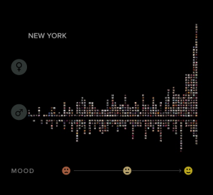
While there are many interesting projects students chose to write about in the “Looking Outwards” posts, I was really interested in Sihan’s post about the Selfiecity project. The man behind the project, Dr. Lev Manovich, and his team are interested in examining the style of selfies in five cities – Bangkok, Berlin, Moscow, New York, and Sao Paulo. By poring through thousands of individual photos, the Selfiecity team has been able to uncover patterns on selfie styles, taking into account aspects such as head tilt, smile, age, gender, and more. For instance, it was found that in all cities, women took more selfies than men, and people in Moscow smiled the least.
An “imageplot” from Bangkok selfies.A visual distribution of people’s selfies in New York, ranging from an unhappy to a happy mood (left to right) and organized by gender (females on the top, males on the bottom)
Like Sihan, I would imagine that the face recognition algorithm behind the selfies would collect quantitative data (i.e. eye position in proportion to the face, head tilt angle, etc.). Although there has been extensive work done on this project, I think it’s difficult to concretely measure certain aspects of a person’s selfie, such as emotion. I also think it would be interesting for the team to create visualizations of people’s selfies by gender, as I would imagine that men and women may also take selfies in different styles.
I chose to look at Cedes’ week 6 post about Jean Tinguely‘s work. She focused on his Drawing Machines, which are moving sculptures that he created with the intention of producing drawings. These drawings were abstract and a bit rough but maintained a rhythm created by the machine. I agree with Cedes about the point she makes that there is a “juxtaposition of using a machine (witch is often associated with precision) to create these un-precise images”, but for me this is not the most interesting aspect of his work. I enjoy both his works that create drawings and his works that are purely performative/moving sculptures.
I think that the Drawing Machine work is most interesting because it functions on many different levels. There are aspects of performance work and sculpture as well as drawing. The machines themselves are beautiful to look at, as well as the products that some of them create. The performance of the work is the most interesting to me, especially in the video clips where you can see the shadows of the work dancing on the walls.
(You have to actually go to Vimeo to watch the video due to the privacy settings)
A sculpture by Jean Tinguely casts a shadow on the wall behind it
Christine Kim’s post [1] on 3D rendering captured my attention when I was looking through the posts for week 5. In her post, Christine discusses how the 3D rendering of an architectural piece often differs from the real experience, which is an increasing problem because it has compromised the trust between clients and architects. “Most of the time, the 3D computer graphic photos focus on artistic values of the render rather than the creating realistic experiential render”, Christine identifies the cause of the disparities, suggesting that clients should be more understanding of the gist the rendering, instead of focusing on the “realistic experience.”
3D Rendering v.s. Actual Office Space Credit: archdaily.com
When I was reading the original article mentioned in Christine’s post [2], I noticed a recommended article by the website named “How to render your building to sell it, not just show it.”[3] It is interesting that, although most of the differences can be attributed to limitations of the rendering software and the variability of the reality, architects’ intentions might also play a crucial role. Just for clarification, I am not implying that architects knowingly deceive their clients; instead, architects are often forced to accentuate certain details of their designs to sell their projects to their clients. For example, going for an impactful POV (point of view) or composition instead of one that most accurately depicts the reality.
Going back to Kim’s advice to clients of not focusing on the”realistic experience”, a question arises: do the client actually want the “realistic experience” in a rendering, or rather a heightened representation that deviates from the reality within an acceptable amount?
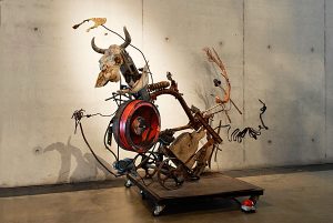
Mercedes selected an Eyal Gever 3D media exhibition called “Sublime Moments” that debuted in 2014 at Frankfurt, Germany. According to his biography, Gever served in the Israeli defense forces as a computer graphics situation simulator. His occupation paved an artistic path for him in that he eventually developed his own software to use and expand upon.
In “Sublime Moments”, Gever uses his software to create ~~moments~~ of natural and man-made occurrences such as waves in the ocean coupled with a large purple sphere being popped and torn open.
With these sections of moments, Gever compiles these compositions and sends them to the world’s largest 3D printer. To recreate something so detailed in digital and physical media is really unbelievable to me.
Mercedes talks about her opinion on Gever’s work and conceptual processes below
I admire this body of pieces because, I usually find hyperrealism (in both painting and sculpture) to be impressive but, ugly. However with Gever’s work I found his subject matter interesting as well as his execution and the forms he chooses to depict. The collection of pieces is enticing to look at as the forms suggest a movement but also give hint to a bigger motion yet to come. Gever Manages to capture the ominous potential along with a beauty and serenity of natural forms in a poetic juxtaposition.
I’m inclined to agree with her because I also find hyperrealism to be impressive but also somewhat grotesque. Gever capitalises on this ‘grotesqueness’ by incorporating a glossy and intricately surreal materiality to his pieces. This results in a very contemporary rendition of
what we are already naturally familiar with.
This week, I looked at Amanda Cox‘s work. She works for the New York Times as a graphics editor, and as I am a big fan of the NYT, I decided to pick her as the individual whose work I would look at. She received a Master’s degree in statistics and ended up at the NYT when she decided to take an internship there while she was still in school.
I am drawn to her work because I think data visualization presents an interesting challenge but is relevant because there is so much information available to us in this day and age. I think the NYT consistently creates fun and interactive infographics, which I find fascinating. They are both informational and engaging, which I think can be a difficult balance to strike at times.
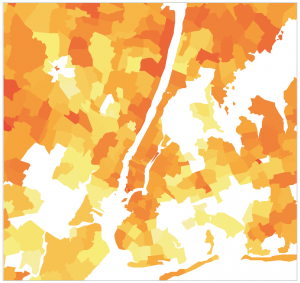
One of the things she worked on that I found particularly interesting was this infographic on Netflix rental patterns depending on location and neighborhood.
(Please click on the image below to access the infographic.)
This infographic provides information on Netflix rental patterns, neighborhood by neighborhood, in a dozen cities.
Kate Hollenbach is a product designer at a company called Oblong. She studied computer science in college and then was working on her MFA when she joined Oblong. She would describe what they do at Oblong as “gestural and spatial interactions in products and installations”.
The work that they do is based in data visualization using very complex hardware called g-speak that can identify hand poses and track hands in a 3D space. This means that it can track what motions your hand is doing as well as where in the space it is – for example grabbing and dragging. There is even ability for multiple people to interact within the same space. These projects are not only for artistic purposes, but also have useful applications for businesses.
The presentation is given really well, with examples coming up on the screen as she explains what the technology is doing. I think this is a really nice way to present because otherwise, even though she verbally explains how things work, the viewer might not understand what she means. The visuals allow for the viewer to better comprehend what she is talking about and also gain insight into the project.
Zach Lieberman is a professor at Parsons School of Design. He studied Fine Arts at Hunter College and received a Masters in Design and Technology from Parsons. He tries to achieve a representation of and tribute to Drawing, Movement, and Magic through his work as a digital media artist. He has created custom drawing tools that do things like uncurl non-straight lines, or allow those with disabilities to draw with their eyes. He also makes drawings interactive and musical. He uses movement in large scale interactive works where people can dial a phone number and appear as a character on a projection that was displayed on a building face. He also helped magicians create illusions, making cards dance and levitate. The project that I admire the most is the drawing software that allowed a paralyzed man to draw with his eyes.
I watched Lauren McCarthy’s lecture on following. Lauren is a Brooklyn and LA based artist and coder and was also one of the creators of P5JS! Lauren received her BS in Computer Science and BS in Art and Design from MIT and then received her MFA from UCLA. Lauren is now a professor at UCLA and was recently working at CMU in code lab.
I loved watching this lecture and was so inspired by the projects Lauren has worked on. What I love about her work is that most of her projects are focused on intimacy and engagement with the people in the world around you. Her main interest seems to be using algorithms and codes to measure or track relationships and then find ways to use that information to determine how you engage with the world and with the people in your immediate surroundings. I also love that she uses this knowledge and interest to empower people to recreate new social structures and ways of thinking about interacting with one another.
The way that Lauren presents is also incredibly personal and she uses her vulnerability and personal anecdotes to connect the reasons why she has had the interest or desire to create the projects she has. I’m ultimately really glad I watched this and am excited to watch more! http://lauren-mccarthy.com/about
![[OLD – FALL 2016] 15-104 • COMPUTING for CREATIVE PRACTICE](../../../../wp-content/uploads/2020/08/stop-banner.png)