Looking Outwards-12

A project that I really found interesting and that pertained to project is one by Bjork Digital. The project is very short but consists of a man moving around and colors, lights, and animations are moving around and seem to react to the way that he moves. The reason why it relates is because initially I was going to include a camera in my project that reads the positioning of your hands based on the lighting. So instead of pressing a key on a keyboard to make the bars rise to the top, you could kind of raise them to the top by yourself like the text rain letter project. The other project that I found interesitng and that pertained to my project was Masaki Fujihata. This project was supposed to take a camera and focus on a specific object until a video came to life with the object that you were focusing on. Going back to my want of using a camera in my project, this could be a really cool interaction between the characters I am using and the person who is playing the game. Unfortunately I do not believe that I can recreate anything that this project has demonstrated.

Björk
James Merry

●ProjectPlanning / Produce and Production 
 Dentsu Lab Tokyo 

Creator: Daito Manabe

Creator: Masaki Fujihata

looking outward 12

The first project I looked into is a transforming architectural installation named Suspès, made by by MID, PlayModes, and David Sarsanedas. It is based on the suspension of 100 helium ballons with 90 cm diameter with inner LED and control systems inside. By turning them on and off synchronically with the music, the installation simulates the apparition of stars and constellations that beat in a big aerial choreography. With the form of balloons, The installation can be held outdoors or indoors, and it includes architectural lighting for the sur- rounding buildings, which synchronizes seamlessly with the balloon matrix.

The second project I looked into is “La Llum de Miravet”. It is an audiovisual installation to transforms a church apse into an alive and mysterious space, discovered through contrast between hums and silence, light and darkness. The project using the spatial condition in the church to maximize the effect of the visual effect connected to the sound control. The project credited to 3D Model: Gerard Vallverdú; Unity3D: Guillem Galimany; Tech Project: Eloi Maduell; Sound: Santi Vilanova
These two project inspired me to explore the possibility in the sound visualization area and I beginning think of making sound graphic animation interact with sound track which sound be project into different architectural space to receive different effects.

Hannah K-Looking Outwards-12

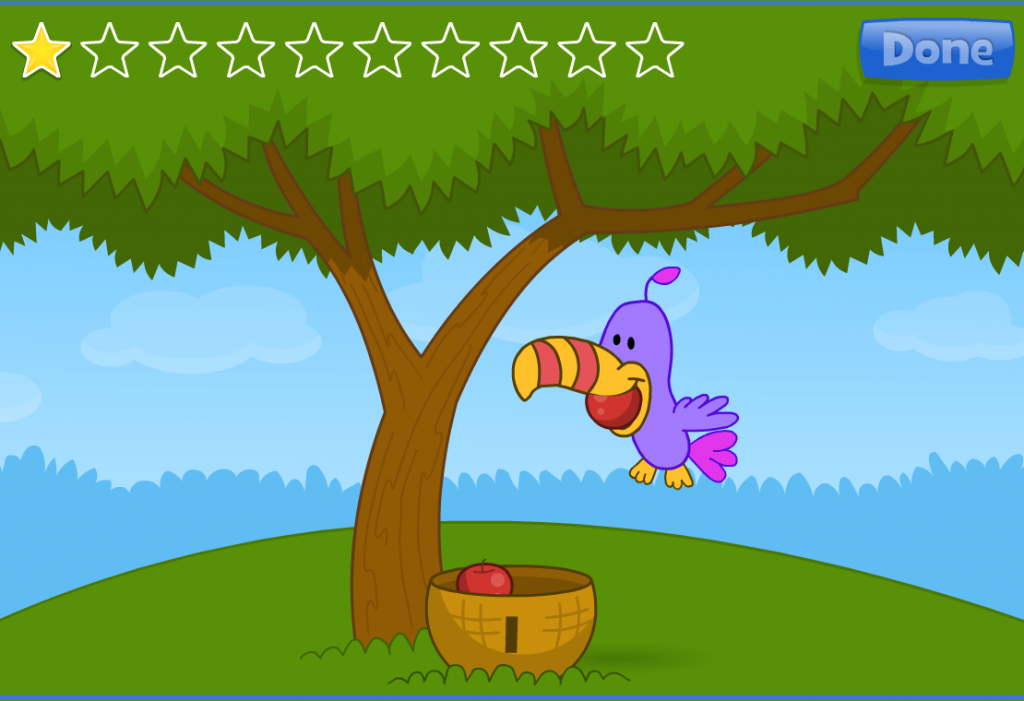
For this week’s Looking Outwards, I looked at two examples of games that are are similar to what I hope to create for my final project. Both games were created by primarygamesarena.com and were originally intended to be educational math games for younger children.

The first game was called Apple Catch, and the second game was called FrostBite.

The main elements of these games that I gained inspiration from was that the graphics were simple but still effective, and both games were mouse interactive and had an element of keeping tracking how how many “items” that the mouse-controlled character caught.


In the background of both of these projects, there were random graphic elements, which is something I may consider adding. As I go about working on my project, I think it will be helpful to come back and look at these games again.

Apple Catch requires that the player moves the mouse to where is apple is dropping.
FrostBite has a similar idea as Apple Catch, but it requires that the player moves the mouse away from randomly generated elements dropping from the sky.

Final-Project-Proposal

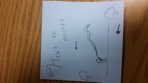
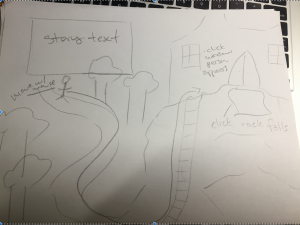
For my final project I would like to create an animation that first draws itself, then tells a story or narrative. I would like to use elements of a drawing feature to incorporate forms of interaction for the user. I think the story would include sounds and possibly a narration. I think it would be extremely short and comical. At the end I hope to make it an audiovisual interactive piece.

For images of the animation, I will take a simplistic approach to match my artistic capabilities. Much like the walking man animation that we have used for homework, I will be drawing my own stick figures to be persons in this story. I will try to create an interactive environment for the persons in my story. I think that I can create the ability for users to draw pieces of the environment for the characters in my animations to interact with. 20161118_234818

Looking Outwards 12

One of my inspirations for my final project comes in the form of online kids’ books. I have young cousins who are learning how to read. Instead of practicing how to read with paper books they I did, they instead are learning how to read online. Education.com has many books online that help kids learn how to read. While I want to add an interactive aspect and my story will not be for small children, I realized that this approach to reading might make adults who may not like to read enjoy it more.

Link to education.com

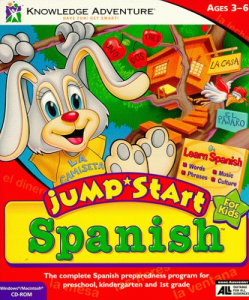
For the interactive part, I remembered a game from back when I was in fourth grade Spanish class. It was Jumpstart Spanish and I remembered how the game made me want to learn Spanish. Conceptually it was similar to clicking and dragging which are things that I want to incorporate to make reading fun.

messages-image426620873

Final Project Proposal

20161118_224233

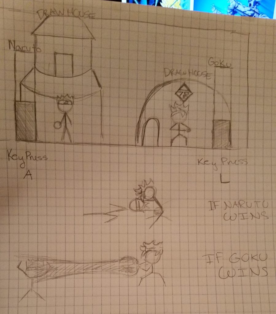
For my final project, I would like to create a little, simple game involving two characters from some TV shows I used to and sometimes watch. I want to create a game that requires players to tap their respective keys ( Key Press A and Key Press L) as fast as they can in order to win. As they press their keys, a level bar will start to fill up. Once this bar is full, the player will see their character attack the other which symbolizes the end of the game. The reason why I want to do this is because I really enjoy making short animations and I think it would be cool to match up the two characters (Naruto and Goku) that are always being compared to each other. If this project goes the way I envision it, then I will be very pleased and can always have a little game to show people that I created. The project would include sound, turtles?, and perhaps a moving background with clouds.

Final Project Proposal

I’d like to do a final project that is an interactive story. I’m a creative writing major with a background in fine arts so I’d like to take a story of mine and then make it into an interactive experience using some sketches of mine and incorporating the whole thing into an interactive program. For example, when the right side of the screen is clicked the scene would change like the flipping of a book page. Similarly when the left side of the screen is clicked the scene would change back to the previous page. Within each screen the text of the story of the scene would be displayed and then the various elements within each screen would be interactive. For example, if a character moves in the text then the character could be dragged by the mouse from one location to another. I haven’t worked out which story I am going to use or if I’m going to use one already existing and the amount of text per page yet, but I’m hoping that it will have maybe a fairytale book feel to it.

sketch

Shan Wang-LookingOutwards12

I got my inspirations for the final project from the two games I have played on the phone. These two projects, Doodle Jump and Mega Jump

share the similarity in the sense of moving upwards. The main purpose of the games are the same, to move higher and higher up. The main differences between these projects lie in the fundamental driving force for moving upwards, and some special features.
For Doodle Jump, the alien is constantly jumping, whereas in the Mega jump, the gold coins are the incentives for jumping up. In both of these games, the platform stays the same unless the character moves, and for my final project I am thinking about having all the platforms dropping down.
The simple format of these two projects provides enormous possibilities in adding other features to platforms, character movement and etc, which I found particularly interesting.

LookingOutwards-12

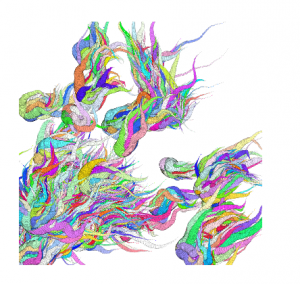
Noise Turbulence Doodles by Raven Kwok is a fun interactive piece that allows the user to draw generative patterns. I really like this piece because of its fluidity and randomness. I think Kwok could have taken this a step further by allowing the user to decide what direction the generative art could go (since it goes to the upper right corner at the moment.

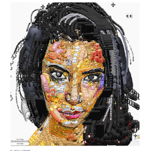
Emoji Portraits by Yung Jake uses simple emoji’s to create portraits of well known figures by using emoji.ink. I really like that Jake uses very common images to construct his portraits. I think that these pieces could be improved if they were interactive and showed Jakes drawing process.

I think for my final project I would like to incorporate elements of the two pieces by ensuring that my project is both interactive, and utilizes very recognizable images. I think this could be done creating a drawing tool for people who like to see images unravel before their eyes.

noise-kwok

noise-kwok

rgriswol_lookingoutwards-12

Since I’m using Mario as a sort of model for my project, since it is the game that made platformers what they are, I wanted to discuss Mario. I wanted to then compare it to another similar game, and since Mario is a professionally made game it seemed unfair to compare it to an indie game. The original Mario Bros game was released in 1983, so I decided to compare it to Zelda II:The Adventure of Link (released in ’87) since it’s also a platformer developed by Nintendo in a similar time period.

Both the original Mario game and the second Zelda game were created by Shigeru Miyamoto, Miyamoto designing the former and producing the latter. Mario originally came from the game Donkey Kong. Mario, while it was original at the time, has become sort of the standard model for platformer games. Zelda II was completely different – while it is still essentially a platformer, the original Zelda was not, where instead you looked down from above (a top-down game like in Pokemon). Because of all the changes to the game – most notably how it was a side-scroller, included “lives” similar games like Mario and Sonic, and the inclusion of experience points – it ended up being not particularly well-received.
While I’ve played the original Mario, I’ve never played the second Zelda game. However, I do admire the risks they took in changing the Zelda series so drastically. Because of the reaction these changes wouldn’t stick, but I still found their bold choices to be inspiring. I also happen to prefer side-scrolling games to top-down, so I may be a little biased.
Mario, while again very “typical” of platformers, is still extremely fun and extremely difficult. While the gameplay, like all early 8-bit games, is rather simplistic, it’s still a very hard game to beat. There’s no ability to save, you can’t go back once you’ve left a certain area, and there’s a ton of levels that increase in difficulty. It’s quite impressive to me to see that this game completely stood the test of time. Sure, new Mario games are fun, but I think that the original is the best designed out of the ones I’ve played – I usually only play the later games because they’re easier to beat and I’m terrible at video games.