yoonseo1-project5 Wall paper

Davewall

////Yoonseo(Dave) Choi
//Section B
//yoonseo1@andrew.cmu.edu
//Project 05 - Wall Paper
function setup() {
    createCanvas(480, 480);
    background(0); //set back ground to black

}
 
function draw() {
	noStroke(); // removing Stroke from the petals
    for (var p = 0;p < 12; p ++){ // setting for loop for patter
    	for (var j = 0; j <12; j ++){
    		var red = map(p*200,0,height,0,255);  //color set for red
            var green = map(j*200,0,width,0,255); //color set for green 
    		petal(p*200+90,j*200+90,red,green,random(0,255)); //execute petal 
    		stroke(255,4); //set stroke color
    		line(p*40,0,p*40,height); //vertical stroke
    		line(0,p*40,p*40,0); // diagonal stroke
    		line(width,p*40,p*40,height); // diagonal stroke
    		noStroke(); // no stroke for the petal

    	}
   }
   noLoop(); //only run once
}

function petal(x,y,r,g,b){ //petal function
	push(); // setting geomety
	scale(0.45); //scale down whole thign by 0.45 too big initially
	fill(r,0,b); // set color of petals
	rectMode(CENTER); // settting center to middle
	translate(x,y); //translate to x, y coordinate given at execution
	for (var i = 0; i < 6; i ++){ //for loop for petal rotation
	push(); 
	scale(1.1) //scale petals up by 1.1
	rotate(TWO_PI*i/6); //make them rotate around the center 
	translate(50,0); //translate them 50 from the cente 
	rotate(180); //rotate the single petals by 180 to create form intended
	beginShape(); //half of petal
	vertex(40,20);
	bezierVertex(70,30,40,50,40,60);
	endShape();
	beginShape(); //another half of petal
	vertex(40,20);
	bezierVertex(-10,35,40,50,40,0);
	endShape();
	pop();// pop the form 

	}
	pop(); //pop the whole 
	}

For this project I started with a flower initially to create a wall paper pattern. I started to modify the form from there and transformed the petals into irregular petal shapes. I have populated them by giving 6 petals a center. I had to scale the petal sizes down because they were too big initially. I have used the color to give random variation through out the wall paper. I have used for loop and random variable for the color lies inside of the loop. After the placement of the petals, it needed extra color of form to contrast with. I decided to put white transparent thin lines to give emphasis on the petals and contrast through out whole wall paper pattern.

sntong-LookingOutwards-05-3D-Comupter-Graphics

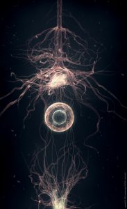
The Roots by elreviae is generated with 3Ds Max and photoshop. elreviae is a french digital artist and designer who started off with self-taught skills. For this piece, he is able to show the process of neurons communicating to each other. It even suggests how branches of network are crossing over or establishing communication through the circular medium in the center. It is fascinating to see technology being re imagined to be implemented in the human body for medical purposes. 

kyungak-lookingoutwards-05

https://vimeo.com/234677070

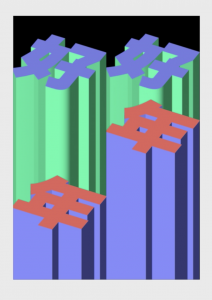
(Timo Lenzen, Dancing High-Rise, 2017)

Lenzen is a graphic designer known for producing simple but eye-catching designs. “Dancing High-Rise” is also one of the simple but aesthetically pleasing works of his. This animation was made to celebrate the Chinese New Year in 2017 and was installed on one of the tallest buildings at shanghai. I particularly enjoy his style because it is once again simple, but rich with meaning. I love the way he manipulates the abstract and architectural forms to produce something that is so uncomplicated yet unique. The designs are easily approachable but also new in their own ways. I am unsure of the programs he used to make this animation as it was not specified in his website. Overall, his works are very satisfying to watch.

danakim-LookingOutwards-05

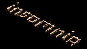
Insomnia; Tomasz Artur Bolek

Insomnia by Tomasz Artur Bolek, a 3D artist/ animator, is a typographic study where he externalizes his interest in urban structures. Bolek used 3D rendering and animation softwares, Blender and Keyshot, to articulate this typographic study.

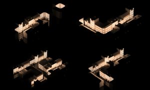
I’m an architecture student so this project immediately caught my eye while I was looking through Behance. I found Bolek’s use of negative space to establish the shapes of the letters quite clever. I also like that he uses the lights shining through the windows as a way of creating contrast and making the letters pop. I admire the balance he was able to create between simplicity and detail.

Tomasz Artur Bolek; Insomnia

I, J, K, L; Tomasz Artur Bolek

jwchou-LookingOutwards-05

Dark Forest by Jakub Javora, 2016

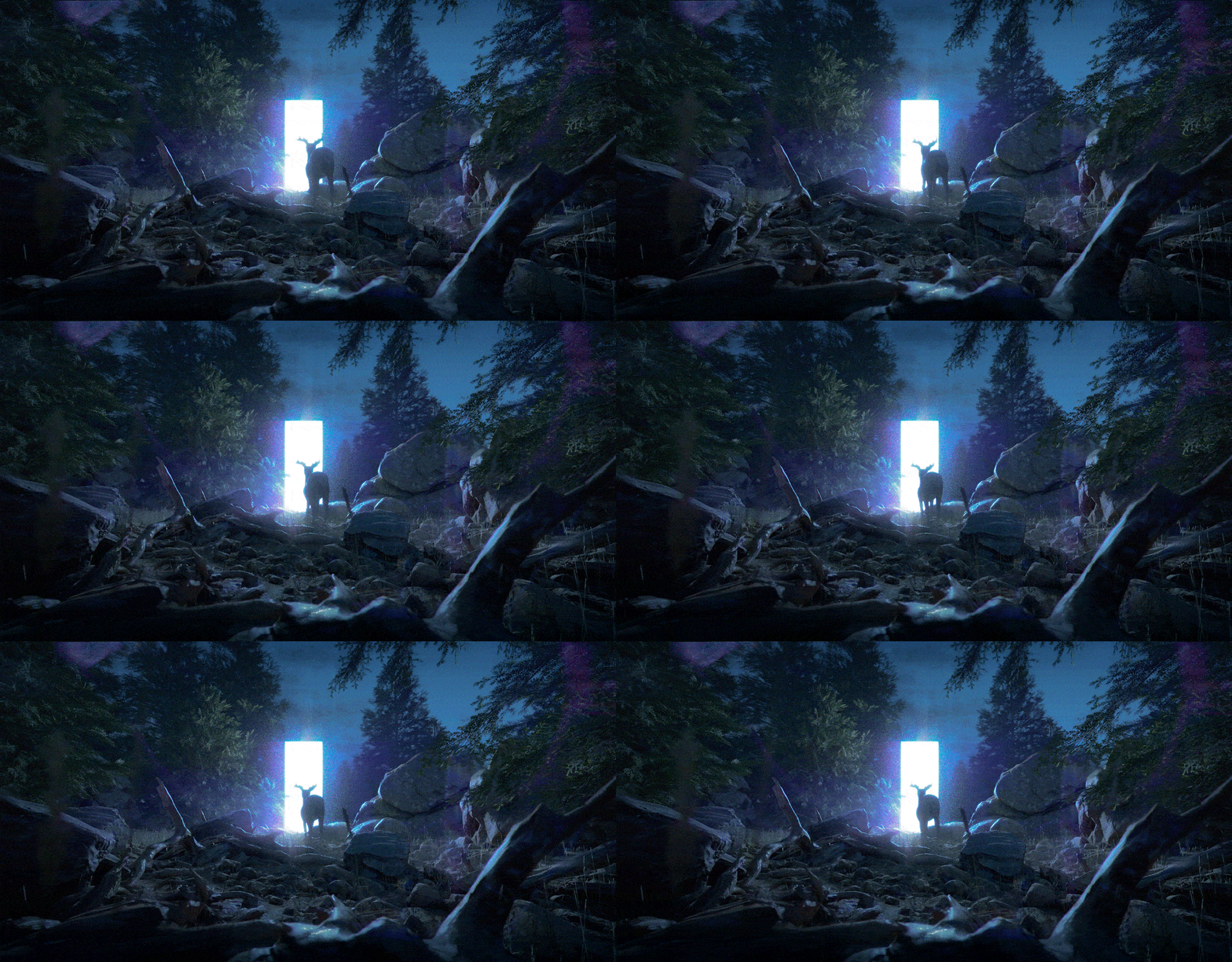
This is a piece I found when I searched for 3D artists on the internet. It depicts a surreal scene of a deer in a forest, facing a bright plane. There are so many reasons to admire this piece. First, it’s very technically sound. Everything is beautifully rendered and the realism is impressive. I also appreciate how the artist found an interesting subject matter that makes use of the medium. He didn’t just recreate a natural scene. He recreated a scene and added a surreal element to it, elevating the narrative.

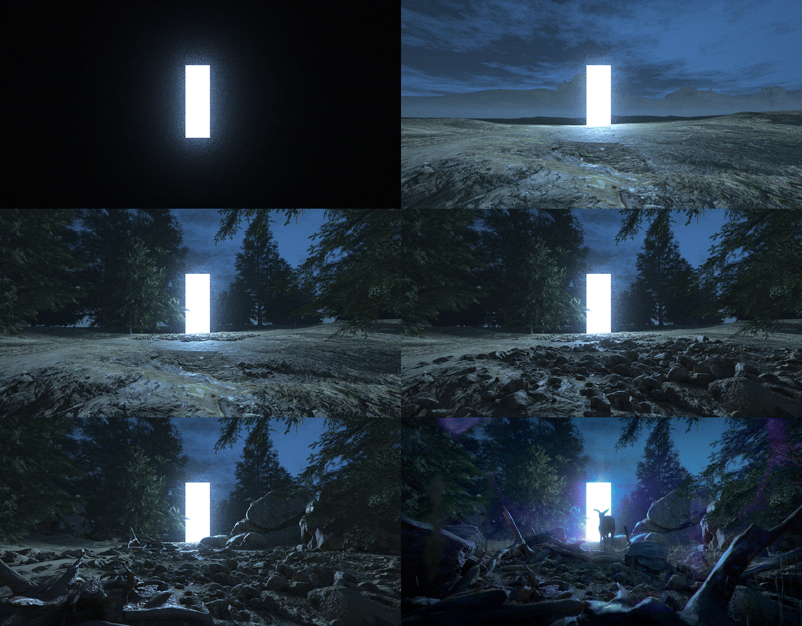
According to a post about the piece here, the artist created Dark Forest using RedShift, Maya, and Photoshop using assets from an XFrog library.

If you look at the iterations in this gif, you can see how the artist used his sense of perspective to lay out the images. It looks that while the algorithms in rendering software rendered the basic elements, he had to go into photoshop to give it a few effects (the purple flare around the deer). So to me, that says the algorithms used in rendering software are not nearly adequate or flexible enough for more stylistic touches.

More info here:

https://www.artstation.com/artwork/QPv04

gyueunp – Looking Outwards 05

Chris Bjerre worked as a part of the motion design and visual effects team that helped create the promotional teaser for American Horror Story: Cult, the seventh season of the television series. Among the multiple eerie scenes included in the video, the striking face loop is my personal favorite. The hypnotising rotation of the countless identical faces and the lack of color and light create a beautiful yet petrifying scene that successfully catches the viewer’s attention. Additionally, the visual and auditory elements work together to create an extremely unsettling mood throughout the piece.

Scenes from the promotional teaser:

I also love other works by Bjerre, mainly due to their simple yet complex visual structures. Some include Echoes, an exploration of the infinite nature of fractal geometry, and Void, a video work that reflects on the art of creation.

A compilation of his works

ghou-lookingoutwards-05

Motion Graphics

like many teens in this generation, one way i discover graphics and trends are through social media. This week I chose to focus on an Instagram account that I’ve been following @motiongraphics_collective, this account collects 3D computer graphic works from other artists and posts them in short video form. This week I chose to check out a couple artists featured on this account.

@ef.social

This is a pretty new account based in Singapore. Their graphics mainly include complex shapes and a series of graphics that leads to forming/deforming it. I admire the geometries created by this artist and the simplicity in its generations.


@lvmtn

This artist is a freelance designer. [his portfolio] His work is very organic and have a natural characteristic.

it is very interesting “stalking” artists on social media because a lot of times the works are very raw. It is nice to see everyone’s individual aesthetic on their accounts.

jiaxinw-LookingOutwards-05

6088AD

by Cornelius Dämmrich

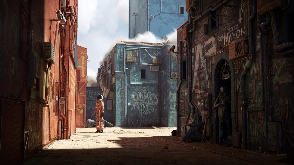
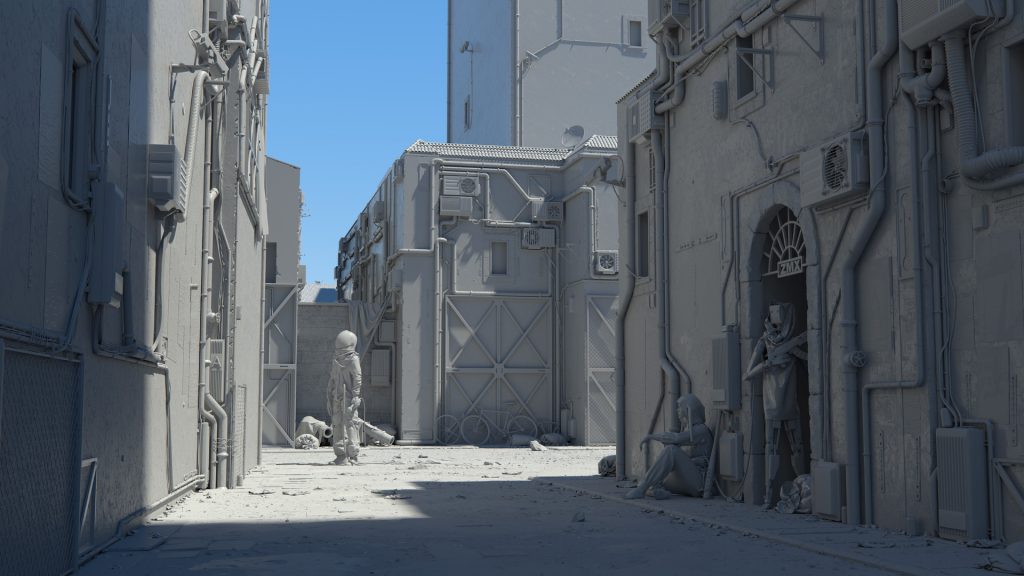
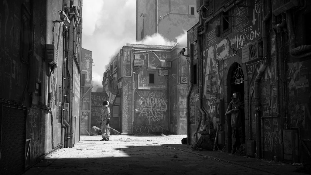
Cornelius Dämmrich is a German freelance CG artist, 6088AD was a painting that he created this year using multiple graphics software. For this painting, he focused a lot on the shading, texture, and lighting for 3D computer graphics. Although the painting doesn’t have a specific story behind, it created an atmosphere combining future and modern humans culture together. The imagination and appearance were very strong and attractive.  Cornelius posted a very detailed breakdown tutorial to explain how he created 6088AD.

From the video, we can see that he first built up the scene using simple shapes to mark the portions of subjects inside. Also, he used the light inside to make shadows in the scene. Later, he kept carving the models and textures to make it more realistic. The choice of color works really well, the orange on the left side and the greyish colors on the right side helps to create the interesting contrast in the painting. It also strengthens the vivid feeling.

For more details, please go here: https://zomax.net/gallery/6088ad/

jiaxinw-Project 05- Wallpaper

sketch

function setup() {
    noLoop();
    createCanvas(480, 600);
    background(255);
    //fill the canvas with a gradient color
    bgColor();

    //riandrop length
    var dLen = 10;

    noStroke();
    //fill the canvas with raindrop, set raindrop x and y equal 10
    for(var dy = 10; dy < height-dLen; dy += 40 ){
        for(var dx = 10; dx < width - dLen; dx += 40){
            stroke(144, 197, 242);
            strokeWeight(3);
            line(dx, dy, dx+dLen, dy+dLen);
        };
    };
    
    //umbrella size 
    var size = 80;

    //fill the canvas with umbrellas, set umbrella x and y equal 60
    for ( var y = 60; y < height-size/2; y += 95){
        for (var x = 60; x < width-size/2; x += 90){

            //blue umbrellas
            if((x+y)%7==0){
                    
                push();
                translate(x,y);
                rotate(radians(-45))
                //umbrella handle 
                noStroke();
                fill(57,130,158);
                rectMode(CENTER);
                rect(0, 0, 4, 80)

                noFill();
                stroke(71,165,200)
                strokeWeight(4);
                arc(0-size/12, 0+40, size/6, size/6, 0, PI)

                //umbrella top                   
                noStroke();
                blueUmbre(0,0);
                //small triangles of umbrella
                var tx=0;
                for(i = 0; i < 6; i++){
                    triangle(tx-size/2, 0, tx-size/2+(size/6), 0, tx-size/2+size/12, 0+size/12);
                    tx += size/6;
                };
                pop();
            } else {//red umbrellas
                //umbrella handle 
                noStroke();
                fill(234, 145, 145);
                rectMode(CENTER);
                rect(x, y, 4, 80)

                noFill();
                stroke(230,80,80)
                strokeWeight(4);
                arc(x-size/12, y+40, size/6, size/6, 0, PI)

                noStroke();
                //umbrella top
                redUmbre(x,y);
                //arc(x, y, size, size, PI, 2*PI)
                //small triangles of umbrella
                var tx=x;
                for(i = 0; i < 6; i++){
                    triangle(tx-size/2, y, tx-size/2+(size/6), y, tx-size/2+size/12, y+size/12);
                    tx += size/6;
                };
            };
        };
    };
    
}

function draw() {
}

function bgColor(){
    //create a gradient color from green to blue
    colorMode(RGB);
    noStroke();
    from = color (179, 222, 213);
    to = color (179, 209, 222);
    interA = lerpColor(from, to, .20)
    interB = lerpColor(from, to, .40)
    interC = lerpColor(from, to, .60)
    interD = lerpColor(from, to, .80)
    fill(from);
    rect(0,0,width,height/6);
    fill(interA);
    rect(0,height/6,width,2*height/6);
    fill(interB);
    rect(0,2*height/6,width,3*height/6);
    fill(interC);
    rect(0,3*height/6,width,4*height/6);
    fill(interD)
    rect(0,4*height/6,width,5*height/6);
    fill(to);
    rect(0,5*height/6,width,height);
}

//create gradient red color for red umbrellas
function redUmbre(x,y){
    var r = 230;
    for (var size=80; size > 0; size -= 2){
        fill(r,80,80)
        arc(x, y, size, size, PI, 2*PI)
        r -=1; 
    };
}

//create gradient blue color for blue umbrellas
function blueUmbre(x,y){
    var g = 165;
    for (var size=80; size > 0; size -= 2){
        fill(71,g,200)
        arc(x, y, size, size, PI, 2*PI)
        g -=1; 
    };
}

To start with the project, I drew out the sketch to have a sense of how the layout should look like.

At first, I only wanted the umbrella all looked like the same. When I created the all-umbrella wallpaper, I found if some of the umbrellas can be changed would be interesting. Therefore, I thought about how to make only some of the umbrellas change but not in a “boring” pattern. Later I found out if I ply around with the variables for the umbrella’s x and y, this design maybe can work! I tried to use modulo related to x and y, and it worked. What’s more, because the color looked “flat”, I thought maybe making the color become gradient can be more attractive, so I add gradient colors to umbrellas and the background.

yoonseo1-Looking outwards5

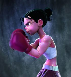
This is “Fight like a girl” by self-taught illustrator and graphic designer Aliel Rocha Prates. I admire two things about this project. First is the creator is self taught and she has produced this amazing art work. I consider that the depiction of any kind of liquid in art work is one of hardest challenge to achieve. I do not exactly know how she has created the art, but I can guess initial was done in sketch form than into the production of form and shape then she post-processed in photoshop for wet skins and illumination. In her website, all of the works seem to remind me of Pixar. Her works are not realistic but very fun to look at the illustration.