Sheenu-Project-01-Face

sketch

function setup() {
    createCanvas(600, 600);
    background(255);
}

function draw() {
	//%60 More handsome Sheenu
	noStroke();

	//Awesome Background
	fill(44,86,159)
	ellipse(300, 300, 550, 550);

	//Neck
	fill(202, 153, 101);
	triangle(391, 203, 300, 1000, 190, 203);

	//Shirt
	fill(255);
	arc(290, 550, 400, 300, PI, 0, CHORD);

	//NeckCollar
    fill(202, 153, 101);
	ellipse(293, 400, 148, 130);	

	//Hair BACK
	fill(16,38,77);
	rect(160, 90, 263, 240, 60);

	//Head
    fill(222,182,139);
	rect(172, 116, 240, 240, 60);
	triangle(393, 340, 300, 400, 191, 340);
	strokeWeight(35);
	stroke(224, 141, 90);
	line(220,253,360,253);
	stroke(0);
	noStroke();


	//Hair FRONT
	fill(16,38,77);
    quad(183, 116, 400, 116, 410, 150, 169, 180);
    triangle(160, 150, 170, 300, 190, 160);
    triangle(370, 130, 420, 270, 420, 150);
    triangle(160,180, 230, 140, 260, 200);

    //Random Rectangle that Hides Stuff
    fill(255);
    rect(1,550,450,600);

    //Ears
    fill(222,182,139);
    ellipse(175, 250, 50, 70);
    ellipse(407, 250, 50, 70);

    //FACE

    //Eyes
    stroke(5, 19, 46);
    strokeWeight(20);
    line(200, 220, 260, 220);
    line(320, 220, 380, 220);
    strokeWeight(5);
    line(220, 250, 260, 250);
    line(320, 250, 360, 250);
    strokeWeight(20);
    fill(5, 19, 46);
    ellipse(250,260,1,1);
    ellipse(350,260,1,1);

    //Nose
    noStroke();
    fill(202, 153, 101);
    triangle(323, 310, 295, 330, 261, 310);

}


This project was really fun and also perfectly challenging. I am really happy with the way this turned out visually, especially since I made this %60 more good looking than me in reality. I tried using Photoshop to help me guide the coordinates for these shapes, but for some reason they did not match and the codes for Photoshop would put shapes in different places in the .js code. Making this face mostly took trial and error and took me a lot of time discovering and learning how to use new shapes like lines, triangle, and other complicated shapes. Other than that, this was pretty good and fun.

ikrsek- Looking Outwards -1

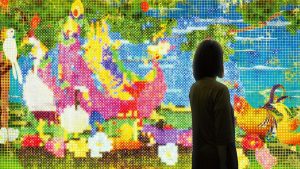
United, Fragmented, Repeated and Impermanent World 

teamLab, 2013, Interactive Digital Work, Endless, 8 channels, Sound: Hideaki Takahashi

teamLab’s installations in the Japan Society’s 2013/2014 exhibition, “Garden of Unearthly Delights” was my first introduction to the use of code/computer based programming as an artistic medium. Specifically, the work that comes to mind is an installation known as United, Fragmented, Repeated and Impermanent World which was an interactive wallpaper of sorts. The room in which it was installed  was lit only by the projections spanning across each wall – which were a plethora of intensely pigmented, pixelated depictions of flowers, trees, water, and nature. As you approached, depending on how you would move your hand or head, cameras would register the movement and respond with blooming flowers, unfurling vines and rippling water (a soft humming tune also played in the background along with some auditory feedback matching the reactions the wallpaper environment had to your presence). It was an amazing interaction, particularly since I’d never seen or let alone heard of code in such a context before, and is what inspired me to take this course and pursue HCI alongside my art career.

teamLab itself is a group of creators: artists, programmers, architects,engineers, CG animators, mathematicians, etc. who collaborate in order to create moving pieces of work that marry the boundaries between art, science, and technology through a unifying creativity. They always have a multitude of people working on projects and as such, have many different sources of inspiration – but what seems to be the most prominent source of inspiration for them is their own drive to create things that go beyond the traditional confines of what we consider art or science, and in doing so – to change people’s minds about the possibilities around them, expand horizons if you will. They have multiple locations (In Japan, Singapore, and Hong Kong), and are fairly well known amongst the new media world.


below is a link to the teamLab website: https://www.teamlab.art

Matthew Erlebacher Looking Outward-01

TIE Fighter – Short Film

One piece of media that has inspired me is the YouTube video “TIE Fighter – Short Film” by Paul Johnson. The film was a homage to the 1994 video game with the same name. According to the credits the project was made by a team of only three people. Paul Johnson was the animator, Zakir Rahman composed the music, and Joseph Leyva worked on sound design. Paul and Zakir were housemates, so it was easy for them to work together. The description also states that it took them four years to complete.

From what I’ve read, the team didn’t create new programs or software to complete the piece. This would put it more in the category of last word art. The obvious inspiration of the creator was the Star Wars franchise. However, he was also a huge fan of 1980’s anime. This was shown by the stylized faces that Paul gave each of his characters. One of his previous works was a Doctor Who animation. He is now working on a mech animation which he stated would be inspired by Generation Kill.

Sources Used:

  • C., Jordan. “Animator Paul.” Mass Appeal, Mass Appeal, 18 Aug. 2015, massappeal.com/animator-paul-otaking-johnson-talks-his-insane-star-wars-anime/.
  • https://massappeal.com/animator-paul-otaking-johnson-talks-his-insane-star-wars-anime/
  • Johnson, Paul, director. TIE Fighter – Short Film. YouTube, 24 Mar. 2015, www.youtube.com/watch?v=PN_CP4SuoTU.

aerubin-Project-01-Face

sketch

//Angela Rubin
//Section C
//aerubin
//Assignment-01

function setup() {
    createCanvas(500, 500);
    background(220, 248, 244);
    angleMode(DEGREES); 
}

function draw() {

    //Hair
    strokeWeight(0);
    fill(64, 30, 5);
    rect(140, 175, 220, 300);

    //Shirt
    if(mouseIsPressed) {
        fill(255, 254, 56);
    } 
    else {
        fill(247, 219, 223);
    }
    
    rect(207, 390, 86, 110);

    arc(220, 570, 270, 315, 180, 310, CHORD);

    arc(280, 570, 270, 315, 200, 330, CHORD);

    //Neck
    strokeWeight(0);
    fill(235, 210, 195);
    rect(207, 320, 86, 105);

    arc(250, 420, 86.6, 79, 0, 180, CHORD);

    //Face
    strokeWeight(1);
    stroke(225,198,208);
    fill(231, 212, 199);
    triangle(250, 250, 325, 350, 250, 400);

    fill(234, 211, 197);
    triangle(250, 250, 175, 350, 250, 400);

    fill(235, 210, 195);
    triangle(250, 250, 175, 350, 150, 250);

    fill(233, 214, 200);
    triangle(250, 250, 325, 350, 350, 250);

    fill(235, 210, 193);
    triangle(250, 250, 340, 175, 350, 250);

    fill(231, 212, 199);
    triangle(250, 250, 160, 175, 150, 250);

    fill(233, 209, 195);
    arc(250, 250, 225, 247, 220, 320, PIE);

    //Facial Features
    strokeWeight(4);
    stroke(0, 0, 0);
    noFill();
    arc(200, 268, 60, 60, 220, 320);

    noFill();
    arc(300, 268, 60, 60, 220, 320);

    noFill();
    arc(250, 300, 90, 80, 0, 180, CHORD);

    line(250, 250, 265, 270);
    line(265, 270, 250, 270);

    //Bangs
    strokeWeight(0);
    fill(64, 30, 5);
    arc(315, 130, 220, 180, 50, 180, CHORD);

    arc(250, 268, 270, 315, 220, 320, CHORD);

    arc(165, 160, 120, 65, 0, 110, CHORD);

    rect(150, 175, 39, 15);

    rect(310, 175, 40, 20);

    //Arm Lines
    strokeWeight(2.5);
    line(168, 483, 168, 500);
    line(332, 483, 332, 500);

    //Bobby Pins
    strokeWeight(3);
    stroke(247, 219, 223);
    line(332, 160, 315, 183);
    line(323, 152, 306, 175);
}

This project really challenged my creativity as I do not normally picture simple shapes forming the basis of a human face. I began forming ideas by drawing faces on paper and experimenting with different shapes. Eventually, I came to the conclusion that triangles could be a viable option to draw the initial structure of the head. Instead of making the triangles the same color and no outline, I thought it would be interesting if each triangle was a slightly different shade than the adjacent ones to add an element of abstractness. I then added the rest of the features of the face, hair, and clothing. In addition, the shirt changes color when the mouse is clicked. I am very happy with the product and it was really enjoyable to create!

Connie – LookingOutwards – 01

In my senior year of high school, our top orchestral and symphony groups were invited to perform at a music festival in Washington D.C. and during our free time while on tour, we went to visit the Renwick Museum. The museum featured a work by Janet Echelman, entitled “1.8 Renwick” because the earthquake shortened the length of a single day by 1.8 microseconds.

It was inspired by the 2011 Tohoku earthquake and incredible heights of the tsunami waves in the Pacific Ocean and uses some technology that links it to a map of the energy released by the powerful tsunamis across the Pacific Ocean. Many artists are inspired by their surroundings or historical events; the impacts of earthquakes on human society have been also noted by other artists such as Ai Weiwei.

I love this project for its interesting link between the vibrancy of spectacular colors and use of technology to bring a visual experience that symbolizes the powerful impact of a natural disaster. The dramatic color shifts in the netting show viewers how quickly things in our natural world can change and how deadly these shifts and changes can be. I don’t know how exactly or how long it took Echelman to create this project or specifically what algorithm she used but I do know the lights are linked to the energy maps of the tsunamis in the Pacific Ocean during the earthquake, hence the shifts in color.

kyungak-lookingoutwards-01


(Audience, February 2010)


“Audience” was a collaborative project between Random International and Chris O’Shea in 2008. This project initially started off in 2002 with the lead of Stuart Wood, Flo Ortkrass and Hannes Koch. They aimed to bring art, science, and technology together by installing a motion tracking software that senses movements of human figures when approached. Random International has previous works that portray the cold nature of technology. They are similarly interactive and technology based.

As stated above, this piece consists of small mirrors that have motion tracking softwares and cameras attached to them. When a human figure approaches the cluster, the software senses the target and turns their reflective sides to the moving subject. After all, the human figure becomes the reflected result, and thus the main part of the piece. It emphasizes the cold nature of technology, and the uneasy feeling one gets from this automated response. By reversing from being a viewer to someone who is viewed, the artists aim to find out if machines can evoke emotions in humans.

This piece is truly fascinating to me because the viewers do not have any access to manipulating the piece when it comes to interaction. This programmed system involuntarily moves the mirrors, and act as more of a surprise. Usually, the viewers are given the choice, but I liked how that isn’t the case for this piece.

sophiaq – LookingOutwards – 1

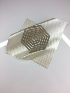
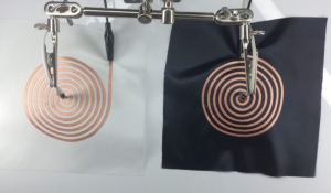
Soft Sound is using textiles as transducers. The cloth is woven with shapes of flat copper and silver coils and there is running and alternating currents that run through it, which creates soft speakers. They are connected to an amplifier and there is a magnet in close proximity to the coils, in order to force coils to go back and forth to induce sound waves. This inspires me because I love to sew and create soft sculpture, but I never imagined putting sounds or technology into the fabric. The project is effective in integrating the coils into the fabric- the coils are nicely designed into patterns rather than just put on, however, I’d like to see it to be more elaborate and create songs and clothing out of this innovative technology. EJ tech, made by Esteban de la Torre and Judit Eszter Karpati, wanted to innovate for contemporary interior design.

karinac-Project-01

karinac-portrait

function setup() {
	createCanvas(500,600);
	background(172,214,234);
	}

function draw() {
	//hair
	stroke(25,0,0);
	strokeWeight(10);
	fill(40,0,0);
	arc(225,250,300,250,PI,PI);
	rect(75,250,300,300);

	//shirt
	noStroke();
	fill(250,242,140);
	rect(100,525,250,125);
	stroke(150,150,150);
	strokeWeight(3);
	arc(225,525,250,150,PI,PI);

	//neck
	stroke(194,141,109);
	strokeWeight(4);
	fill(207,165,141);
	rect(175,400,108,70);
	stroke(150,150,150);
	strokeWeight(7);
	fill(207,165,141);
	arc(229,460,112,140,0,PI);

	//face
	stroke(194,141,109);
	strokeWeight(5);
	fill(207,165,141);
	ellipse(225,300,250,275);

	//left eye
	noStroke();
	fill(250,250,250);
	ellipse(170,310,50,50);
	fill(30,0,0);
	ellipse(175,305,35,35);

	//right eye
	noStroke();
	fill(250,250,250);
	ellipse(281,310,50,50);
	fill(30,0,0);
	ellipse(286,305,35,35);

	//left eyebrow
	noFill();
	stroke(0);
	strokeWeight(3);
	arc(170,275,60,10,PI,PI);

	//right eyebrow
	noFill();
	stroke(0);
	strokeWeight(3);
	arc(280,275,60,10,PI,PI);

	//nose
	noStroke();
	fill(194,141,109);
	triangle(200,365,225,320,250,365,20);

	//smile
	stroke(0);
	strokeWeight(2);
	fill(250,250,250);
	arc(225,380,110,80,0,PI);
	line(170,380,280,380);


	//headphones
	noFill();
	stroke(165,10,10);
	strokeWeight(20);
	arc(225,303,315,372,PI,PI);
	stroke(110,10,10);
	strokeWeight(35);
	arc(225,170,220,90,PI,PI);
	line(65,275,65,355);
	line(385,275,385,355);
	noStroke();
	fill(165,10,10);
	rect(30,265,40,100,30);
	rect(380,265,40,100,30);
	stroke(250,250,250);
	strokeWeight(5);
	line(65,372,65,405);
	line(65,405,85,415);
	line(85,415,55,435);
	line(55,435,85,460);
	line(85,460,55,485);
	line(55,485,85,492);
	line(85,492,85,600);

	//music note
	fill(0);
	stroke(0);
	strokeWeight(5);
	line(420,92,420,137);
	line(390,95,390,140);
	strokeWeight(6);
	line(390,95,420,92);
	strokeWeight(5);
	ellipse(380,140,20,10);
	ellipse(410,138,20,10);
	strokeWeight(3);
	line(457,25,457,60);
	ellipse(450,60,15,8);
	
	//hair-top
	fill(40,0,0);
	stroke(34,0,0);
	strokeWeight(3);
	rotate(QUARTER_PI-.13);
	ellipse(270,95,90,230);


}

I knew from the beginning that in addition to coding a self-portrait I wanted to display something that represented who I am.  So naturally, even though it took extra time and effort, I had to include the headphones since music has always been a huge part of my life.

The most challenging ad time-consuming feature was the front bangs of the hair layered on top of the headphones. The process consisted of a lot of trial and error as I struggled with the orientation of the ellipse.

Overall, I learned a lot through this process and I’m happy with how it turned out.

hdw – Looking Outwards – Week 1

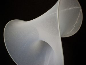
Material Equilibria is an installation by Sean Ahlquist in collaboration with Achim Menges, Bum Suk Ko, Ali Tabatbai, Bettina Woerner, Helene Jensen, Vibeke Riisberg, and Mette Ramsgard Thomsen. The artists used a spring-based environment coded with processing. The creators did not cite any work for inspiration, but it is based on Alquist’s research on articulated material behavior and differentiated structural forms. The techniques used can be applied to clothing, product, interiors, or other industrial designs in the future. Their work can be viewed here, on an article written called “Material Equilibria: Variegated Surface Structures” by the University of Stuttgart.

aboyle-Project01-Face

Anna-Face

//Anna Boyle
//Section D
//aboyle@andrew.cmu.edu
//Assignment-01

function setup() {
    createCanvas(350, 350);
    background(166,242,252);

    strokeWeight(0)

//hair color-back
    fill(81,58,30)
    ellipse(230,220,95,100)
    fill(81,58,30)
    ellipse(120,90,120)
    ellipse(115,150,110)
    ellipse(110,200,110)

//clothing color
    fill(38,112,51)
    ellipse(160,275,180,120)

//skin color
    fill(241,197,137)
    ellipse(149,100,120,120)
    ellipse(149,150,115,115)
    rect(140,190,45,50)

//blush
    fill(244,156,103)
    rect(94,130,70,20,0,20,20,20)

//hair color-front
    fill(81,58,30)
    ellipse(170, 55, 100, 60)
    ellipse(210,100,95,100)
    ellipse(220,180,95,100)

    strokeWeight(9)
    noFill()

//face
    curve(160, 20, 150, 207, 95, 138, 300, 0);
    curve(100, 100, 120, 50, 95, 130, 300, 290);

//eyes
    line(110,112,110,128)
    line(135,112,135,128)

//hair lines
    curve(350,280,137,34,68,123,350,350)
    curve(150,150,68,123,65,170,150,150)
    curve(200,200,65,170,77,245,200,200)
    curve(200,100,137,34,220,50,300,300)
    curve(0,100,220,50,245,135,50,200)
    curve(150,125,245,135,270,190,210,250)
    curve(100,100,270,190,253,263,200,125)
    curve(280,0,120,50,175,80,200,0)
    curve(350,0,168,83,200,145,220,0)

//clothing lines
    stroke(22,65,29)
    line(102, 280, 102, 315)
    line(200, 280, 200, 323)
    curve(100,100,125,230,195,227,120,120)

//hair line
    stroke(0)
    curve(350,50,185,149,240,220,630,0)

//face
    strokeWeight(5)
    curve(200,140,120,140,120,150,200,150)
    curve(100,100,115,170,135,170,120,120)
    curve(100,130,102,105,120,100,100,140)
    curve(150,130,129,100,147,105,120,140)
}

I thought this assignment was pretty cool! The project description included a picture of Tintin, which inspired me to use bold, black lines in my drawing. It was a lot of trial and error for me, but I enjoyed the process a lot. I had fun with the curve function, as you can probably tell. I also learned very quickly that it helps to separate your code and comment what each section is for.

I had one little hiccup with noStroke() affecting later lines, but I changed it to strokeWeight(0) and that worked out a lot better. I also meant to have a bigger canvas, but by the time I realized my canvas was set to (350, 350) it would’ve been a ludicrous amount of extra work to go back and adjust everything accordingly. Overall I’m pretty happy with how it turned out.