Matthew Erlebacher Looking Outward-08

The lecture I watched was given by Darius Kazemi. Darius is a video game developer, computer programmer, and generative artist. He graduated from Worcester Polytechnic Institute. He hoped to get a master degree, but eventually dropped out to work on independent projects. Darius worked on generative art created from several websites such as twitter and google maps. His most popular project was a bot on Amazon which bought random books, CDs, and movies each month. I admired his work because his programs took small and inconsequential things and put them together to make something bigger. His presentation style was very interesting. One of the main points that he brought up that generative art would be boring without the human input. His best example of this was a program that would give the definition of random words. Darius realized that there was nothing interesting with this whatsoever. He decided that he would turn it into a joke generator. I also like that he gave examples outside his own creation. The best example he gave was a twitter account intended to mimic a teenage girl. It was actually, so good that there was a boy who spent three hours hitting on it.

Sources:

“Darius Kazemi.” Wikipedia, Wikimedia Foundation, 20 Aug. 2017, en.wikipedia.org/wiki/Darius_Kazemi.

http://tinysubversions.com/

ljkim-looking outward 08

Eyeo2012 – Jennifer Pahlka from Eyeo Festival // INSTINT on Vimeo.

Eyeo2012 – Jennifer Pahlka

“Jennifer Pahlka is the founder and executive director of Code for America. She recently served as the U.S. Deputy Chief Technology Officer in the White House Office of Science and Technology Policy, where she architected and helped found the United States Digital Service. She is known for her TED talk, Coding a Better Government, and is the recipient of several awards, including MIT’s Kevin Lynch Award, the Oxford Internet Institute’s Internet and Society Award, and the National Democratic Institute’s Democracy Award. She spent eight years at CMP Media, where she ran the Game Developers Conference, Game Developer magazine, Gamasutra.com, and the Independent Games Festival. Previously, she ran the Web 2.0 and Gov 2.0 events for TechWeb, in conjunction with O’Reilly Media. She is a graduate of Yale University.” This is the website for code of america:

I appreciate one that she is a woman in tech. She also works to bridge the gap with the government and technology advancements. By using crowd sourcing, she bridges the gap between policy making and data driven information.Jennifer talks about how Code for America re-thinks, and re-makes our interactions with government, and why. I admire her approach to making design applicable to all aspects. Theres several areas where design can be used to make experiences more efficient. This is clearly one of them.

Its important for our government to be well informed. Tech can take away the lengthy process for the government to access information.

ssharada-looking-outwards-08

Eyeo 2016 – Jenny Odell from Eyeo Festival // INSTINT on Vimeo.

Jenny Odell is an American from the San Francisco Bay Area. Her work combines the mining of online imagery with writing and research, usually in an attempt to highlight the material nature of our modern networked existence. Because her practice involves collecting, tagging and cataloguing, she has often been compared to a natural scientist – specifically, a lepidopterist. She teaches internet art and digital/physical design at Stanford.

http://www.jennyodell.com/

This talk analyses Hockney’s relationship toward technology — from a montage to faxes, early computer drawings, and a car-mounted camera system inadvertently reminiscent of StreetView — as a model for how an artist might engage new technologies without fetishising them. From there, the talk moves on to consider Daniel Jones and James Bulleys’ Living Symphonies, Camille Utterback’s Entangled, and Erica Molesworth’s Silicon Landscapes as contemporary examples that place people in the physical, embodied world. She tries to contextualize her own Bureau of Suspended Objects as an effort to use the digital as a portal back into the physical.

What I like the most about her presentation is that she makes processing seem like a thing that everyone should be taking an interest in – be in the the digital form or the more analogue form of processing which is done through the interaction of daily objects. She does this by taking objects everyone recognises and owns and makes that into art.

Sarah Hendren: Inclusive Design

Sarah Hendren’s “Disability” Grafiti Project

I remember Sarah Hendren coming to CMU give a lecture for the School of Design’s Design the Future lecture series. Her presentation revolves around presenting an intriguing project, explaining the process of it, and then using the story of the process to make her point.  Sarah is an artist and design researcher at the Ollin College of Engineering whose work “engages adaptive and assistive technologies, prosthetics, inclusive design, accessible architecture, and related ideas”. As designers, unless prompted otherwise, we will always assume that the user is of able body, sense, and intellect. Because of this unstated assumption in design, the most designer would fail to consider how handicapped people would interact with their designs. Additionally, even when designers do consider these “not-normal” people, often time designers would assume that these “not-normal” people would want to reestablish “normalcy” through technology. Sarah distinguishes between the idea of cure versus accommodation, should we cure disability or should we accommodate a disability? She contrasts a high-tech electric muscle prosthetic arm that Gizmodo celebrates, with the high-impact almost free prosthetic leg that is made of recycled plastic in India. From communication to products, and environments, Sarah’s work spans no bounds. As a whole, Sarah’s practice is about re-contextualizing disability and transitioning towards a society where differences are celebrated.

ifv LookingOutwards-08

“phosphere” Rhizomatiks Research x ELEVENPLAY

Daito Manabe’s: site

Daito Manabe studied math, science, technology/programming and art, Manabe’s art reflects this intersection. I enjoy the aesthetics of his work, it takes simple visual elements and uses them as building blocks to make a more interesting visual. I admire “phosphere” Rhizomatiks Research x ELEVENPLAY which Daito was the visual director for. I was unable find his talk from the festival but he is listed as one of the artists listed for the 2013 iteration, some of his work involves video so a vimeo search of name brings plenty of results. I think an artist’s site is another personalized curation of their work similar to how they would in a lecture. Manabe’s site is very coherent and knows how to present his work within a format that matches the work’s aesthetics. I really like the stills from ELEVENPAY so I linked them above.

hqq-LookingOutwards-08

^”Hacking IKEA”, a project by Taeyoon Choi focusing on the multiplicity of noise density in a busy context.

I was pretty captured by the work of Taeyoon Choi, a visual and computer artist based out of New York City and Seoul, South Korea, who combines a passion for digital interfacing with a passion for urban and human interactions to create a school of thought he calls “poetic computation”. Poetic computation allows an artist to intervene in a social space to use digital and computational tools to reorganize and reparametrize that space. In doing so, Choi enables spaces to reflect both their natural, intuitive elements of being juxtaposed against his interventions which, big or small, transform spaces in different ways.

Choi’s work is particularly reflective of a new model of architectural thinking that I’m inspired by, which is personally driving my academic path as we speak. If spaces have the power to be fundamentally altered by what we as individuals can do to them, then architects and designers have the power to optimize these spaces for complete user intervention. What does it mean for a store like IKEA, where customers slowly follow a calculated path in environments meant to reflect their own homes, to suddenly exhibit an experience so foreign to a customer that it forces them to remind themselves that they’re in a store? (See Choi’s project, linked above). How can designers use this thinking to drive the creation of spaces? These questions elevate off of Choi’s work and serve as a major inspiration for what I strive to do.

Ziningy1-Looking Outward 1-Looking outwards 08

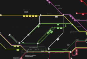
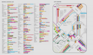
I am always very interested in how data can be used to create meaningful visualizations. So as I was browsing through the Eyeo Festival, I immediately spotted theSpeaker Sarah Williams and her project on the Nairobi Transportation System. Sarah William is a associated professor of technology and urban planning at MIT, and also the director of the Civic Data design Lab. So she started her presentation by introducing what is motivating her doing what she has being working on. With a strong interest in using data to facilitate urban planning, She promotes while we are massively collecting and researching data, we should pay more attention on how wecan use the data. Thus regarding the data visualization, she indicated that new visualization of data exposing pattern in the world and revolute the way people perceive information. And many examples was shown in her presentation specifically mapping systems. Williams also indicate there is legitimacy in map that “map is powerful, power is the ability to do work, which is what maps do, they work.” After introducing the motives and her research areas, Sarah Williams started to talked about the Digital Matatus project she did. Digital Matatus is a collaborative Mapping system for public transits in Nairobi. So in Nairobi, Matatus are the current loosely self-organized “bus” system. However due todiverse Matatus companies that lack of a uniformed organization, Nairobi people are having a hard time to make sense of the entire matatus system and navigate effectively through them.  So Williams and her team collaborated with students from the University of Nairobi and collected data locally with the Matatus drivers and frequent passenger, who can identify different routes and stops. After the data is collected, they developed this visualization with color coded routes along with the GTFS compatible data structure. It is interesting on how they dealt with the huge chaotic data and draw the map diagrammatically along 45-90 angles so that the user will be able to make sense of directions much more easily. The map also become the official matatus map in Nairobi and instantly have many of the users from the local Nairobi citizens, so it is really inspiring that how a simple visualization would actually affect a community by facilitating a more efficient transportation system. On the hand, I really admire the fact that Williams make the data completely open to the public so that the government and other tech organization can build upon it. Base on the data, several digital application are made for easier access to the Matatus schedule as well as cash-free cards for faster payments. Overall, witnessing all the design process and changes being made in the Nairobi society, I am really inspired on how data and visualization can solve social problems in a such effective way.


LookingOutward-08

For this weeks looking outward post, I chose to look at Jesse Louis-Rosenberg and Jessica Rosenkrantz’s (both co-founders) speech where they talked about the work of their design studio, Nervous System.

Jesse Louis-Rosenberg

Jesse is an artist, computer programmer and maker who studied math at MIT.

Jessica Rosenkrantz

Jessica is a designer, programmer and artist who architecture and biology at MIT. They began by introducing their background and explaining the main three areas of focus that the projects of their studio stems from: science and nature, digital fabrication and co-creation. Their project, the hyphae lamps, was their initial example of combining science and natural patterns with digital fabrication.

Hyphae Lamps

Using their various projects, the two co-founders go on to describe their design ideals and the design philosophy of their company, having a huge focus on new technology and the interaction of digital fabrication and technology with nature and design. Throughout their presentation, they describe various design problems and challenges they faced and the solutions they created, connecting the solution to other new problems in order to transition from topic to topic.

http://n-e-r-v-o-u-s.com/about_us.php

Eyeo 2015 – Jesse Louis-Rosenburg and Jessica Rosenkrantz from Eyeo Festival // INSTINT on Vimeo.

Looking Outwards – 08

“Dear Data” is by two women, Giorgia Lupi and Stefani Posavec. Lupi is an information designer in NYC, and Posavec is a designer in London. The two women actually only met twice, at EYEO 2013 and 2014, where, in between they had a year-long collaborative data project. The challenge was both in their data collection and in their data visualizations. With every postcard they sent to each other, they would visualize something new in their daily lives, using a new creative visual system.

In their presentation, I love their camaraderie with each other, it makes the entire presentation come alive. Another aspect I really loved was the visualization of everything, i.e. the map of where they lived and the traveling their post cards did. Showing and explaining some of their postcards was also very helpful in regards to really understanding what went on during their processes. I loved how innovative some of the projects were, from using materials such as lipsticks, the design of the visualization, to just the topic of the data, these two women proved to be truly restless in regards to finding something new with every postcard. Nonetheless, overall the entire presentation was extremely powerful because of its structure, and clarity in their thinking, the timeline, and data visualization explanation.

yoonyouk-lookingoutwards-08

This week’s Looking Outward, I focused on Anouk Wipprecht who spoke at Eyeo Festival in 2016. She is a Dutch artist who identifies herself as Dutch fashion tech designer who welds fashion and technology together. She utilizes fashion and craft skills as well as soldering and technical skills in order to create dresses and garments that move and glow.

She titles her work “Robotic Dresses and Mimicry” combining fashion and technology in order to create eye-catching and moving pieces of clothing. When working with Audi, she took parts from a car and combined them into a garment. Her work is extremely unique and particularly interests me because rather than slapping on technology or LED lights, she integrates fashion and technology in a very cool manner. In addition, the garments don’t look entirely too bulky but rather very high tech and almost high end fashion. I learned that two different subjects can be combined in order to make something quite beautiful. In modern design, a lot of technology is also integrated together but I believe it should be a symbiotic relationship as Wipprecht shows.


Anouk’s Wipprecht work displayed with an Audi car. She created the clothes to go with the car rather than as an accessory to the car.

Her work can be found in this link.