gyueunp – Looking Outwards 09

Circles Within Circles (2016) by Simon Russell

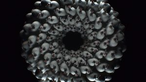
I chose to discuss Clair Sun’s week 4 Looking Outwards post on Simon Russell’s Circles Within Circles. The work is from a series of explorations based on audio and geometry, with its audio being generated from bursts of particles that collide to create what the artist calls an “audio pulse.” As mentioned in her post, the artist used Houdini, Cinema 4D, After Effects, and Audition to create this piece.

I believe that the artist’s aim of creating a satisfying interaction of sound and shape is successfully achieved. The auditory element adds a lot to the visual, which is definitely interesting in itself. I especially like its symmetrical components and its clear beginning and end that are represented by the creation and the destruction of the from, respectively.

More:

Simon Russell’s website

Simon Russell’s Vimeo account

gyueunp – Looking Outwards 08

Stephanie Posavec describes herself as a self-employed graphic designer
who considers “data” her favored medium. She specializes in data related design and works on data projects that involve language, literature, and science. She has worked on projects and commissions for various companies and institutions that include Facebook, BBC, Tate Britain, and Victoria and Albert Museum. After moving from the United States for her MA in Communication Design in Central Saint Martins, she decided to stay in London to continue her artistic career.
The simplicity of her the Eyeo presentation slides allowed me to easily focus on her works and the messages she delivered through the talk. One of the works that caught my attention both in her talk and her web site was the project she worked on for the Memory Palace exhibition for V&A in London. The push and pull between the objective logical design decisions and the subjective emotional design decisions that occur in the process of working with data is prevalent in this project, as it exemplifies how she works in between the two worlds.
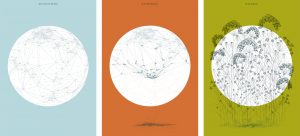
The work consists of three different prints that are simultaneously illustrative and data oriented. Although the illustrative quality initially attracted my attention as the most appealing aspect of the work, the idea behind the artistic choices is what I find more fascinating. Each of the three prints functions as the map of the world, involving accurate data that displays the locations of various capital cities. I admire this project in that it remains true to the data while containing an illustrative quality, just like many other works by Posavec.
In short, I believe that her works go beyond focusing on data visualisation and information design. Using data as a basis to create an illustrative work of art is what I intend to explore in the near future.

Posavec’s world maps for V&A‘s Memory Palace project

gyueunp – Looking Outwards 07

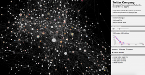
This is a sample demo that was created using Newk, a browser-based application for Networks Visualization. It is currently being developed by Santiago Ortiz with the aim of presenting a visualization of the network of Twitter conversations of the company’s employees.

To the right of the network visualization are sections that provide information for the viewers, such as “network and nodes metrics.” There is also an interaction guide that succinctly outlines the instructions on how to obtain information through the visualization. The intersecting lines are joined by nodes, which are photos of employees. They change colors as the cursor hovers over the nodes, displaying the interaction among the employees in a single glance.

This example is fascinating in that it presents us with information that could be personal to the employers. The fact that this seemingly complex network is only a week of conversations makes me rethink about the significance of our online conversations that we often take for granted, due to its simple accessibility.

gyueunp – Project-07: Composition with Curves

Composition with Curves

//GyuEun Park
//15-104 E
//gyueunp@andrew.cmu.edu
//Project-07

//define rose curves by r = cos kθ 
var k = 7/4;

function setup() {
    createCanvas(440, 440);
    frameRate(1000);
}

function draw() {
	background(70);
	
	//change the origin to the center of canvas
	translate(width/2, height/2);

	beginShape();

	stroke(124, 9, 21);
	fill(124, 9, 21, 150);
	strokeWeight(2);
	
	for (var a = 0; a < TWO_PI * 8; a += 0.01){
		var r = map(mouseX, 0, (70 * cos(k * a)), mouseY, (200 * cos(k * a)));
		var x = r * cos(a);
		var y = r * sin(a);
		vertex(x,y);
	}

	for (var b = 0; b < TWO_PI * 4; b += 0.01){
		var r2 = map(mouseX, 0, (40 * cos(k * b)), mouseY, (20 * cos(k * b)));
		var x2 = r2 * cos(b);
		var y2 = r2 * sin(b);
		vertex(x2,y2);
	}

	endShape(CLOSE);
}

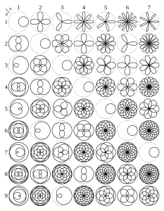
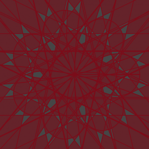
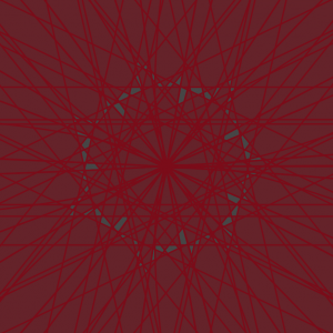
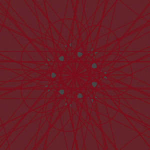
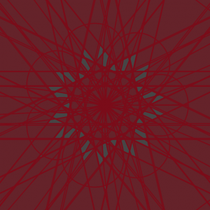
I used a rhodonea/rose curve to create a composition that bears a resemblance to a petalled flower. As seen in the code, I used one of the curves defined by , with the value 7 as the numerator and 4 as the denominator in defining k as n/d.

However, the addition of the interactive quality using mouseX and mouseY led to forms that are more fascinating and intricate than the stagnant rose. I’m glad that the project requirement pushed me to enable a broader range of possible compositions.
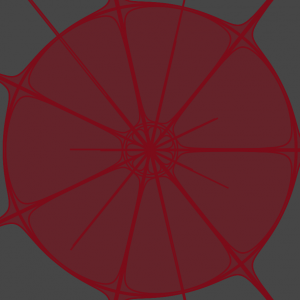
Screenshots :

gyueunp – Project-06: Abstract Clock

Abstract Clock

//GyuEun Park
//15-104 E
//gyueunp@andrew.cmu.edu
//Project-06

var maxDiameter = 120;
var theta = 0; 
var x = []; // every variable now starts out as an empty array
var y = [];
var dx = []; // velocity in x direction (d for "delta" meaning change or difference)
var dy = []; // velocity in y direction
var col = [];


function setup() { 
	createCanvas(400, 400); 

// the radius of the circle
  	r = height * 0.3;
  	speed = 10; 
  	theta = 0;
  	startTime= second();
  
  	for (i = 0; i < 50; i++) {
  		  x[i] = random(width);
        y[i] = random(height);
        dx[i] = random(-5, 5);
        dy[i] = random(-5, 5);
        col[i] = color(255,50);
    }
    
    frameRate(50);
} 

function draw() { 
  	background(117, 2, 21, 10);
  
  	push();
  	var diam = 150 + sin(theta) * maxDiameter ;
  
  	stroke(117, 2, 21,80);
  	strokeWeight(10);
  	fill(255,13);
  	ellipse(width/2, height/2, diam, diam);
  
  	theta += 10;
  	pop();
  
 	push();
  	angleMode(DEGREES);
  
  	translate(200,200);
 	  rotate(-90);
  
// time variables
  	var hr = hour();
  	var mn = minute();
  	var sec = second();
 
  	stroke(0);
  	var secAngle = map(sec,0,60,0,360);
  
 	stroke(0);
  	var mnAngle = map(mn,0,60,0,360);
  
// restart once it gets to 12 and 13 becomes 1 o'clock
  	stroke(0);
 	  var hrAngle = map(hr%12,0,12,0,360);
  
// second hand, highlight on iris
  	push();
  	rotate(secAngle);
  	translate(5,5);
  	stroke(255);
  	fill(255);
  	ellipse(0,0,3,3);
  	pop();

// minute hand, iris 
    push();
  	if (mn % 2 == 0){
      stroke(255);
      ellipse(0,0,40,40);
    } else {
      stroke(158,3,29);
      fill(158,3,29,10);
      ellipse(0,0,40,40);
    }
  	pop();

// hour hand, sclera
  	push();
    if (hr % 2 == 0){
      stroke(157,8,32);
      strokeWeight(10);
      noFill();
      ellipse(0,0,385,385);
  	} else {
      stroke(157,8,32);
      strokeWeight(10);
      noFill();
      ellipse(0,0,280,280);
    }
    pop();
  
  	pop();

// stagnant pupil in the center of canvas
  	push();
  	fill(158,3,29)
  	stroke(158,3,9,30);
  	strokeWeight(10,2);
  	ellipse(width/2,height/2,10,10);
  	pop();
 
// swimming rectangles 
    noStroke();
    for (i = 0; i < 20; i++) {
        fill(col[i]);
        rect(x[i], y[i], 10, 10);
        x[i] += dx[i];
        y[i] += dy[i];

        if (x[i] > width) x[i] = 0;       
        else if (x[i] < 0) x[i] = width;
        if (y[i] > height) y[i] = 0;
        else if (y[i] < 0) y[i] = height;
    }  
}

This abstract clock resembles an eye in that it is composed of various circular forms that are distinct from one another. The rapid blink-like movement and the gliding objects do not represent the time, but instead add a sense of agitation and discomfort. In fact, the subtle alterations of object positions and colors are the components that represent time. In short, this project portrays not only the repetitive nature of time, but also the sense of tension that is created by the limitation of time.

gyueunp – Looking Outwards 06

Nicholas Sassoon is a French-born artist who currently lives and works in Vancouver, Canada. He uses early computer imaging techniques to create his works that demonstrate the possibility of expressing dimensions of the physical realm through digital images.

Sassoon’s Drift is a work with an oddly celestial quality that captivated me. The random alterations of the elements create a fascinating effect that displays a sense of motion. Ultimately, the random movements of the visual elements create a simultaneously mesmerising and unsettling effect. They separate and merge together to create scenes of nature or those that convey a sense of narrative.  Additionally, the auditory element enhances the overall experience of the piece.

More:

Nicholas Sassoon’s website

gyueunp – Project-05: Wallpaper

Wallpaper

//GyuEun Park
//15-104 E
//gyueunp@andrew.cmu.edu
//Project-05-A

function setup() { 
  createCanvas(400, 400);
  noLoop()
} 

function draw() {
    background(114, 0, 0);
    for (var x = 0; x <= width; x = x + 50){
      for (var y = 0; y <= height; y = y + 50){

//white hightlight 
        push();
        stroke(247, 230, 230, 110);
        strokeWeight(1.5);
        fill(247, 230, 230);
        arc(x+1, y+1, 15, 10, 0, PI-120, CHORD);
        pop();

//shadow below seed
        push();
        stroke(0);
        strokeWeight(1);
        fill(0);
        arc(x, y, 15, 10, 0, PI-20, CHORD);
        pop();

//seed
        push();
        noStroke();
        fill(209, 200, 123);
        arc(x-3, y-3, 20, 15, 0, PI-20, CHORD);
        pop();

//shadow on seed
        push();
        noStroke();
        fill(181, 173, 106);
        arc(x-2, y-0.5, 16, 10, 0, PI-20, CHORD);
        pop();

//circle highlights from left to right
        noStroke();
        fill(247, 230, 230);
        ellipse(x-8, y+6, 1, 1);

        stroke(247, 230, 230, 110);
        strokeWeight(1.5);
        fill(247, 230, 230);
        ellipse(x-5, y+8, 2.5, 1);

        stroke(247, 230, 230, 110);
        strokeWeight(1.5);
        fill(247, 230, 230);
        ellipse(x-1, y+9, 1, 1);

        noStroke();
        fill(247, 230, 230);
        ellipse(x+2.5, y+8.7, 1, 1);
    }
  }
}

Although I made a repeating pattern by following the project guideline, my wallpaper resembles the naturally occurring pattern of strawberry achenes. While maintaining the characteristics of the fruit, I used multiple geometric shapes to add small details, such as subtle highlights and shadows. For future projects, I would love to experiment with creating not only repeating patterns, but also textures and dimensions that further enhance the quality of my work.

gyueunp – Looking Outwards 05

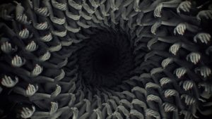
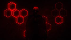
Chris Bjerre worked as a part of the motion design and visual effects team that helped create the promotional teaser for American Horror Story: Cult, the seventh season of the television series. Among the multiple eerie scenes included in the video, the striking face loop is my personal favorite. The hypnotising rotation of the countless identical faces and the lack of color and light create a beautiful yet petrifying scene that successfully catches the viewer’s attention. Additionally, the visual and auditory elements work together to create an extremely unsettling mood throughout the piece.

Scenes from the promotional teaser:

I also love other works by Bjerre, mainly due to their simple yet complex visual structures. Some include Echoes, an exploration of the infinite nature of fractal geometry, and Void, a video work that reflects on the art of creation.

A compilation of his works

gyueunp – Looking Outwards 04

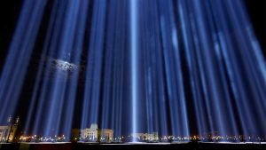
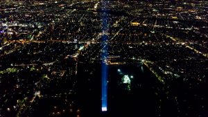
Spectra (2004) is a series of installations created by the new media artist Ryoji Ikeda. It is produced using an array of xenon search lights that is accompanied by a sound system of a mathematically derived score. His work has been installed in multiple locations including London, Tasmania, and JFK International Airport, and the number of lights and scales vary depending on the sites. Its white lights and ultra-high frequency sound component present the viewers with an ethereal experience as they walk through the field of light. The scale of the work is one of its most noteworthy features; the xenon lights shoot straight up into the sky, allowing a broad range of audiences to see the work. I would love to experience the work’s symphony of ultra pure sine sound waves; its sound is just as beautiful and celestial as the captivating visuals.

Ryoju Ikeda’s website

More about Spectra

gyueunp – Project-04: String Art

String Art

//GyuEun Park
//15-104 E
//gyueunp@andrew.cmu.edu
//Project-04

function setup() {
    createCanvas(400, 300);
    background(0);
}

function draw() {
	var x1 = -5;
	var y1 = -25;
	var x2;
	var y2;

	for (var x2 = 0; x2 < width; x2 += 10) {
		for (var y2 = 0; y2 < height; y2 += 10)
	stroke(255);
	strokeWeight(0.2);
//lines from top left 
	line(x1-15,y1,x2,y2,40);
	line(x1-25,y1,x2,y2,40);
	line(x1-35,y1,x2,y2,40);
//lines from top right 
	line(width+35,y1,x2,y2,40);
	line(width+25,y1,x2,y2,40);
	line(width+15,y1,x2,y2,40);
}

//growing center lines
	for (var i=0; i <= 2000; i += 100){
		var xPos = random(0,width); 
		var yPos = random(0,height);
		var x2Pos = random(width/2,width/2);
		var y2Pos = random(height/2,height/2);
		var linethickness = random(0,1);
	stroke(255,20);
    strokeWeight(linethickness);
    line(xPos,yPos,x2Pos,y2Pos);
}
}

One of the most attractive aspects of string art is the pattern that is created by the merging lines. Therefore, I focused on accentuating the patterns that are created by the spaces between the lines. In order to provide a contrast, I decided to limit the usage of colors for this project.