ablackbu-LookingOutwards-05

Jonathan Zawada

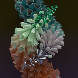
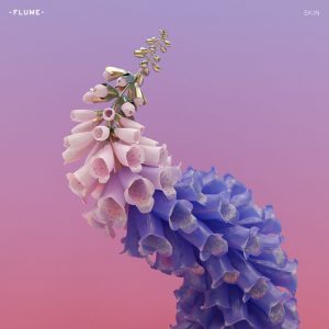
Jonathan Zawada is a graphic designer who is responsible for the cover artwork and graphics for Flume’s “Skin” album. He creates these moving 3D animations using algorithms.

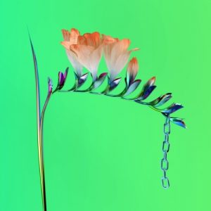
If you have not seen these incredibly amazing graphics, here is a video of what they can do:

Zawada in a short video explains his process of using little algorithms to create the appearance of each petal and the fractal growth factor that really makes this not just some nature advertisement.

The thing I found so cool about this project is how he states how easy it would be if he were just to paint these, but he feels that this is cheating.

“There is something real about plugging in the numbers and that feels real.”

Something about his process makes these look so real but so unimaginably complex and mesmerizing.


I can truly see the artist’s feelings and concept of reality manifesting in the artwork. It is interesting to take the flowers out of a musical context and relate to what is actually happening in the artist life.

hyt-Looking-Outward-05: Nature and Algorithm

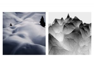
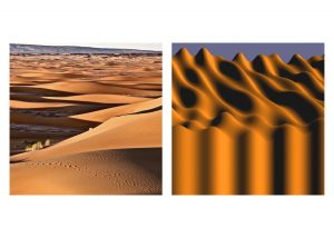
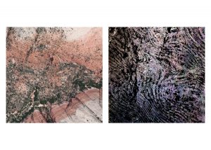
“Nature and Algorithm” is a 100-day consecutive project created by a multidisciplinary artist and programmer Liu Chang. Throughout the 100 days, she collected textural landscape photos and transformed them into dimensional, abstract productions through an algorithm she developed independently.

Day 035
Day 048
Day 012

What was drawn to me the most was her consistency with her choice of medium, as well as her juxtaposition between the original landscape images and computer-generated “landscapes” — the latter one especially intriguing, since the transformation was applied with similar color tone, shadows, and even pattern, but the image is no longer the same, and only functions as a representation of the image. I was also curious about why the artist describes the project as “a question to the relationship between nature and AI.” Unfortunately, she did not mention the softwares and algorithms used for this project, but relating to this comment, I think she is inquiring for a line between authenticity and artificiality, and how how we can incorporate learned AI into reality but still different from reality.

You could view more of her 100-day work here: http://www.liuchang.work/#/natureandalgorithm/

LookingOutwards 05

Artist’s Website

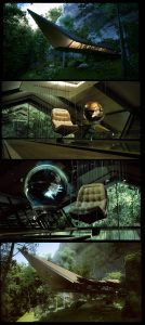
Time Travelers House by Tolgahan Gungor


I found this post in the CGSSociety website, which is a large platform for creative digital artists. After browsing the pages, I found this Time Travelers House most attractive to me.
This set of renderings are most inspiring to me because as an architecture student, I am well aware of the difficulty of 3D renderings. First, the author needs to build a 3D model in SketchUp or Rhino even though the result is only a 2D image. When she was trying to render the model the materials are really hard to find or choose. After rendering the model, you need to render the background using Photoshop. It is so amazing that I could not find any flaw in these renderings. It really inspires me to learn photoshop and vray well so that one day, I can do the renderings as cool as she does.
I think the purpose of those photo-realistic renderings are that, first, they can give people to realistic overall sense towards the context of the house- the imitated experience of being there. Then, good renderings for household can really attract more buyers to purchase the house. Finally, I feel like every rendering has its own emotion as well. It conveys to audience some feeling, sometimes regretness, sometimes sadness, and sometimes curiosity. I think this one gives me the feeling of curiosity, which matches with its theme Time Travelers House as well.
It is quite amazing that the 3D rendering technologies nowadays are so advanced that 3D computer graphics are able to create images that sometimes even seem more realistic than photograph.

hannahk2-LookingOutwards-05

Walking City from Universal Everything on Vimeo.

The 3D graphics project that I chose to discuss is “Walking City” by Universal Everything. The project is an evolving video sculpture which slowly and constantly changes its form through many permutations. The only thing that remains constant in the video are the colors, and the core motion/act of walking. The project references the utopian visions of 1960’s architecture practice, Archigram. The video aims to capture the patterns seen in the radical architectural transformations. Though 3D motion graphics usually bore me, I am pretty captivated by the delicate transitions from form to form. I really appreciate how the artist actually made me anticipate each transformation, and how much character each “version” gave to the walking figure. I am really not sure how the creators rendered or generated this work, but I assume that it is some 3D modeling program combined with mathematical algorithms to create the perfectly geometrical shapes. The artist’s sensibilities are manifested in the work seeing the way that it is so uniquely clean, monochromatic, and geometric.

Jihee Kim (Section D)– LookingOutwards-05

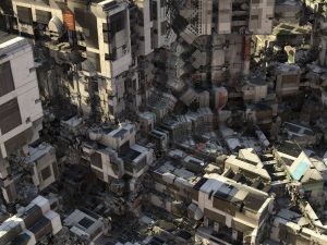
Danilton: The Brutal Deluxe is a computational art project that was created by visual artist, Daniel Brown. The project is basically a rendered image that was first based on some photographs that were manipulated with an algorithmic program that the author created himself. There is not much information on the specifics of this program that he made, but considering the known fact that he did not 3D model each building components, one can assume that he could have used a plug-in similar to Grasshopper.

end product

To generate the parasitic, massive buildings, Brown first plugged in random numbers to the program that produces the masses through fractal mathematics. He then searches for a particular area or geometries that he finds interesting within the randomly generated field, or 3D graph and adds to that particular shape. He basically gets the general from through algorithms and make the shapes even more complex and interesting by applying images of apartments from the 1970s and having the computer to generate infinite patterns, thereby creating a giant, maze-like cityscape that looks both retro and futuristic to a certain extent.

Brown has always been exploring with mathematical space before and after Danilton (2016), trying to create unlimited, boundless environments without constraints of physical building and modeling each component. The particular project and his other works clearly reflect his desire to use computational design as a means to discover and explore areas that were perhaps intangible. It is interesting how computer programs made something like creating a hyper-realistic image with tremendous amount of detail more plausible for artists.

More information on the project and other computational art by Daniel Brown can be found on his website:
Daniel Brown
More images are available here:
Daniel Brown Flickr

Brandonhyun-LookingOutwards-05

Liars — Brats from ian cheng on Vimeo

Ian cheng is a contemporary artist who uses 3d animation and Artificial Intelligence to create “live simulations” that are infinite in duration and composed of both man-made and algorithmically generated content that together produce emergent behavior and sound.

The visual aesthetics that Ian produces is very interesting because it is rigid and fine with details. Even though the visuals are very interesting the behaviors that each character produces in his “live simulations” is what is so interesting. The algorithms that Ian produces is based from the game called the “Sims” and that became the reference for his algorithms.

Ian is not the visual creator for his artwork but it is the algorithms and the program that create these visuals and sounds. The manifesto that the program creates in this artwork is significant since we are heading into a era where Artificial Intelligence is becoming dominant.

Ian Cheng’s Website

Work that “Live Simulations” produced

Emissary Forks At Perfection, live simulation and story, 2015


sntong-LookingOutwards-05-3D-Comupter-Graphics

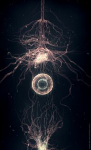
The Roots by elreviae is generated with 3Ds Max and photoshop. elreviae is a french digital artist and designer who started off with self-taught skills. For this piece, he is able to show the process of neurons communicating to each other. It even suggests how branches of network are crossing over or establishing communication through the circular medium in the center. It is fascinating to see technology being re imagined to be implemented in the human body for medical purposes. 

kyungak-lookingoutwards-05

https://vimeo.com/234677070

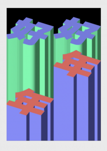
(Timo Lenzen, Dancing High-Rise, 2017)

Lenzen is a graphic designer known for producing simple but eye-catching designs. “Dancing High-Rise” is also one of the simple but aesthetically pleasing works of his. This animation was made to celebrate the Chinese New Year in 2017 and was installed on one of the tallest buildings at shanghai. I particularly enjoy his style because it is once again simple, but rich with meaning. I love the way he manipulates the abstract and architectural forms to produce something that is so uncomplicated yet unique. The designs are easily approachable but also new in their own ways. I am unsure of the programs he used to make this animation as it was not specified in his website. Overall, his works are very satisfying to watch.

danakim-LookingOutwards-05

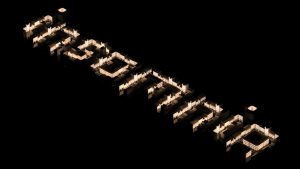
Insomnia; Tomasz Artur Bolek

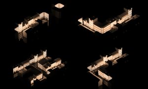
Insomnia by Tomasz Artur Bolek, a 3D artist/ animator, is a typographic study where he externalizes his interest in urban structures. Bolek used 3D rendering and animation softwares, Blender and Keyshot, to articulate this typographic study.

I’m an architecture student so this project immediately caught my eye while I was looking through Behance. I found Bolek’s use of negative space to establish the shapes of the letters quite clever. I also like that he uses the lights shining through the windows as a way of creating contrast and making the letters pop. I admire the balance he was able to create between simplicity and detail.

Tomasz Artur Bolek; Insomnia

I, J, K, L; Tomasz Artur Bolek

jwchou-LookingOutwards-05

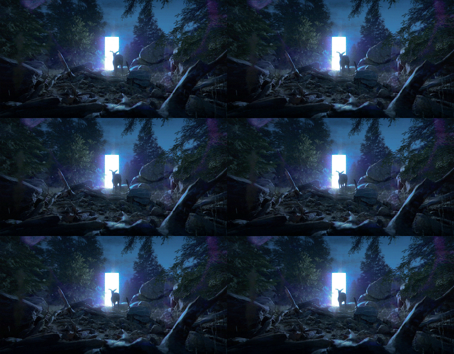
Dark Forest by Jakub Javora, 2016

This is a piece I found when I searched for 3D artists on the internet. It depicts a surreal scene of a deer in a forest, facing a bright plane. There are so many reasons to admire this piece. First, it’s very technically sound. Everything is beautifully rendered and the realism is impressive. I also appreciate how the artist found an interesting subject matter that makes use of the medium. He didn’t just recreate a natural scene. He recreated a scene and added a surreal element to it, elevating the narrative.

According to a post about the piece here, the artist created Dark Forest using RedShift, Maya, and Photoshop using assets from an XFrog library.

If you look at the iterations in this gif, you can see how the artist used his sense of perspective to lay out the images. It looks that while the algorithms in rendering software rendered the basic elements, he had to go into photoshop to give it a few effects (the purple flare around the deer). So to me, that says the algorithms used in rendering software are not nearly adequate or flexible enough for more stylistic touches.

More info here:

https://www.artstation.com/artwork/QPv04