dnoh-sectionD-lookingoutwards-05

Artist: beeple
Project(s?): everydays
Brief Description: Beeple create[d] new 3D computer graphics everyday and posted it to his website for over 3800 days.

For this post’s specific purpose, I will highlight a fairly recent piece he created, as well as another video of his process in creating a piece.

Above is a process video of a piece he created. As you can see from the video, Beeple uses Cinema 4D with various plugins to create most of his pieces. Although I didn’t really see any significant algorithmic or code-able things within these pieces, I found it utterly fascinating how detailed and beautiful these 3D renderings of make-believe images are. Through the video, we can see that he turned a screenshot of a topographic image and used a plugin to turn it into 3D, which probably used an algorithm to see the depth of the ground through tonal values. It is also visible that he created the structure itself by hand, detail by detail.

This is another piece I admire by Beeple. Although I don’t quite know the process of this piece, I found it amazing that this all was created in 3D space, detail by detail, just to be rendered into this, albeit amazing, 2D image.


LookingOutwards-05-Chickoff

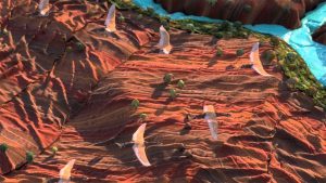
Warde “Home Is A Quest” DIRECTOR’S CUT is an animated commercial made by Leo Burnett for Warde, which is “the biggest reseller of fabrics in the middle east and Africa” and is known world-wide for these designs.

Warde “Home Is A Quest” Still

While I really love the animation itself, I felt that the music and narration weakened the video and made it feel gimmicky and cheesy. Even if it was the producer’s intention to have the video be light and upbeat, it felt overdone. The soundtrack that is chosen for a video is incredibly important and can easily change the mood. This choice can make or break a project.

“That’s when we know we arrived: home,” is what I think the most powerful line of this commercial because of the image it’s paired with: baby birds in their nest being fed by their mother. Unfortunately, this scene ended as quickly as it appeared. I wish it lasted longer because the concept of home and comfort seems to be the main theme of this commercial, but it ended so quickly and was not able to have as much of an impact.

Still, I really love how the landscapes of the animation look like soft fabrics. The rolling hills and even the rocks are comforting despite being in the wilderness.

Jonathan Perez Looking Outwards 5

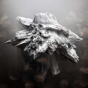
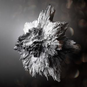
Chaotic Atmospheres’ “Crystallized Asteroids”

Chaotic Atmospheres is an artist dedicated to creating surreal landscapes and environments. This project in particular was created using e-on Vue 8 along with procedural landscapes, allowing for the creation of unlimited, unique asteroids.

To me, the texture of the images is what strikes me first. If you look at a few of the asteroids under the project page (a link will be provided below), each texture slightly varies from the other, and in combination with exposure/shadows, works to create an extremely strong mood. Each asteroid has a focus and direction. It’s amazing how an artist can render a landscape procedurally, that stands its ground as the main focus, not just a cool environment.

In some ways, I wonder if the procedural aspect of these asteroids lead to a more organic aesthetic. Nature is quite random and chaotic, after all, and as hard as we try, it might be hard to entirely emulate that chaos. That is certainly something to think about in future projects attempting to capture something organic.

In addition, something I took away from this project was the lighting and exposure… Like a photographer setting up a portrait, Chaotic Atmospheres sets up the lighting and exposure to give the image a certain mood. At first glance, all I thought about was the details of the asteroid… but I quickly realized that what actually drew me to these asteroids was the well executed lighting. In the future, I will keep that in mind for my images… especially in regards to procedural lighting and exposure. Or perhaps the generated portion of the project should be procedural, and the lighting and exposure can be where the individuals artistic sensibilities comes in.

Here’s a link to his portfolio on Behance:

https://www.behance.net/gallery/3418025/Crystallized-Asteroids

SaveSave

Connie – LookingOutwards – 05

I decided to look for 3D art that is meant to mimic the incredible intricacy of OUR real world. It’s easy to be amazed by how wonderful and creative the things in fantasy worlds are but I think that even “mundane” real life holds many wonders.

Architect and CGI artist, Ibrahim Saad from Cairo, Egypt uses a texture/material-adding software known as Substance created by a company known as Allegorithmic. Saad uses Substance Painter to actualize his project, the “Black & White Apartment (2017)” by using it to add incredible details to his models of everyday objects that really reflect everyday life in this apartment he has designed.

In this image, Saad uses the Substance texture features to be able to add even fingerprints to this model. (Credit: https://www.allegorithmic.com/blog/interior-design-fingerprint-ibrahim-saad )

I find this project inspiring because his works are so beautiful and I am in awe of the capabilities of Substance to be able to add such a strikingly realistic and life-like quality to these models.

Examples of his work. (Credit:https://www.allegorithmic.com/blog/interior-design-fingerprint-ibrahim-saad)

From the dishevelment of the hammock to the cups and bowls stacked on top of the cabinets in the kitchen, there is something particularly beautiful of being able to capture “real life” in an honest visual that feels so real like you could feel the fabric of those pillows on the floor.

nahyunk1-Looking Outwards 05: 3D Graphics

Similar to generating 3D graphics with 2d images through Photoshop and Illustrator, this piece of animation story made by Disney used two dimensional art to create a third dimensional world on screen. First by drawing the characters and the setting, the computer then generates each of the motions to create a set of animated scenes into film. What I admire about this is Disney’s high regard of manual skills and the collaboration of the hand-drawn and the computer. Short films like these from Disney hold significance in that they originate from the artistic skills of the artist more than the artist’s ability to handle machines and softwares. That itself is a quality in this film that I admire and believe a commendable work that sticks to the older practice of creating animation.

mjanco – Looking Outwards-05


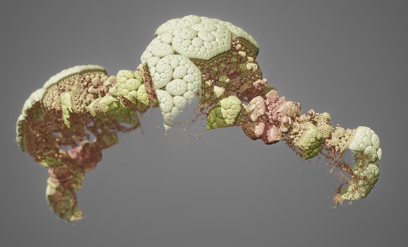
I’ve chosen to look at this piece by Mikael Hvidtfeldt Christensen. He is a physicist who creates 3D generative artworks using Structure Synth and Fragmentarium, both open source applications. This particular piece, “Algebraic Decay,” uploaded to Christensen’s profile on October 19, 2012, really captured my attention because of its stunning textures and colors. I see it as if it is a large floating landscape, but it also is just vague enough that it could be an image under a microscope. I love how the composition and textures play with the perspective, and make me wonder whether this 3D object is very large or very small. This piece is very complex, therefore it is hard for me to pinpoint what must have been required to produce this piece. However, they must have needed a soft, warm-toned light source, and perhaps Perlin Noise to create the soft, gently wavering textures. The artist does specify that the work was folded in Fragmentarium. The artist says he is interested in chemistry, physics, and complex systems. The texture, lighting, and vague background definitely give the impression that it is a specimen being examined under a light, which is where the artists’ fascination with scientific examination comes into play. The textures and colors also give the impression of an organic substance, which the artist also has interest in exploring.

https://www.flickr.com/photos/syntopia/

Algebraic Decay


mjnewman LookingOutwards-05, Section A

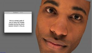
Design company, Immersive, is striving to bring new life into emoticons. With the help of a technology called Emotion Capture by Expressive AI, anybody is able to create emotionally responsive avatars. What I admire most about this project is not the creativity they are taking with conveying a more accurate depiction of human emotion through technology, but the fact that this new product has helped kids with autism. Kids with autism respond to these virtual avatars because there is “less fear and agitation when talking with a robot.” It goes beyond the obvious entertainment aspect to actually help others communicate.

However, with 40 cameras surrounding each person and a heavy weight on top of their head, this process is no easy feat. After each expression is made (sadness, anxiety, joy, etc.), there are 40 cameras fired at the same time. Each session only takes about 20 minutes, but it can take up to 4 to 6 weeks in order to get the two dimensional pictures into a three dimensional shape by way of a process that combines “mathematical algorithms with computer vision in order to create software personalities.”

Article Here

mecha-lookingoutwards-05

ramen scene (buttons determine what elements fall/how they interact)

Creator of the company Terrified Jellyfish, Tj Hughes thought up Nour, an interactive food simulator experimenting with 3D stylistic renditions of food. Advertised as “food art” on kickstarter, the program allows users to interact with scenes of ramen, boba, and popcorn through button mashing (whether on a keyboard or midi board). The user learns about how each button affects the scene through experimentation.

What drew me to this project was the beautiful visuals and the seamless combination of art and code. The way that the scenes appear makes it feel like an animation, yet the ability for users to interact with it the way that they do ties it back to programming. I also liked how the creator’s admitted love of “bright, saturated colors” and “absurdist humor” are reflected in the visual aesthetics and interactivity of the game itself.

Although it has yet to be fully backed and completed, the game is expected to be downloadable through Steam.

boba scene (buttons determine how/what elements move)

sunmink-LookingOutwards-05

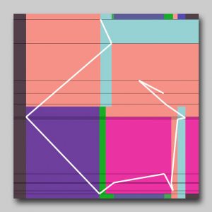
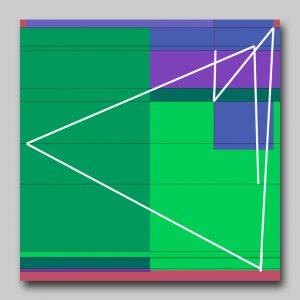
Manfred Mohr created a Computer-Generated Art that captures a hypercube in 2D. Once users type something in the search engine such as Google, users’ text goes through an algorithm and proceed an outcome that matches what users put in. This algorithm is an equation that is a set of operations mathematically built to create particular tasks.

Thus, through this algorithm, users are able to create an abstract visual art. I admire the artist Manfred Mohr because he is a pioneer of computing art who continuously explores through a varied collection of algorithmic-based artworks drawn by a computer. He has produced several algorithmic-based works such as algorithmic music in the 60s and algorithmic-based artworks called “Artificiata II.”

“Artificiata II” is an artwork that I am most interested in because it is pulled out from a design concept that he created called “diagonal path.” It is interesting to see how he used this algorithm to build a hard-line abstract shape into a hypercube drawn randomly between 11 and 15 dimensions. With his artistic sensibilities, he could convert a simple abstract shape into an impressive artwork using the randomness of the algorithm.


creyes1-LookingOutwards-05

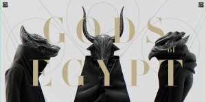
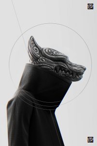
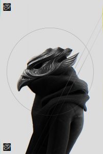
Created in January 2017 by Sasha Vinogradova, Gods of Egypt is a print series that reimagines Egyptian gods as more contemporary characters. The figures themselves – Anubis, Hathor, and Horus, in order – are sculpted and rendered using Maxon Cinema 4D and Zbrush, then manipulated with photo editing software for the final print.


Anubis and Horus from Vinogradova’s “Gods of Egypt”

I’ve always been interested in mythology and ancient world religions, so to see them reimagined into something more modern while keeping the original context in mind is really admirable. Vinogradova achieves this with an incredible degree of photorealism that I initially thought this was straight photography and photomanipulation. It’s a really interesting and satisfying blend of mediums that Vinogradova includes here, with small graphical elements bringing out the quality of the sculpture.

This project along with Vinogradova’s other work can be found on both her website and Behance.