LookingOutward-05

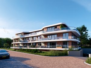
For my 3D computer graphics project, I choose to feature the work of Alex McLeod. I’m using his piece, Mystical Pond 2010 as my example, but I admire his work as a whole in general.

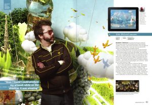
Alex McLeod is a new media visual artist who creates landscape “paintings” through computer rendering. He uses renderings of various materials and textures to create romantic, otherworldly landscapes. Through his art, he uses reoccurring themes such as overpopulation, urban overdevelopment, and climate change.

I view artists such as Alex McLeod as a bridge between traditional artists and modern graphic animators. McLeod treats his work similar to that of traditional artists, trying to convey a message with no limits or boundaries to his work. However, he uses modern technologies and modern “materials”/mediums to create his art.

http://www.alxclub.com/

rsp1-Looking Outwards-05

Assemblence By Unbrellium

This project is a fully immersive interactive augmented reality environment made ‘real’ by using light as a physical material, the aim is to structure participation and build trust between people who must sometimes suspend disbelief in order to cooperate and co-exist.

According to the artist, “Drawing on our backgrounds in architecture and design of networked urban infrastructure, Assemblance uses light to construct a semblance of physicality in which people that don’t know each other gain enough trust to collaborate on building delicate, ephemeral, luminescent structures, where intimate and hyperlocal participation becomes even more important, and the question of our responsibility and culpability towards each other is thrown up in challenging ways.”

I personally liked how interactive these artists have made the lasers used in the project. Instead of being projected onto a flat surface, the users are able to physically interact and play with the lasers in 3D. The lasers, although not completely tangible, now have the capabilities of becoming more tangible and object-like.

image of person interaction with lasers
play of light and interactivity with the lasers

ljkim Looking Outward 05


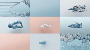
Snapshot from Nike’s Air Max campaign using 3D computer graphics.

After reading the prompt, I was immediately drawn to my internship this summer with Nike. I worked internally for them, and became close to the 3D team. This commercial/ad uses 3d graphics to communicate Nike Airs. The use of color and material communicates the light, flow, and durability of that particular line of shoes. I appreciate how easily Nike was able to convey that feeling through the use of 3D computer graphics. Its impressive how this level of fidelity is now available.

This is defiantly more design than coding – and frankly I much enjoy that. If there were algorithms used for this project, I see it being used in the geometric patterned scenes.Repeating the same shape, in different sizes, then randomizing the location of each. For example, 00:13.

Nike ~ Air Max 2017 from ManvsMachine on Vimeo.

“>

jknip-SectionA-LookingOutwards-05

Michael Theodore’s Scratchboard Engravings (2014)

Theodore collaborated with the Boulder Engineering Studio to create a robotic arm that creates millions of tiny straight lines through computer code. The interesting part of this project is how the robotic arm can etch patterns in a three dimensional quality, which would have been significantly more different if done through the human hand. I really admire the patterns as they form very intricate patterns and in real life, reveals more about the white clay canvas. The algorithms forms original line formations and combinations, and it takes between 10 to 16 hours to produce each piece. Theodore was able to capture the artistic, natural and gestural quality of the human hand through this mechanical etching method.

http://michaeltheodore.info/

https://creators.vice.com/en_us/article/aeng5g/robotic-drawings-turn-computer-code-into-intricately-etched-patterns

atraylor – Looking Outwards 05 – Section B


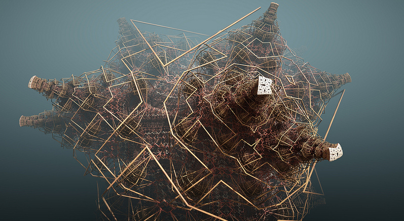
3d art is something that I’m passionate about and for this post I wanted to talk about art that inspires my own personal pieces. But, I wouldn’t learn much if I were to discuss something wholly familiar. However I don’t have much knowledge of generative 3d art. I chose Tom Beddard‘s fractal art because it looks very algorithm heavy. Motivated by visual complexity achieved through simple mathematical processes, Beddard writes his own software and tools to produce these complex fractal images. I admire these pieces of art because they create an environment of their own. The manifold details and configurations of the objects fascinates me, and makes me realize how time/computing intensive it would be to attempt to model and render this through software like Maya.


aerubin-LookingOutwards-05-Section-C

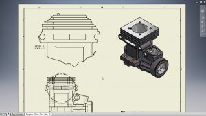
In many of the technology classes and programs I have attended in the past, we used computer programs to create 3D representations of what we intended on building. One of the most notable computer programs we used is Autodesk Inventor. The program allows the user to build a product utilizing 2D shapes to begin a design. Then the creator has the ability to “extrude” their design to suddenly make it appear three dimensional. The final design can then be viewed in both a 2D and 3D view and can even be 3D printed with the correct equipment. Autodesk Inventor is extremely important and helpful for creating parts, designing complex structures, and creating intricate art and sculptures.

2D and 3D views of a product generated by Autodesk Inventor

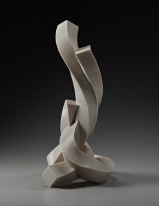
Bruce Beasley, an artist, took Autodesk Inventor to the next level. Renowned for his sculptures that have been premiered in the Guggenheim and the Museum of Modern Art, his latest project utilized Autodesk Inventor to create the “Coriolis Series.” This is a series of sculptures that were designed on the computer, then 3D printed with liquid plastic.

Coriolis XXIII – Bruce Beasley

The advantage of using Autodesk Inventor is the precision one may achieve when the design is dependent on subtle digital calibrations. Intricacy does not always occur in sculpting with other mediums such as stone or bronze, which are difficult to manipulate to a fine degree. In addition, when one makes a mistake on a computer program, it is easily fixed with a simple command to go back a step or multiple steps. When one makes a mistake with stone, there is no “control z,” and one would have to completely start over or work with the mistake to try to disguise it. It is also possible to view the final design before the printing product in a 3D rendered form to know what it will look like from every angle, which is very important for sculptures as it is desired to have the work be interesting from every possible viewing point. In conclusion, creating and viewing sculptures on the computer is helpful for artists and creatives for designing and even printing works of 3D art.

https://www.autodesk.com/gallery/exhibits/currently-on-display/the-coriolis-series

enwandu-Looking Outwards-05

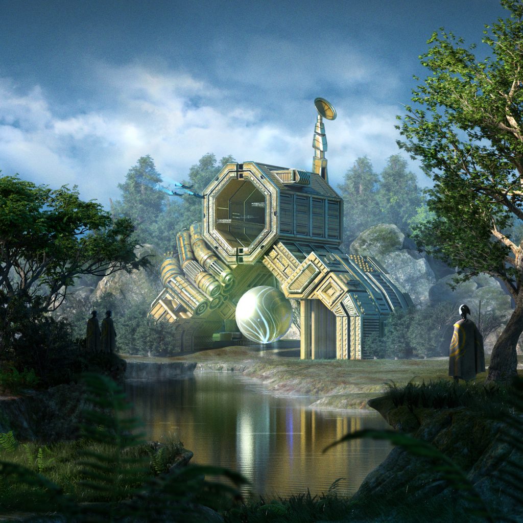
Sanctuary by Akin Adekile (2016)

Sanctuary;  3D Computer Graphics

Akin Adekile is a 3D modeler, texture artist and designer. He graduated from the Gnomon School of Visual Arts in Los Angeles where he specialized in hard surface and environmental modeling for film. I find the project particularly interesting because he essentially remade a painting he had previously done, using 3D modeling tools. The ability to jump between 2D, and 3D representation, in order to understand 3D dimensional space is something I can relate too, as a student of architecture. Something I consider essential, and something I admire greatly.

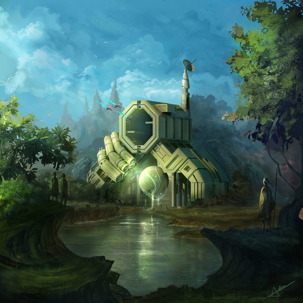
Adekile used a range of tools: Maya, 3Ds max, Speedtree and Substance Painter – to create this visually stunning image. By recreating his own work in 3D and producing a 2D render, Adekile could both transfer, and refine some of his artistic sensibilities. Looking at both the original painting and the 3D computation, there is a commendable level of precision, with them each evoking similar, but eerily different emotions.

Sanctuary; original painting

cduong-Looking Outward 05

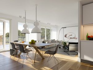
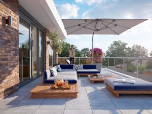
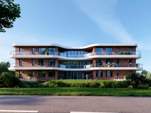
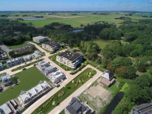
I was looking at George Nijiland’s works (http://www.triple-d.nl/52723/portfolio) and noticed that they were just all so beautiful. The one that really captured my eye was his most recent project, Project: Varne Buiten. This is a project that is a design for an “outside residence” on the edge of Heiloo. The goal of the project it to create a neighborhood for the young and the old and consists of 15 luxury apartments per building. I am unsure if this apartment even exists because it looks so real in the rendering and I haven’t been able to find it on google maps but I found a website selling a housing unit in the building. (https://www.funda.nl/nieuwbouw/heiloo/project-49219271-varne-buiten-fase-5-appartementen/).

What I like about this project is the fact that George Nijiland is designing buildings and instead of only drawing plans, sections, elevations, etc. he creates renderings that make the house just look absolutely breathtaking and real and it really makes the viewer imagine what it would be like if they were at the building. I only recently learned about architectural rendering and I find it really fun and amazing, so George Nijiland’s projects really captured my attention because of just how amazingly real his renderings look.

George Nijiland uses programs like 3dsMax, Vray, and Photoshop with plugins like Forestpack pro, Multiscatter, floor generator, mightytiles, HDRI, etc. When creating his architecture he has to think of the constraints that his building must have while designing, which really holds him back from designing too far ahead. Such constraints include the architectural market in Holland, which is considerably bad so George Nijiland has a difficult time finding projects sometimes and finding people who would want the types of projects that he makes. He also thinks more about what he wants to communicate through his drawings and renders rather than focusing on his render technique.

George Nijiland used to work on office furniture manufactures and design and photography, which are skills that he uses in his current work, architectural renderings. He really likes designing the interiors of his houses, which you can see in his renders because he really focuses on the detail of the house both inside and out, even allowing the audience to see little bits of furniture when they’re just looking at the exterior of the house to make the house look like it’s already being lived in in the renders. He also gets a lot of inspiration from websites like pinterest, architectural books, facebook, magazines, photography, etc. which you can somewhat see in his works because his work does have a sort of aesthetic look to it that just makes you want to look at it forever.
Title of Work: Project Varne Buiten
Created by: George Nijiland
Date: June 2017

Sources
http://www.triple-d.nl/52723/portfolio
https://www.behance.net/Triple-D
http://www.nieuwbouw-varnebuiten.nl/
https://krk.nl/wonen/nieuwbouw/varne-buiten-fase-5-appartementen-heiloo
http://www.3darchitettura.com/george-nijland/
dnam-Looking Outwards-05

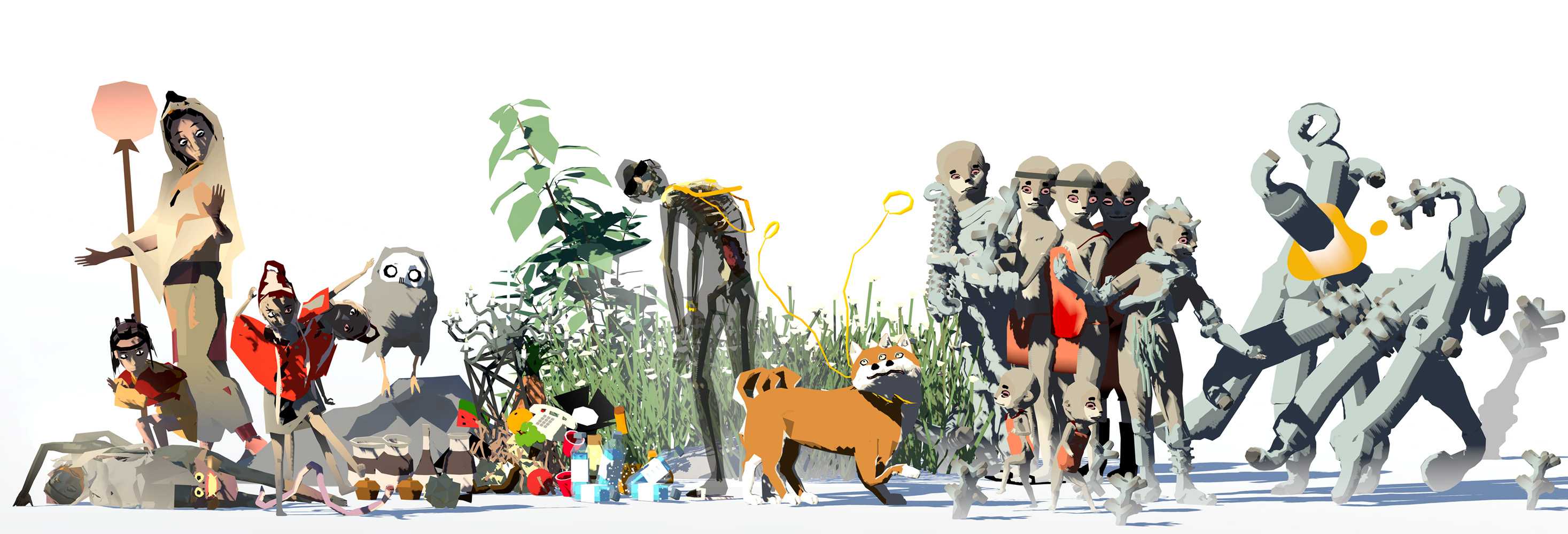
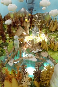
“The narrative agents and wildlife of Emissaries (2015-2017)” Creatures from Ian Cheng’s Mind

WHen it comes to computer generated 3D art, Ian Cheng, the recent speaker in Carnegie Mellon University comes up to mind. Ian Cheng focuses on making ‘simulations’, where artificial intelligence and instructions and given to the computer. These instructions and tasks are performed by characters that are given physical body through 3D generative graphic arts. I personally find Ian Cheng’s works with 3D graphics interesting as he creates another reality that we, as humans, can comprehend are made up, yet still eerily realistic. 3D graphic computers allow a whole new world to exist upon the reality we currently live in. You may find more examples of Ian Cheng’s works here.

Architectural Digital Renderings – Looking Outwards 5

In the field of Architecture renderings of buildings have always been used to sell ideas. In order to win competitions or get clients, firms must produce a compelling case for their ideas. But, most people that aren’t architects cannot conceptualize space in plan, section, and elevation, so architects must make renderings in perspective of their ideas. Each rendering is a work of art so I couldn’t pick just one. Instead I will share my discovery of a firm called Studio Cyrille Thomas that works only as a rendering firm.

With their team of architects, artists, and experts in digital rendering. They create works of art with 3D modeling software such as Rhino, SketchUp, and Revit alongside Vray (a rendering software) and photoshop for architecture firms that need to sell their ideas to clients. I believe their rendering work is some of the most compelling because of their ability to capture the atmosphere that aligns with the architect’s concept behind each space. Anyone can learn to use these software to create a realistic looking image, but not many people can create a work of art that truly captures the feeling of being in a wonderfully designed space.

Studio Cyrille Thomas’ Website