Ziningy1 – section c – looking outward 07


Chris Harrison, CMU HCII professor, is one of the professors I admired in CMU. While I always stalking the projects he lead of the Future Interface Group, I was surprised to find out about some of his amazing data visualization project. The Cluster Ball project is a data visualization he made to represent the structure and interconnection of wikipedia pages. Centered in the graph is a parent node. Pages that are linked from this parent node are rendered inside the ball. Finally, pages that are linked to the latter (secondary) nodes are rendered on the outer ring. Links between category pages are illustrated by edges, which are color coded to represent their depth from the parent node. I found it very intriguing that how Prof Harrison managed to create order and structure out of the extremely chaotic wikipedia pages. The way of visualization not only shows how topics are forming topics groups and the degree of linkages, but also reflect the way people organize informations through seeing where the fields diverge and intersect. The visualization can also presented which area of topics may have more concern from the public(more linkages), and which topics may be omitted(less clustered).

hqq – LookingOutwards-07

Above: Zoomed and static network visualization of Twitter connections by Santiago Ortiz.

Santiago Ortiz, founder of Moebio Labs, is a visual scientist and designer, whose work uses expressive network theory to demonstrate physical and metaphorical connections between people and their surroundings. Ortiz believes that data visualization is most effective not in the form of static charts and graphs, but as fluid, moving pieces of art. Ortiz’s analysis of connections on Twitter between different followers in different locations exemplifies this belief perfectly. The analysis considers a variety of metrics to highlight important information on who is tweeting, who they connect with, how often they connect, and even why they connect the way they do. The visualization uses a series of nodes and lines to create webs between different users who connect with each other. Subtle nuances such as line thickness and node size highlight other important statistics such as the amount of communication and popularity. Moreover, the analysis is fluid. From the webpage, you can zoom in, click, and slide metrics to reveal more information.

sijings-lookingoutwards-07

ManyMaps is one of the custom software created by Rachel Binx. She is currently working at Netflix, with the content Science & Algorithms team in Los Angeles. She is an American data visualizer, developer, and designer. She is the co-founder of Meshu and Gifpop, two companies that create physical objects, such as maps and animated GIFs, from social data. For this particular project, it is a site for designing our own map prints. The site is built on Shopify, and Rachel Binx made the site end-to-end, including concept, frontend and backend code, visual design, and photography. It is made possible by OpenStreetMap, which is the largest open-source mapping community in the world. The individual data tiles come from Mapzen, an open-source mapping company. All of the posters and canvas prints are made in the USA.


Overall, I really enjoyed this software/website as I am able to create my own design of the place I like. For example, the place I chose there is Beijing, China where is my hometown. By selecting my favorite colors with the important location, I was able to build a connection with the place even though I am not physically there.

The design page for the users creating their dream map | updated 2017
The poster I designed for my hometown
The samples/art works presented on the website

MANYMAPS official website

juyeonk-Project-07-Curves-Section E

sketch

//Claire Koh
//Section E
//juyeonk@andrew.cmu.edu
//Project-07


function setup() {
    createCanvas(480, 480); //sets the size of the canvas 
}


function draw() {
    background(0);
    translate(width/2, height/2); //so that the shapes would begin from the center of the canvas
    drawStar();
    drawRose();
}


//this function will generate the outer shape. There is no specific name for this curve. I invented this 🙂 Also it's called drawStar because it'll draw a star if you move your mouse towards the furthermost right side of the canvas. 
function drawStar() {
    var flicker = random(240, 255); //will be used to make the star flicker 
    var transparency = random(100,200); //also will be used to make the star flicker by controlling its transparency
    var gradient = map(mouseX, 0, width, 0, 255)
    var a = constrain(mouseX, 50,480);
    var n = constrain(mouseX, 50,480);
    
    if (a != 480) {
        push();
        rotate(mouseY/300);
        fill(0);
        strokeWeight(0.7);
        stroke(200,255-gradient,255-gradient);
        beginShape();
            for (var t=0; t <= 2 * PI; t+= PI/100) {
                var x = 0.5 * a * cos(n * t); 
                var y = 0.5 * a * sin(n * t); 
                vertex(x, y);
            }  
        endShape();
    }
    
    
    //when the a value of the equation reaches 480, the curve's stroke color and fill color will change
    else {
        push();
        rotate(mouseY/300);
        fill(flicker, 200, 200, transparency);
        strokeWeight(2);
        stroke(255);
        beginShape();
            for (var t=0; t <= 2 * PI; t+= PI/100) {
                var x = 0.5 * a * cos(n * t); 
                var y = 0.5 * a * sin(n * t); 
                vertex(x, y);
            }  
        endShape();
        pop();
    }
}


//this function will draw the fixed rose in the middle of the canvas
function drawRose() {
    //http://mathworld.wolfram.com/Rose.html
    var a = map(mouseX, 0, width, 0, 40);
    var n = map(constrain(mouseX, 0, width), 0, width, 0 , 6);
    var r;
    
    noFill();
    strokeWeight(1);
    stroke(255);
    
    push();
    rotate(mouseY/300)
    beginShape(); // will draw the rose shape in the middle 
        for (var t=0; t <= 2 * PI; t+= PI/100) {
            r = a*sin(n*t);
            x = r * cos(t);
            y = r * sin(t)
            vertex(x,y);
        }
    endShape();
    pop();
    
}


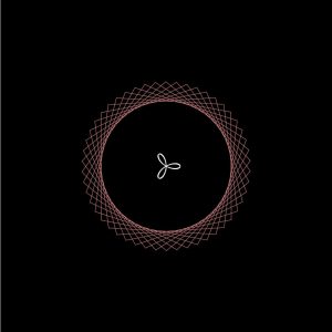
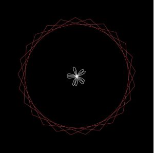
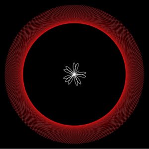
For this project I wanted to create a set of symmetrical curves that are somewhat related to each other for the sake of aesthetics and clarity.

The shapes starts with a square and a point in the very middle. But as you move your mouse sideways you’ll notice the outer curve changes to a drastic degree while all the inner curve is doing is just drawing more rose petals at a time. The outer shape doesn’t have a specific name; it was a result of an incorrect rose petal function but I am satisfied at how it turned out because of the variety of shapes it could create.
I added a bit of fun by making the star flicker at the end when the outer shape is complete.

(Final form)


ssharada-looking-outwards-07

Can Buyukberber is a visual artist working on immersive audiovisual experiences that’s embodied both in physical and digital spaces.

Unifield is a form experiment which attempts to explore H.S.M. Coxeter’s higher dimensional geometry studies. The work intends to trigger a timeless perception by merging both archaic and futuristic components. By using computational design techniques with a digital fabrication method and projection mapping, Unifield uses the space where digital and physical overlaps as a portal to visualization possibilities of a higher dimensional object.

It works as an ambiguous sculpture, animated with light and sound that has the qualities of this historical background and scientific studies. With this correlation, Unifield aims to transcend a single association of time, which rather is a holistic understanding.

aerubin-LookingOutwards-07-Section-C

Airbnb is a hospitality service that enables people to rent a place to stay in a multitude of locations around the world. This service is much less expensive than hotels and can be more accommodating to needs as it is renting another individual’s room, home, or even an igloo instead of a single costly hotel room. The data from all of the online transactions was recorded and Rachel Binx turned it into a work of art.

This represents Airbnb’s top 50 markets, with the thickness of the lines corresponding to the relative volume of travels between each pair.

Rachel Binx is an American data visualizer, developer, and designer. She has worked at Stemen Design and NASA and is also a co-founder of Meshu and Gifpop. While working at Stemen, she was assigned to create a visual representation of all places people have traveled to and from utilizing Airbnb. Her design utilized data from Airbnb’s top 50 markets listed in a circular pattern. Lines were then drawn in between locations with the thickness of the lines being dependent on the number of travels between each pair of locations.

Originally only designed to be on a presentation by Airbnb’s CEO, it turned into this abstract design that is both visually pleasing and informational. I really admire her design as it shows data in an interesting and intuitive manor. The data taken from the travels between areas could have easily been written out in an uninteresting fashion with places listed next to their given volume of travel. This would make it difficult to quickly examine the places with the highest/lowest volume of travel between each pair. She did not only turn the data into a easily legible design, but she turned it into artwork.

http://rachelbinx.com/Airbnb

rkondrup-Looking-Outwards-07

visualization of bike rental program in NYC updated in real-time
Nicholas Felton is a graphic artist, designer, and creator of BikeCycle, a data visualization set which plots activity from a bike sharing program in New York City. The information was gathered over the duration of a year and updates in real time to correspond to the same date and time of 2014 when the information was gathered. This sort of delayed but real-time data visualization is effective not only in representing the locations of particular events or paths, but it also allows for a much deeper analysis of data because it is separates information into an accurate timeline, allowing viewers to perceive changes in activity over time. The advantage of utilizing such a means of visualization over more regular representational methods is that rental bike use can be related to time of day, time of year, and other factors, data which would otherwise be lost in the quagmire of conventionally compiled data sets.
I admire this project because it takes something which appears on the surface to be intrinsically two-dimensional and static and turns it into something more that is dynamic and even more informative than the standard model for data mapping. I expect that the points are placed over a static map of New York City and that the points of an array which correspond to certain times of day are called and plotted as the time and date changes.

jamieh-Looking-Outwards-07

Interaction between human and plants through lighting
Sensor attached to orchid

The Botanicus Interacticus project by Disney Research (in collaboration with Philipp Schoessler, Jonas Loh/Studio NAND, Munehiko Sato) is an interactive technology that creates an expressive visual interaction between humans and plants. It was exhibited at the 2012 SIGGRAPH exhibition. The way the Botanicus Interacticus works is by placing a wire in the plant soil, which when touched or within close proximity with any location of the plant is detected, the collected data will trigger shapes and colours around the plant. Those shapes and colours depend on several factors, including touch/gesture, amount of contact and proximity. This project is based upon a sensing technology Touché, which was previously invented at Disney Research Pittsburgh. The added expression to the plants do not cause any harm and is non-invasive. The main purpose of the project was to eliminate the divide between real and artificial, which also develops new organic forms. My favourite aspect of this project is the response through lighting that dances around the plant based on interaction, which makes what is relatively static into something dynamic.

Computer showing the collected data of where touch is sensed

Below is a video of the interaction between person and plant.

enwandu-Looking Outwards-07

Cyclotone III | Fulldome Audiovisual Projection | 2015

Paul Prudence

This is an excerpt, Prudence associates with his Cyclotone project.

“By gyro-static action, The Machine is transparent to successive intervals of time. It does not endure or ‘continue to be’, but rather conserves its contents outside of time, sheltered from all phenomena. The Machine’s immobility in Time is directly proportional to the rate of rotation of its gyro stats in space.”

–From How to Construct a Time Machine, Alfred Jarry.

Paul Prudence is a live-cinema artist, well versed in the area of time-based geometric narratives, and audiovisuals. Many of his projects, including ‘Cyclotone’ explore very abstract avenues to combine sound, space, and form in an interesting fashion. He is inspired heavily by constructivist minded artists, particle accelerators, and four-dimensional place. His project embodies his artistic sensibility, and a clear connection can be seen between what inspires him, and his artwork.

I really admire the project, because of the intersection between sound and space in the project. It is quite compelling, despite being a 2D representation on a screen. Much of my admiration comes from be being in awe what he could create, it is extremely satisfying to watch. Even the still images successfully suggest motion. Prudence produces a mesmerizing, floor-to-ceiling sensation by cross-wiring electroacoustic sound design and conceptual video material.

LookingOutward-07

For this weeks project, I chose a project with athenahealth. Fathom, a design firm focused on creating visuals that show data, partnered alongside athenahealth to create a visual showing how patients move through their healthcare network. The application divides patients’ interaction into four parts: practice, patient, orders, and payers.

Four parts of patient interaction with healthcare network.

Practice includes initial patient exchanges with caregivers, patient includes the patient’s individual interaction with the online health portal, orders include orders and lab transactions, and payers include payer transactions like processing of insurance claims.

When in action, the application has a series of dots that appear and float around the screen between the various groups, changing colors according to the category and where it is.

I find this application very visually pleasing and creative compared to many other data displaying applications. It’s easy to revert to a graphical display of data, but this application uses a much more original visual. Standing alone, the application can easily catch peoples eyes and be a work of art. However, in reality it displays data in a way that shows relationships and connections between various areas of the healthcare network.

https://fathom.info/athenahealth/