hdw – Looking Outwards – 07

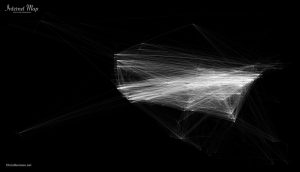
Chris Harrison did a really cool project on internet maps, where he compared internet connectivity of the world, and focused in on North America and Europe especially, as they had the most connections between each other.

Logistically, he mapped out the locations of connectivity by nearest whole number in a coordinate system. The brighter the point, the more points of connectivity there is. Harrison himself says that this approach probably is not indicative of users, as one point of connectivity can have multiple users. However, he chose the data and representation style based on an aesthetic approach, as there are already many other practically modeled ones existing. You can read more about it here.

Internet connectivity of Europe
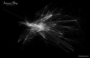

Internet connectivity of North America
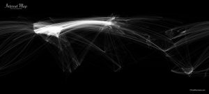

Internet connectivity of the World

I love how delicate the lines are and how orderly the grids look, zoomed in. Because Harrison rounded connectivity locations to nearest longitude and latitude, it looks like it follows a coordinate grid system. The contrast between order and chaos gives the appearance of string art.

LookingOutwards07 – jooheek

The Rhythm of Food: Moritz Stefaner

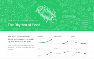
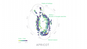
This collaboration with Google News Lab called “The Rhythm of Food” by Moritz Stefaner tries to visualize seasonal patterns in food searches based on twelve years of Google search data related to food. It compares seasons, the year, and the relative search interest of the particular type of food. This is done by representing the seasons on the outer most circle, the colors as the year, and the distance from the center of the circle as the relative search interests.

I find it interesting how this data visualization compares multiple variables that you would never think of comparing. Who knew that there would be a correlation between food searches and the type of year? The way the data is visualized also helps people see that correlation in a way that makes sense. I appreciate how they created their own system or in a sense, computation, to demonstrate data visualization.

They also made an animation making it easier to see the visualization.

Rhythm of Food – flying charts from Moritz Stefaner on Vimeo.

agusman-LookingOutwards-07

1.01 ‘Circles Within Circles’
Simon F A Russell

Video Documentation

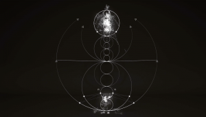
This video, created by freelance animation director Simon Russell, is one in a series of explorations on sonically generated geometry. He uses a program called Houdini, a plug-in commonly used with Cinema 4D, to generate 3D particle simulations that emit audio pulses from particle data (such as collisions, position on the canvas, etc.) In this sequence, a particle burst generates the first tone which sets the precedent for the following tones. The outer and inner ring also emit a constant tone. A Plexus-like effect, as Russell describes it, generates other tones based on the heights of the circular drawings.

As a musician, it’s really fascinating to see how other musicians interpret sound because it is almost always never the same. Sound is a highly intimate sensation and is internalized within us from a very young age. Our interpretations and projections of sound, music and raw noise alike, are a reflection of a deeper aggregate of personal influences, preferences, inspirations. When we hand off the task of interpretation to a computer, we see a collaboration between the preferences of a human and the logic of a highly sensitive machine- it is a joint effort between the person who has influenced the program with their associations with sound and the computer who can grab pieces of data that humans simply do not have access to or are too complex to grasp. These things include frequencies below or above our range of hearing, precise decibel and frequency levels that can be compared and contrasted relatively to others, and of course the potentiality of representing these datums in an orderly and beautiful way. In Russell’s video, we can see manifested the representations of the 8 note scale and how the laws of physics applies to the perception of sound. Really data-vis!!!

cduong-Looking Outward-07

“Emoto” is an installation that represents the global response around the London 2012 Olympic Games based on millions of twitter messages. Using this data they created a physical sculpture. The sculpture represents message volumes, per hour, and horizontal bands that move up and down according to the amount of tweets they get each time. What I admire about this project is the creativity of it and the physical forms that it creates. It just looks really aesthetically pleasing and so complex at the same time. What captured my attention the most was that I thought they were buildings at first, which they could be seen as from far away since they are just abstract lines based on data collection. People can also look at it and get a vague idea of what kinds of responses were obtained for specific events during the Olympics like a certain person winning a gold medal or breaking a world record.

I’m not sure how the code for this project works but I think that the program is always updating and always being connected to a specific type of tweet that the program looks for to update the physical data sculpture.

This project was specifically made based on people’s reactions to a specific event, which gives a sense of what types of projects this company makes and also gives a gauge of what kinds of interests they like since they picked such a specific event like the 2012 London Olympics.

Project: Emoto – Installation
Creator: Studio Nand
Year: 2012
Link: http://www.nand.io/projects/clients/emoto-installation/


A video of what the project looks like when activated

mstropka-Looking Outwards-07

This is one project from a data visualization firm called Variable. Nike hired the designers at Variable to create a data visualization for the data collected from one of their products, Nike Fuel. The video explains the process of moving from the raw data that the team received from these devices to these plant like organic forms. I think that this approach to data visualization is very interesting because the visualizations themselves don’t necessarily make the data readable in any useful way like a graph or a chart would. Instead, they create a sort of artistic expression of the data. My favorite part of this project is that each visualization was created with data from one person, and the colors and shape of the virtual strands are personalized to the athletes. This makes these visualizations sort of like self portraits of the athletes who’s data was collected.

abradbur – Looking Outwards – 07

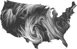
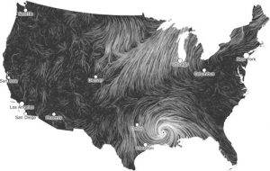
A Visualization of the wind currents in the U.S.

This is the Wind Map, created by Fernanda Viégas and Martin Wattenberg in 2012. It takes the current windspeed and direction of the wind currents in the U.S. in real time and presents them as whirling, organic lines. The denser the lines, the greater the windspeed. The data is pulled from the National Digital Forecast Database, and updates every hour. The simplicity of the design and the way it evokes the feeling of wind is incredible, as are the images this piece produces. Here is a screen capture of the map during Hurricane Isaac:

Hurricane Isaac

Here is the blog post.

And here is the live map.

ifv-LookingOutwards-07

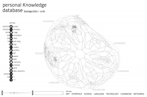
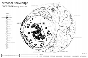
Screenshots from Santiago Ortiz’s Personal Knowledge Database

Visualizes all of Ortiz’s internet references that he collected for over 10 years. The number of data points is over 700. There are paths between data that darken when your cursor hovers over them. I liked the is project because I have felt the urge to make an archive for all my digital references/inspirations but was intimidated why the scale of the task. This project was able to take a large amount of data and compress it in a way that made it easier to understand through the various categorizations and interactivity. Since sections of the circle are divided by category Ortiz had to assign each data point a certain value in all those categories so it could be accurately plotted on the shape. Ortiz’s artistic sensibilities showed through in the design created by the paths, especially how they change the image when interacted with.

HaeWanPark-LookingOutwards-7

YOU’RE NOT THE ONLY ONE WHO HAS TROUBLE PARKING IN NEW YORK CITY

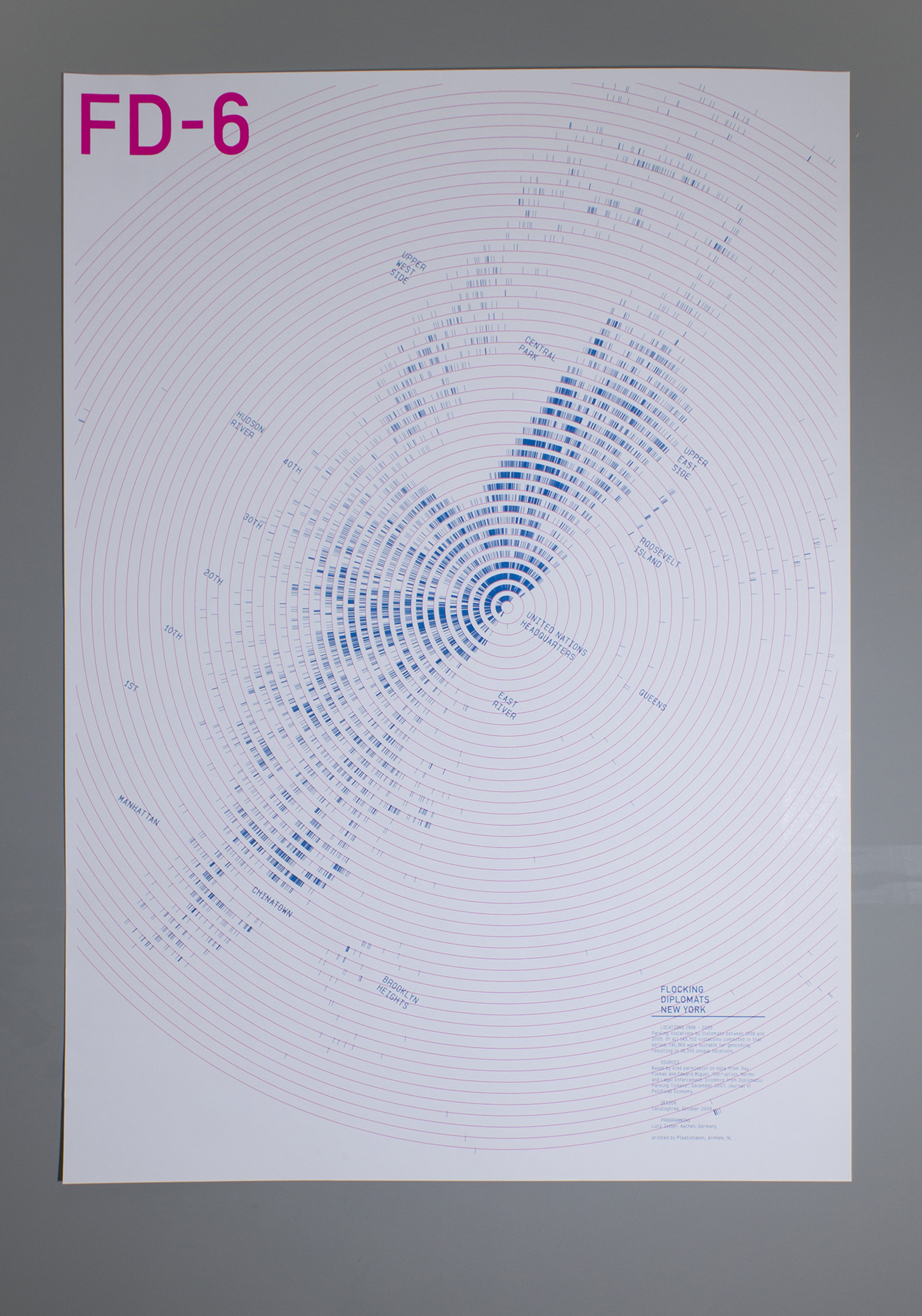
The Sixth Poster of “Flocking Diplomat” Series

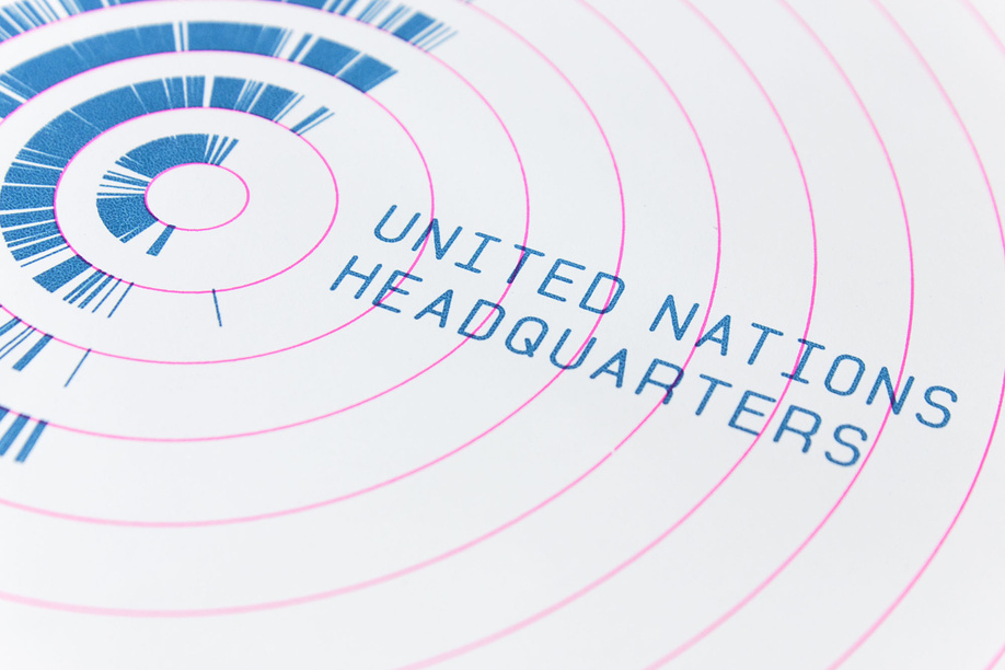
This is the last piece of six poster series named Flocking Diplomat representing Parking Violations by Diplomats in New York City between 1998 and 2005. Each different poster is represented same data but in each unique discipline allowing audiences to engage in a different perspective. The last piece was created by Christina Cannella who is a Digital Design Fellow in the Department of Drawings, Prints & Graphic Design at Cooper Hewitt, Smithsonian Design Museum. Each tick on this poster is marking a parking violation by a diplomat in NYC, 1998 – 2005. This was executed by the loop technique (I think it is what we have been learning in past few weeks) of programming that plotted 141,369 geo-coded data points. It is resulting in 16,355 unique locations and pointing out the United Nation which is the source of the diplomats. So, in this data visualization, viewers can see the hidden patterns behind the data. This poster has been exhibited at Cooper Hewitt, Smithsonian Design Museum.

YOU’RE NOT THE ONLY ONE WHO HAS TROUBLE PARKING IN NEW YORK CITY


dnam-Looking Outwards-07

Ross Spiral Curriculm

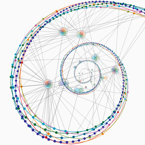
Looking at computational information visualisation, I looked at Santiago Ortiz’s work, especially the Ross Spiral Curriculum. The graphics showcase the development of the human consciousness. The different colors represent the different aspects in how our brains developed. For example, orange discuss an important evolution in the human mind’s ability to understand the visual arts, whereas navy blue discuss human’s scientific development. The part of the art that really grabbed my attention was not only the beautiful aesthetics that interact with the user’s mouse, but also the clean UI graphics that allowed me to fully understand how to use the tool in a few seconds. You can check out Santiago Ortiz’s spiral here.

rmanagad-lookingoutwards-07-sectione

Creator: Stamen Design

Title of Work: WHO Immunization Report 2016

Year of Creation: 2016

Link to Project Work: https://stamen.com/work/who-immunization-2016/

Link to Artist Bio: https://stamen.com/about/


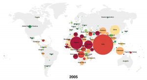
The WHO Immunization Report visualization created by Stamen Design was created in an effort to improve visualization and public understanding of report data — by combining understandable text with analogous information, the report is inviting and easier to read. As a communications designer, this bridge is especially important — if information is not obviously readable, then the general public would not browse through the data in order to understand it.

The algorithms relevant to how the information was visualized was not explicitly stated by Stamen, however it can be implied that the proportions and colours of some elements (i.e. circle size) are directly affected by the size of the data (i.e. number of unvaccinated children in a country). As a company, Stamen Design creates data visualizations and maps — these algorithms are most likely duplicated and applied to each of their works.