atraylor – Looking Outwards 07 – Section B

A still from the real-time animation.

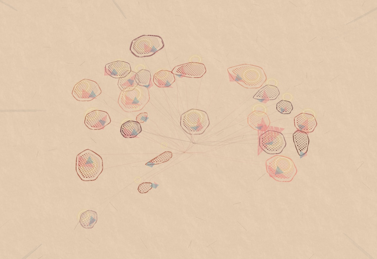
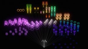
When looking for works to write about at the beginning of the semester, I stumbled upon this project, A Selfless Society by the RAT.systems team at Queen Mary University of London, which visualizes data from a naked mole-rat colony.  The real time data is taken from the movement of the colony and rendered in an audio-visual animation. The project doesn’t experiment on the naked mole-rats and is purely for observation. The mole-rats have implanted passive integrated transponders that are sensed around the burrow to gather data on their movement and speed which is then used in the animation. The data gathered is being used to understand mole-rat social structure and is being put to other scientific uses. I find this project interesting because it integrates ecology, technology and art. The final result makes you wonder what each key animation means in relation to the actual happenings in the burrow.

Looking outwards-07

Data visualization is an important part of understanding complex systems because it allows for an intuitive understanding of complex systems. Data is not the answer to problems, but pulling a well informed understanding from data can help experts decide the state and needs of the system. The Tweet Bursts project from Senseable City @mit used public tweets to understand events. Data is valuable because it’s inherently crowdsourced. As natural language processing develops, computational understanding of events can be understood and communicated in realtime. Realtime access to events around the world can help leaders (hopefully) make good decisions.

http://senseable.mit.edu/tweetbursts/

Matthew Erlebacher

Video on the work of No Ceilings

Video on the work of Connected China

To be completely honest, it was somewhat hard for me to find interest in this looking outward report. This probably isn’t what you wanted me to write about, but I simply don’t find it very interesting. However, one program that was able to engage me was Fathom by Ben Fry. In particular, I enjoyed looking at the No Ceilings video which showcased statistics on how women’s rights have progressed over the years. They had statistics on things such as teenage pregnancy, child brides, and female entrepreneurship. I also found the Connected China video to be somewhat interesting. The website offered a look into the inner workings of the Chinese government, and a large amount of information on their leaders. As for the algorithms they used, likely had to create a lot of computer graphics. In addition, it seems like they had to program a large amount of mouse interactions. These helped the website feel more alive, as well as make for an incredibly intuitive experience.

http://www.noceilings.org/

http://china.fathom.info/

hannahk2-LookingOutwards-07

The project I chose for this week is “Flight-Patterns” by artist, Aaron Koblin. It is a computational information visualization project created as a series of experiments for the project, “Celestial Mechanics”. The project basically takes paths of air traffic over North America, and visualizes them in color and form, creating luminescent cotton-like webs of light and paths. To make this project, FAA data was parse and plotted using the Processing programming environment. I admire this project because the artist was able to take something as mundane and repetitive as flight paths, and turn them into a stunning visual map. The lines look like the thinnest strands of thread and resemble the shape of the united states. I can see the artists’ creative sensibilities manifesting in the work, because seeing his other works he is obviously drawn to fragile and delicate, complex and elegant lines. I am also extremely amused by his project, The Single Lane Superhighway, in which he invites visitors of his website to draw a car facing right, using a simple drawing tool he created. After reaching 50,000 cars, he compiled them to drive on a never ending parade on a single line. I thought this was really cute.

http://www.aaronkoblin.com/project/flight-patterns/

http://www.aaronkoblin.com/project/the-single-lane-superhighway/

monicah1-lookingoutward-07

The Rhythm of Food by Moritz Stefaner

This project Mortiz Stefaner works on relating specific food and time of the year. For example, he looked at the human purchase behavior on apricot; The population of purchasing apricot, the amount they buy, and when they buy.

I am interested in this data visualization because I never seen data viz on specific food. When I really look into the visualization. The visual tells me so many information, like stories, seasons, demographic and more. When looking at data viz on strawberry, it interesting to see the anecdote on how strawberries relates to valentines. It would be interesting to see if people are keeping up with the tradition on certain holidays by looking at people behaviors when purchase food. Also, the data viz can clearly support people supply and demand needs.


elizabew – Looking Outwards – 07 – sectionE

Inequaligram, a project worked on by Lev Manovich and Agustin Indaco, is a project that focused on analyzing public Instagram images in Manhattan over a period of five months. The point of the project was to measure and correlate the economic equality with how much people share between different parts of the city.

I really look up to this project since it tackles a new modern day social issue relating to inequality that many people are affected by in one way or another. The result was interesting in that after analyzing over 7 million photos, they found that the inequality of these images were actually higher than inequalities between different standards of living of the locals; and that the inequality of visitors’ images is even larger than extreme income inequality. Poor areas show much less while rich areas have become “social media rich”.

data-visualization between photos taken by locals/visitors

In order to generate the dataset for this research, Lev Manovich and Agustin Indaco used Instagram images with location information to collect their data while using the standard measure of inequality (Gini index) to measure the social inequality. In order to visualize all this data, they plotted locations of 200,000 random images from their dataset.

Click here for more information on the project

amui1-LookingOutwards-07


The project I chose to reflect on for this week’s Looking Outwards is called “Facebook Flowers.” This project is by Stamen Designs.

This first video is called “Marvin the Martian.” The artists follow the viral activity after George Takei, an American Actor, most well known as Hikaru Sulu in Star Trek, shares a “Marvin the Martian” picture on Facebook. They realized that the sharing and connections that follow a thread create this ever continuing strand, which branches indefinitely off of numerous points. The artists compare this large and complex data set to a living organism such as a plant or algae.

Caption: “Marvin the Martian.” This video is showing the thread after George Takei shared a picture on Facebook.

Caption: “Famous Failures.” Facebook thread after posting of the most famous failures.

This video is called “Famous Failures.” I admire this video in particular because it contrasts significantly to the video above. This “algae” is much more concentrated and sprouting much more quickly. This represents how fast and how far “bad news” spreads. I can only imagine how large and complex the data set behind this visualization was. So, it is really inspirational that the artists were able to symbolize and communicate the same meaning from the data set in such a representative, graceful experience.

I couldn’t find any information on how exactly the artists related the data set points to the points on the visualization. However, I suspect there is a mapping of points (each time the thread is continued) from an original point (the beginning post). I suspect, after that, maybe the points are transferred to an x-y plot.

The full page can be found here

rsp1-LookingOutwards-07

Calligraffiti

https://creators.vice.com/en_us/article/nz57wz/activists-are-projecting-digital-calligraffiti-onto-walls-in-berlin

Calligraffiti is an art form combining traditional calligraphy with graffiti. In yet another unlikely symbiosis, calligraffitos are now fusing it with new media to render “digital calligraffiti,” which is projected onto the sides of structures. Worked on by refugees, the medium is a part of a community project organized by Public Art Lab. The main idea with this project is to transform the “urban screens” such as subways and building exteriors into communication platforms for immigrants. A lot of these pieces convey messages such as  “love not war,” “art is love,” and “no violence.”

From this project, I appreciate how new media art is now also being used as a new platform to raise awareness of social injustice or unnecessary violence. Instead of being just a static installation that lives in a museum, Calligraffiti can be seen in the simplest of neighborhoods and the everyday lives of the citizens who live nearby these pieces.

calligraffiti in action
the board where people can create their artwork
This man’s calligraffiti is being projected onto the wall right in front of him as he creates the calligraphy

akluk – Section A – Looking outwards-07


A still of what the animation looks like.
For this week the project that I have chosen to explore is a project called “The creatures of Prometheus” by Simon Russell which was created this year.


Demonstration of the animation

What I found interesting about this project is the fact that it utilizes both visual and audio data to convert into a beautiful animation. What is interesting is that the artist usually hand animates his own animations, but for this project, he simply created a self generative algorithm and plugged in the data, and the animations were as vivid and fluid as it is. While I do not know what exactly the algorithm that was used to generate this animation. It seems to utilize not only the current audio/visual data presented but also calculates and incorporates the rate at which the audio and visual data is changing to create a more natural and organic waves. What I most like about his style which is also present in this project is the use of more vibrant and neon colors, which the lines looking like electrical pulses and waves. It gives a very futuristic and sci-fi nature to his artwork. Below is the link to the project.
The Creatures of Prometheus

aboyle-Looking Outwards-07

“The Creatures of Prometheus” is a generative visualization of the ballet composed in 1801 by Beethoven. It was created as part of a series of self-initiated studies by Simon Russell that explore the connection between audios and visuals. Russell was assisted by Alex Eckford, Greg Felton, and Alan Martyn. It can be found at http://www.creativeapplications.net/sound/the-creatures-of-prometheus-generative-visualisation-of-beethovens-ballet-with-houdini/. The visualization is entertaining to watch and it makes the audience think about their conceptions of music and color. I also think that the little stick figure composer at the bottom is adorable.

According to the website, the “animation is driven mainly through a MIDI file. The Houdini setup reads the notation and emits particles using the pitch to derive their height and amplitude to derive their speed. As the volume of each note increases it also effects the colour emitted.” The setup also takes into account the previous note when determining the height of the current note. The little conductor is keyframed, but his movements are exaggerated depending on the volume.

The creator could have been inspired by the idea of synesthesia, which is a phenomenon where two senses are intertwined so that people can see music or hear colors. The creator also could have been inspired by Disney’s Fantasia 2000, which beautifully gives visuals to many classical musical compositions. Regardless of possible inspirations, it’s very clear that the creator has a love for visuals, music, computation, and the combinations thereof.