A computational art project that inspires me is the Crown Fountain in Millennium Park, Chicago. The art piece is, of course, very well known. I visited Chicago for a few days, and I quickly became fascinated with it, even after only seeing it from a distance.
The construction alone took 17 million dollars in donations, around three years in construction. It was planned by the Krueck and Sexton Architecture firm.
I’m unaware of the technology they used to create the imagery on the art piece and whether or not it was custom for the project, but almost all of the LEDs and glass plates had to be custom made as a result of the sheer size.
Here’s a link to a video of the monument.
Here’s a link to a full description of the monument, on the City of Chicago’s website.
https://www.cityofchicago.org/city/en/depts/dca/supp_info/chicago_s_publicartcrownfountaininmillenniumpark.html
I’m unaware of the artist’s inspiration, but I would assume it had to do less with prior art installations and more with the diverse community within the city of Chicago.
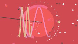
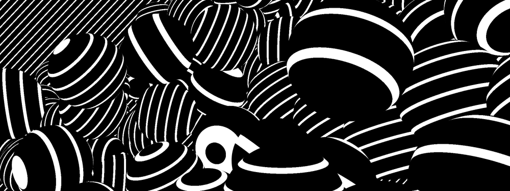
Patatap is a website created in 2014 (previously a concert piece as far back as 2012) that uses the keyboard of the user’s computer to play corresponding sounds to each key. In addition, the developer, Jono Brandel, teamed up with Lullatone, a Japanese musical duo, to come up with fun and unique sounds for each key. What I admire most about this project is that it goes beyond a simple beat making website, it also uses animated graphics to go along with each sound and allows the user to have a synesthetic experience.
There might be an opportunity in the future to possibly add tutorials on the website for musical novices like myself, who don’t necessarily understand music as well as others. However, overall, Patatap uses color and shapes in a whimsical and entertaining way that it is able to achieve the goal of a fun and inspiring toy on the Internet that doesn’t take itself too seriously. According to Brandel’s portfolio site, he was inspired by painters such as Piet Mondrian and Wassily Kandinsky and animators Norman McLaren and Oskar Fischinger and to me that inspiration was evident in his treatment of the product.
After some digging, I was not able to find the exact information as to how Brandel made the website. However, I don’t think it’s totally off the table that Brandel was able to make Patatap with Javscript. He uses simple animations, shapes, lines, and points to construct the visual elements of the website that are involved with Javascript.
Here are some examples of beats users were able to make:
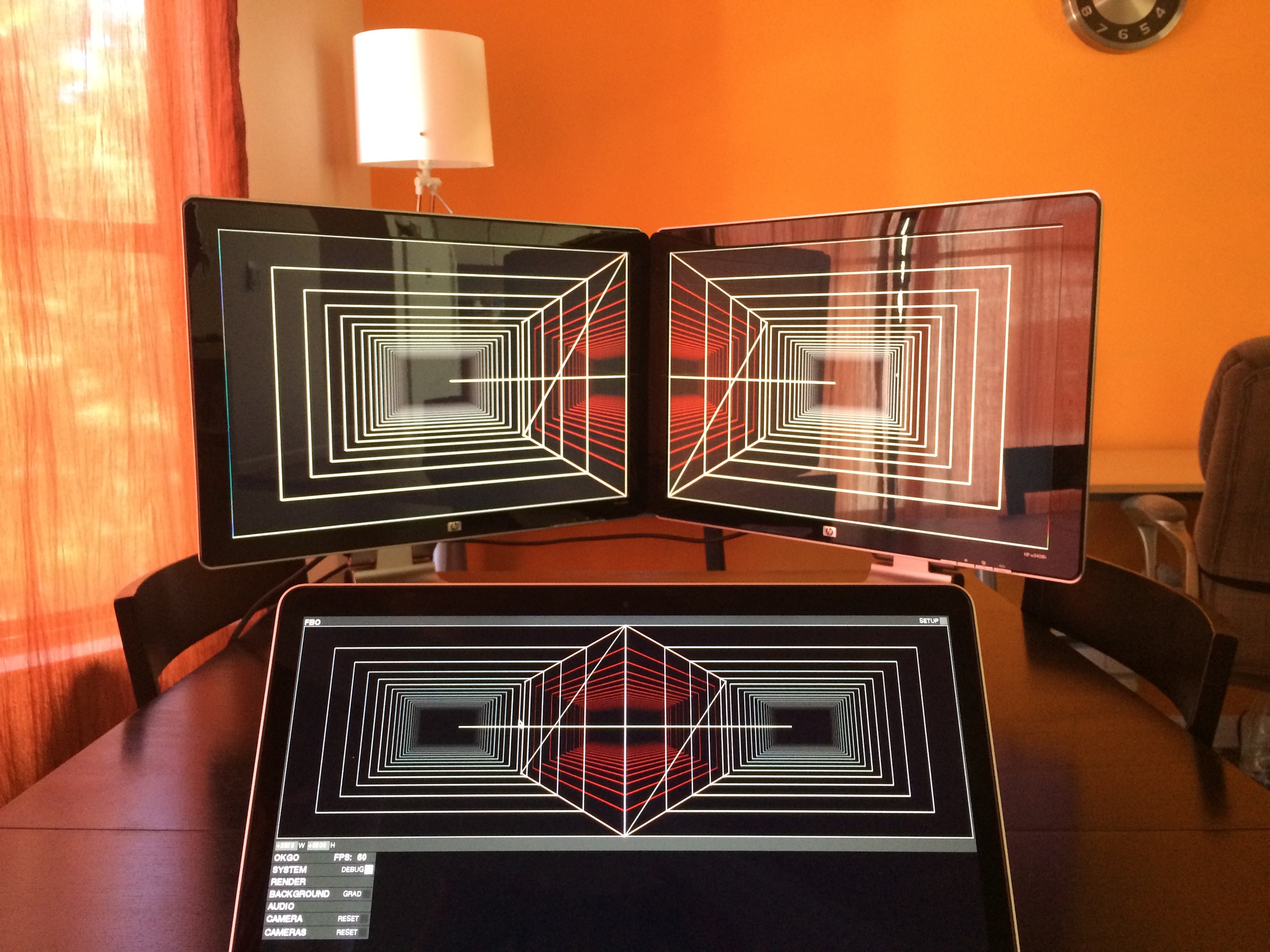
Reza Ali, a computational designer and engineer was asked to create six pieces of music videos by Ok Go, a rock band from Chicago. These videos were planned to be presented in OK Go’s summer/spring 2014-2015 concert. So, Reza created the motion graphic sequence videos that go along with the Ok Go’s music during a month. The sequences display geometric shape and pattern within generative systems. He utilized his custom software called ‘Rezanator’ in this project. His works were inspired by optical illusion, visual music, OP Art, hyper-sensory immersive media, and synaesthesia.
The Writing’s on the Wall Music Video by Reza Ali / Optical illusion
Reza took a special process to design these videos based on the context. In the concert, Two large V shape of project screen was installed behind the band. He tried to accord with this screen arrangement. So, during this project, he worked on not only a regular screen but also two screens that he put together in a V. As a result, he created a design that V screen enhances the visual effects in a music video.
Development Process of graphic sequence
I pretty much enjoyed how those simple geometric elements in his videos create decent visual effects. For me, the one with optical illusion is especially mesmerizing. All the video pieces even go along with this their music really well.
This project is the BMO200 Fountain, a creation that celebrates the 200th anniversary of BMO, a bank in Montreal.
The creative director of this project is Jess Willis of Mosaic. This project involved not only people of the design firm and the production company, but also members and employees under BMO. BMO’s CMO, Connie Stefankiewicz. Jennifer Marman and Daniel Borins were also artists involved with the project.
In order to celebrate BMO’s bicentennial anniversary, the company wanted to grant wishes to their customers through an interactive installation. Thus, the idea for the BMO200 Fountain came to be. The project is a sculpture that depicts water pouring into a pond. The image of water is created through mosaic tiles that flip between white and blue in order to form the appropriate imagery and icons. Users can type in a “wish” with their mobile device and then toss the coin into the fountain. This piece particularly caught my eye because I enjoy how the project is a successful combination of art, interaction and software.
I believe this project required the development of custom scripts because the artists and developers of the project wanted to created an interactive interaction that didn’t involve the cliche projections or screens. They thus created a software involving a “flip side” where many discs along the fountain water form would easily flip between white and blue in order to create the appropriate images. The project designers had to configure different ways that the coin would fall into the fountain waters.
The BMO200 Fountain demonstrates that interaction design is not limited to screens. Although today we see a lot of interactions involving these components, I think it is endearing to see the mosaic tiles moving to create different shapes. However, when not with the fountain, the experience is definitely not has sublime.
Millions of people come together to watch the annual League of Legends World Championship. While League of Legends is a current meta game that may seem too ‘pop’, the game has always been a great inspiration for me as a student. Starting with a small group and C++, Merc Merrill decided to tap into the video game market with League of Legends, a MOBA-style game. The most impressive aspect of the whole project is how prevalent it became in today’s eSports. Following up Starcraft, League of Legends has become an overwhelming favorite for eSports fans. Stadiums sell out, viewership stumps other ‘real sports’, and the game has found successful even after 7 years of release. To me, League of Legends demonstrates how technology is further expanding to the sports scene. In fact, the United States has started to give work Visa to professional eSports players because of how big the scene has become.
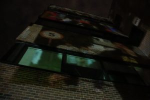
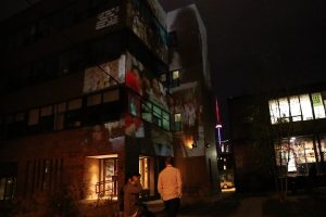
Workers That Live In The Mirrors by Dave Colangelo
This is a architectural projection which is located in United Steelworkers Hall. Toronto, Canada. The artist created this project based on his belief in public art being interactive with viewers.
“we want public art that can talk and listen, public art that we can click on, swipe, share, capture, and converse with and about. Public art that tell us something about the place it is in, about ourselves and others as we engage with it, and that connects us to other people and times, both near and far.” – Dave Colangelo
This art project can interact with people by introducing multiple, projection-mapped scenes of work and resistance in contemporary economies. It created connection between people by giving them a platform to share their thoughts and everyday life. It was a successful project that illustrates the situation of our society through series of projection. Also, the artist chose a red-brick masonry wall of “steelworkers” building for the projection instead of white wall inside of exhibition hall. To me, it successfully drew intention from pedestrians walking by the street and it effectively depict his belief in art being engaging and interactive to public .
However,it could be more effective if it can be responsive to reaction of the viewers. Perhaps, images in projection change based on various social data we put in or the projection has sensor that detects physical reaction of people and responds to it visually.
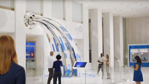
eCloud, installed in Terminal B at San Jose International Airport in San Jose, CA.
eCloud
eCloud is an art installation in Terminal B at San Jose International Airport in San Jose, CA. I know this exhibit well because SJC is my home airport, and I flew through it fairly often.
According to the piece’s official website, eCloud was created by Dan Goods, Nik Hafermaas, and Aaron Koblin. It is composed of hundreds of polycarbonate planes that are suspended from the terminal’s ceiling in the rough shape of a cloud. The panels can change transparency, based on real-time weather data from cities around the globe. The effect is of a digital cloud that changes subtly based on each panel’s transparency level.
The installation also includes a large LCD panel installed in the adjacent wall, that shows the weather of the city being represented at the moment, as well as a simulated preview of the cloud itself. This project really inspired me because its innovative use of technology truly represented Silicon Valley and it was a beautiful representation of how technology could contribute to something simple and beautiful. These days, a lot of thinkers are concerned about technology’s harmful impact on our generation, but we should be reminded that technology isn’t bad in itself, but we have to be be careful in how we choose to use it.
The artwork was essentially commissioned by the city of San Jose. While the terminal was being built, the city called for applicants to propose their own ideas, and eCloud was eventually selected. It seems that the applicants started prototyping their piece in 2007, but the final terminal with the installation did not open until 2010.
The team was led by three main artists/designers, who also worked with some professionals who had some more specific expertise.
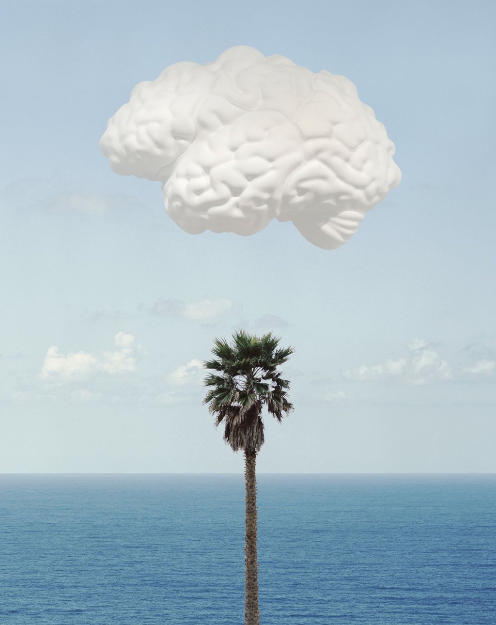
The team who created the piece had plenty of previous experience in environmental design. They had designed various spaces and environments and many settings such as airports and museums. And why a cloud? According to a VICE article, the art world at the time was heavily relying on clouds for inspiration.
John Baldessari’s Brain/Cloud
Here is a video of the installation:
According to the official website, the project utilized a lot of custom software so that the panels could communicate with each other and utilize the proper transparency.
Could the project have been effective? I don’t know! After all, it’s a piece of modern art, not quite a product so it doesn’t feel right to critique it. However, I think it works incredibly well in its setting. Perhaps I wish the panels were darker in default, so the more transparent “white” panels would be more visible with greater contrast.
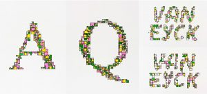
This project was developed by a professor in the School of Design, Kyuha Shim. I really enjoy his project as he creates an algorithm that bridges designers’ logic with computation through software generated typography. The algorithm establishes systematic patterns from type iterations, and can create different combinations of typographic forms. The resulting forms are not only pleasing to look at, but can also be taken further, becoming responsive to external inputs such as sound and motion. I think Shim has always been involved in data visualization, typography, and code work for some time, and this series of work were created between 2011 and 2014. The project required custom software I believe, that toggled different inputs and iterations. Shim may have been inspired by other forms of existing parametric design. Generative Typography provides a new paradigm of metadesign, where designers can push boundaries of creation beyond traditional type rules and guides.
This new media art installation is created by Akinori Goto in 2015. He recorded the movements of a person walking, created profiles of those “frozen” movements and made his own data series to make a loop in the movements. Judging from the short software interface shown in the video, I think Goto used Rhino with other plug-ins such as Grasshopper or Kangaroo to create the loop. He the choose to 3D print his installation and places it on a turntable with rays of light shining on it. Here is the link to his tumblr page with more of his videos http://akinorigoto.tumblr.com/. This art installation has inspired me to think of movement and time in a different perspective, as Goto stops time to create the frames, then using those shapes to create a movement. I liked the idea how light defines how the movement is read and re-interprets what a zoetrope can look like.
Komorebi is a robot projector that aims to replicate natural sunlight and shadows. Leslie Nooteboom created this device as a result of the increasing creations of the tall looming buildings standing over the cities. When she realized the increasing difficulty for homes to receive natural lighting and shadows, she developed Komorebi. Nooteboom’s creations have all dealt with interaction, whether it may be human-machine interactions or environment-machine interactions. This invention particularly spoke out to me because although I knew of the increasing technological innovations and construction, I never thought to consider what would be impacted as a result of each additional benefit for society. I loved how the creator tried to add hints of randomness to the projections to make the experience feel more realistic, but there is no warmth being emitted from this projection, which lowers its realistic feel. One thing I would suggest inputting into the komorebi to improve the machine would be implementing a weather detector or forecaster type of element into the komorebi because the amount of light houses get a day really depends on whether the sun is out or not and whether the clouds are covering it. By allowing the device to change the amount of sunlight it shows based on the current whether would make the komorebi even more fascinating.
![[OLD FALL 2017] 15-104 • Introduction to Computing for Creative Practice](../../../../wp-content/uploads/2020/08/stop-banner.png)