ChristineSeo-Project05-SectionC

sketch

// Christine Seo
// Section C
// mseo1@andrew.cmu.edu
// Project-05

var shapeSize;
var smallSize;

var r;

function setup() {
  createCanvas(500, 500);
  
   mouseClicked();
}

function mouseClicked(){
   background(255, 250, 220);

//first row set
push();
for(var x = 15; x <= width; x += 110){
  for(y = 30; y <= height; y += 110){
	shapeSize = random(15,25); //randomness of size of shapes with restriction
	smallSize = random(5,7);//randomness of size of shapes with smaller restriction
  
  r = random(255)
  
  noStroke();
	colorMode(HSB,200);//restrict colors
	var c = color(r,30,200);
	fill(c);
  ellipse(x + 5,y - 13,smallSize,shapeSize);//ears
  rect(x,y,shapeSize,shapeSize); //;legs
  ellipse(x,y,shapeSize,shapeSize);//eye
  ellipse(x + 25,y,shapeSize + 12,shapeSize + 12);//body
  fill(50);
  ellipse(x,y,shapeSize / 2,shapeSize / 2);//eye black
  fill(255);
  ellipse(x + 5,y - 3,shapeSize / 3,shapeSize / 3);//eye highlight
  	}
	}
pop();

//hearts pattern
push();
for(var x = 70; x <= width; x += 110){
  for(y = 80; y <= height; y += 115){
  r = random(255)

  noStroke();
  colorMode(HSB,200);
  var c = color(r,30,200);
  fill(c);
  triangle(x,y,x + 20,y + 20,x + 40,y);//bottom of heart
  triangle(x + 15,y,x + 30,y - 10,x + 40,y);//top right of heart
  triangle(x,y,x + 15,y - 10,x + 25,y);//top left of heart
    }
  }
pop();

noLoop() 
}

Ideas: Rough sketch

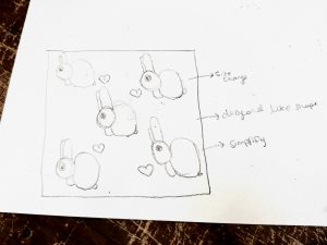
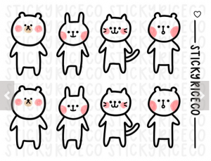
I was inspired by my baby cousin’s bunny wallpaper. I added hearts to give it a different pattern so it won’t be boring. I wanted to randomize the color and size of the shape of the bunny as well. I tried to stay in certain a color palette that resonates with soft colorful cotton candies. I also made sure the pattern visually stayed within the canvas. This project is something that I would actually use in real life and even in other classes if I need a unique background for other projects! I think the for loop function is very useful to redraw multiple things at once.


Kevin Thies -Project 5 – Wallpaper

sketch

// Kevin Thies
// kthies@andrew.cmu.edu
// Section C
// Project 05 - Sellout Wallpaper

// For reference, my 'brand' is Thies Arch, maybe Thies Art one day.
// my logo is a stylized TA. when TA is referenced in the code, it refers to
// the little TA logos, which can be thought of as a rectangle with corners
// and a center.

var d;              // physical spacing between TAs in pixels
var TAXSpacing;     // x distance from centers of TAs
var TAYSpacing;     // y distance from centers of TAs
var TAXSCALE;       // proportion of width to height
var TAYSCALE;       // 1, establish TA proportions
var SCALE;          // SCALE value, proportions are multiplied by this
var TAx;            // width of TA
var TAy;            // height of TA
var rotation = 0;   // rotates every other TA
var colR;           // R value of gradient
var colG;           // G value of gradient
var colB;           // B value of gradient
var toggle = 1;     // toggles between designs


function setup() {
    // basic style setup
    createCanvas(480,480);
    background(0);
    angleMode(DEGREES);
    strokeWeight(1.5);

    // establish proportions of TAs and spacing
    TAYSCALE = 1;
    TAXSCALE = 0.58;
    SCALE = 40;
    d = SCALE/5;

    // width/height is equal to width/height proportions * SCALE
    TAx = TAXSCALE * SCALE;
    TAy = TAYSCALE * SCALE;

    // spacing is equal to TA size * SCALE + d
    TAXSpacing = TAx + d;
    TAYSpacing = TAy + d;
}


function draw() {
    // set up a basic grid of proportioned TAs TAXSpacing
    // and TAYSpacing apart from each other
    // columns of grid
    for (var y = 0; y < height; y += TAYSpacing) {
    rotation ++;

        // each row should progress a gradient, top being gray, bottom being beige
        // these ensure an even transition
        colR = map(y, 60, height - 60, 135, 174);
        colG = map(y, 60, height - 60, 135, 166);
        colB = map(y, 60, height - 60, 135, 128);
        stroke(colR, colG, colB);

        // rows of grid
        for (var x = 0; x < width; x += TAXSpacing ) {
            rotation ++; // every other TA rotates 180 degrees

            // move origin to the top right corner of each TA
            push()
            translate(x, y);

            if(rotation % 2 === 0) {
                rotate(180);
                drawTA(-TAx, -TAy);
            } else {
                drawTA(0, 0);
            }
            print(rotation);
            pop();
        }
    }
    noLoop();
}


// given top left coords of TA, draw TA to scale and maintain proportions
function drawTA(x, y) {

    if(toggle % 2 === 0) {
        stroke(174,166,128);
    }
    // T - |
    line( x, y,
          x, y + TAy);
    // T - --
    line( x, y,
          x + (0.44 * SCALE), y);


    if(toggle % 2 === 0) {
        stroke(135);
    }

    // A - |
    line( x + TAx, y,
          x + TAx, y + TAy);
    // A - /
    line( x + TAx, y,
          x + (.12 * SCALE), y + TAy)
    // A - -
    line( x + (.35 * SCALE), y + (.75 * SCALE),
          x + (.47 * SCALE), y + (.75 * SCALE) );
}

// I  ended up doing some variations with fixed colors,
// so clicking on the canvas will toggle between designs
function mousePressed() {
    rotation = 0;
    background(0);
    toggle ++;
    redraw();
}

My early idea in a sketch

As of today, I’m a sellout to my own brand.
For context, I have a “brand” called ThiesArch, and I have a logo for it. Influenced a little by designer fabrics like Louis Vuitton and Gucci, and with a desire to spice up my portfolio website, I decided to go the route of a simple wallpaper made up of a tiled logo, so that at a distance it doesn’t look like much more than some lines and a gradient, but up close you could make out the logos. It’s all based off the proportions of the logo, so I could just change the scale value to make it look more or less legible. It would be cool to print fabric with this design, with the gradient accounting for the length, and make like a “branded company T-shirt” (it’d be just me).

It actually wasn’t as hard as I thought it would be to get the relative positions of the lines, since there are only five. It’s just tedious to make sure the proportions are correct.
Also if you click the sketch, I did one where the Ts and As form stripes, but that’s only legible on larger scales.

My “logo”, for reference

Sophie Chen – Project 05 – Wallpaper

sketch

var r; // red 
var b; // blue
var x;
var y;

function setup() {
    createCanvas(480, 480);
    background(250, 130, 150);
}

function draw() {
	for (y = 0; y < height; y += 80) {
		for (x = 0; x < width; x += 80){
			r = x;
			b = y / 2;
			
			// circles
			noStroke();
			fill(r, 150, 150);
			ellipse(50 + x, 50 + y, 50, 50);
			fill(255, 100, 100, 90);
			ellipse(40 + x, 35 + y, 50, 50);

			// banana body
			fill(200, 230, b);
			noStroke();
			beginShape();
			vertex(30 + x, 20 + y);
			bezierVertex(75 + x, 15 + y, 70 + x, 75 + y, 25 + x, 70 + y);
			bezierVertex(50 + x, 60 + y, 45 + x, 20 + y, 30 + x, 22 + y);
			endShape();

			// banana stem
			stroke(200, 230, b);
			strokeWeight(5.5);
			line(25 + x, 26 + y, 39 + x, 14 + y);

			// curve pattern
			noFill();
			stroke(255, 200, 200, 30);
			strokeWeight(2.5);
			arc(15 + x, 10 + y, 25, 25, HALF_PI, PI);
		}	
	}
}


I’m really glad I got to successfully use the bezier vertex to create a shape that’s not an ellipse this week (a banana 🙂 ).  I also enjoyed incorporating subtle color gradients into the wallpaper and combining that with different opacities. I had fun making this and definitely have a better understanding of nested for loops now.

Looking Outward – 05

Computer Graphics and 3D Representation

Architectural Applications and Platform Sandbox V.2: The Pixel Monster

Sean McGadden

Little Black Box is a a platform for sharing the work of designers, artist and architects. They are an open source platform that essentially expose the work of many talented young professionals and new graduates. This project, The Pixel Monster, evolved using a program called Platform Sandbox. This software uses architectural assemblage to generate forms and structures that can then be montaged. The Pixel Monster specifically is an instillation intended to be a community center at the “Europa Garten” in Frankfurt, Germany.


The author of this project is Kishan Kumar Thasma Seshier Kuppusamy is an architect from Frankfurt Germany practicing expressive innovative techniques and trying to break from conventional use and forms to generate structures creating real interaction and mystery. This project is highly experimental as there are not many structural members explored and it does start to indulge the viewers and participants in the many possibilities that can come from generative form.

I admire the way he is able to divulge, in these drawings, a clearly defined sense of space and emotion. This project is seeking to be a community center and reunite members from adjacent neighborhoods. I can see the way that it pulls from different directions to explore a central catalyst for social interaction and exploration. This was mainly generated using Sandbox and later post processed. The techniques for generating the form are interesting because they are both random and calculated at the same time. The branches of the project start to imply space and function but continue to intrigue as to what they are really trying to accomplish. Enjoy this render the author has made to truly emphasize the many implications of this project has in a context of calm or chaos…

ADDED: Platform Sandbox was developed by a man named Damjan Jovanovic he is a very talented artist, designer and architect. Here is a small video on his work and the nature of the Sandbox platform. It creates some really cool visualizations and animations.

Link to Damjam’s website and the Pixel Monster on Little Black Box.


Justin Yook – Project 05 – Wallpaper

wallpaper

//Justin Yook
// Section C
// jyook@andrew.cmu.edu
// Project 05

// bear + flower wallpaper
function setup() {
    createCanvas(600, 600);
    background(135, 206, 250);
    noLoop();
}

function draw() {
    var box = 40; // bear original x position
    var boy = 50; // bear original y position
    var bvs = 55; // bear vertical spacing
    var bhs = 110; // bear horizontal spacing

    //draws bears and oranges  
    for (var y = 0; y < 11; y++) {
        for (var x = 0; x < 10; x++) {
            var bpy = boy + y * bvs; // y position of following bears drawn
            var bpx = box + x * bhs; // x position of following bears drawn 
            var fpx = bpx + bhs + (bhs /2); // x position of fruit for even rows
            var fpy = bpy + bvs; // y position of fruit for even rows

            //draw bears on even rows
            if (y % 2 == 0) {
                //draw bear head
                noStroke();
                fill(255);
                ellipse(bpx, bpy, 60, 60);

                //draw bear ears
                fill(255);
                ellipse(bpx + 14, bpy - 26, 15, 15);
                ellipse(bpx - 14, bpy - 26, 15, 15);

                //draw bear nose
                fill(234, 212, 182);
                ellipse(bpx, bpy, 20, 20);
                fill(0);
                ellipse(bpx, bpy - 8, 6, 6);

                //draw bear eyes
                fill(0);
                ellipse(bpx + 8, bpy - 12, 6, 6);
                ellipse(bpx - 8, bpy - 12, 6, 6);

                //draw mouth
                stroke(0);
                line(bpx, bpy - 8, bpx - 4, bpy);
                line(bpx, bpy - 8, bpx + 4, bpy);

                //draw rosy cheeks
                noStroke();
                fill(255, 192, 203);
                ellipse(bpx - 20, bpy, 15, 15);
                ellipse(bpx + 20, bpy, 15, 15);
            }

            //draw oranges on odd rows
            if (y % 2 != 0) {
                //draw orange body
                fill(255, 192, 79);
                ellipse(bpx - bhs - 60, fpy - bvs, 30, 30);

                //draw orange leaves
                fill(50, 205, 50);
                ellipse(bpx - bhs - 60, fpy - bvs - 10, 8, 8);
            }
        }
    }
}

I wanted to create a friendly and cute wallpaper that gives off a refreshing vibe. The blue background is supposed to be comfortable to the eyes, and the orange complements that color. I can imagine the wallpaper pattern to be on stationery products such as tapes, or pencil cases. There is no pen and paper sketch of the design, but my main inspiration was a bear character called Rice from StickyRiceCompany, a handmade-sticker shop; I tried to re-create the character as accurately as possible.

Inspiration for character

Store Link: https://www.etsy.com/shop/StickyRiceCompany?ref=search_shop_redirect


Catherine Coyle – Looking Outwards – 05

I wasn’t sure what to write about for this project at first because there is such a multitude of impressive 3d graphics projects out there. I found this artist, mregfx, while scrolling through Twitter though, and thought his work seems perfect!

‘track tests with smoke’ by mregfx

This is the piece that I had initially seen. It is amazing that 3d graphics can look so realistic and seem to blend in with real world surroundings so well. The work itself feels very mysterious and fits especially well with October coming up. I am particularly impressed by the smoke physics. It’s amazing that a computer can generate these textures and movements.

The artist himself doesn’t seem to have a website, but has a fairly large following on both Twitter and Instagram and it based out of the UK. A lot if his projects are similar to this one in that they seem extremely realistic but some small details are changed using computer graphics that make them particularly intriguing or cool to look at.

It’s amazing was graphics can do!

‘Headache’ by mregfx

Justin Yook – Looking Outwards 05

“Transformers: Age of Extinction” is the 4th movie in the live-action “Transformers” films, directed by Michael Bay. “Transformers” films are known for their extensive use of 3D computer graphics, or CGI, but from what I have observed, the 4th movie has the most impressive computer graphics. All of the robots have intricate parts, and unique transformation sequences. For example, one of my favorite characters is Grimlock, a robot that can turn into a giant T-rex. The softwares that were most likely used to create the 3D models and their animations were Autodesk’s Maya or 3DS Max. I think that the creator’s artistic sensibilities can be seen from each robot’s design; the characters’ robot and transformed forms complement one another very well.

Jenna Kim (Jeeyoon Kim)- Looking Outwards-5


(Guide to Snow Simulation in Frozen)

Frozen Snow Simulation is a project by the graphics community to illustrate real snow in the animation environment. Since already existing 3D graphics only have techniques for solids and liquids, and making graphics for wet and dense snow is difficult, the graphics team had to use a grid that creates self collision and breaking of the snow. The algorithm used for this project is called Matterhorn, which made basis for most of the snow effects in the movie. The designers started with Matterhorn and changed the look for a perfect snow. The creator’s artistic sensibilities manifested in the final form because he carefully considered the composition, details of the snow, and style/ elegance of the whole animation into Frozen. I admire this project because in order to create the real, specific effects of the snow, a team of forty people came together to simulate snow that gives both reality and fits into the style of the movie.

Link: http://www.cgmeetup.net/home/making-of-disneys-frozen-snow-simulation/

Project 05: Wallpaper

circle

/*
Samantha Ho
sch1
Project 05
Section E
*/
function setup() {
    createCanvas(600, 400);
    noStroke();
}

function draw() {
    background(250, 230, 230);
    //repeating the pattern linearly along the x axis
    for (var y = 0; y < height; y += 120) {
        for (var x = 0; x < width; x += 90) {
            var r = (y / 400 * 200);
            var g = (y / 400 * 255);
            var b = (x / 400 * 200);
            stroke(r, g, b);
            //creating the top pattern1
            line(x + 10, y + 10, x + 10, y + 50);
            line(x + 20, y + 5, x + 20, y + 45);
            line(x + 30, y + 0, x + 30, y + 40);
            line(x + 40, y + 5, x + 40, y + 45);
            line(x + 50, y + 10, x + 50, y + 50);
            //creating base1
            line(x + 30, y + 45, x + 10, y + 55);
            line(x + 38, y + 50, x + 18, y + 60);
            line(x + 48, y + 55, x + 28, y + 65);

        }
    }

    for (var y = 0; y < height; y += 120) {
        for (var x = 0; x < width; x += 90) {
            var r = (y / 400 * 60);
            var g = (x / 400 * 200);
            var b = (y / 400 * 200);
            stroke(r, g, b);
            //creating the top pattern1
            line(x + 10, y + 10, x + 10, y + 50);
            line(x + 20, y + 5, x + 20, y + 45);
            line(x + 30, y + 0, x + 30, y + 40);
            line(x + 40, y + 5, x + 40, y + 45);
            line(x + 50, y + 10, x + 50, y + 50);
            //creating base1
            line(x + 30, y + 45, x + 10, y + 55);
            line(x + 38, y + 50, x + 18, y + 60);
            line(x + 48, y + 55, x + 28, y + 65);

            var r = (y / 200 * 20);
            var g = (x / 200 * 20);
            var b = (y / 200 * 50);
            stroke(r + 30, g + 100, b + 100);
            //creating the top pattern2
            line(x + 30, y + 70, x + 30, y + 115);
            line(x + 40, y + 75, x + 40, y + 110);
            line(x + 50, y + 80, x + 50, y + 105);
            line(x + 60, y + 75, x + 60, y + 110);
            line(x + 70, y + 70, x + 70, y + 115);
            //creating front side
            line(x + 5, y + 12, x - 15, y);
            line(x + 5, y + 28, x - 15, y + 16);
            line(x + 5, y + 45, x - 15, y + 32);

            //ellipse
            var r = (width / x * 20);
            var r = (width / y * 20);
            var r = (width / y * 20);
            noStroke();
            fill(r, g, b)
            ellipse(x + 9, y + 110, 2, 2)
        }
    }

}

I wanted to go with a line pattern and use the negative space to insinuate shadow. Originally I had a full black background, but it was difficult to distinguish shapes due to the contrast. Inevitably, I decided on the lighter background and was rather satisfied with what I came up with.

inspiration/ concept to get me started

PO5 – Alexander Chen

sketch

//Alexander Chen
//Section A 
//alchen1@andrew.cmu.edu
//Project05

function setup() {
    createCanvas(400, 480);
    background (32, 29, 46);
}

function draw() {
    drawGrid();
    noLoop(); 
}
function drawGrid() {

//Red lines on the navy background to create effect of alternating red and blue lined background
	for (var i = 0; i < 40; i+=2) {
		fill (64, 18, 26);
		noStroke();
		rect (i * 15, 0, 15, height);
	}

//SHIELDS//
	for (var y = 40; y < height - 10; y+=55) {
		for (var x = 27; x < width - 10; x+=55) {
            //Shield 
            stroke(255);
            fill(34, 51, 74);
            triangle (x, y, x + 20, y, x + 10, y + 20);
          
            //line detail inside shield
            line(x + 4, y + 7, x + 15, y + 7);
           
           	//red tip of shield
            stroke(255);
            fill (147, 26, 28);
            triangle (x + 4, y + 7, x + 16, y + 7, x + 10, y + 20);


        }
	}
}

This wallpaper was largely inspired by classic Americana/Ivy League fashion. A lot of inspiration was drawn from vintage Ralph Lauren, Tommy Hilfiger, and modern American microbrand Arnold Steiner. Additionally, I found myself reminiscing my home city of Philadelphia and thinking about the colors of the crest of UPenn. This kind of preppy and classic colorway found its way into the three main colors of my wallpaper. I wanted create something that represented old traditional families and what better way to represent that in a simple and minimal but still classic crest.

You can see in the pictures displayed below some inspiration that I drew from:


Shield of the University of Pennsylvania


2013 Tommy Hilfiger Campaign


Arnold Steiner Instagram post from August 2018 @arnoldsteiner