Anthony Ra – Project 07 – Curves

sketch

/* Anthony Ra
Section-A
ahra@andrew.cmu.edu
Project-07 */

function setup() {
    createCanvas(480, 480);
    frameRate(100);
}

function draw() {
    background(255);

/* mapping the colors so that it changes based on mouseX */
    var r = map(mouseX, 0, width, 140, 180);
    var g = map(mouseX, 0, width, 160, 190);

/* printing hypotrochoid */
    push();
    stroke(r, g, 255);
    strokeWeight(0.25);
    translate(width/2, height/2);
    drawHypotrochoid();
    pop();
}

function drawHypotrochoid() {
/* naming variables */
    var hypoX;
    var hypoY;
/* radius of hypotrochoid */
    var hypoRadius = 240;
/* hypotrochoid alteration with cursor */
    var a = map(mouseX, 0, width, 0, 5);
    var b = map(mouseY, 0, height, 0, 3);
    beginShape();
      for(var i = 0; i < 300; i ++) {
        var angle = map(i, 0, 200, 0, 360);
/* equation of hypotrochoid from the link */
        hypoX = (a - b) * cos(angle) + hypoRadius * cos((a - b) * angle);
        hypoY = (a - b) * sin(angle) - hypoRadius * sin((a - b) * angle);
        vertex(hypoX, hypoY);
      }
    endShape();
}

hypotrochoid chart

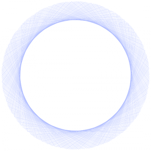
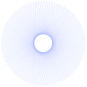
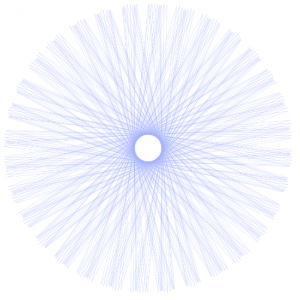
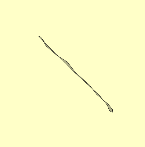
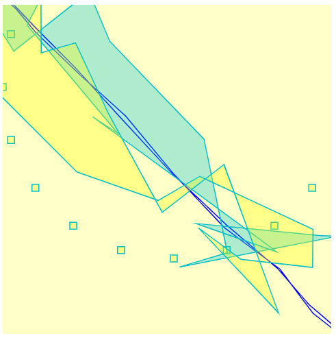
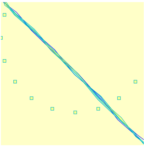
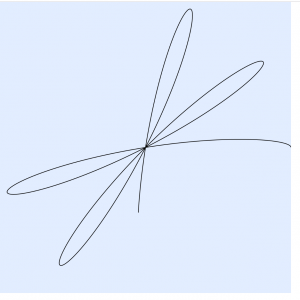
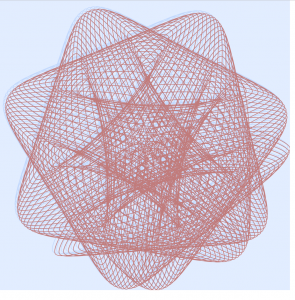
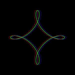
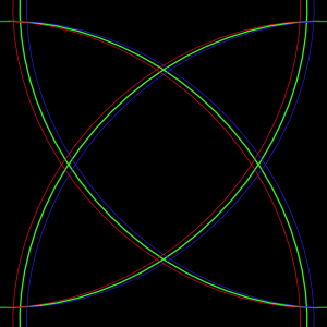
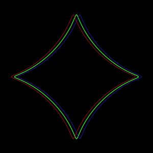
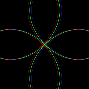
Thinking about the project that we did a couple weeks ago on string art, I focused on curves that bring lightness, tranquility, and balance in regards to symmetry and motion. The purpose of picking a hypotrochoid is the many ways in which the control points of each line or curve responds differently but respects the symmetry in balance.

variation with the largest radius

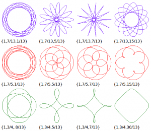
Looking back at the hypotrochoid chart, that moment of the cursor provides the twelfth iteration, producing a modular set of filleted triangular curves.

second variation
a similar variation to the above one

Christine Chen-Looking Outwards-07

The above video shows the website “YEAR IN NIKEFUEL” built by Fathom for Nike+ FuelBand for users to view their personal physical activity patterns (couldn’t find exact year created) Link: https://vimeo.com/151097197

What I admire most about the various aspects of computation visualization information is how they bring so much convenience and assistance into our daily lives. The website that Fathom, a design agency, created in collaboration with Nike for Nike+ FuelBand users perfectly illustrates this. On this website, users are able to download and share posters with information of their daily movement for everyday of the year. Different colors are used to depict different levels of activities. Different concentrations of colors are also utilized to depict patterns and behaviors of activities. Unfortunately, I couldn’t find the algorithm and software that Fathom used to create the actual website, but the software that they used to create the model is Frame.

As someone who is having a hard time finding motivation to work out, I think this website is great for motivating those with low daily activities. Because of all the different usages (entertainment, easy access to various sources of information…etc.) that technology provides to us, most people today spend their time sitting in front of their TV or computer or scrolling away on their phone. Thus, they end up not “moving” around enough to build a healthy body. I really love how this app displays visually the differences of low and high areas of activities, reminding people of how their lifestyle is like as they can easily visualize it. The “sharing” aspect of the website also motivates people as others will be reminded or motivated to workout when they see their friends posting from YEAR IN NIKEFUEL.

The team’s choice of using the three primary colors (blue, red, and yellow) as the main theme colors for the website also helps to give the whole website a “simple” vibe that is user-friendly, which encourages people to try and experiment with the website. The various graphics that helps to organize information are also designed and considered so well that it minimizes distractions and helps users to understand the information right away. The graphics are designed so well that they seemed to be designed without effort. As a designer-in-training, I only realized how hard it is and how many things are needed to be considered when I entered the program of design at CMU. Thus, this is one of the many things that I am trying to learn from, which is why I admire this design from Fathom so much!

Link to YEAR IN NIKEFUEL website: https://yearinnikefuel.com


Poster showing the website’s various functions

Project 07: Curves

sketch

/* Samantha Ho
Section E 
sch1@andrew.cmu.edu
Project 07*/

var x;
var y;


function setup() {
	createCanvas(480 , 480);
        frameRate(25);
	}

function draw(){
 background(255, 255, 200);
    
    var nPoints = 20;
    var radius = 250;
    var separation = 125;
    
    // draw the squares in the back
    push();
    translate(2*separation, height / 4);
    for (var i = 0; i < nPoints; i++) {
        var theta = map(i, 0, nPoints, 0, TWO_PI);
        var px = radius * cos(theta);
        var py = radius * sin(theta);
        rect(px - 5, py - 5, 10, 10);
    }
    pop(); 
    
    
    // draw the baseline squiggle 
    strokeWeight(1.5);
    stroke(0,0,255);
    fill(250, 255, 250, 80);
    push();
    translate(2*separation, height /2);
    beginShape();
    for (var i = 0; i < nPoints; i++) {
        var theta = map(i, 0, nPoints, 0, TWO_PI);
        var px = radius * sin(theta);
        var py = radius * sin(theta);
        vertex(px + random(-5, 10), py + random(-5, 10));
    }
    endShape(CLOSE);
    pop();
    
    //green squiggle
    strokeWeight(1.5);
    stroke(0,190,200);
    fill(0, 195, 220, 80);
    push();
    translate(2*separation, height /2);
    beginShape();
    for (var i = 0; i < nPoints; i++) {
        var theta = map(i, 0, nPoints, 0, TWO_PI);
        var px = radius * sin(theta);
        var py = radius * sin(theta);
        vertex(px + random(-mouseX/3, 10), py + random(-mouseX/3, 10));
    }
    endShape(CLOSE);
    pop();
    
    //yellow squiggle
    strokeWeight(1.5);
    stroke(0,190,200);
    fill(255, 255, 0, 80);
    push();
    translate(2*separation, height /2);
    beginShape();
    for (var i = 0; i < nPoints; i++) {
        var theta = map(i, 0, nPoints, 0, TWO_PI);
        var px = radius * sin(theta);
        var py = radius * sin(theta);
        vertex(px + random(-mouseX/3, 10), py + random(-mouseX/3, 10));
    }
    endShape(CLOSE);
    pop();
  
}


After playing around with the circles and the graphs, I liked the animated rendering effect so I continued to play around. I created this layered squiggle and baseline whose form is contingent on the cursor’s X-position.

initial vibrating squiggle
max-position squiggle
minimum position squiggle

Looking Outwards 07: Nike Fuel

I really liked Fathom’s project with Nike because not only is it visually stunning, but also it’s extremely interactive with the user. The charts break down a user’s daily movement and visualizes their active lifestyle. This is really cool because this feature is enhances the entire Nike+ FuelBand system. It creates a collaborative community aspect to the product that further engages the user

year in NikeFuel

Additionally to the community aspect, the details and features of each graph are unique to the user completely.

The top of the poster serves as a unique “fingerprint” of a person’s behavior, routines, and lifestyle, while the bottom portion offers a detailed summary of their year in hard numbers.

No user will receive the same graph, thus the sharing aspect is further encouraged so people can share with their friends and compare.

Rjpark – Project 07 – Curves

rjpark_curves

var nPoints = 300;
var angle = 0;

function setup() {
    createCanvas(480, 480);
}

function draw() {
    background(175, 110, 235); // resets background every time draw is called so only one curve shows

    push();
    translate(mouseX, mouseY); // center of curve follows mouse
    rotate(radians(angle)); // rotates on center of curve
    drawEightCurve(); // draws curve
    pop();

    angle = angle + 3.5; // speed of rotation
}

// http://mathworld.wolfram.com/ConicalSpiral.html    
function drawEightCurve() {
    var x;
    var y;
    var r;
    
    var a = constrain(mouseX, width / 6, width / 2.2);
    
    fill(60, 20, 35);
    stroke(160, 15, 90);
    strokeWeight(5);

    beginShape();
    for (var i = 0; i < nPoints; i++) {
        var t = map(i, 0, nPoints, 0, TWO_PI);
        r = - a * cos(3 * t);
        x = r * cos(t);
        y = r * sin(t);
        vertex(x, y);
    }
    endShape(CLOSE);
}

I first went to the Mathworld curves site and found the trifolium curve. It reminded me of a fidget spinner and so I got inspired to create one using this curve. As a result, I created a function (drawTrifolium()) that would draw the trifolium curve and, to do this, I used the polar equation from the site. Within the function, I made the “a” variable dependent on my mouseX movement. This changes the size of the fidget spinner as mouseX decreases or increases. Then, within the draw() function, I called drawTrifolium() and translated it so that the center of the fidget spinner would be wherever my mouse (mouseX and mouseY) is. Below are two pictures of the minimum and maximum size of the fidget spinner.

Catherine Coyle – Project 7 – Curves

catherine curves

// Catherine Coyle
// ccoyle@andrew.cmu.edu
// Section C
// Project 7  - Curves

// equations taken from http://mathworld.wolfram.com/Hypotrochoid.html

var n = 1;
var h = 2;
var t = 1;
var a;
var b;

function setup() {
    createCanvas(480,480);
}

function draw() {
    background(226, 237, 255);
    // number of 'rotations' is dependent on y
    n = map(mouseY, 0, height, .9, 1.1);
    // size of rotation circles is dependent on x
    h = map(mouseX, 0, width, 2, 4);
    // smaller helper functions below here
    a = aCalc();
    b = bCalc();
    drawHypotochroidShadow(t, a, b);
    drawHypotochroid(t, a, b);
}

// i broke a lot of the heavy math parts into smaller functions
// to make it more manageable
function aCalc() {
    return(2 * n * h / (n + 1));
}

function bCalc() {
    return(((n - 1) * h) / (n + 1));
}

function xPar(t, a, b) {
    var answer = (a - b) * cos(radians(t));
    var cosVal = ((a - b) / b) * t;
    answer = answer + h * cos(radians(cosVal));
    return answer;
}

function yPar(t, a, b) {
    var answer = (a - b) * sin(radians(t));
    var cosVal = ((a - b) / b) * t;
    answer = answer + h * sin(radians(cosVal));
    return answer
}

function drawHypotochroid(t, a, b) {
    stroke(193, 124, 124);
    noFill();
    // loops through entire curve and plot every point
    beginShape();
    for(var i = 0; i < width; i++){
        var x = map(xPar(i, a, b), -4, 4, 0, width);
        var y = map(yPar(i, a, b), -4, 4, 0, height);
        curveVertex(x, y);
    }
    endShape();
}

// same as above but with some offset just to look cool
function drawHypotochroidShadow(t, a, b) {
    stroke(66, 134, 244, 50);
    noFill();
    // loops through entire curve and plot every point
    beginShape();
    for(var i = 0; i < width; i++){
        var x = map(xPar(i, a, b), -4, 4, 0, width);
        var y = map(yPar(i, a, b), -4, 4, 0, height);
        curveVertex(x-4, y-4);
    }
    endShape();
}

This project was kind of hard to get started with but once I wrapped my head around it I found it very cool.

I probably spent a good hour on the mathworld website trying to settle on a curve, but found that a lot of them were too hard to implement. I decided to go with the hypotrochoid shape found here.

If you keep your mouse on the left end of the screen, the curve should stay within the canvas if you want to see an entire design. Otherwise, moving your mouse to the right will kind of ‘zoom in’ to the center of the curve.

It took a lot of experimenting and trial and error to make the program work right, but in the end it produced some nice results.


The really early stages of the program when I first started to connect vertices
An interesting design that I found in the program at the end.

Jenni Lee — Project 07 — Curves

sketch

/* Jenni Lee
Section E
jennife5@andrew.cmu.edu
Project - 07
*/


var a = 60;

var r = 255,
  g = 0,
  b = 0;

var curveType = 0; // draw different curve type depending on mouse click

function setup() {
  createCanvas(480, 480);
  frameRate(15);
  angleMode(RADIANS);
}

function draw() {

  background(255);
  if (curveType == 0) {
    drawEpitrochoidCurves();
  } else {
    drawHypocycloidPedalCurve();
  }
}

function drawEpitrochoidCurves() {

  a = map(mouseX, 0, width, 20, 120); // a is the radius of the inner circle
  a = constrain(a, 20, 120);
  var ratioB = floor(map(mouseY, 0, height, 2, 20)); // randomize ratioB to get 
  //inner circle radius when mouse pressed
  var ratioH = floor(map(mouseY, 0, height, 1, 6)); // randomize ratioH to get 
  //crossing radius when mouse pressed

  var b = a / ratioB;
  var h = ratioH * b;

  var t = 0.0;
  stroke(r, g, b);
  strokeWeight(2);
  beginShape(LINES);
  for (var i = 0; i < 1600; i++) {
    var x = (a + b) * cos(t) - h * cos((a + b) * t / b);
    var y = (a + b) * sin(t) - h * sin((a + b) * t / b);
    vertex(x + width / 2, y + height / 2);
    t += 0.008;
  }
  endShape();
}

function drawHypocycloidPedalCurve() {
  a = map(mouseX, 0, width, 20, 240); // a is the radius of the inner circle, 
  //depending on mouseX position  
  a = constrain(a, 20, 240);
  var t = 0.0;
  var n = floor(map(mouseY, 0, height, 3, 24)); // # of paddles, from 3 to 24 
  //depending on mouseY position
  n = constrain (n, 3, 24);
  beginShape(LINES);
  stroke(0, 0, 0);
  strokeWeight(2);
  for (var i = 0; i < 1600; i++) {
    var x = a * ((n - 1) * cos(t) + cos((n - 1) * t)) / n;
    var y = a * ((n - 1) * sin(t) - sin((n - 1) * t)) / n;
    vertex(x + width / 2, y + height / 2);
    t += 0.008;
  }
  endShape();

  stroke(r, g, b);
  strokeWeight(2);
  beginShape(LINES);
  for (var i = 0; i < 2000; i++) {
    var x = a * (n - 2) * (cos(t) - cos((1 - n) * t)) / (2 * n);
    var y = a * (n - 2) * cos(t * (1 - n / 2)) * sin(n * t / 2) / n;
    vertex(x + width / 2, y + height / 2);
    t += 0.008;
  }
  endShape();
}

function mousePressed() {
  curveType = 1 - curveType;
  r = random(0, 255);
  g = random(0, 255);
  b = random(0, 255);
}

// first curve: 
// Epitrochoid curves/equation
// http://mathworld.wolfram.com/Epitrochoid.html
// x	=	(a+b)cos(t)-h*cos((a+b)/b*t)	
// y	=	(a+b)sin(t)-h*sin((a+b)/b*t)

// second curve:
// Hypocycloid Pedal Curve
// http://mathworld.wolfram.com/HypocycloidPedalCurve.html
/*
The pedal curve for an n-cusped hypocycloid

x	=	a((n-1)cost+cos[(n-1)t])/n	
y	=	a((n-1)sint-sin[(n-1)t])/n	

with pedal point at the origin is the curve

x_p	=	a((n-2){cost-cos[(1-n)t]})/(2n)	
y_p	=	a((n-2)cos[t(1-1/2n)]sin(1/2nt))/n.
*/

This project was entertaining for me because I enjoy browsing/analyzing the artwork of other artists/designers, so implementing different curves created by others was really fun. I used the curves/equation for the epitrochoid and the hypocloid pedal curve. This project required a bit of math, so it was a nice memory-refresher of high school math.

Sophia Kim-Project 07 Sec C

sketch

// Sophia S Kim
// Section C 1:30
// sophiaki@andrew.cmu.edu 
// Project-07-Composition with Curves

var nPoints = 200; 

function setup() {
  createCanvas(480, 480);
}

function draw() {
  background(0);
  
  //middle green diamond 
  push();
  translate(width/2, height/2);
  noFill();
  strokeWeight(2);
  stroke(35, 255, 0);
  drawAstroid();
  pop();

  //right blue diamond
  push();
  translate((width/2) + 10, height/2);
  noFill()
  stroke(35, 0, 255);
  drawAstroid();
  pop();

  //left red diamond
  push();
  translate((width/2) - 10, height/2);
  noFill()
  stroke(255, 0, 0);
  drawAstroid();
  pop();
}

  //atroid move based on mouseX and mouseY 
  // Asteroid - http://mathworld.wolfram.com/Astroid.html
function drawAstroid() {
  var x; //xvalue for astroid curve
  var y; //yvalue for astroid curve
  var a; //for mouse X movement 
  var b; //constrains mouseY values 0 to 300

  a = mouseX; 
  b = constrain(mouseY, 0, 300);

  beginShape(); 
  for(var i = 0; i < nPoints; i++) {
    var t = map(i, 0, nPoints, 0, TWO_PI);
    //for degrees based on i 

    x = 3 * a * (cos(t)) + b * (cos(3*t)); 
    y = 3 * a * (sin(t)) - b * (sin(3*t));
    vertex(x,y);
  } 
  endShape();
}

For the “Composition with Curves,” I decided to do an “Astroid” curve, which is a 4-cusped hypocycloid. At first, I was really confused which equation I use for the parametric equations, because the website offered 3 equations for each variable (x, y). I tried all three for each variable to see which one showed the diamond-like shaped curves. Within that process, I got static-like lines, which looked beautiful but was not what I wanted in my final product. After many trials and the right equations, I was able to find the diamond-like curves and create 3 different copies with different colors using push() and pop(). I really liked the way my code turned out, because the changes of the curves reminded me of the Louis Vuitton branding.

Mimi Jiao – Looking Outwards 7 – Section E


Nicholas Feltron is a designer and artist whose work centers around exploring different ways of information visualization and translating data into meaningful and digestible experiences. He is widely known for his multi year project, the personal annual reports. In this personal annual reports, he summarizes his yearly activities in a series of graphic representations. These statistics track his living habits such as amount of time spent sleeping, working, relaxing, etc. as well as information about the external environment such as weather. I found out about him last year through my design professors and I was really interested in how he used Processing to map out his information in a visually interesting way. Since he collects a ton of information everyday, he uses coding to filter out unnecessary data and find patterns within the data. I really enjoy the layout and visual elements of his annual reports; they are very readable and easy to understand. It’s interesting seeing him map out his own behaviors as well as the environment’s behaviors through bar graphs, population density clusters, and other information visualization techniques. In addition, it is also really easy for viewers to jump to specific sections of his report since there is an overwhelming amount of information throughout the entire report. His use of colors unify his report and adds emphasis to the information he wants to highlight. All in all, Feltron’s annual reports demonstrate the effectiveness of creative coding while maintaining good design conventions for optimal information digestion. As a piece of design, I think it is very interesting and effective, however, his reports don’t really explore the aesthetics of information visualization as much. There are probably much more interesting and fun ways of visualizing the data in his annual report. But, I really enjoy this for the content of the work rather than the aesthetics, and I think it is really interesting seeing someone’s life represented through numbers, graphs, and text.

John Legelis – Project 07: Composition with Curves

sketch

// John Legelis
// Section D


//Define canvas width and height
cwidth = 480
cheight = 480

function setup() {
    createCanvas(cwidth, cheight);
    background(0);

    textSize(40);
    fill(255)
    textFont('Helvetica');
    text('mouse over', 120, 240);
}

//Initialize number of points drawn in graph
var npoints = 60
var step = 2 * Math.PI / npoints
//Radius of outer circle
var bigR 
//Radius of inner circle
var r
// offset the graph so it is drawn about the center
var offsetx = cwidth/2
var offsety = cheight/2 
//color variable
var cw


function hypX (t) {
    //Big and little circle radius mapped to x,y mouse and constrained to canvas
    bigR = map(constrain(mouseX, 0, cwidth),0, 1000, 0, 400)
    r = map(constrain(mouseY, 0, cheight), 0, 700, 0, 400)
    var x = ((bigR - r) * cos(t) + r * cos((bigR - r)/r * t) + offsetx)
    return x
}

function hypY (t) {
    //Big and little circle radius mapped to x,y mouse and constrained to canvas
    bigR = map(constrain(mouseX, 0, cwidth),0, 1000, 0, 400)
    r = map(constrain(mouseY, 0, cheight), 0, 700, 0, 400)
    var y = ((bigR - r) * sin(t) + r * cos((bigR - r)/r * t) + offsety)
    return y
}

function draw() {
    //color variable randomized RGB in neon range
    cw = [random(0,200), random(0,200), random(0,200)]


    //for every point in the pattern
    for (theta = 1; theta < 30*PI; theta = theta + 2*PI/npoints) {
        strokeWeight(3)
        stroke(cw)
        // draw a line from the point to the previous point
        line(hypX(theta), hypY(theta), hypX(theta - step), hypY(theta - step))
    }
    // erase everything when mouse mouseIsPressed
    if (mouseIsPressed) {
        background(0)
    }
}

This week’s project was left very open ended, and after some research on Wolfram Alpha World about curves and their mathematical composition, I developed an understanding for how a spirograph creates hypotrochoid shapes by rotating a circle within another circle.

The general formula for the X and Y coordinates of a hypotrochoid curve in reference to theta is:

x(θ(Rr)*cosθ r*cos(θ*(Rr)/r) y(θ(Rr)*sinθ − r*sin(θ*(Rr)/r)

Where R and r refer to the radii of the outer circle and the inner circle respectively.
In my project I created code that draws a hypothyroid whose R and r vary with mouseX and mouseY respectively. When the mouse is pressed the canvas will erase