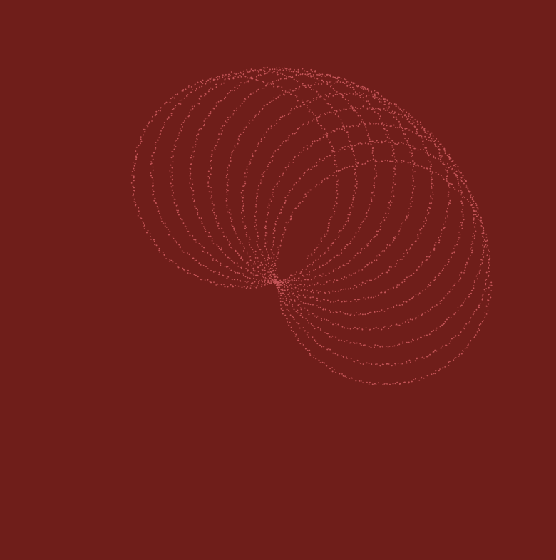
// Ilona Altman
// Section A
// iea@andrew.cmu.edu
// Project-07

function setup() {
    createCanvas(400, 400);
    frameRate(10);
    noStroke();
}

function draw() {
//pink background
background(121,20,20);

// variables d/n = petal variations
var d = map(mouseX, 0, width, 0, 8);
var n = map(mouseY, 0, height, 0, 8);

// translating the matrix so circle is in the center
push();
translate(width/2, height/2);

//changing the colors
var colorR = map(mouseX, 0, width, 200,255);
var colorG = map(mouseY, 0, width, 50,245);
var colorB = map(mouseX, 0, width, 50,200);

// the loop generating the points along the rose equation
for (var i = 0; i < TWO_PI *3*d; i += 0.01) {
    var r = 150* cos(n * i);
    var x = r * cos(i);
    var y = r * sin(i);

    //making the circles more dynamic, and wobbly
    fill(colorR,colorG,colorB);
    circle(x +random(-1, 1), y + random(-1, 1), 1, 1);
    }

pop();
}
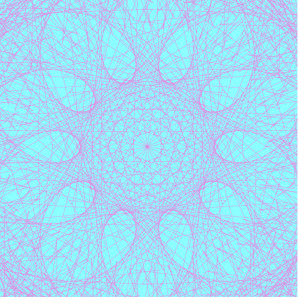
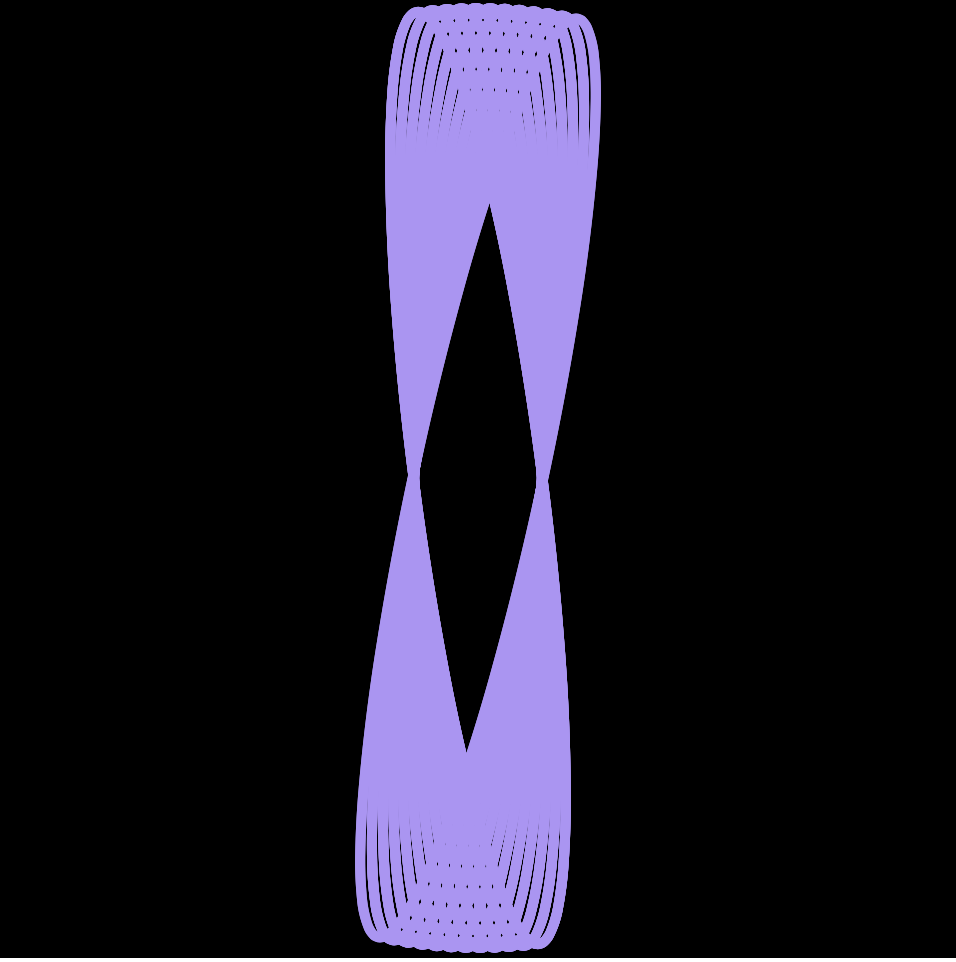
With this project, I was thinking a lot about auras, and energy, and how to make something digital that feels organic. I wanted to experiment with a flickery effect, achieved by alternating the size of the circles which compose this curve. I like the idea of these patterns looking like they are created from vibrations. I have been thinking about sacred geometry a lot, and about the patterns made in water when sound reverberates through it.
/*
Claire Lee
15-104 Section B
seoyounl@andrew.cmu.edu
Project-07
*/

var nPoints = 100;
var angle = 0;
//initial global variables

var bgRed = 135;
// background color variable

function setup() {
    createCanvas(480, 480);
    background(bgRed, 195, 255);
}

function draw() {
    bgRed = 150 + (mouseX * (120 / width));
    background(bgRed, 195, 255);

    push();
    translate((width / 2), (height / 2));
    rotate(radians(mouseY));
    hypotrochoidCurve();
    pop();
    // place curve in center, govern rotation by mouseY

    push();
    translate((width / 2), (height / 2));
    rotate(radians(mouseX));
    epitrochoidCurve();
    pop();
    // place curve in center, govern rotation by mouseX

    push();
    translate((width / 2), (height / 2));
    rotate(radians(mouseX * 5));
    deltoidRadialCurve();
    pop();
    // place curve in center, govern rotation by mouseX
    // comparatively faster rotation
}

function hypotrochoidCurve() {
    var a1 = map(mouseX, 0, 480, 80, 200);
    //size changes with repsect to mouseX
    var b1 = 30;
    var h1 = (mouseX / 10);
    var angle1 = 0;
    // variables for shape 1 (hyopotrochoid)

    strokeWeight(1);
    stroke(255);
    noFill();
    beginShape();
    for (var i = 0; i < nPoints; i++) {
        var angle1 = map(i, 0, nPoints, 0, TWO_PI);
        x1 = (a1 - b1) * cos(angle1) + h1 * (cos(((a1 - b1)/ b1) * angle1));
        y1 = (a1 - b1) * sin(angle1) + h1 * (sin(((a1 - b1)/ b1) * angle1));
        vertex(x1, y1);
    }
    endShape(CLOSE);
    //hypotrochoid curve
}

function epitrochoidCurve() {
    var a2 = map(mouseX, 0, 480, 50, 100);
    //size changes with respect to mouseX
    var b2 = 50;
    var h2 = (mouseY / 20);
    var angle2 = 0;
    // variables for shape 2 (epitrochoid)

    strokeWeight(1);
    stroke(255);
    fill(255, 255, 255, 50);
    beginShape();
    for (var i = 0; i < nPoints; i++) {
        var angle2 = map(i, 0, nPoints, 0, TWO_PI);
        x2 = (a2 + b2) * cos(angle2) - h2 * cos((a2 + b2) * angle2);
        y2 = (a2 + b2) * sin(angle2) - h2 * sin((a2 + b2) * angle2);
        vertex(x2, y2);
    }
    endShape(CLOSE);
    // epitrochoid curve
}

function deltoidRadialCurve() {
    var a3 = map(mouseY, 0, 480, 0, 100);
    //size changes with respect to mouseY
    var angle3 = 0;
    // variables for shape 3 (deltoid radial)

    strokeWeight(1);
    stroke(255);
    fill(255, 255, 255, 50);
    beginShape();
    for (var i = 0; i < nPoints; i++) {
        var angle3 = map(i, 0, nPoints, 0, TWO_PI);
        x3 = (1/3) * a3 * (2 * cos(angle3) + cos(2 * angle3));
        y3 = (1/3) * a3 * (2 * sin(angle3) - sin(2 * angle3));
        vertex(x3, y3);
    }
    endShape(CLOSE);
    // deltoid radial curve
}
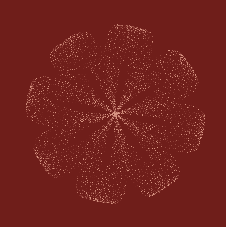
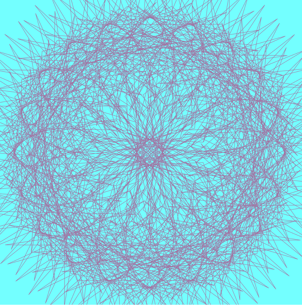
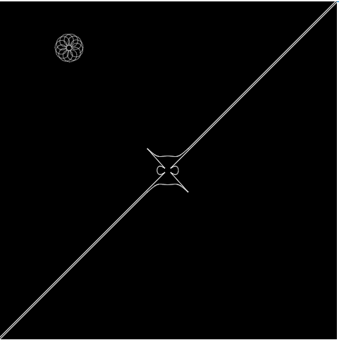
This project was really interesting because I got to see how I could adjust different variables within parametric equations to change with respect to mouse position. I wanted to create something relatively simple that resembles a “blooming” flower as the mouse moves position from (0,0) to (480,480). Admittedly, this took a bit of trial and error, and I ran into a lot of formatting issues in the beginning, but I’m pretty satisfied with how it turned out.
The first hypotrochoid curve — “petals”Addition of the epitrochoid — “center”
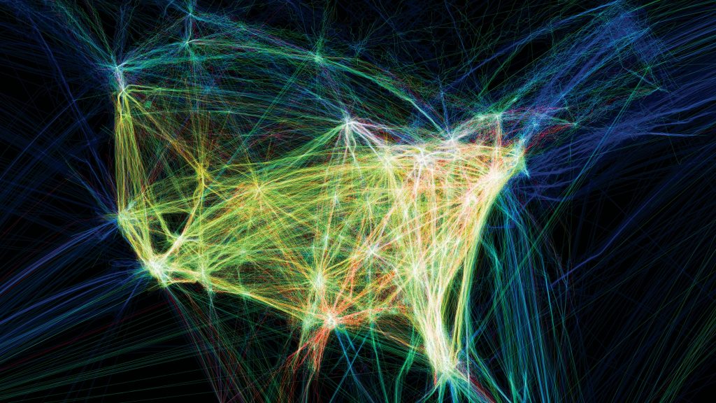
Flight patterns is a data visualization of airplane traffic that captures the rhythms and spatial patterns across North America over a 24- hour period. This project was created by Aaron Koblin who used data from the Federal Aviation Administration’s (FAA), which tracks 140,000 planes a day. He then used processing to plot where each plane went and used after effects and Maya.
The various colors and patterns are coded to show a wide range fo data such as type of aircraft, alterations to routes, weather systems and no fly zones. Also, the airline hubs appear as bright points of diffusion inside a complex web. I found this project particularly intriguing because this project’s use of aggregated data is visually pleasing as well as represents a relationship between humans and technology.
This was originally part of
Flight paths from FAA data drawn algorithmically and colored based on airplane model
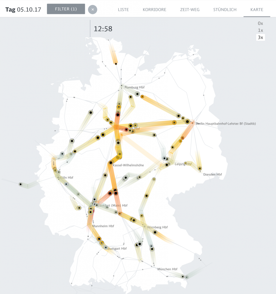
The animated map allows to see the big picture in train movements and to spot systemic effects. Peak Spotting by Christian Au, Moritz Stefaner, Stephan Thiel, Christian Laesser, Gabriel Credico, Lennart Hildebrandt, and Kevin Wang
The computational information visualization that I looked at is “Peak Spotting.” This is a means to combine machine learning and visual analytics methods to help manage the passenger loads on trains in Germany. It has a futuristic elements in the web application that integrates millions of datapoints over 100 days in the future to make predictions, and custom developed tools such as animated maps, path-time-diagrams, and stacked histograms create a vast range of types of data. The clearly color-coded visualizations point out what the critical bottlenecks are within the traffic difficulties. I think that the overall aesthetics is very helpful for understanding the data because it is subtle and readable with highly effective key colors. I can immediately know what kind of data I am looking at, and what time period the data are relevant to. Navigation also gives a good guidance.
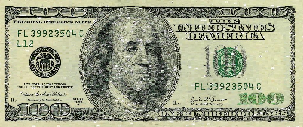
Aaron Koblin is an artist, designer, and programmer specializing in data and digital technologies and using computational techniques to visualize and develop information networks. One of his most compelling works focuses on visualizing flight pattern networks, which render paths of air traffic over North America through varieties of color and form. The FAA data for the flight networks was parsed through Processing and visualized to show nodes and overlaps among highly complex flight patterns. Another Intriguing work of Koblin’s, uses Amazon’s Mechanical Turk to spread out the work of developing an image of the hundred dollar bill across thousands of individuals to where each individual was unaware of the overall task. The computational process works in service of exploring the idea of an advancing economy and distribution of labor. These highly visual and creative ways of visualizing information by Aaron Koblin challenge conceptions of informational graphics and have the potential to become generative models for innovative thinking and development.
10, 000 Cents Image Produced through Mechanical Turk System
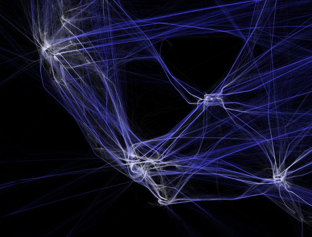
Originally developed by Scott Hessels and Gabriel Dunne, “Celestial Mechanics” project used Adobe After Effects and Maya. With time lapse animation, the project visualizes air traffic data and turns it into a series of videos and drawings, and perhaps art. Through still 2D drawings and screen captures, it displays the dynamics. Information shows the origin, end and path of the journey. Comparing the density of parts, readers find the busier ports in North America within a period of twenty-four hours. Also as it reveals multiple iterations of multiple iterations of flight patterns during the cycle, the project implies weather systems and no-fly zones.
Air Traffic over North AmericaZoom-in Flight Pattern
I chose Santiago Ortiz’s “History Words Flow” because I found the way he represented the data really intriguing and visually captivating. He represents the words found in Wikipedia articles about different time periods. In a video, he talks about the way he chose to represent the words. He uses scale and color to indicate the frequency and type of word, and arranges these words on a timeline that looks like melting or flowing paint. Moreover, the information is not absorbable at once glance. The viewer must scroll through the timeline in order to parse through and view each of the most common words at a single point in history. I liked this project because it was an interested concept executed in a creative and unique way.
// Name: Shariq M. Shah
// Andrew ID: shariqs
// Section: C
// Project 07

//defining global variable for number of points

var nPoints = 500;


function setup() {
  createCanvas(400, 400);
}

function draw() {


  //stroke colors will be a function of mouseX location

  var r = map(mouseX, 0, width, 80, 250);
  var g = map(mouseY, 0, height, 80, 250);
  var b = map(mouseX, 0, width, 80, 250);


  //call drawEpitrochoidCurve function

  background(g, b * 2, r * 2);
  push();
  noFill();
  stroke(b, g, r);
  strokeWeight(0.5);
  translate(width/2, height/2);
  drawEpitrochoidCurve();
  rotate(radians(frameRate));
  pop();


  //call drawFermat function
  push();
  noFill();
  stroke(r, g, b);
  strokeWeight(0.5);
  translate(width/2, height/2);
  drawFermat();
  pop();

}


function drawEpitrochoidCurve() {

    // Epicycloid:
    // http://mathworld.wolfram.com/Epicycloid.html

    var x;
    var y;

    var a = map(mouseX, 0, width, 0, width/2);
    var b = a / 2;
    var h = height / 4;
    var ph = mouseX / 10;

    beginShape();
    for (var i = 0; i < nPoints; i++) {

        var t = map(i, 0, nPoints, 0, PI * 2);

       // defining curves as function of i

        x = (a + b) * cos(t) - h * cos(i * (a + b) / b);
        y = (a + b) * sin(t) - h * sin(i * (a + b) / b);


        vertex(x, y);


    }
    endShape(CLOSE);

}

function drawFermat() {

    var x;
    var y;

    var a = map(mouseX, 0, width, 0, width);
    var b = a / 2;
    var h = height / 2;
    var ph = mouseX / 10;


    beginShape();
    for (var i = 0; i < nPoints; i++) {

        //defining angle variable for function

        var angle = map(i, 0, nPoints, 0, TWO_PI);


        x = (a - b) * sin(angle) - b * sin(angle * (a - b));
        y = (a - b) * cos(angle) - b * cos(angle * (a - b));

        vertex(x, y);


    }
    endShape(CLOSE);

}
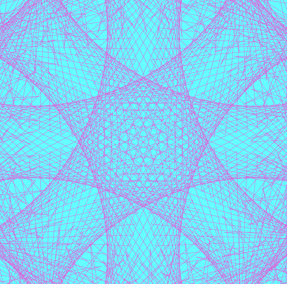
In this project, I was able to use curve equations to generate highly complex and articulated line patterns that change with the location of the mouse. By using mapped numbers and for loops that iterate upon the functions the line patterns become layered and produce interesting effects as the overall patterns change. From there, I was able to use variables to change the color of the lines as the mouse position changes, and subsequently the background to match the line colors as they adapt. By using variables for many of the inputs, the results become highly varied and complex.
/* Cathy Dong
   Section D
   yinhuid@andrew.cmu.edu
   Project 07 - Composition with Curves
*/

var density = 200;

function setup() {
    createCanvas(480, 480);
}

function draw() {
    background(0);
    stroke(255);
    noFill();

    //call devil's curve
    strokeWeight(1);
    push();
    translate(width/ 2, height / 2);
    devilDraw()
    pop();

    //call curve and make its center move with mouse
    strokeWeight(.5);
    push();
    var xDraw = constrain(mouseX, width / 5, width / 5 * 4);
    var yDraw = constrain(mouseY, width / 8, height / 8 * 7);
    translate(xDraw, yDraw);
    hypocycloidDraw();
    pop();
}

//draw hypocycloid move with mouse
function hypocycloidDraw() {
    var xA;
    var yA;
    var aA = map(mouseX, 0, width, 0, width / 5);
    var bA = map(mouseY, 0, height, 0, height / 8);
    beginShape();
    for (var i = 0; i < density; i++) {
        var t = map(i, 0, density, 0 ,PI * 2);
        xA = (aA - bA) * cos(t) - bA * cos((aA - bA) * t);
        yA = (aA - bA) * sin(t) - bA * sin((aA - bA) * t);
        vertex(xA, yA);
    }
    endShape();
}

// draw devil's curve function
function devilDraw() {
    var xD;
    var yD;
    var aD = map(mouseX, 0, width, 10, width/ 8);
    var bD = map(mouseY, 0, height, 10, height / 10);
    beginShape();
    for (var j = 0; j < density; j++) {
        var t = map(j, 0 , density, 0, PI * 2);
        xD = cos(t) * sqrt((pow(aD, 2) * pow(sin(t), 2) - pow(bD, 2) * pow(cos(t), 2)) / (pow(sin(t), 2) - pow(cos(t), 2)));
        yD = sin(t) * sqrt((pow(aD, 2) * pow(sin(t), 2) - pow(bD, 2) * pow(cos(t), 2)) / (pow(sin(t), 2) - pow(cos(t), 2)));
        vertex(xD, yD);
    }
    endShape();
}
mouse bottom leftmouse upper left
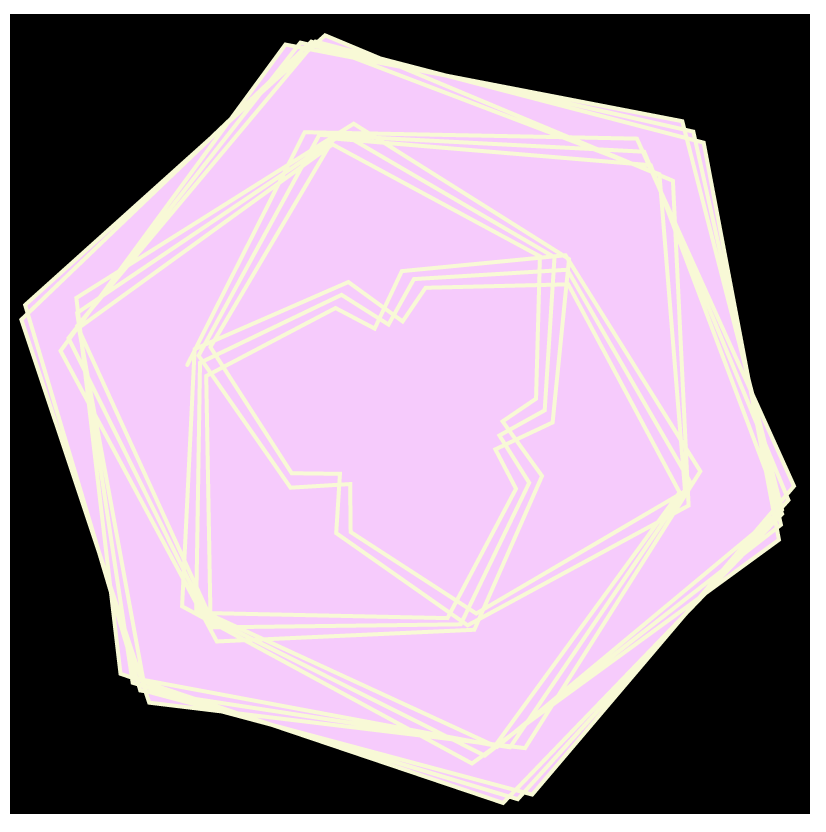
I started the project with browsing Mathworld Curves and found the curves that I am interested in. I used devil’s curve and hypocycloid. Devil’s curve remains at canvas center and its long diagonal edges change side when mouse moves, whereas hypocyloid itself flies with mouseX and mouseY. Hypocyloid is the smallest when it’s at upper left corner and largest at lower left. It is less complex and mouse moves to left of the canvas. The longest devil curve edges and the hypocyloid would only appear to be at the same edge when mouse is at upper right.
// Nawon Choi
// nawonc@andrew.cmu.edu
// Section C
// Project 07 Composition with Curves

// number of points
var np = 100;

function setup() {
    createCanvas(400, 400);
}

function draw() {
    background("black");

    stroke("#f7fad2");
    noFill();
    strokeWeight(2);

    // center the curves
    push();
    translate(200, 200);
    drawHypocycloid(100);

    // color of second curve depends on mouseX
    fill(255, 200, mouseX);
    drawHypocycloid(-200);
    pop();
}


// http://mathworld.wolfram.com/HypocycloidEvolute.html
function drawHypocycloid(xy) {
    var x;
    var y;
    var a = xy;
    var b = mouseY;

    beginShape();
    for (var i = 0; i < np; i++) {
        var t = map(i, 50, np, 50, TWO_PI);

        var one = a / (a - 2 * b);

        x = one * ((a - b) * cos(t) - b * cos(((a - b) / b) * t));
        y = one * ((a - b) * sin(t) + b * sin(((a - b) / b) * t));

        vertex(x, y);
    }
    endShape();
}
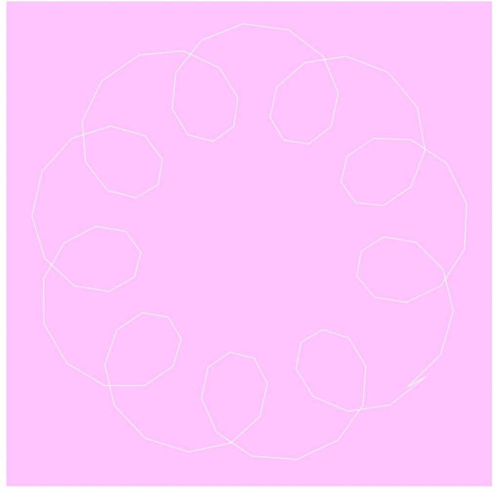
For this project, I chose to draw a curve called Hypocycloid Evolute. It was fun playing around by plugging in different variables at different points and seeing how it affects the shape. I eventually decided on having one of the variables, b, be dependent on the y-position of the mouse. I originally drew one curve, but decided to add another one to create depth. I drew another, larger curve and filled in the shape to create different flower-esque shapes as a result. I really enjoyed seeing how the changing colors and varying number of edges and angles created significantly different images with a single curve.
![[OLD FALL 2019] 15-104 • Introduction to Computing for Creative Practice](../../../../wp-content/uploads/2020/08/stop-banner.png)