Margot Gersing- Looking Outwards – 08

Connected Worlds
Connected Worlds, Exhibits at the Hall of Science. Photo by David Handschuh

For this week the I watched a lecture by Theo and Emily of Design I/O from Eyeo 2012. I decided to choose this one because I had seen some of their projects before and really like their work.

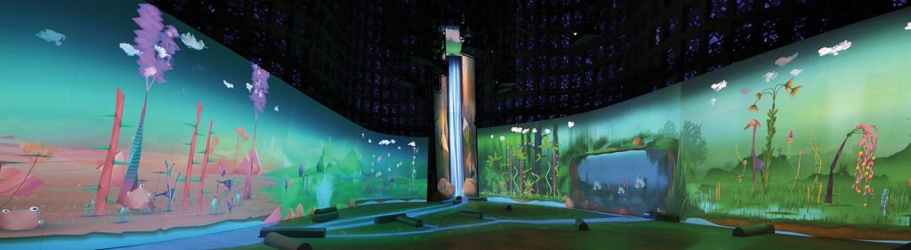
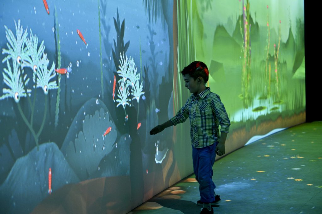
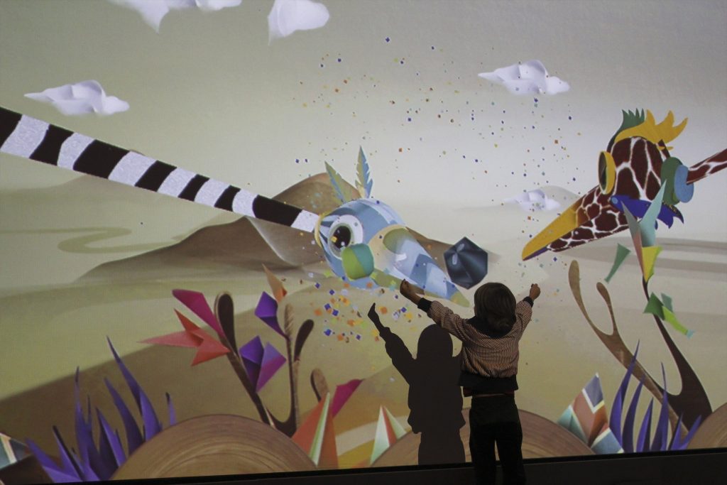
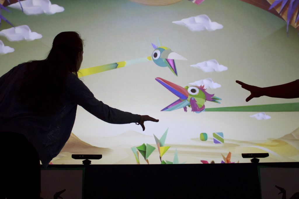
Their studio works with design, research and coding to create immersive interactive environments. The environments use design and code as tools to makes theses experiences come to life. Behind all of their projects are the goal to create “delight and wonder” to encourage open play and exploration in children. They have offices in California and New York but their work appears all over the world.

NightBright

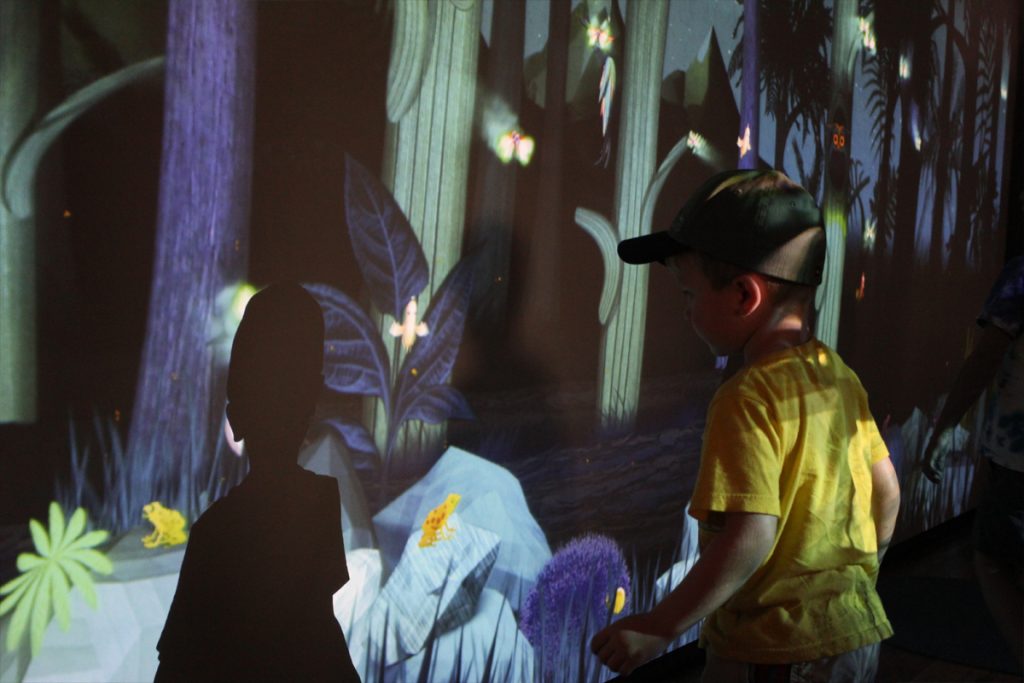
I love this studio so much because all the work they make is essentially my dream job. I love working with children and (I work in a preschool) and it has always been my dream to mix teaching, and design to create things for children. All of the projects they do encourage children to explore and openly play. Some of their projects have teaching elements too. They utilize the game and play nature to have the children actually learn something. One of their projects is a games about sharing resources and sustainability and the children not only have to interact with the program but also each other in order to keep up the simulation. They use the Kinect tracking device quite a lot in their projects and hack it different ways to do what they want, like make giant animated and interactive shadow hand puppets.

Using the Kinect to do arm tracking for the Puppet Parade
Puppet Parade
Puppet Parade

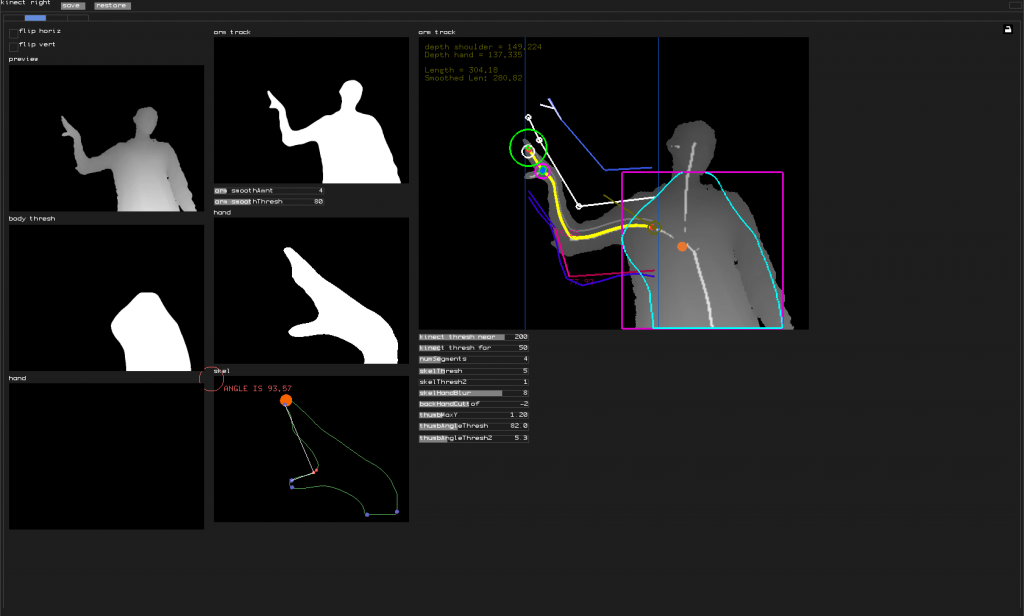
In this lecture they go through some of their recent projects and talk about the entire design process; research, to prototyping to implementation. they talk about the importance of testing projects at different levels of completion and how testing to scale is so important. They stress the importance of ensuring that the audience is well defined and that it makes sense with that in mind. In order to present and document their projects they use a lot of video, screen capture and photography. They also save all of the tests that they do throughout the process. In the lecture they show a lot of these test and it is so interesting to see the project come together from the early stages.
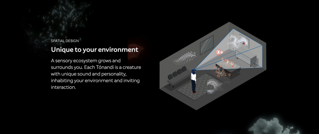
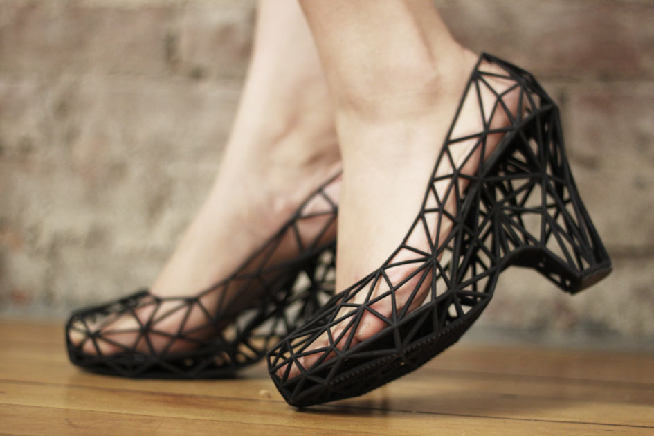
Other Projects:

NightBright, Field, Living Library, Connected Worlds

Monica Chang – Looking Outwards – 08

Mike Tucker

Mike Tucker’s Lecture(second video): https://vimeo.com/channels/eyeo2019/page:4

Tónandi project: https://www.magicleap.com/experiences/tonandi

Mike Tucker is an interactive designer and director at a company, MagicLeap, that focuses on the future of spatial computing. With his skills of audio-visual exploration, he was able to collaborate with Radiohead’s Jonny Greenwood and Encyclopedia Pictura in creating Kanye West’s video game. He has also worked with Universal Everything(I have blogged about before in Looking-Outwards 05) which is a collection of designs and digital art which pertains to technology and humanities curated by a man named Matt Pyke.

A peak into the virtual app created by MagicLeap, Tónandi.
Spatial Design for Tónandi

Tucker has worked with various concepts and projects such as hand and eye-tracking, spatial controllers and optics. Spatial music interactivity became his next experiment when he was collaborating with Sigur Rós and MagicLeap.

Tucker states that he hopes to inspire and to enhance the minds of spatial designers all over the world by providing a new mindset of approaching technology and utilizing it to be able to design a “mixed-reality future”.

Xiaoyu Kang – Looking Outward – 08

The artist Rachel Binx introduces herself as an only child who grew up in Mexico. And her work started with her dream of becoming a world traveler by herself when she was younger. She would handwritten the location CSV of every city she travels to and tracted that information for years. What she did with the data was that she generated an image from all the places that she has been to through programming. She started collaborating with a jewelry company that use shapes that are generated from places to make jewelry, and the idea of the whole project is to take people’s experiences as data points and visualize them, thus summarizing someone’s life through the medium of a map. 

As the first project became successful, she started to create more products. For the people who didn’t move as much in their lives, she connects the streets that people walk every single day to generate patterns and creates them into jewelry. She also incorporated maps into other items such as skirts and pillows. 

In addition, she also did projects that used programming to document her life. For example she programmed her laptop to take pictures whenever she uses her laptop in a new environment. All of her works focused on data journaling, either through automated data or memory. What she was trying to do is to take the data points that are important and personal to people and turn the data points into something visual and physical.

The speaker talks about her project by connecting her work to her own stories and experiences. In this way, she made the lecture much easier to understand and much more relatable since a lot of her experiences are commonly shared among many people.

https://rachelbinx.com

Mihika Bansal – Looking Outwards – 08

The creative person I am analyzing with this post is Rachel Binx. Currently Rachel Binx is working at Netflix with the Content and Data team in Los Angeles. Before that Rachel worked at Mapzen, NASAJPL, and Stamen. Rachel describes herself as a data visualizer, developer, and designer.

In the lecture, Rachel specifically talks about new ways to visualize data, methods that transcend the way that we have typically thought about data in the past. She emphasizes the importance of the practicality of the manner in which the data is visualized, not just creating something that is “eye candy.” One of her projects that I find to be particularly interesting is the GPX Jewelry project, which creates interesting jewelry based on maps that she has used before.

She is a very engaged presenter which makes it more interesting to watch her work being presented as it engages the user and the audience.

Link to website: https://rachelbinx.com

Rachel’s Lecture

Claire Lee – Looking Outwards – 08

I decided to read about Mary Huang, one of two joint speakers at the 2013 Eyeo festival that founded a software-based apparel creation company called Continuum Fashion. Huang graduated with a BA in Design/Media Arts from UCLA, and went on to receive a MA from the Copenhagen Institute of Interaction Design.

Eyeo 2013 – Huang & Fizel

I really admired Mary’s projects under Continuum Fashion, which served as a reflection the emerging role of technology in society while also giving the masses an accessible outlet with which anyone could design their own apparel and see it come to life. I really liked that Mary considers her work a continuation of the constantly evolving definition of “fashion” and the social commentary behind her work. I also really liked that she put a lot of effort into the user-interface design of these projects so that they were easy for people with no coding experience to use.

Strvct, Continuum’s first collection of 3D-printed shoes.

Some of the strategies in her presentation that I thought were most effective were that she gave a lot of visuals and included examples of some concepts and projects (2-dimensional pictures to knitwear, different types of weaves) that served as the foundation on which her work was based. I think it did a lot to enhance my understanding of her goals for these projects and her thought process behind them. I also liked that she went in and actually gave her audience a look inside the user interface of her apparel-making programs, so they could see some of the customizations and adjustments available for the users to make on their pieces.

Shannon Ha – Project 07 – Curves

sketch

//Shannon Ha
//sha2@andrew.cmu.edu
//Section D
//Project 07 Curves
var nPoints = 200
var angle = 0

function setup() {
    createCanvas(480, 480);
}

function draw() {
	background(0);
	push();
	translate(width/2, height/2); // moves around center point
    if(mouseX > width/2){

        rotate(radians(angle)); //rotating curves and stop motion effect
        angle += 2 * mouseY/250;
    }
    drawCoch();
	pop();
}


function drawCoch(){
    //color change in stroke
    colorR = map(mouseX, 0, width, 0, 255);
    colorB = map(mouseY, 0, height, 0, 200);

    //stroke & fill
    strokeWeight(2);
    stroke(colorR, 100, colorB);
    noFill();

    //variable that change the size, shape, num of edges in curve
    a = map(mouseX, 0, 200, 0, width);

    beginShape();
    for (var i = 0; i < 200; i ++) {

        // set angle/t to loop in relation to mouse and positions curve
        var t = map(i, 0, 20, mouseY/20, mouseX/50);

        //paratmetric equation for cardioid
        x = (a * sin(t)*cos(t))/t ;
        y = a * sq(sin(t))/t;
        vertex(x,y);
    }
    endShape();
}

For this project, I spent a lot of time trying to find the right curve to use, and when I came across the Cochleoïd curve, I figured it would be interesting to create some sort of spiral hypnotic effect by mapping the variables and angles to the position of the mouse. As I experimented with this, I realized that I can play around with the mapping values to change the smoothness of the curve. I display this by changing smoothness of the curve according to mouseY. Overall it was a bit of a struggle trying to figure out how to change the variables in order for it to move while adding/detracting to the curve , but it was also an interesting and fun learning experience!

As you can see in these screenshots, the number of edges changes depending on mouse position!!!

looking outwards – 07- ilona altman

edit (forgot to put this earlier) – I am using 1 of my grace days for this late submission.

The project “Melting Memories” by  Refik Anadol Studio created in 2017 is a beautiful series of artworks created from visualizing different EEG data collected. By representing the EEG data gives it a tactility that emphasizes the materiality of memory.  The EEG data collected was based off of the prompt to focus on recalling specific moments of childhood.

I think it is beautiful and admirable that the project has this large scale, and this sense of having an organic life of itself. It is interesting to me how the data was able to have such a sculptural form. This sculptural form makes me think about how all EEG data is collected from the flesh of our being, and that the integration of data into this piece allows one to understand this generated sculpture as part of one’s own personal world. 

I suppose the algorithms that generated this work broke down the EEG data into several characteristics like the amplitude of the wave, the duration of the spikes, and used these broken down variables in order to also cue the drawing for the moving image.

The artist’s sensibilities for simplicity and emotional impact are clear through the clean documentation for this piece in the photographs and the video of this work.

Capturing EEG data, process image
data visualization process
image of person standing in front of EEG data map

Mari Kubota- Project 07- Curves

index sketch

<!DOCTYPE html>
<html>
  <head>
    <meta charset="UTF-8">
    <title>p5.js vers 0.7.1, Edit index.html to Change This Title</title>
    <script src="https://cdnjs.cloudflare.com/ajax/libs/p5.js/0.7.1/p5.js"></script>
    <script src="https://cdnjs.cloudflare.com/ajax/libs/p5.js/0.7.1/addons/p5.dom.js"></script>
    <script src="https://cdnjs.cloudflare.com/ajax/libs/p5.js/0.7.1/addons/p5.sound.js"></script>
    <script src="sketch.js" type="text/javascript"></script>
  </head>
  <body>
  </body>
</html>

In this project I created used the Conchoid of de Sluze curve to create continuously changing circle which is controlled by the mouse. The equation of the curve was x=(sec t +acos t) cos t, y=(sec t +acos t) sint in parametric form. The tricky part of the project was that p5js did not understand “sec t” so I had to rewrite it in cosine form.

SooA Kim – Looking Outwards – 07

Image of theyrule.net

They Rule is a data visualization site where you are able to browse and identify the relationships of the US ruling class. It shows you the boards of the most powerful U.S. corporate companies, such as Google, Yahoo, and Amazon. If you click one of the board members in one of the companies, it will show the connections the individual has to different companies that he/she is involved in. Through the process, the data visualization expands from one to multiple connections of people and companies. It shows you how everything is connected to one another. This information design shows the structure of large corporations and distribution of power in U.S economy.

Website: Theyrule.net

Xiaoyu Kang – Project 07 – Curves


sketch

//Xiaoyu Kang
//xkang@andrew.cmu.edu
//Section B
//Project-07

var angles = 0;
function setup() {
    createCanvas(480, 480);
}

function draw() {
    background(0);
    stroke(mouseX, 220, mouseY);
    translate(width / 2, height / 2);
    // all the curves rotate at the same speed
    rotate(radians(angles));
    angles += (mouseY/30);
    drawCruciform(); 
    drawAstroid();
    drawEpitrochoid();
}

function drawCruciform() {
    // http://mathworld.wolfram.com/Cruciform.html
    push();
    noFill();
    strokeWeight(1);

    
    //creates the cruciform
    beginShape();
    var a = map(mouseX, 0, width, 0, 300);
    var b = map(mouseY, 0, height, 0, 300);
       
    for (var i = 0; i < 800; i++) {
        var t = map(i, 0, 150, 0, TWO_PI);
        var x = a * 1 / (cos(t));
        var y = b * 1 / (sin(t));
        vertex(x, y);
    }
    endShape();
    pop();
}

function drawAstroid() {
    // http://mathworld.wolfram.com/Astroid.html
    push();
    noFill();
    strokeWeight(1);
    
    //draw astroid
    beginShape();
    var a = map(mouseX, 0, width, -300, 300);

    for (var i = 0; i < 500; i++) {
        var t = map(i, 0, 150, 0, TWO_PI);
        var x = 3 * a * cos(t) + a * cos(3 * t);
        var y = 3 * a * sin(t) - a * sin(3 * t);
        vertex(x, y); 
    }
    endShape();
    pop();
}

function drawEpitrochoid() {
    // http://mathworld.wolfram.com/Epitrochoid.html
    push();
    noFill();
    strokeWeight(1);
    
    //draw epitrochoid
    beginShape();
    var a = map(mouseX, 0, width, -100, 100);
    var b = map(mouseX, 0, width, -100, 200);
    var h = map(mouseY, 0, height, -300, 200);


    for (var i = 0; i < 600; i++) {
        var t = map(i, 0, 150, 0, TWO_PI);
        var x = (a + b) * cos(t) - h * cos(((a+b)/b) * t);
        var y = (a + b) * sin(t) - h * sin(((a+b)/b) * t);
        vertex(x, y); 
    }
    endShape();
    pop();
}

For this project, I really want to create curves that are diverse in shape as the mouse moves around. I picked three curves that are all very different in shape an as the mouse moves they turn into patterns with different level of complexity. Also to add some more visual elements, I changed the color setting so that as the mouse moves the color changes as well.