Project 07: Composition with Curves

curves
var points = 100;

function setup() {
    createCanvas(400, 400);
}

function draw() {    
    background(map(mouseX, 0, width, 50, 0)); // background color goes from grey -> black as mouse moves to the right
    translate(width/2, height/2); // move origin to center
    hypotrochoid(); // draw the curve   
}

function hypotrochoid() {
    // https://mathworld.wolfram.com/Hypotrochoid.html
    var x; 
    var y;
    var a = map(mouseX, 0, width, 50, 80); // radius of fixed circle
    var b = map(mouseY, 0, height, 0.1, 1); // radius of circle rolling around fixed circle
    var h = mouseX/2; // distance from center of interior circle
    strokeWeight(map(mouseX, 0, width, 0.1, 3)); // stroke weight increases as mouse moves to the right
    stroke(mouseX, 100, mouseY);
    noFill();
    beginShape();
    for (var i = 0; i <= points; i ++) {
        var t = map(i, 0, points, 0, TWO_PI);
        x = (a - b) * cos(t) + (h * cos(((a - b)/b) * t));
        y = (a - b) * sin(t) - (h * sin(((a - b)/b) * t));
        vertex(x, y);
    }
    endShape();
}


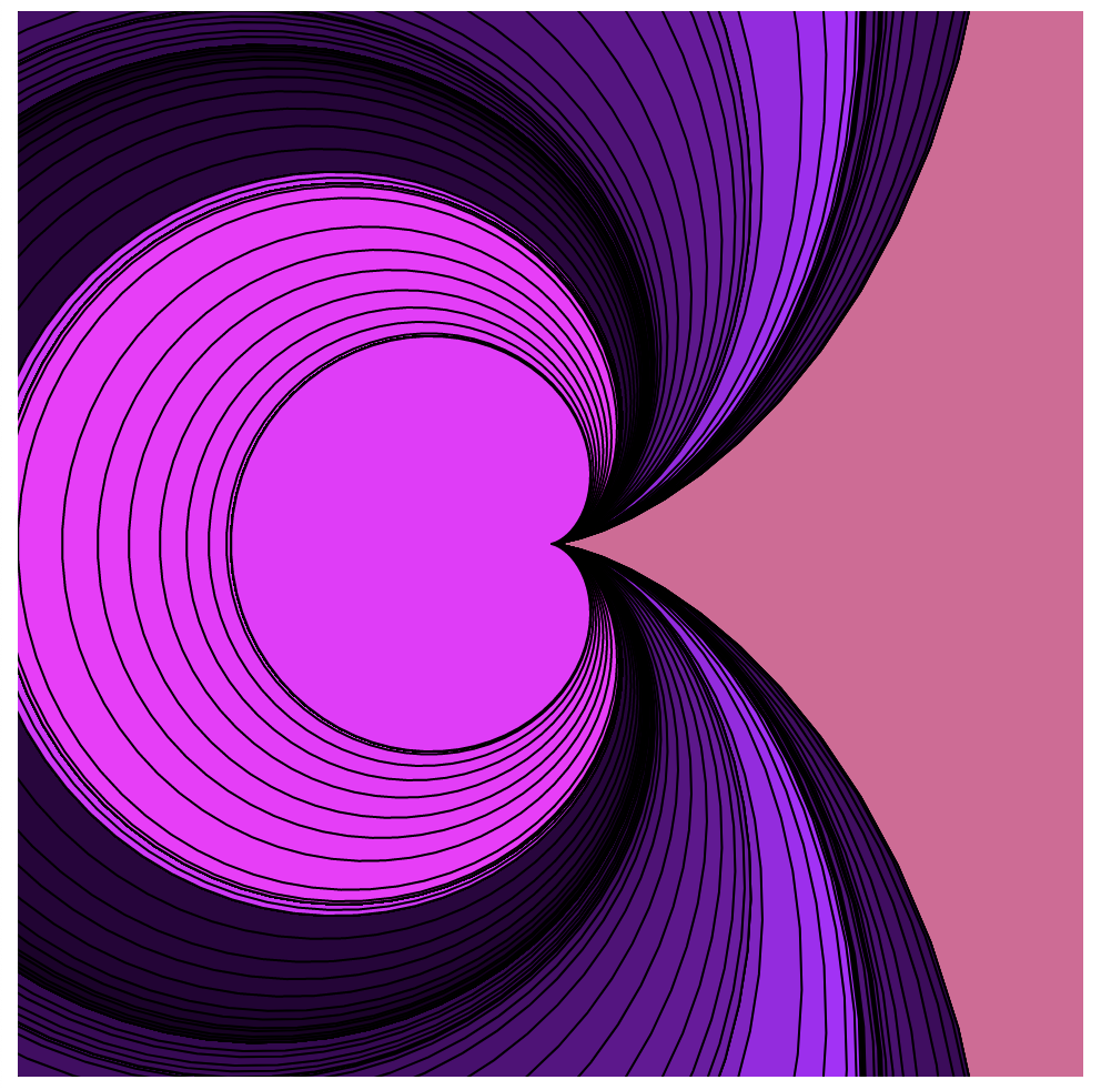
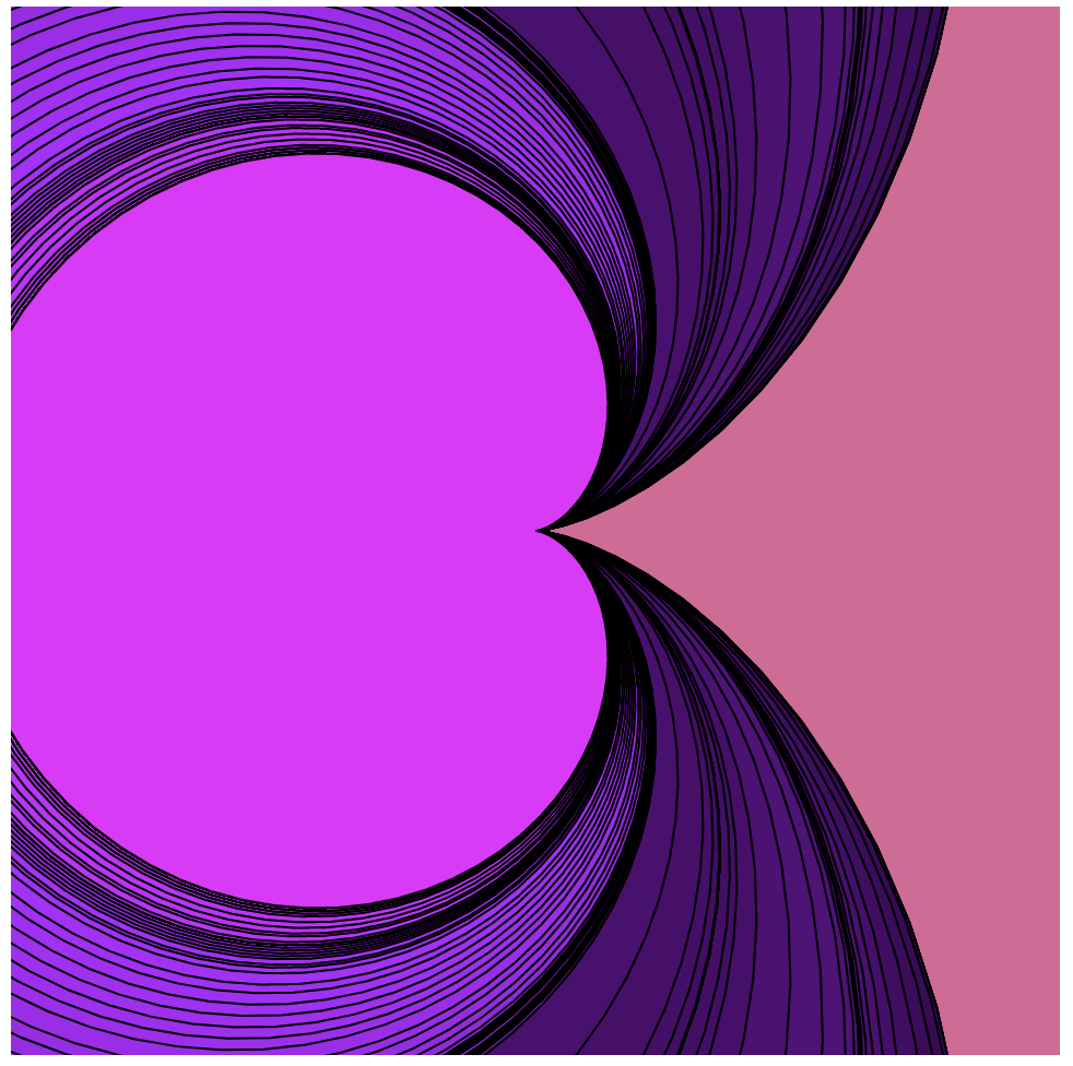
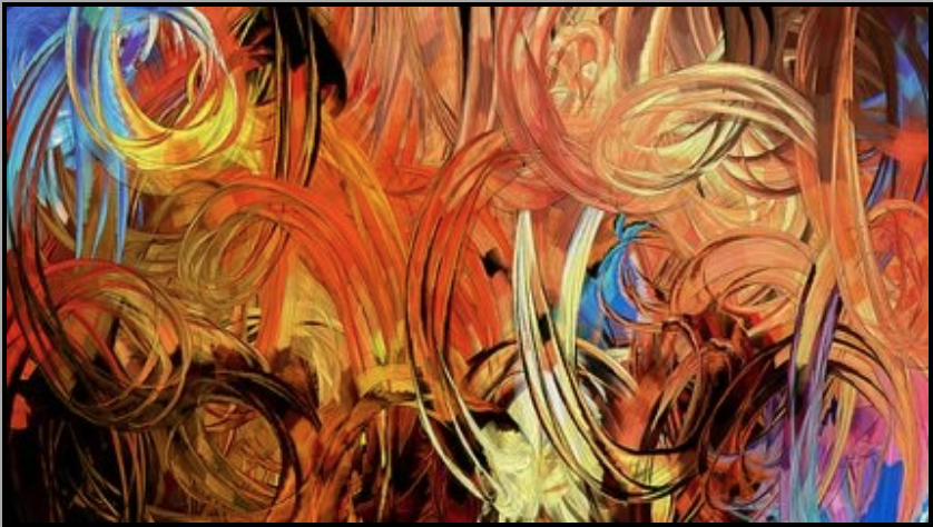
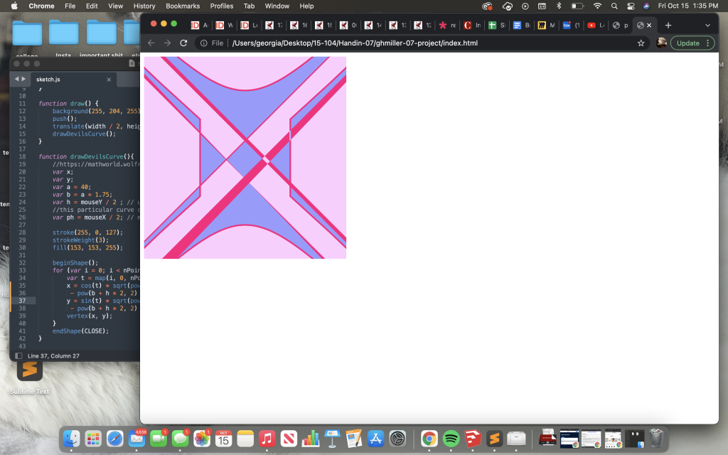
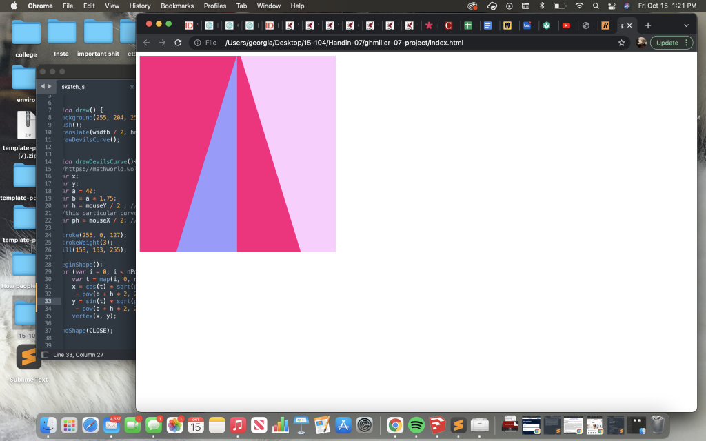
I started the project by just browsing all the different curves in mathworld and coding them to see how they look on the canvas. I ended up settling on the Hypotrochoid curve. The sample curve on the website actually didn’t seem very interesting, but once I allowed the parameters to change based on the mouse’s position, the curve had a lot more details and got much more complicated. It was quite incredible to see how the curve changes as the mouse cross the canvas. Here are some screenshots of the different looks:

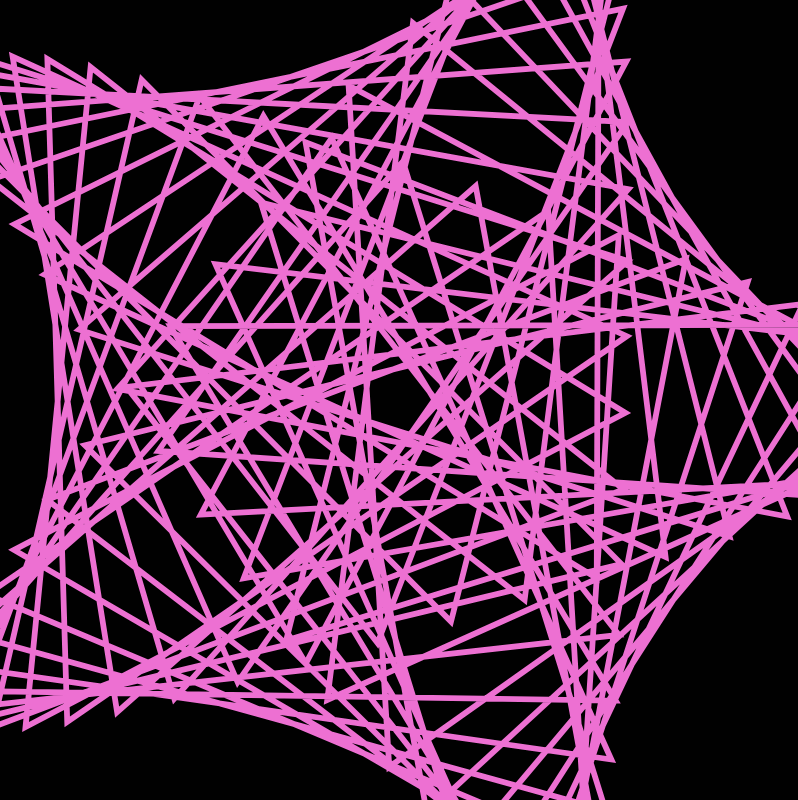
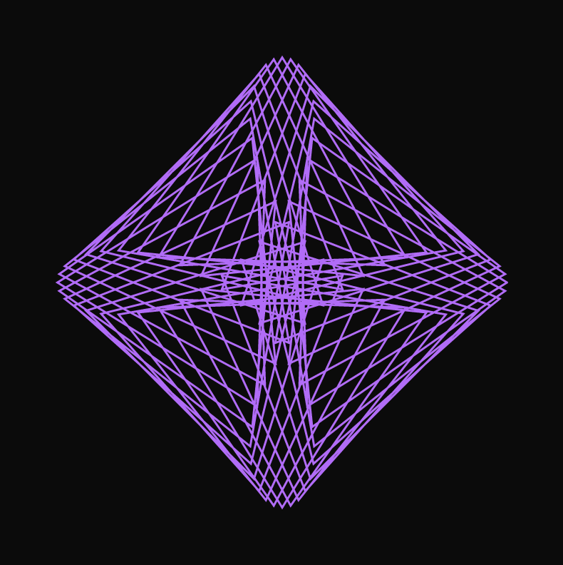
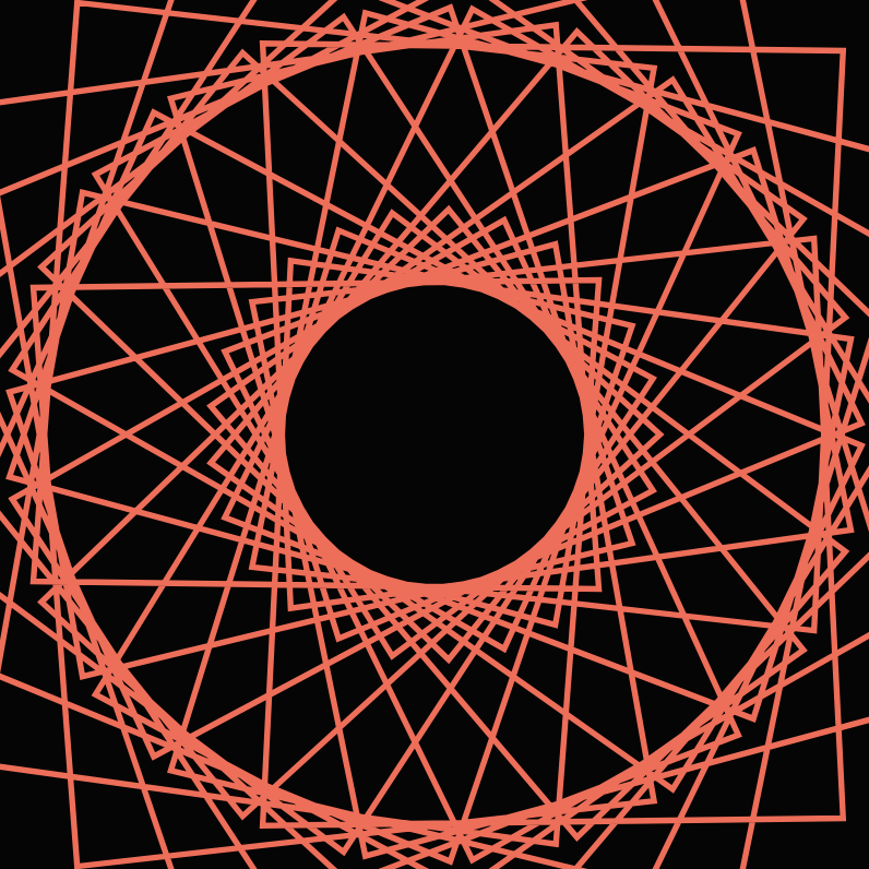
The changes are quite drastic, so it’s interesting that they were all produced by the same equation.

Information Visualization

The project that I chose for this week’s Looking Outwards is called “Selfiecity” and it was coordinated by Dr. Lev Manovich. Selfiecity is an interactive project that analyzes the way people take selfies: in 5 different cities – Bangkok, New York, Moscow, Berlin, and Sao Paulo – the data of people’s selfies was collected to find many different patterns such as who smiles the most, who has more reserved looks, do angry people tilt their heads more strongly or what is a characteristic mood for people in Moscow. 

I admire this project because it focuses on different cities all around the world instead of focusing on just specific ethnicity, culture or gender which shows more inclusion and diversity.  

Selfiecity used different theoretic, artistic, quantitative, computational and data visualization methods to collect all the data. For example, Manovich’s team created an algorithm called Imageplots that assembled thousands of selfies to reveal interesting patterns and the team also created an interactive application called Selfiexploratory which allowed them to navigate the whole set of 3200 photos for the project. Selfiexploratory took into consideration matters such as location (1 of the 5 cities), age, gender, pose of looking up or down, tilt or turn of a head left or right, eyes and mouth open or closed, glasses or no glasses, calm, angry or happy. It’s fascinating how the team was able to create an application to take into consideration all of those things from just a simple selfie! 

“This project is based on a unique dataset we compiled by analysing tens of thousands of images from each city, both through automatic image analysis and human judgement.” Manovich’s team randomly selected 120,000 photos, approximately 20,000-30,000 photos per city, from a total of 656’000 Instagram posts. After the selection, the team made 2-4 Amazon’s Mechanical Turk workers tag each photo by answering the simple question of “Does this photo show a single selfie?” The next step was to choose the top 1000 photos for each city and submit them to Mechanical Turk again to more skilled workers to guess the age and gender of the person in the selfies. With the top image selection, the team ran Selfiexploratory app to analyze the details. Finally, one or two members of Manovich’s team examined all these photos manually to find any mistakes and rounded the photos down to only 640 selfies per city. 

The creator’s artistic sensibilities manifest in the final form by finding out many interesting facts about selfies. For example, Manovich’s team found out that only 3-5% of images they analysed were actually selfies. The other 95-97% were pictures of cats, food, houses, artwork, other people like friends, etc. We always assume that people, especially Gen Z, take a lot of selfies lately, however only 3-5% of the photos analyzed were actually selfies. Moreover, the team found that in Moscow 82% of selfies were taken by women rather than men and Moscow has the least smiling selfies. 

I think this project is very interesting because it focuses on the idea of a selfie and analyzes things such as tilt of a head or having glasses on. Many people wouldn’t even think that any data can be collected from a selfie, however data collected from a selfie in different cities can be used to find many cultural differences and lifestyles.

http://selfiecity.net

Dr. Lev Manovich, Selficity, 2014
Process of Selfiecity
Main findings from the project of Selfiecity

LO7

Link of the project:https://benfry.com/genomevalence/

This project is called genome valence by Ben Fry, which is a visual representation of the algorithm most commonly used for genome searches.
The genome of an organism is made up of thousands of genes (34,000 for the human, 20,000 for the mouse, and 14,000 for the fruitfly). A gene is made up of a sequence of As, Cs, Gs, Ts that averages 1000 to 2000 letters apiece. To handle this amount of information, the BLAST algorithm breaks each sequence of letters into 9 letter parts. Every unique nine-letter set is represented as a point on the screen. I’m very surprised by the complexity of the project. The creator’s artistic sensibilities are manifest through the integration of biology, computer science, and art.

Project 7

sketch
var nPoints = 500
function setup() {
    createCanvas(400, 400);
    background(220);
    text("p5.js vers 0.9.0 test.", 10, 15);
    frameRate(100)
}
function draw() {
    //background color varies with mouse X and mouse Y
    background(map(mouseX,0,width,0,144),map(mouseY,0,width,0,122),255)
    translate(25,25)

    //draw the 16 devil's curves
    for (x = 25; x < width; x += 100){
        for (y = 25; y < height; y += 100){
            push()
            translate(x,y)
            drawDevilCurve()
            pop()
        }
    }
}
function drawDevilCurve(){
    //Devil's Curve
    //https://mathworld.wolfram.com/DevilsCurve.html

    var x;
    var y;
    var a = mouseX/15;
    var b = constrain(mouseY/5, 0, a*100);
    fill(max(min(0,width),mouseX/2),max(min(0,width),mouseY/2),255);
    beginShape();
    for (var i = 0; i < nPoints; i++) {
        var t = map(i, 0, nPoints, 0, TWO_PI);
        x = cos(t) * sqrt((sq(a) * sq(sin(t)) - sq(b) * sq(cos(t))) / (sq(sin(t)) - sq(cos(t))));
        y = sin(t) * sqrt((sq(a) * sq(sin(t)) - sq(b) * sq(cos(t))) / (sq(sin(t)) - sq(cos(t))));
        vertex(x, y);
    }
    endShape(CLOSE);
}

I used Devil’s curve because i was intrigued by its name, and the demonstration of devil’s curve on the website is really fancy so i wanted to try it out. I made one devil’s curve first, and played with how the mouse would affect the shape of it. After having that one devil’s curve, i thought that i might be able to make a kaleidoscope using devil’s curves. So I wrote an for loop, and I changed the mouse X mouseYs to make sure that there would be significant changes when we move mouse X and mouse Y no matter where the mouse is ( i’m saying this because previously some manipulations of mouse X and mouse Y may not greatly impact the picture).

Project 07: Curves

sketch
//Anthony Pan
//Section C

//Cardioid Curve Interaction
//polar coordinate equation r = a*(1-cos(theta))
//parametric equation
    //x = a * cos(t) * (1 - cos(t))
    //y = a * sin(t) * (1 - cos(t))
//mouseX change colors
//mouseY changes how many are drawn


function setup() {
    createCanvas(480, 480);
    background(220, 100, 150);
}

function draw() {
    //var x1 = 0
    //var y1 = 0

    push();
    //drawRect(x1,y1); //draw another shape
    translate(width/2, height/2);
    drawCardioidCurve();
}


function drawCardioidCurve() {
    var x;
    var y;

    var a = 80;
    var h = mouseX; //mouseX interaction
    var h1 = map(mouseY, 0, 480, 0, 256); //mouseY interaction

    fill((h1 * 0.7)%256, 0, h1);
    beginShape();
    for(var i = 0; i < 101; i++) {
        var theta = map(i, 0, 101, 0, TWO_PI);

        x = (h + a) * cos(theta) * (1 - cos(theta));
        y = (h + a) * sin(theta) * (1 - cos(theta));
        vertex(x, y);
    }
    endShape(CLOSE);
}

For this project, I wanted to create a curve that would be drawn multiple times as the user moved mouseX. I chose to create a heart using the cardioid function and chose purple/pink as my color for the heart. I wanted it to feel like you were drawing hearts repeatedly that would change color and dimensions based on the mouseX and Y positions.

For the process, I did something very similar to the technical assignment this week, utilizing an equation to draw the different points on the curve rather than the noise function.

Looking Outwards 07: Computational Data Visualization

This week I took a look at some artists who specialize in computational data visualization. In particular, I took a look at Chris Harrison’s piece, Visualizing the Bible. This piece drew me in particular because the bible has always been something I have been so fascinated with. The combination of technology and a piece of world history felt refreshing and innovative. Harrison was able to visualize 63,000 cross-references within the bible to create a stunning piece that “honored and revealed the complexity of the data at every level”. A couple of other pieces were also made following the conclusion of the bible arc piece. Harrison wanted to capture the story of the bible and more specifically the people and the places within the bible. He used a spatial clustering algorithm to show the different connections between the 2619 biblical names. These pieces create new and refreshing ways to view classic pieces of human history. They give us a different perspective on how things can be interpreted.

Chris Harrison’s Bible Visualization

Looking Outwards 07

A particular work that I find very interesting is ‘FORMS – String Quartet’ by Playmodes. It is a “live multimedia performance for a string quartet, electronic music and panoramic visuals, in the field of visual sonification”(Visnjic 2021). They are able to create performances that are visually appealing that are controlled by the sound they were creating. In a sense, it was such a great experience watching them because it was so cool how the lights and images were adding to the meaning of the song. It is done by a generative system that creates endless, unrepeatable graphic scores that are immediately transformed into sound. The software that’s used is “coded in processing where the image sonification was done in Max/MSP. Hardware in this performance is comprised of a 3840*1080 pixels LED screen, aMacbook Pro with RME Fireface UCX soundcard, stereo sound system + subwoofers, a series of DPA 4099 microphones and two violins, one viola and a cello”(Visnjic 2021).Overall, I really enjoyed their performances.

Website: https://www.creativeapplications.net/maxmsp/forms-string-quartet/

Looking Outwards 07: Information Visualization

“Melting Memories” by Refik Anadol is one of my favorite digital works as a designer. The website itself which presents the work is immersive and dynamic which is so fitting to the work. Anadol is a pioneer in the aesthetics of machine intelligence and researches practice centered around the discovery and development of data narratives. His work addresses the challenges of computing which imposed on humanity and what it means to be an individual in the age of AI. The perception and experience of time and space he creates work around is enriched in environments which are so immersive and create a multi-dimension perception of space. His specific piece “Melting Memories” is a reference to Anadol’s unexpected interconnections between philosophical works and academic inquires which take memory as it’s principal theme. The work is a digital “video” format which is 2-dimensional but appears as if it is 3-dimensional, reaching out to the viewer. The work is a slow burn which mimics liquified colors to represent time and perception of humans.

Looking Outwards 6

I really enjoyed this work by Patrick Gunderson. The visual complexity created by the ramdomly generated splotches of colour pattern is really visually pleasing. I really enjoy the complementing and in some cases contrasting colour patterns that are created randomly. It many arts it almost looks as if the art is capturing the motion of a specific object. He tries to incorporate imperfections into algorithmic systems the strikes the tension in between order and natural flow. 

https://www.artistaday.com/?p=2812

Curves

I decided to chose the Devil’s Curve for my project, mostly because I liked the way it looked. It was very hard at first because I have not been in a math class in years, to figure out what each part of my equations did. At first I had a problem where my signs were wrong and only had the crunode show up.

bad ()s
more bad ()s

I got stuck for a bit, but the project seemed simpler than I thought at first. To better understand and to play around with my curve to figure out how I should have it move, I was able to find an example of the curve and move it’s a and b points on desmos. One thing I had already accidentally realized was that if a and b were equal they would make a circle and if a/b was more or less than one rotated the crunode. I thought these properties were interesting so I wanted to attach my b value and a values to movements so that they would be able to both equal each other and be more than and less than. Doing this also allowed my curve to grow and shrink.

The code works so so that mouseX and Y control a and b. They do the same thing to the numbers but depending on the position of the mouse on the page it controls rotation of the crunode and size.

file

//Georgia Miller
//Section D
//15-104

nPoints = 400;
function setup() {
    createCanvas(400, 400);
    frameRate(10);
}

function draw() {
    background(255, 204, 255);
    push();
    translate(width / 2, height / 2);
    drawDevilsCurve();
}

function drawDevilsCurve(){
    //https://mathworld.wolfram.com/DevilsCurve.html
    var x;
    var y;
    var a = 40;
    var b = a * 1.75;
    var h = mouseY / 2 ; // up and down to change crunode
    //this particular curve changes orientation based on if a/b is bigger or larger than 1
    var ph = mouseX / 2; // move mouse to right to grow

    stroke(255, 0, 127);
    strokeWeight(3);
    fill(153, 153, 255);

    beginShape();
    for (var i = 0; i < nPoints; i++){
        var t = map(i, 0, nPoints, 0, TWO_PI); //t = theta
        x = cos(t) * sqrt((pow(a + ph, 2) * pow(sin(t), 2) 
         - pow(b + h * 2, 2) * pow(cos(t), 2)) / (pow(sin(t), 2) - pow(cos(t), 2)));
        y = sin(t) * sqrt((pow(a + ph, 2) * pow(sin(t), 2)
         - pow(b + h * 2, 2) * pow(cos(t), 2)) / (pow(sin(t), 2) - pow(cos(t), 2)));
        vertex(x, y);
    }
    endShape(CLOSE);
}